
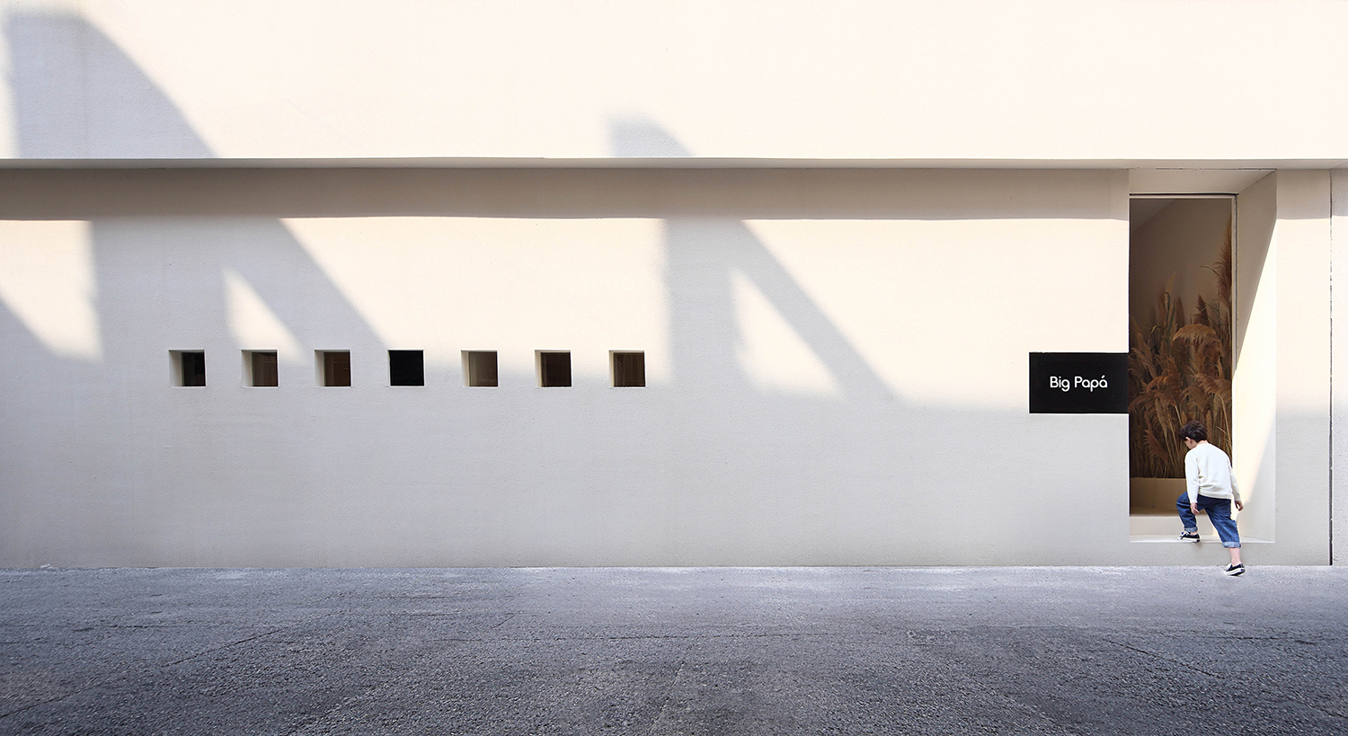
BigPapá位于江阴市青果路,是一家极具品味和独特风格的童装集合店。 BigPapá is located in Qingguo Road, Jiangyin City. It is a collection of children's clothing with a taste and unique style. 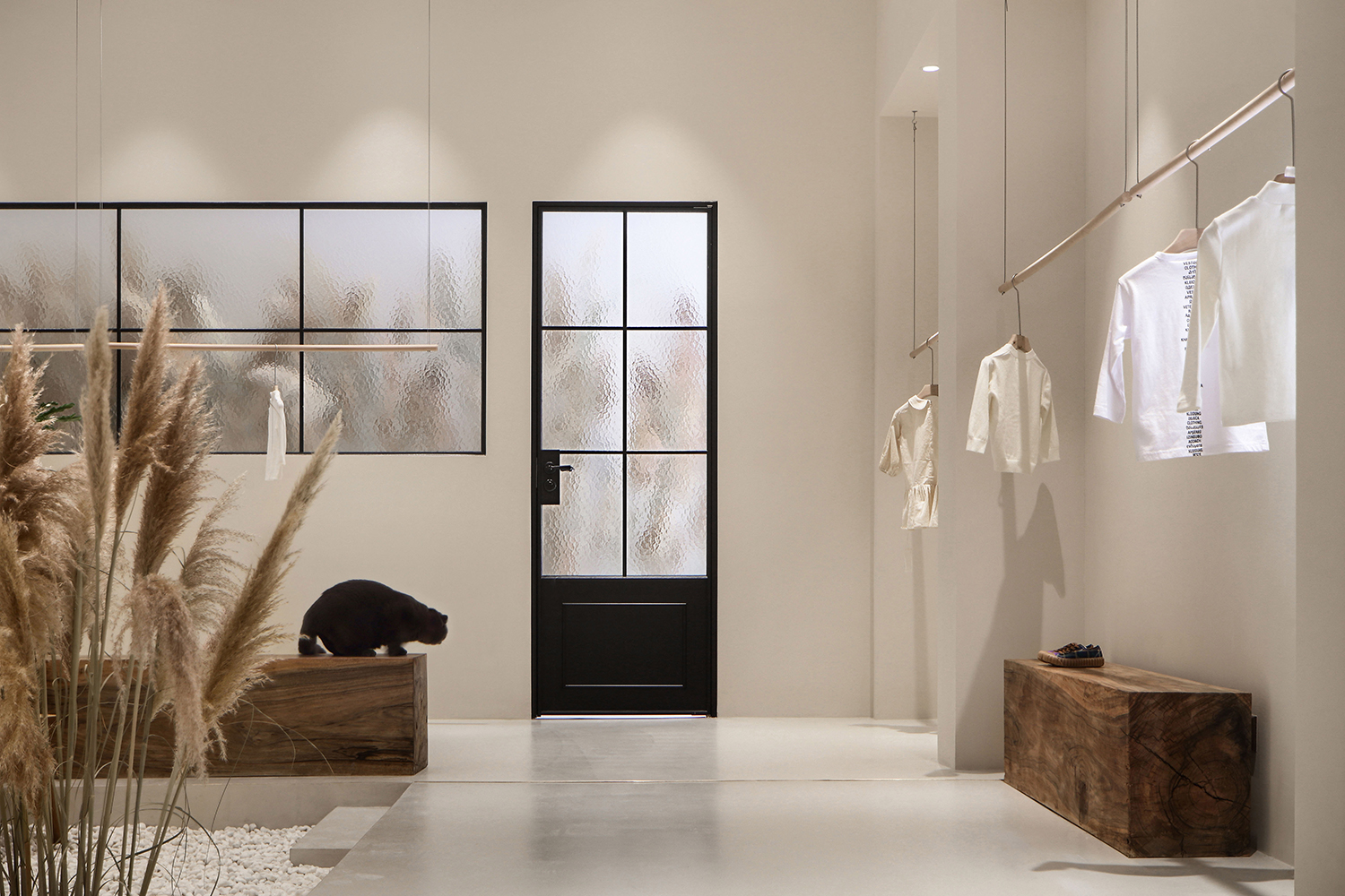
“我们想做一间不囿于固定年龄和性别、别开生面的集合店。希望人与空间产生互动,可以好奇、张望、驻留或者合影留念。在动态的日常切片里,发现它富有包容性和毫无拒人千里之外的亲近感。”惊喜地是,设计师的理念与BigPapá的主理人程先生夫妇在初次交流时,一拍即合,于是有了这次作品的完美呈现。 “We want to be a collection store that doesn’t care about a fixed age and gender. We want people to interact with space, curious, look, stay or take a group photo. In the dynamic daily slice, it is found to be inclusive and There is no sense of intimacy that is thousands of miles away.” Surprisely, the designer’s philosophy coincides with the BigPapá’s principal, Mr. Cheng and his wife, when they first communicated, so they have the perfect presentation of this work. 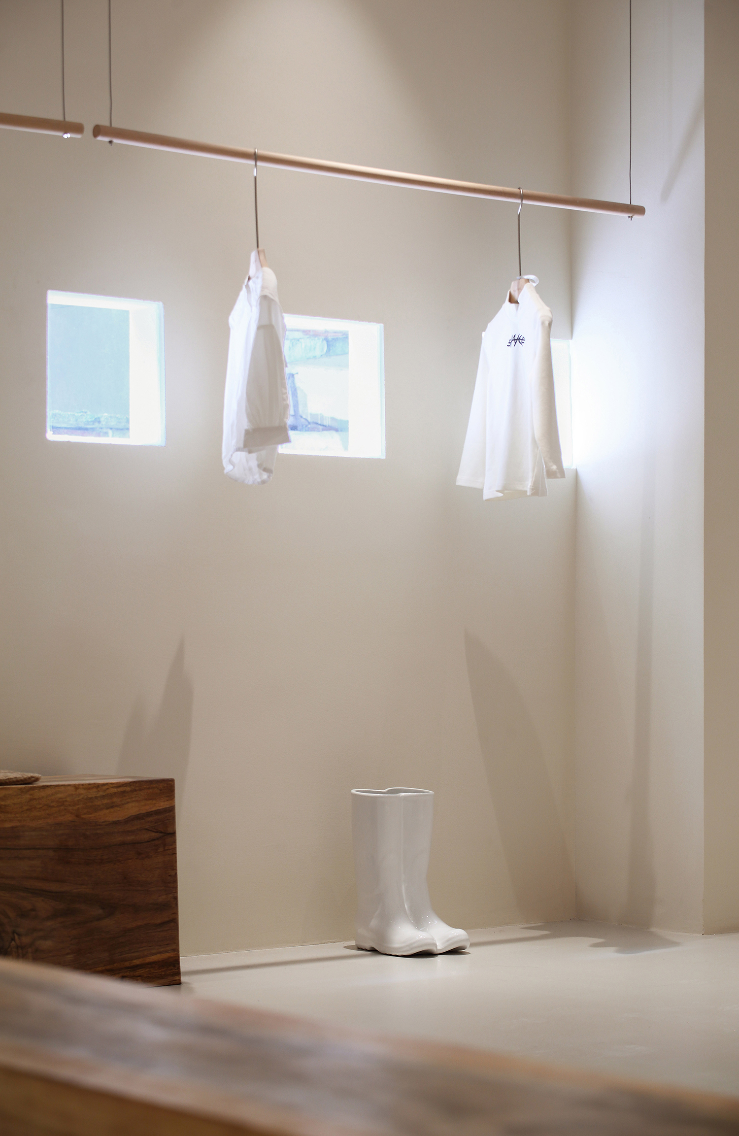
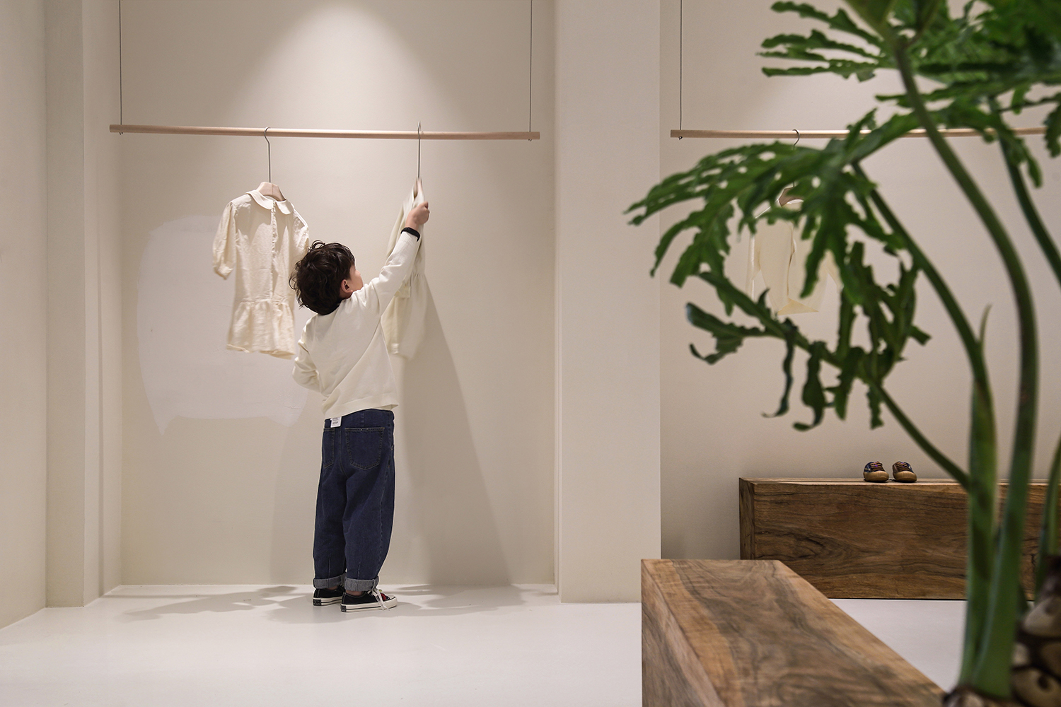
与周遭“自由生长”的店招毗邻,我们希望BigPapá更克制,更干净素雅一些。以抵挡来自车水马龙的街道嘈杂和人群来往的喧闹,动与静之间,有对比,有缓冲,有大千世界和个人精神世界内心对话。 Adjacent to the “free-growth” shop around us, we hope that BigPapá will be more restrained and cleaner. In order to withstand the noisy and crowded traffic from the busy streets, there is contrast, buffering, and dialogue between the world and the personal spiritual world. 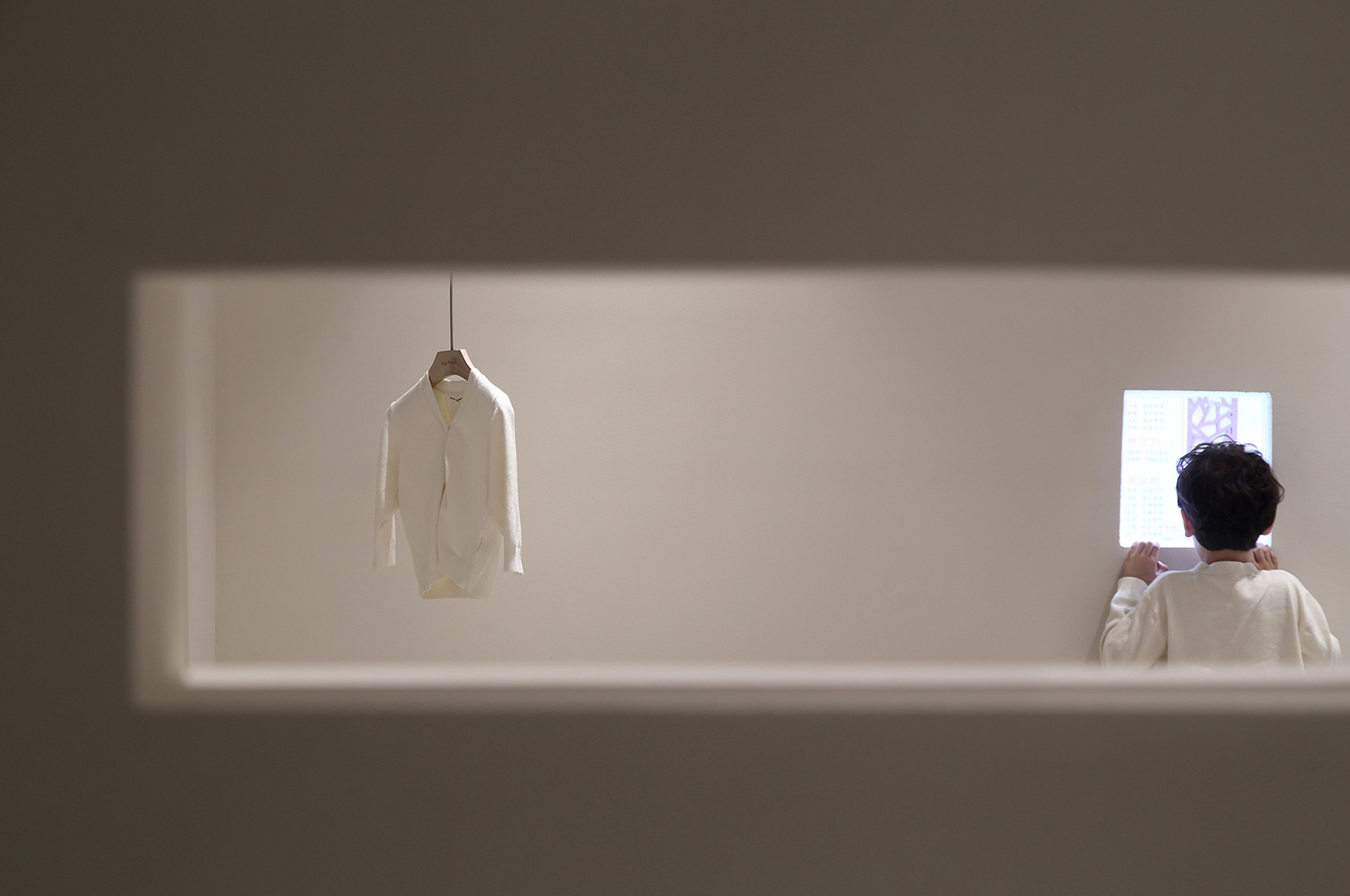
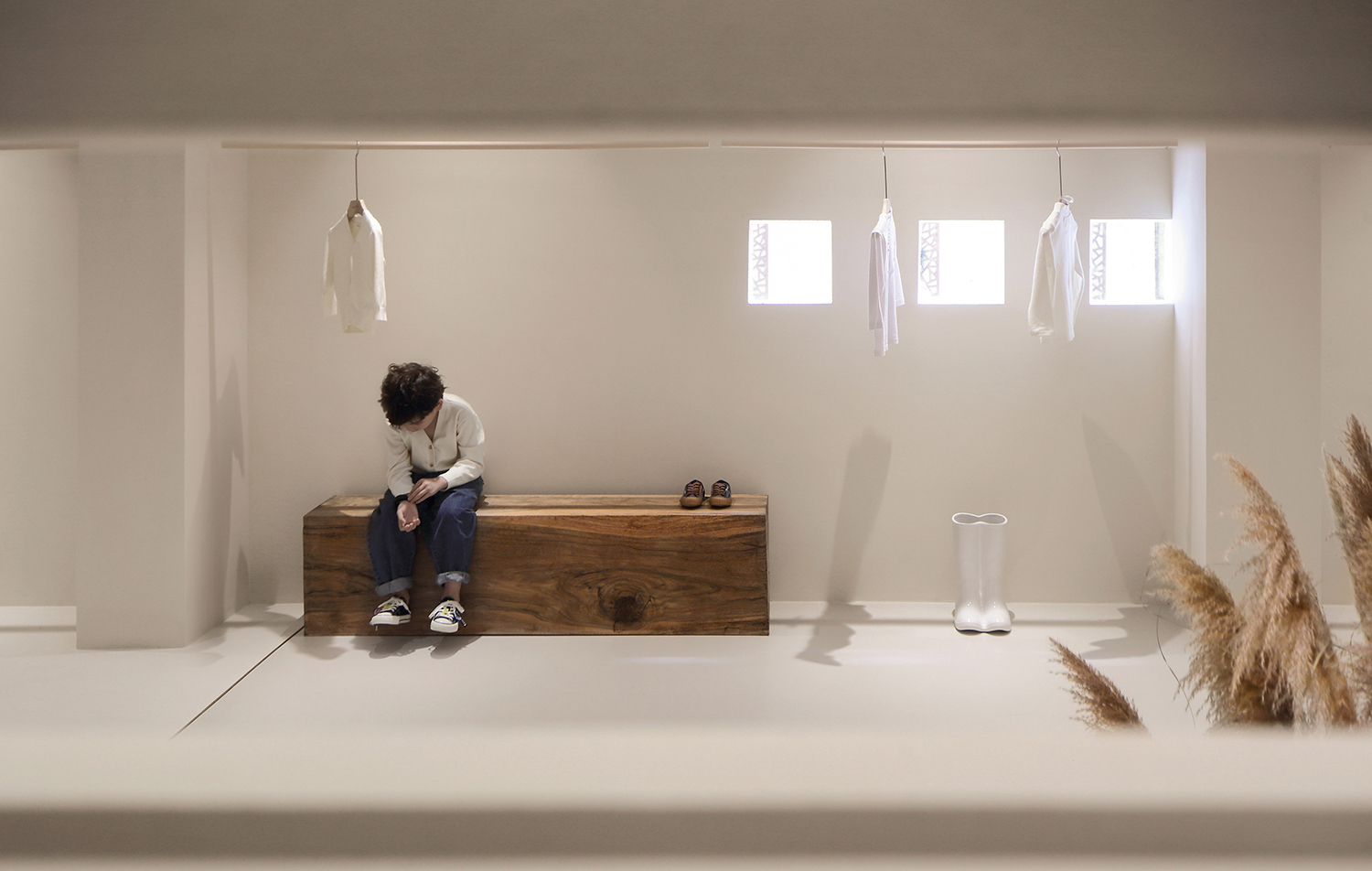
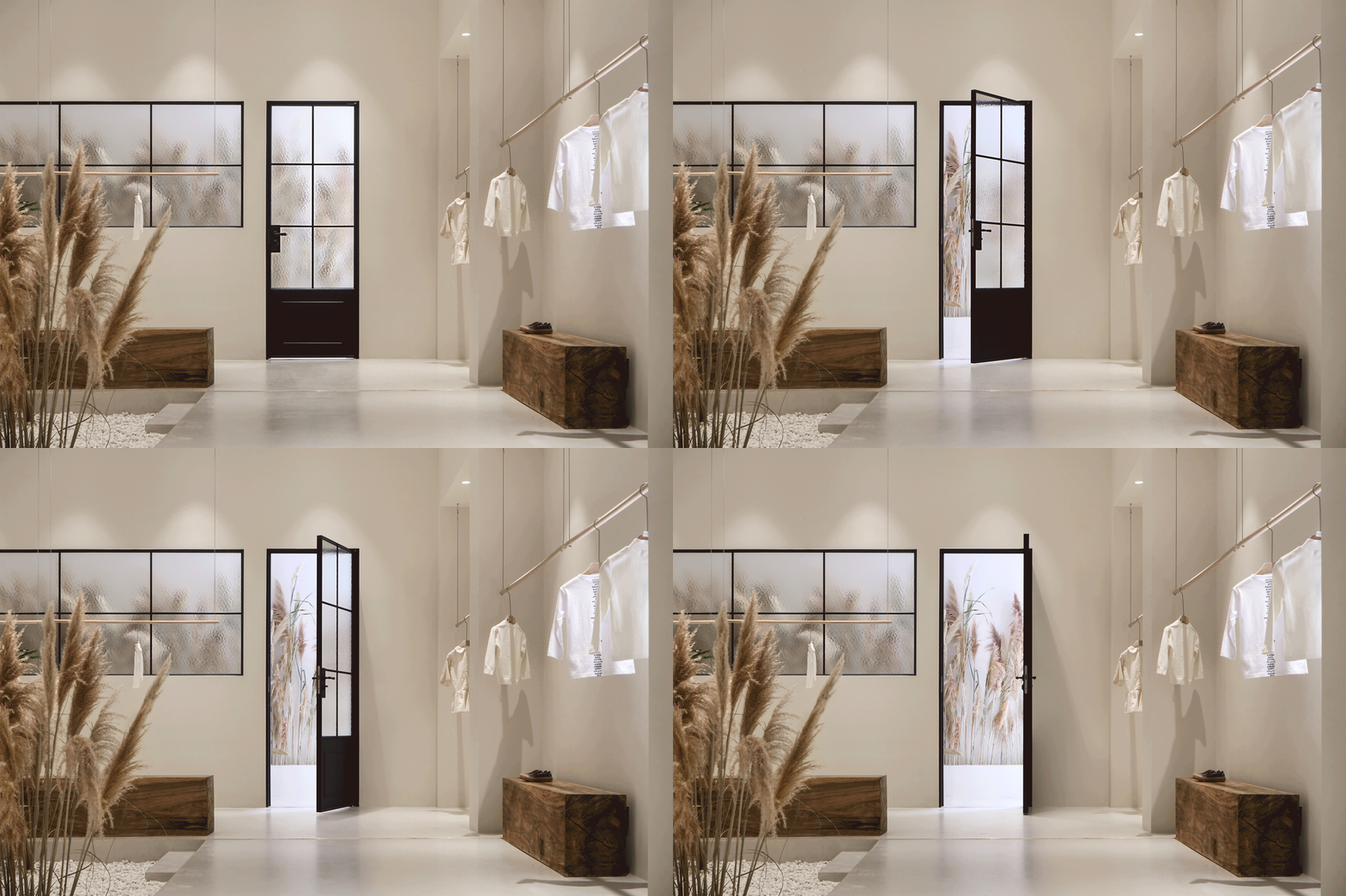
这是一个有着丰富质感的室内空间。 This is an interior space with rich texture. 整体氛围轻松愉悦,置入芦苇一簇,以内敛安静的姿态摇曳在空间里。细腻与粗粝相互交织,产生戏剧化的美妙冲突。晕开微微涟漪,抚平了日常奔波在钢筋水泥中人的情感和生活褶皱。 The overall atmosphere is relaxed and pleasant, placed in a cluster of reeds, swaying in the space with a restrained and quiet attitude. Delicate and intertwined, creating dramatic conflicts. The fainting of the slight sputum smoothes the daily emotions and life folds in the reinforced concrete. 室内的手工木制品、一方白砂石、一字排开的方形窗洞、展架上的陶瓷器皿,无不宣示着回归日常中去,剥离不必要的繁缛装饰,借由艺术设计,将自然引进建筑。 The hand-made wood products in the room, the white sandstone in one side, the square window holes in the word line, and the ceramic utensils on the display stand all declare that they return to the daily life, strip away the unnecessary traditional decoration, and introduce nature into the building through art design. 人可以通过空间重塑时光的美好,与温暖。 People can reshape the beauty and warmth of time through space. 项目名称:BigPapá 设计施工:精成空间设计 项目设计:苏小烟 项目位置:无锡江阴 项目年份:2019年 文案编辑:Da Lim 项目摄影:ingallery Projectname:BigPapá DesignTeam:JCD.Interior Design Project designer: Su xiaoyan Location:JiangyinWuxi ProjectYear:2019 Copywriter:Da Lim Photographs:ingallery |
精华推荐
换一换
-
然然伊 2020-8-28 10:46:27
迪趣多啦啦 发表于 2019-10-29 09:58
个人观点. 无意冒犯.觉得东施效颦. 童装的展示想搞得奢饰品 或者概念店一样 留白, 又摆的毫无章法 凌乱. ...
这点常识都没有吗?肯定是摆拍完再把衣服挂上去啊 看来你摆场的经验不足啊
-
ulwgiyygy 2019-10-29 09:19:50
CIII 发表于 2019-10-29 00:32
聚焦的表现手法,但是童装感觉较弱,芦苇自然感受视觉和嗅觉有些许刺激,摆台的物件年龄大了些。对于空间是 ...
观察细致

 收藏
收藏  说两句
说两句 


还停留在玩设计概念的阶段。这种韩式风格17-19年胜起,大多数以女装,快装店为主。但是玩童装。看看能撑多久吧。。。
这种店说实话还不如小县城五彩斑斓的童装店生意好。。。我说这话,不是对客户,而是对作品的设计师而言。
虽不需要考虑运营,但是也得考虑设计结果的导向性。。。