
|
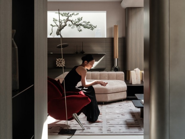
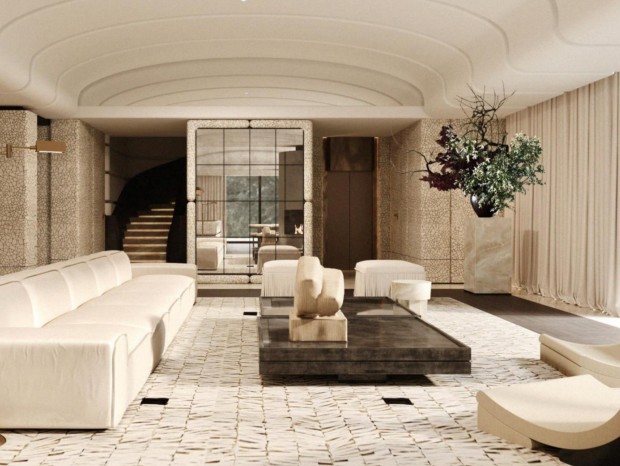
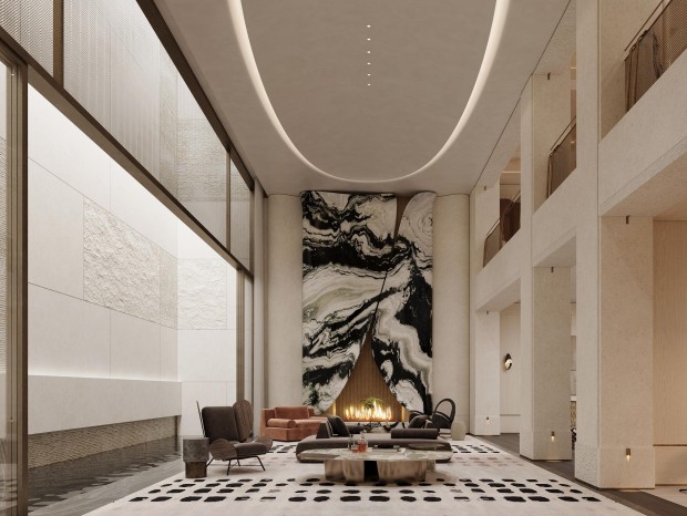
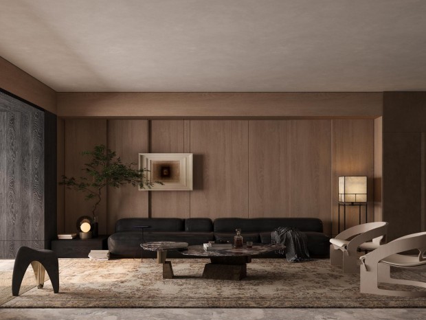
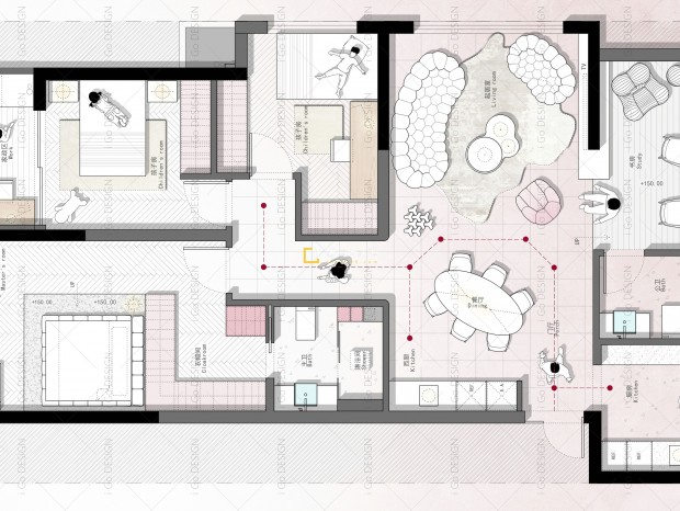
本帖最后由 fengdian 于 2020-12-7 12:33 编辑 % E. T, z/ Q% ?" h 大师主义的借鉴:密斯范德罗的“少即是多”的理念在一定意义上讲与当代实际使用上还是有一定差距的。他的理念有两层意思:一是纯净形式,即使用简洁而抽此昂的防踢,删除一切装饰,落得一个光溜溜的盒子。而是通过空间,使用简洁而抽象的方块平面或接近方块的平面,把圆形当作圣经,以减胜繁,以少胜多。由于平面的高度抽象,必然造成功能上无所适从。因此,“功能服从形式”就成为一定的理论指导。 Master of the draw: Mies van der Rohe "less is more" concept in a certain sense with the actual use of contemporary there is a certain gap. His idea had two meanings: one was pure form, that is, to use a simple and pumping anti kick, to remove all decoration, and to end up in a perfectly polished box. But through space, using simple and abstract square plane or close to the square plane, the circle as the Bible, to reduce the complexity, to more with less. Due to the high level of abstraction of the plane, it is inevitable to be at a loss of function. Therefore, "the function obeys the form" to become the certain theory instruction. 甲方是三位刚刚创业的90后专业美发造型师,信心满满的想做一番事业。想法特别多。通过多次的沟通,反复的交流,终于在这些方向上有了切入点。首先色调达成了统一。 Party a is three just started 90 professional hair stylist, full of confidence to do some business. So many ideas. Through many times of communication, repeated communication, finally in these directions have an entry point. First of all, the colors are unified. 高级灰作为绘画的一种调性,在建筑室内中很少会让人接受。综合性的空间会受到很多自然条件的影响而变化,经过和几位90后的甲方沟通后,觉得融入一些比较耐看的视觉效果会更好。于是在大面的材质上运用了很多漫反射的材料,加上镜子的直接反射,视觉上经过各种光线的融合形成了很微妙的变化。 As a tonality of painting, high-grade Gray is seldom accepted in architectural interior. Comprehensive space will be affected by a lot of natural conditions and change, after communication with several 90 party, feel into some more durable visual effect will be better. So a lot of diffuse material is used on the surface of the material, plus the direct reflection of the mirror, the visual light through the fusion of the formation of a very subtle changes. 高级灰在水粉画中高级灰特指 一个色系或一组色。色彩经过调合纯度通常偏低给人的感觉和谐,而不是单独一个色。 因为色彩的运用关键在于搭配,没有一个色是独立存在。 In Gouache, especially a color scheme or group of colors. Color after blending purity is usually low to give the feeling of harmony, rather than a single color. Because the key to the use of color is collocation, no one color is an independent existence. 高级灰柔和,平静,稳重,和谐,统一,不强烈,不刺眼,没有冲突,色彩内含的元素是复杂的而非单纯的。这是一种存在于现实生活中的色彩。 High Gray soft, calm, stable, harmony, unity, not strong, not harsh, no conflict, the elements of color is complex rather than simple. It's a color that exists in real life. Oject Name项目名称:NICE SALON美发造型 Design area/设计面积:130平米 Material Quality/材质:铝板,瓷砖,钢化玻璃,不锈钢板,金茶镜 Design company/设计公司:北京晨升DESIGN Design Director/设计总监:姚远 Original design/主创设计:姚远 Execute the design/执行设计:孙晓阳 Engineering team/工程团队:北京晨昇佳艺装饰工程有限公司 Photographer/摄影师:侯松茂 |
精华推荐
换一换


发表评论0