|
项目名称|Project Name:《 环球翡翠湾 》 项目地址|Location:上海 · 浦东新区 面积| area:300㎡ 设计机构|Design Agency:简狄设计事务所 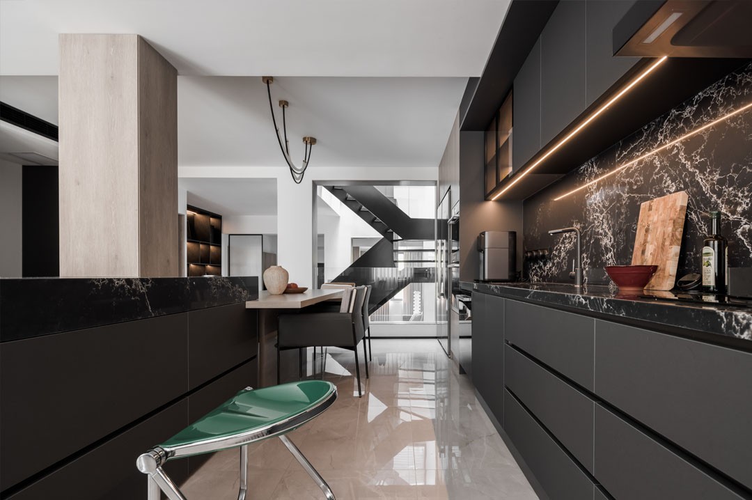
前言 # PREAMBLE # 屋主是一对年轻夫妻 男主人是画家 女主人是美妆博主,也是位准妈妈 由于工作性质不同 对居住的个性化需求也不同 男主人需要一间画室/工作间 还需要一间可以放较大器械的健身房 女主人需要一间书房/直播室 陈列美妆用品和粉丝无障碍互动 共同的需求则是希望拥有大大的开放式中西厨+餐厅 美美的浴缸可以泡澡看星星 开阔敞亮的大客厅 舒适明亮的大卧室…… 整体风格定位为充满艺术感的现代风格 空间改造 # SPACE TRANSFORMATION # ---原始户型图--- ---平面布局图--- 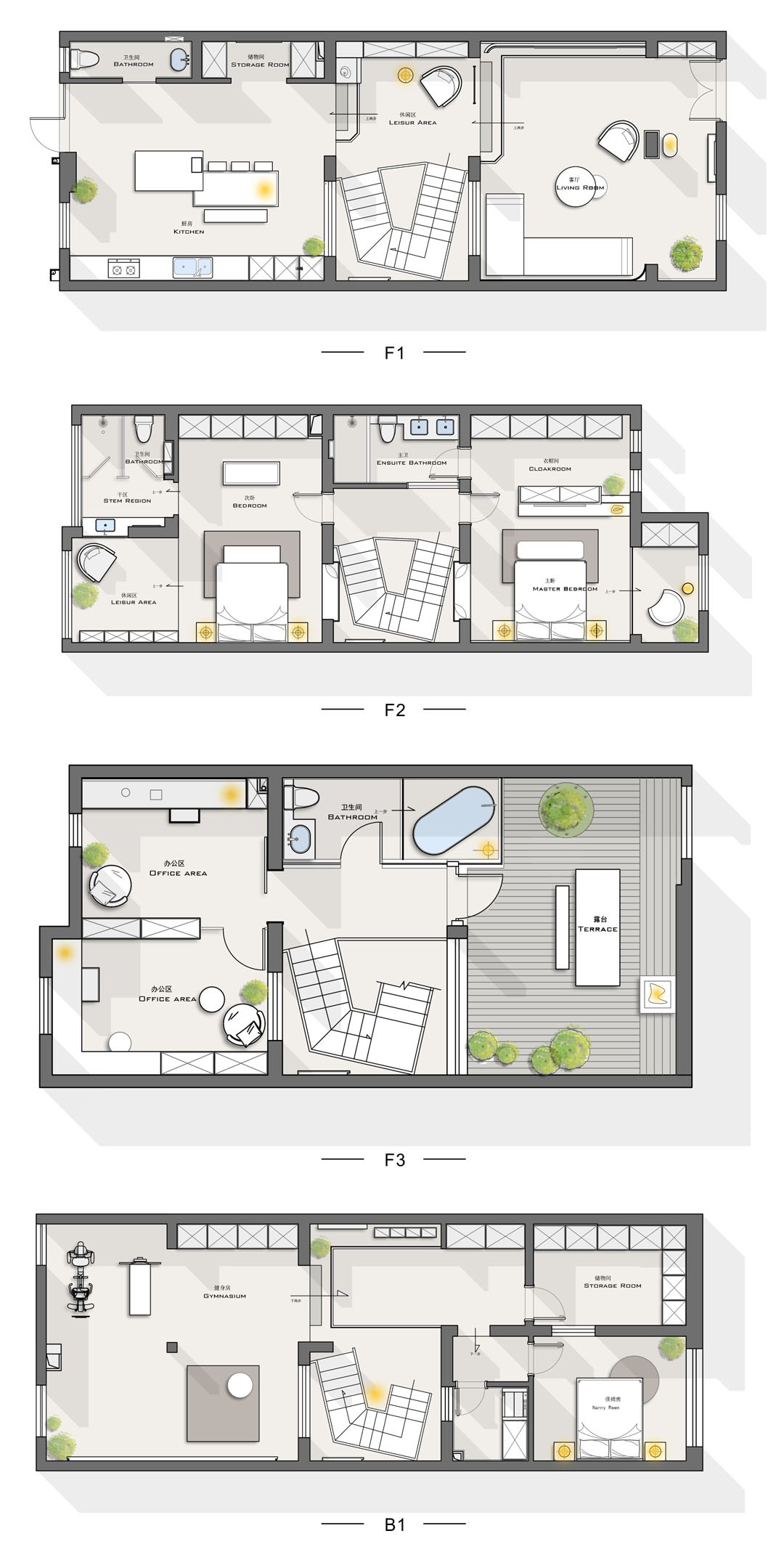
房子内部的原始结构却并不理想,内部结构bug较多,已经无法满足现代年轻人的居住要求。我们充分勘测房屋结构后总结出以下需要改善的问题: 1、一层地面存在近一米的高低差,活动极其不方便; 2、整个客餐厅公共空间被楼梯截断,空间感丧失; 3、采光仅通过客厅一面窗户和后院出口,导致别墅的中间段采光较差; 4、虽然别墅中央有个小天井,但是利用率低,光线也没有很好地被引导到客厅。 我们的改造思路:把楼梯的改造作为重点,确定了将天井的优化利用和楼梯做结合的改造思路。这样做的最大好处是,纵向上打通了露台至地下室的“光通道”,让阳光惠及到每一层,使得整座房子内部敞亮起来,处处可以享受到“日光浴”。 其次,针对一层的高低差问题,我们用两段楼梯来分散落差,缓解了视觉压迫感。第一段楼梯上来设计了一个缓冲的休闲平台,这里可以直接上二楼,或者再经过第二段楼体去餐厨区。 循序渐进的让楼梯在空间中消化掉,这种方式不仅让动线更流畅舒适,视觉上也更有延伸性,同时丰富了空间的层次感。 案例讲解 # CASE EXPLANATION # 01 # Entrance # 玄关内退至第一段楼梯上,这样的处理也是结合我们对整个客厅格局完全打开的思路。因原本进门的内门厅并没有太多功能性,而且占据了不小的空间,也阻挡了部分光线,于是我们将之取消并融入到大客厅空间。 The entrance is retreated to the first flight of stairs. This treatment is also combined with our idea of completely opening the entire living room layout. Because the original inner foyer did not have much functionality, and it took up a lot of space and blocked part of the light, we canceled it and integrated it into the large living room space. 02 # Living room # 开门的第一视野可以穿透客厅、楼梯、餐厨区,直至后院,整体空间感较改造前已是质的飞跃。灰砖、白墙,穿插局部深灰花纹的大理石,以及黑色金属的质感,一座现代风格大宅赫然眼前。 The first view of opening the door can penetrate the living room, stairs, dining and kitchen area, and even the backyard. The overall sense of space is a qualitative leap compared to before the renovation. Gray bricks, white walls, marble with partial dark gray patterns, and black metal textures make a modern mansion stand out in front of you. 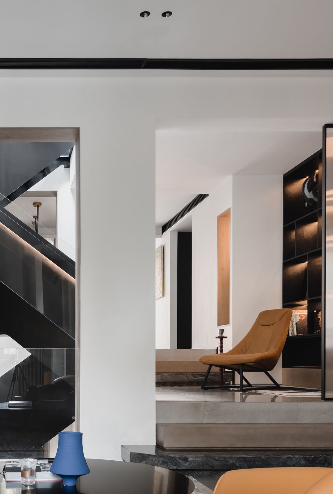
第一段楼梯分三个层级,大理石、原木、地砖三种不同材质叠级而上,第一层的大理石踏步和电视下的地台连为一体,为单调的楼梯赋予了结构上的穿插之美。 The first stair is divided into three levels. Three different materials of marble, logs and floor tiles are stacked on top of each other. The marble steps on the first floor are connected with the platform under the TV, which gives the monotonous stairs the beauty of interspersed structure. 楼梯上来是一块休闲平台,这里原本是楼梯所在的位置,改造后成为衔接客厅与餐厅的过渡区,也是两条动线的枢纽,因此我们给与这里足够宽敞的空间。并且为了提升利用率,特意为喜欢黑胶音乐的男主人营造了这处品酒听音乐的休闲区。当半躺在休闲椅上俯瞰客厅与家人互动时,更多了一种有趣的体验感。 Up the stairs is a leisure platform. This was originally the location of the stairs. After the renovation, it became a transition area connecting the living room and the dining room, and it is also the hub of the two moving lines. Therefore, we gave this place enough space. And in order to improve the utilization rate, this leisure area for wine tasting and music is specially created for the male owner who likes vinyl music. When half lying on the lounge chair overlooking the living room and interacting with the family, it adds a sense of fun experience. 客厅的承重柱也处理为木质的感觉,与电视背景墙相互呼应。 The load-bearing columns in the living room are also treated with a wooden feel, echoing with the TV background wall. 客厅沙发区的视角也是饶有趣味,可以直接穿过楼梯看到餐厅。原来闭塞的天井被完全打开,楼梯则被移位到天井内,像一条黑色的巨龙至下而上盘旋而上。 The viewing angle of the sofa area in the living room is also interesting, and you can see the dining room directly through the stairs. The originally closed patio was completely opened, and the stairs were moved into the patio, like a black dragon circling up and down. 03 # Dining room # 第二段楼梯上来即是通透宽敞的餐厅。这里重点要处理的是这根粗壮的承重柱,我们将立柱与餐桌岛台做了结合。同一角度的前后对比,无论是采光还是空间感都得到很大提升。 The second flight of stairs leads to the spacious dining room. The key thing to deal with here is this sturdy load-bearing column, which we combined with the dining table island. The contrast between the front and the back at the same angle has greatly improved both the lighting and the sense of space. 岛台和餐桌采用错拼的方式,让餐桌的宽度放至最大。 The island and dining table are staggered to maximize the width of the dining table. 04 # Kitchen # 餐厨一体化的设计逐渐被现代人接受并喜爱,本案里整面的中西橱柜为黑色金属哑光材质,非常有质感。搭配一款艺术感极强的高档人造石台面,极具视觉冲击力。 The integrated design of dining and kitchen is gradually accepted and loved by modern people. The entire Chinese and Western cabinets in this case are made of black metal matte, which is very textured. With a high-end artificial stone countertop with a strong artistic sense, it has a great visual impact. 05 # Stairway # 楼梯是整套别墅里的核心与灵魂,更是颜值担当。我们将楼梯调整至天井中的最大好处是彻底释放出原本截断南北区域的楼梯井空间,实现了整个一层空间的贯通。楼梯为黑色钢架主体,透明玻璃踏板的设计。顶部的阳光可以穿过透明踏板一泻而下,直接打到地下室,别墅的纵向空间就被盘活了,无论采光还是通风都得到质级的提升。 Stairs are the core and soul of the whole villa, and they are also responsible for their appearance. The biggest advantage of adjusting the stairs to the patio is to completely release the stairwell space that originally cut off the north-south area and realize the connection of the entire first-floor space. The staircase is a black steel frame with transparent glass treads. The sunlight at the top can pour down through the transparent pedals and hit the basement directly. The longitudinal space of the villa is revitalized, and both lighting and ventilation have been improved in quality. 和楼梯相接的走廊也受益于天井的改造,随时可以接受到阳光顶洒下的自然光。 The corridor connected to the stairs also benefits from the transformation of the patio, which can receive natural light from the sun roof at any time. 06 # Bedroom # 二层规划了两间套房,分别为主卧和次卧。原本暗仄的走廊,经过改造后变得宽阔而明亮,阳光可以直接洒在走廊地板上。走廊和主卫共用的这面墙,原本有扇小窗,我们改为整块落地的艺术玻璃,将自然光充分引入主卫内。 Two suites are planned on the second floor, the master bedroom and the second bedroom. The originally dark corridor has been transformed into wide and bright, and the sunlight can directly shine on the corridor floor. The wall shared by the corridor and the main bathroom originally had a small window. We changed it to a whole piece of floor-to-ceiling art glass to fully introduce natural light into the main bathroom. 二层零碎的空间被重新整合后,主次卧被划分得非常方正且宽敞。主卧电视背景墙后形成一条长过道,利用过道规划为主人的衣帽间,并且朝南的窗户将衣帽间完全照亮。 After the fragmented space on the second floor was reintegrated, the master and second bedrooms were divided into very square and spacious. A long aisle is formed behind the TV background wall in the master bedroom. The aisle is used to plan the master's cloakroom, and the south-facing window completely illuminates the cloakroom. 内阳台整体抬高一步做了地台,成为一处可以发呆、看书的休闲区。 The inner balcony is raised as a whole to make a platform, which becomes a leisure area where you can sit in a daze and read books. 原本天井里的小窗改造后全部放大,空间和空间的关系更为开放、通透,同时也营造出多样的光影变化。 The small windows in the original patio were all enlarged after renovation, and the relationship between space and space was more open and transparent, and at the same time, various light and shadow changes were created. 我们重新调整了次卧空间的布局和功能块,释放出原本被切割浪费的空间,化零为整的感觉真是一种精神上无比愉悦的享受。 We re-adjusted the layout and functional blocks of the second bedroom space to release the wasted space that was cut and wasted. 可移动的支架电视更为灵活,作为未来的儿童房,这个电视将会被放置到其他空间。 The movable stand TV is more flexible. As a future children's room, this TV will be placed in other spaces. 07 # Basement # 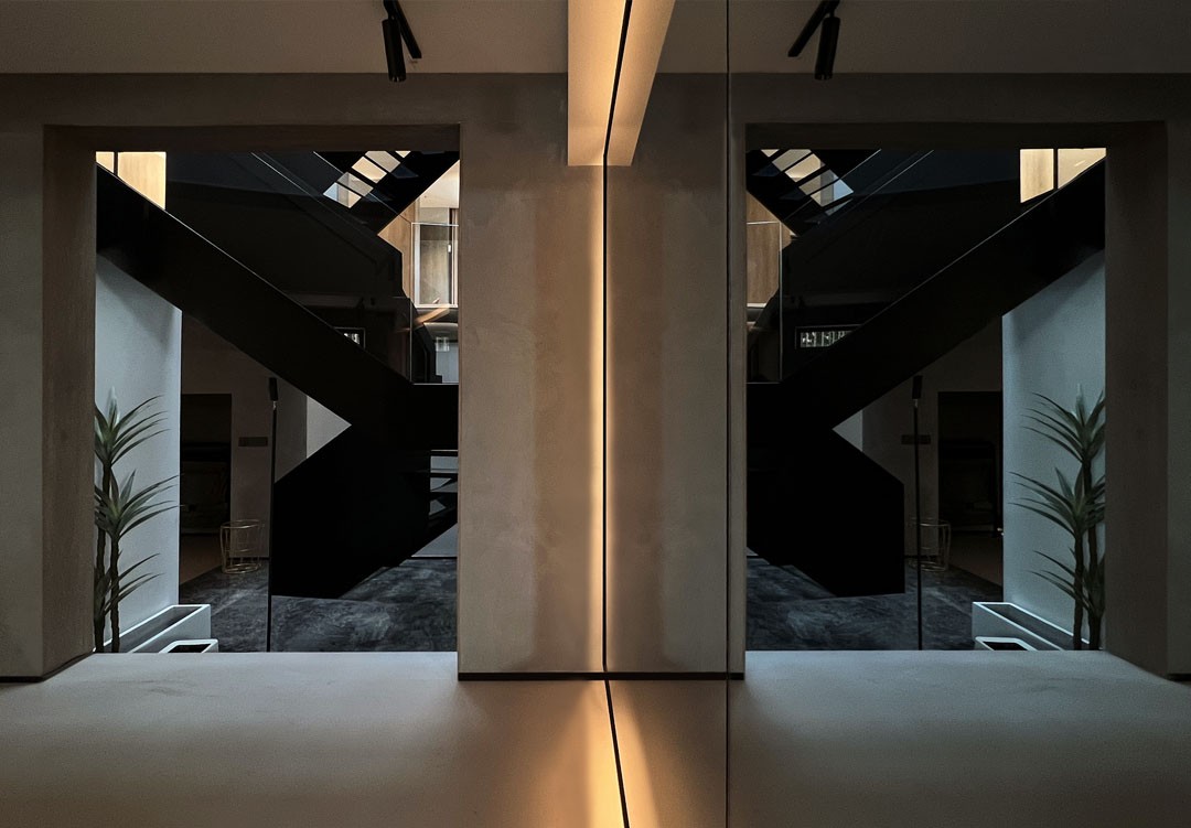
拆除多余墙体,直接打通一层的天井,让原本封闭的地下室和楼上有了空间上的联通,除了光线可以直接照射下来,整体空间也被放大很多。 Remove the redundant walls and directly open the patio on the first floor, so that the originally closed basement and upstairs are connected spatially. In addition to the direct illumination of the light, the overall space is also greatly enlarged. 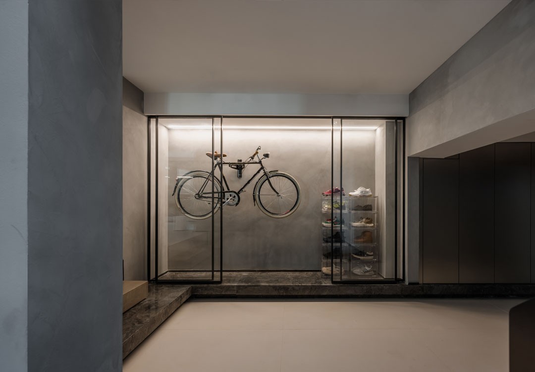
楼梯下来就是一面玻璃橱窗,可以展示男主人的藏品。 Down the stairs is a glass window, which can display the collection of the male owner. 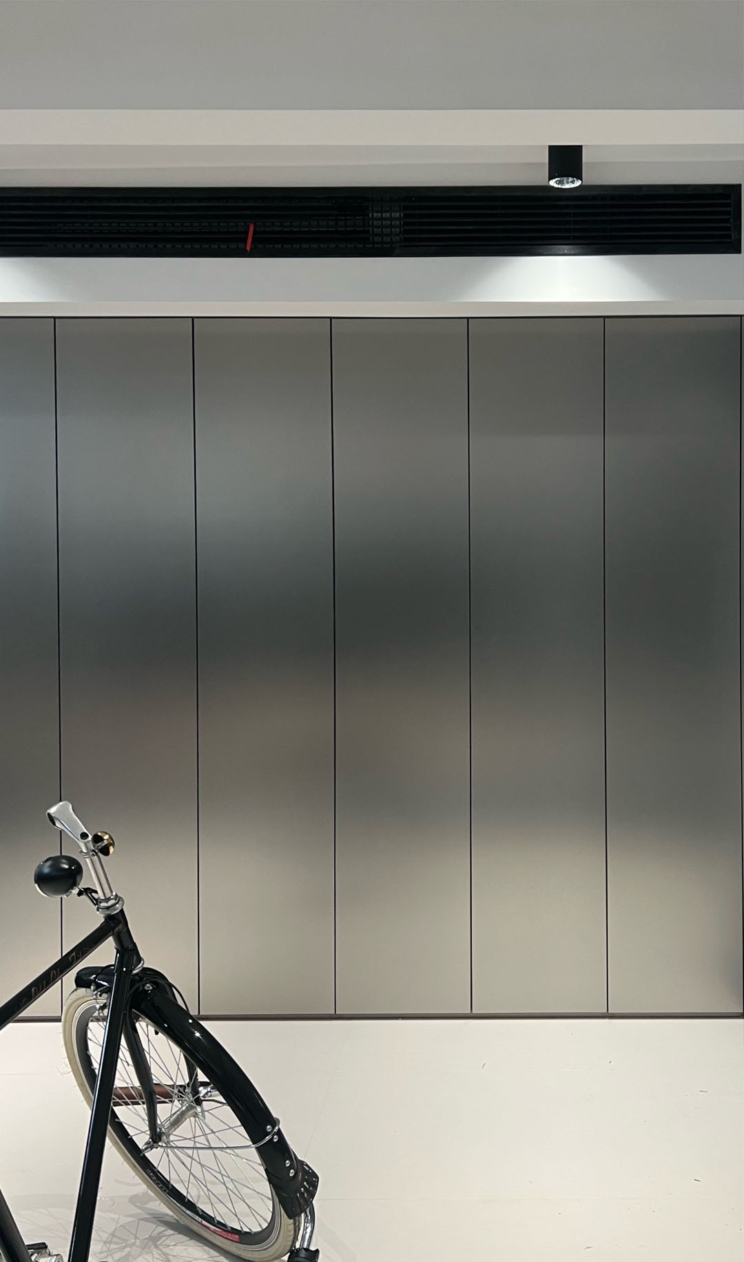
收纳柜的门板为金属哑光材质,充满高级而炫酷的光泽,给地下室带来了一种工业科技感。 The door panel of the storage cabinet is made of metal matte material, which is full of high-grade and cool luster, bringing a sense of industrial technology to the basement. 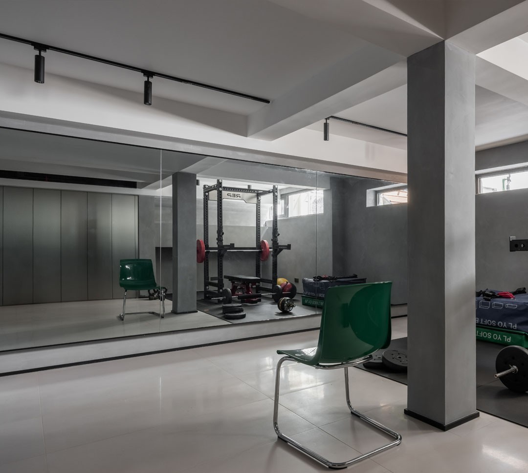
男主人的健身房也比改造前更敞亮,整墙的镜面也起到了放大空间的作用,同时也拓展了作为舞蹈练功房的功能性。 The male owner's gym is also more spacious and brighter than before the renovation, and the mirror surface on the whole wall also plays a role in enlarging the space, and also expands the functionality as a dance practice room. 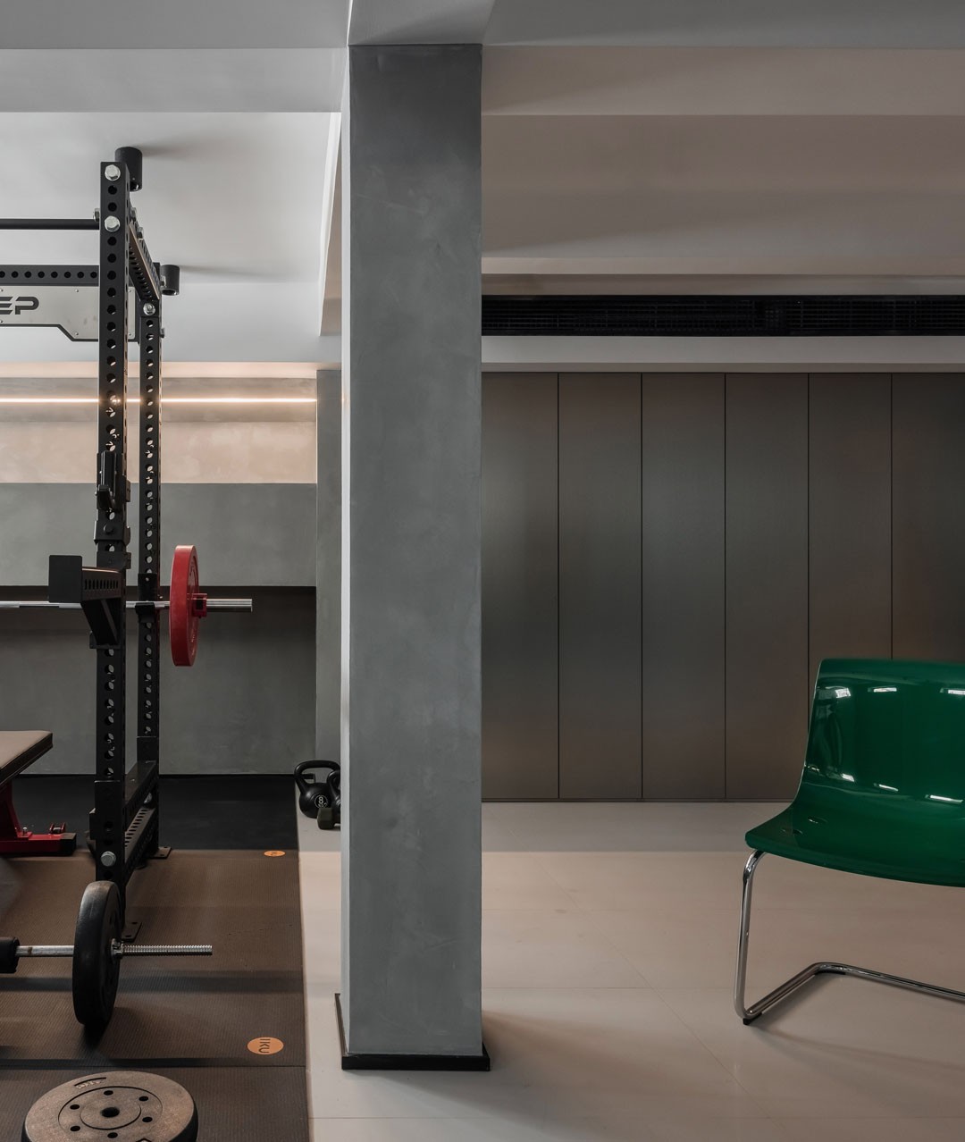
08 # Study # 男女主人的工作室安排在三层,既可以随时互动,也可互不干扰。 The studios of the hostess and the hostess are arranged on the third floor, which can interact at any time without interfering with each other. 男主人的工作室彰显了其不凡的艺术品位,简洁的现代风格直线条与中古风格的家具,相得益彰。浓烈跳跃的橄榄绿色的背景墙更是充满时尚感。 The master's studio showcases his extraordinary artistic taste, with clean, modern straight lines and period-style furniture complementing each other. The strong jumping olive green background wall is full of fashion sense. 09 # Toilet # 为了完成屋主躺在浴缸里看星空的愿望,我们在三楼专门设计了一间和露台相接的泡澡间,可以沐浴阳光,仰望星空,和露台共享自然……情调和氛围就一下拉满了。 In order to fulfill the owner's wish to lie in the bathtub and watch the stars, we specially designed a bathing room on the third floor connected to the terrace, where you can bathe in the sun, look up at the stars, and share the nature with the terrace... The mood and atmosphere can be pulled full. 男主人将自己收藏的一面明清时期的屏风放置在了浴缸旁边,是不是有种古今交融的既视感?。 The male owner placed a screen from the Ming and Qing Dynasties in his collection next to the bathtub. Is there a sense of sight that blends ancient and modern? 这是次卧的卫生间,拱形的门洞是不是有一种穿越时空通道的感觉? This is the bathroom of the second bedroom. Does the arched doorway feel like a passage through time and space? 10 # Terrace # 当华灯初上,穹顶之下的这方露台,可以尽情享受自然的馈赠,微醺的灯光和星空交织成一幅绝美的艺术画,在高楼林立中更显得珍贵。 When the lights are on, the terrace under the dome can fully enjoy the gifts of nature. The slightly drunken lights and the starry sky interweave into a beautiful art painting, which is even more precious in the high-rise buildings. ---end--- |
精华推荐
换一换

 收藏
收藏  说两句
说两句 


发表评论0