|
空间公理:空间无界永在 空时关系是“永在” 指空间永现于当前时刻,而经典的空间是脱离不了人。 而每个空间都会与人发生关系,从而使空间变得有情感,有温度 成为有故事的空间,而设计者只是故事开始的铺垫。 设计者需要把建筑和空间的关系先处理好,将空间变得更有意思,更具有特殊性,更有记忆性。 Space principle: It is always boundless. The space and time are infinitive, the space lives only in the current time. A classic space will never exist without the presence of a human being. The interaction between space and human being always enlivens and warms up the space, making it a full-of-story space, while the designer is just out there to get the story ready to tell. The designer needs to take a prior consideration on the relationship between construction and space to make the space more interesting and memorable and with more speciality. 这是个极小的迷你空间,室内面积只有35平方的商业体。 一个简单的BOX,在立面不断剥离,不断反思,不断延伸, 用建筑构成,用光影让她在空间里诉说纯净,通透,细腻的情感。 In this case, the store takes an area of only 35 square meters. In this simple box-liked structure, we have to keep thinking, discarding and extending, so as to let the light express its pure, smooth and exquisite feelings. 
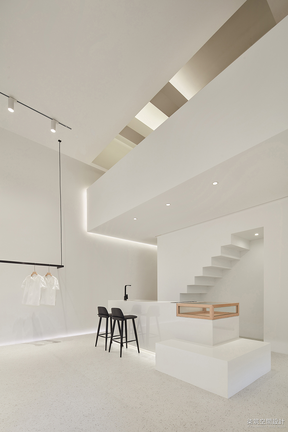
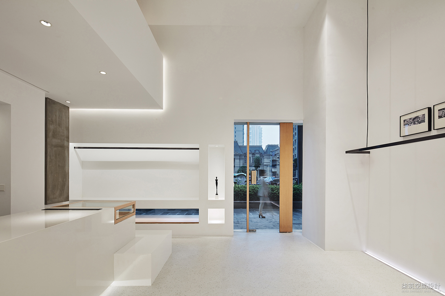
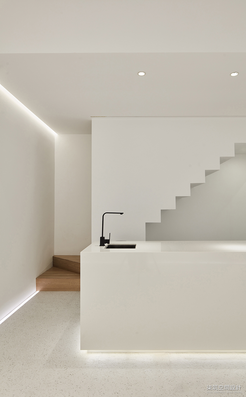
在这个小空间里大面积使用白色,将白色用到了极致,白色是极具包容性的颜色, 白色也是代表所有,小空间里使用白色似乎很有优越性。 白色方盒子中用光线诉说角和距离如何取向量或建立空间的平行垂直的关系, 层次透视的关系,线面角及面面线的关系起到一个抛砖引玉的作用。 White is such a permissive color that we make the best of white by using it massively in this room. Using white in a tight room seems like very superior because white itself would represent everything. Light is appropriately used to make the beam of light play a specific guiding role in dealing with the aerial perspective relationship of vertical and horizontal space. 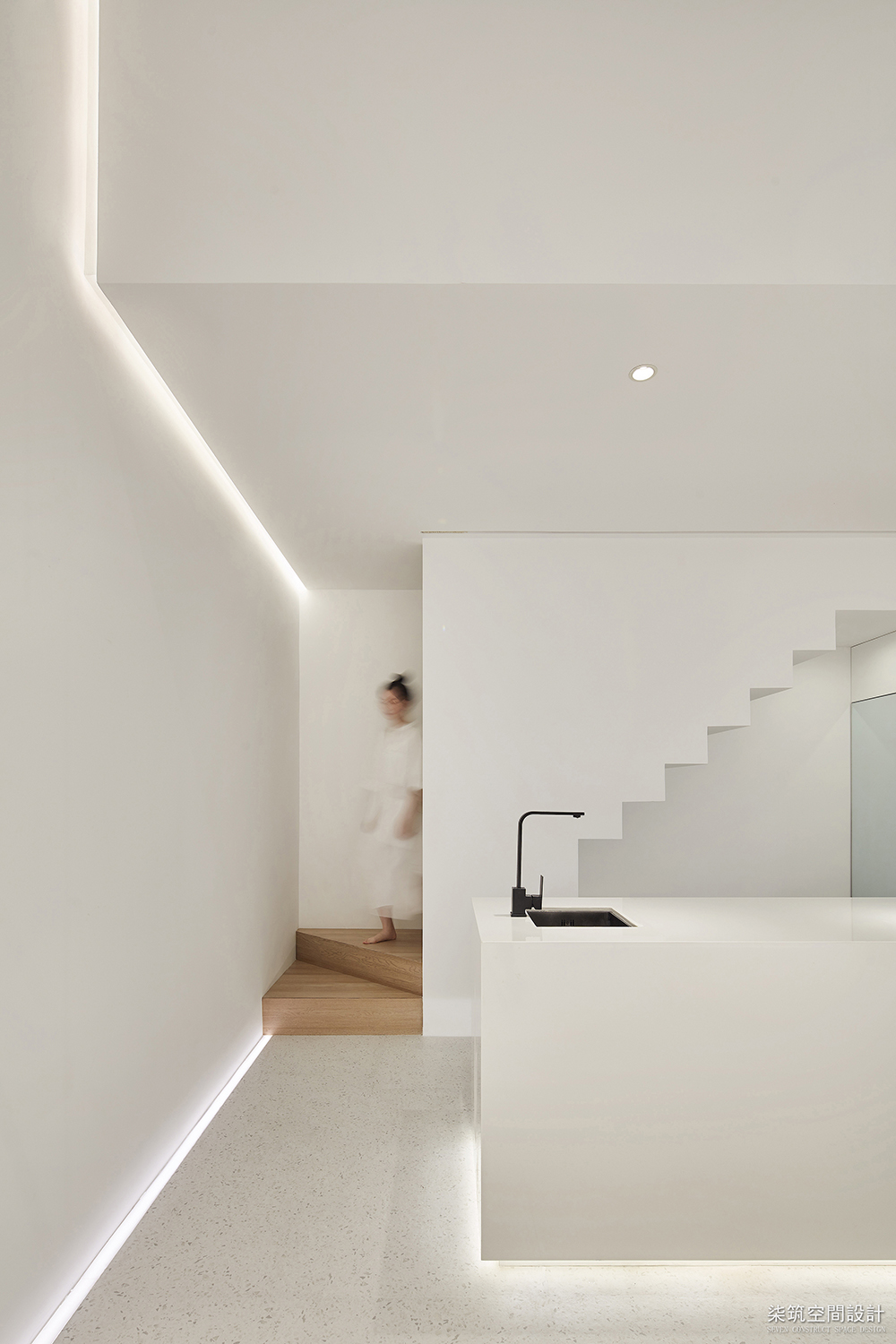
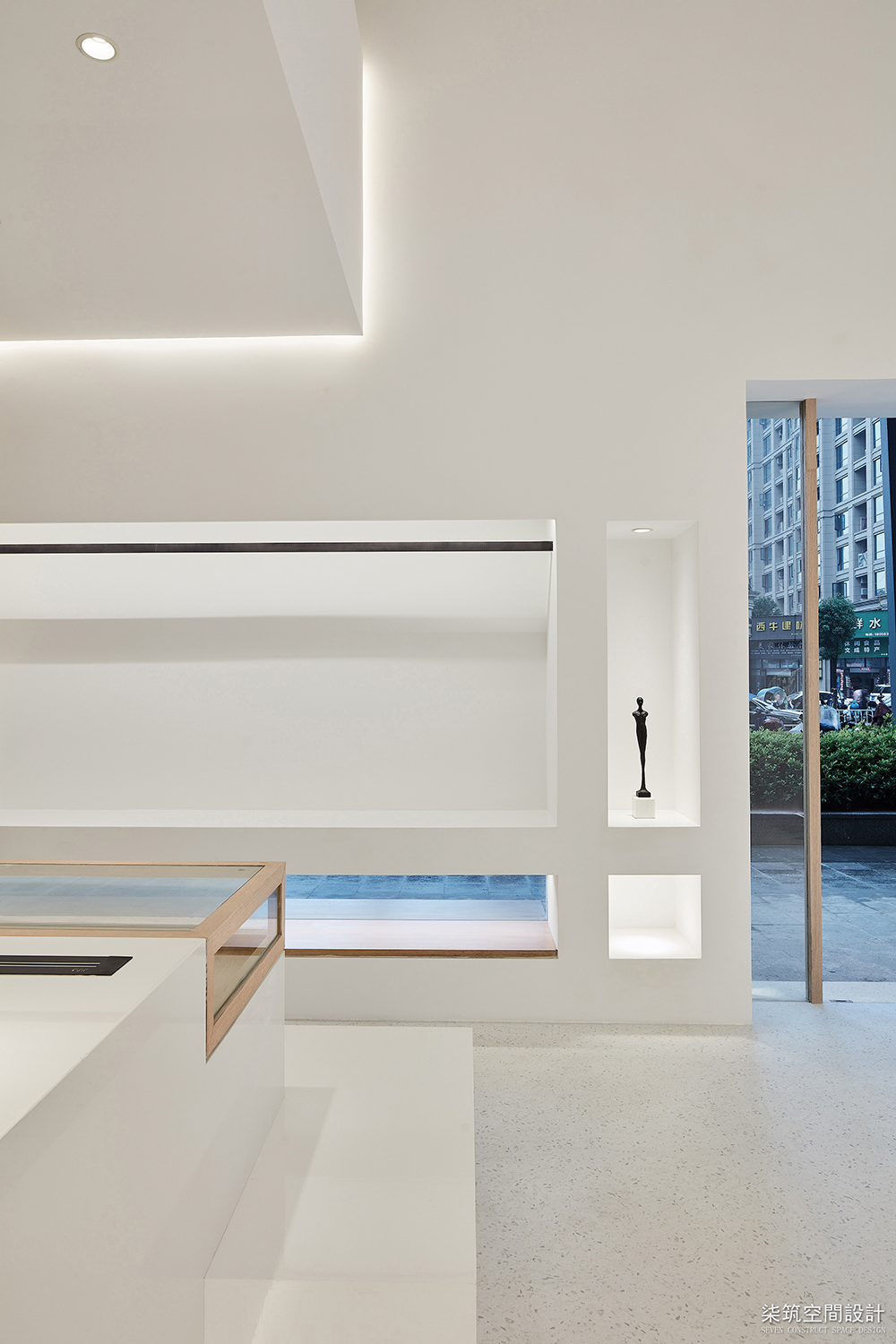
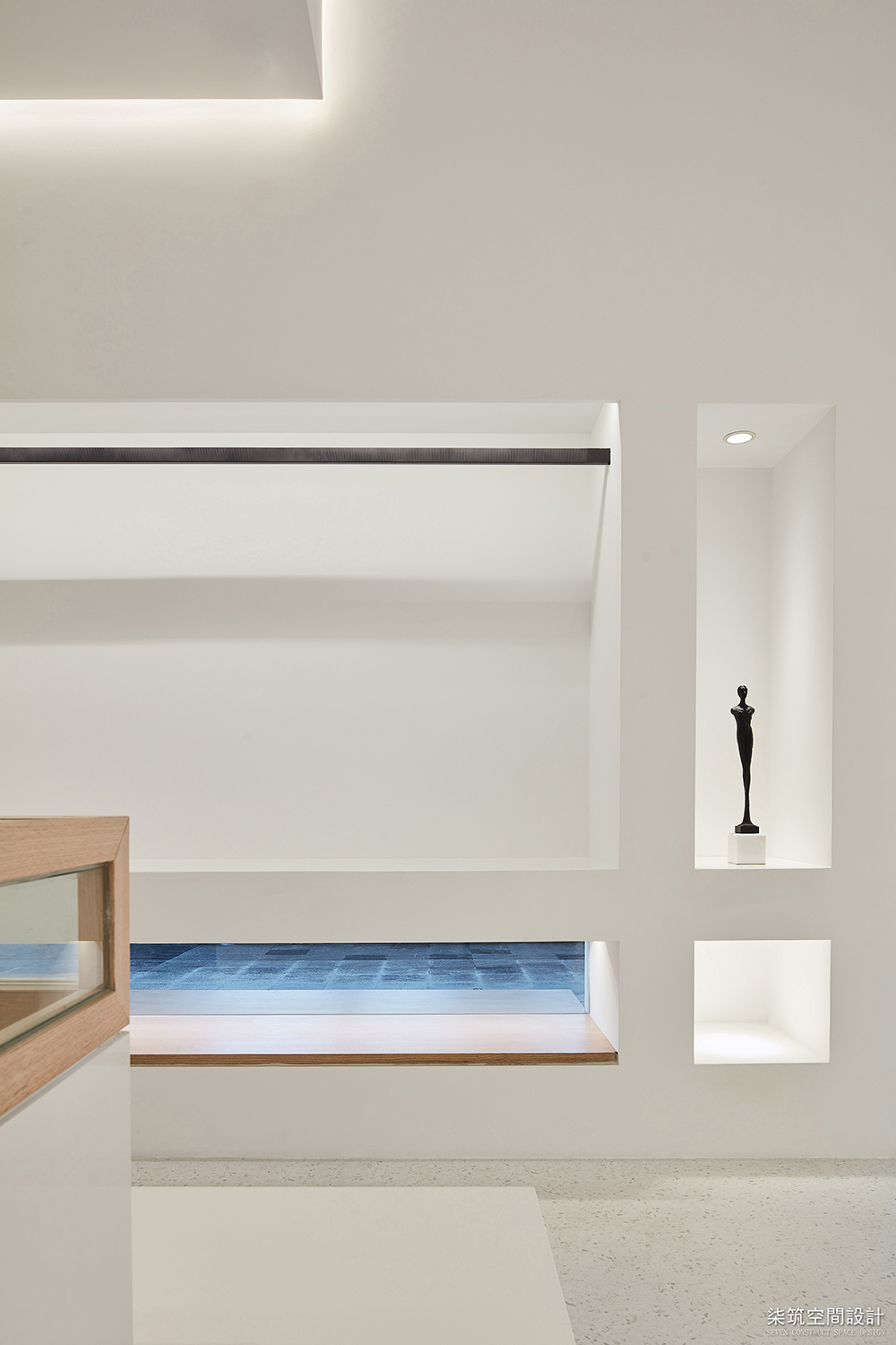
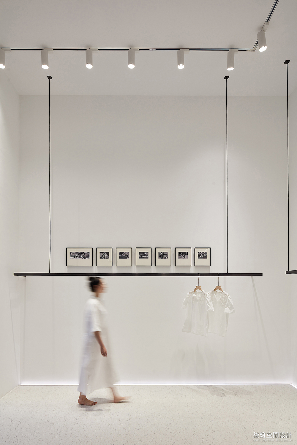
小空间里再建小空间,阁楼的搭建是让小空间可以延伸,展开,并且梳理空间的层次感, 还可以让小空间得到更充分的利用,充分满足使用性。 We built a mini loft in this room, because we believe another mini space in a small room will extend the room itself and make it well-organized. Furthermore, the room will also be fully used in functional purpose. 地面铺装的是白底的水磨石,让干净的空间更有细腻的画面感, 柔和的灯光下,地面的石材变的柔软温和。 The floor is covered with white-colored terrazzo, which makes this clean room even more elegant. The stone would feels like warm and softened under the gentle light. 灯带在挑空阁楼两侧,将空间的载体的量变到了质变,将建筑形式转载到室内的体验,橡木楼梯踏板结合地脚灯,使得狭窄的楼梯通道有巧妙延伸感。 The light strips in both sides of the loft make a big difference in this room, they help build a connection between people and construction. The footlights together with the oak stairs are another ingenious designs to make the narrow stair path outstretched. 深入人心的极致白,这种纯粹感犹如烙印刻在脑海。 The white is so simple and impressive that it is sure to be remembered. 店铺门面也很小,大面积的白在底部做水平长条横窗,不再是传统的橱窗形式,引起行人的好奇心。门头的两侧做了侧切小块面,让大面积细节有立体感。 The front door is small, and the traditional display window is replaced by a horizontally long window with much white at the bottom to attract the passerby. 每个空间的开启是人, 每个空间的成长也是人, 愿她可以长成我们喜欢的模样。 It is the human being that opens the space. It is still the human being that grows up together with the space. We wish it will be turned into what we like it to be like. 项目信息: 项目名称:白色盒子 项目地址:中国 浙江 温州 项目业主:THE OPEN服装店 项目范围:全案设计 设计公司:中國柒筑空間設計有限公司 设计主案:黄齐正、黄小影 设计时间:2019年4月5日 - 2019年4月25日 施工时间:2019年5月1日 - 2019年5月25日 项目面积:35平方米 风格定位:现代极简 主要用材:水磨石、橡木地板、人造石、金属 实景摄影:李迪 遇见 柒筑期待与你的相遇 ! Where story starts. Seven Space expects to be the one writes story for you. 我们坚持梦想 保持初衷 做有思想,有价值,有温度的设计 愿我们都不会被环境改变,坚持做好自己 We keep pursuing our dreams and never change our mind ever. Design means perspective, worthy and warm for us. We hope we could always be the best of ourselves and nothing would change it. |
精华推荐
换一换
-
四叶草. 2019-8-5 11:37:11
 回复举报
回复举报
 收藏
收藏  说两句
说两句 





发表评论8