|
U·Style Location: Fujianfuzhou, China | 福建福州 ChiefDesigner: Jiangjifang | 江继芳 Installation anddisplay:Jiangjifang | 江继芳 Photography: MOJOSTUDIO | 形在建筑空间摄影-贺川 Area: 60㎡ Year: 2019 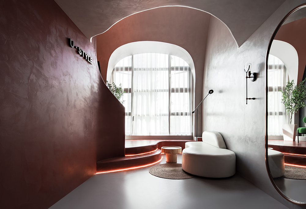
平面概念Plane concept 运用半挑空的空间平面布局,让原本不大的空间显得通透。楼梯踏步利用线与面的交错,给空间带来趣味性。连结了飘窗,隐藏了空调机位,同时让地面与二楼柔美的连结在了一起。 The use of semi-empty space plane layout, so that the original small space appears transparent. Stair step makes use of the crisscross of line and Surface, bring interest to the space. Linked to the BAY window, hidden air-conditioning units, while the ground and the second floor of the soft link together. 来自中国福建福州的一名从业10多年的高级美发师,想要为自己打造一个富有生命力,感染力,创造力的工作室。就像他的创造工作一样。U·Style是业主给这个工作室所命名的。 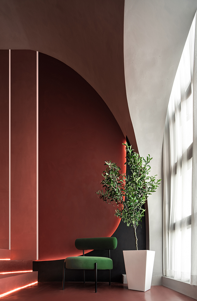
A senior hairdresser from Fuzhou, Fujian Province,China, who has been working as a hairdresser for more than 10 years, wants tocreate a studio full of vitality, infectivity and creativity. Like his creativework. U Style is the name given to the studio by the owner. 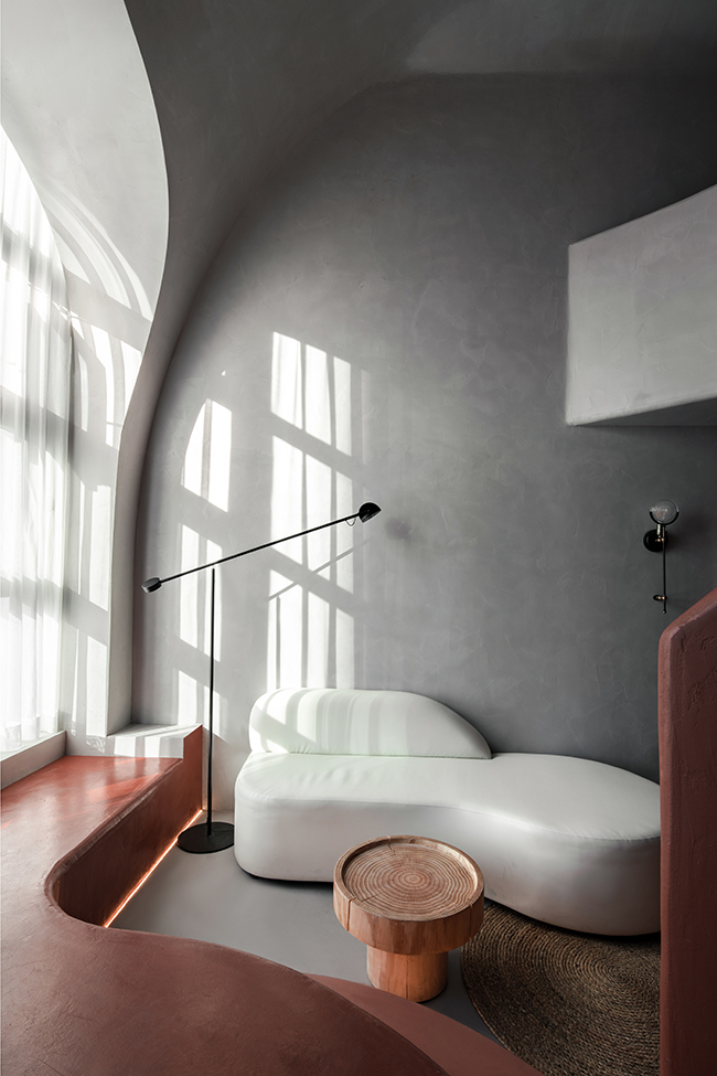
在尘嚣里待久了,对于大自然总是充满无限的向往。在快节奏的喧嚣都市中,人们更渴望在都市中看见大自然的影子,一种突破带来新的能量,刺激大脑,超越孤独和缓解城市水泥森林带来的疲惫。 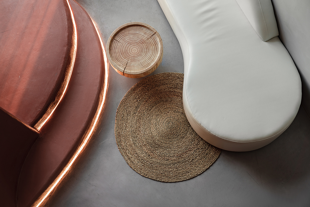
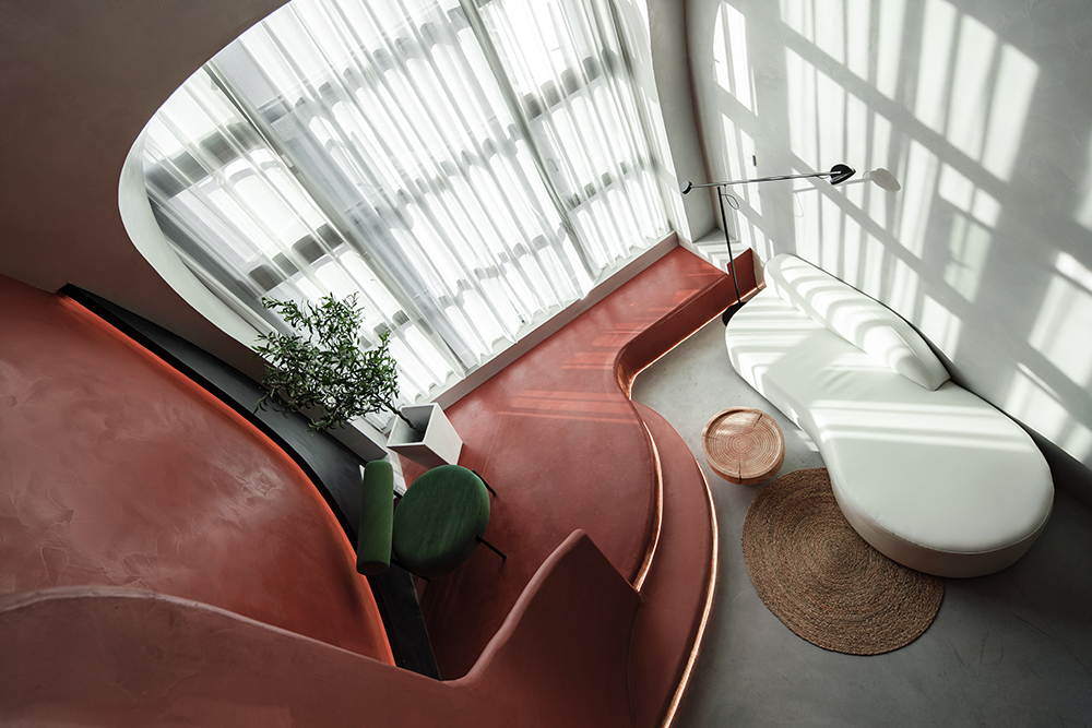
After a long time in the hustle and bustle, there isalways an endless yearning for nature. In the fast-paced Hustle and bustle ofthe city, people are more eager to see the shadow of nature in the city, abreakthrough to bring new energy, stimulate the brain, beyond the lonelinessand ease the fatigue of urban concrete forest. 一个60平方狭小的空间,坐落于写字楼的15层。设计师利用结构与空间进行对话,让线条在空间中运动。借由线条找到空间的起点,如洞穴路径,曲线移动形成面,面面相叠成体,产生为人所感知的流动性,仿佛进入山谷一般,趣味横生。 A60 square foot cramped space on the 15th floor of an office building. Thedesigner uses the structure to communicate with the space, allowing the linesto move through the space. Find the starting point of the space by the lines,such as the Cave Path, the curve moves to form the surface, the surfaceoverlapping, creating the perceived mobility, as if into the valley, thegeneral, fun. 办公区空间 Office Space 入口设置窄小的空间,越入深处,仿佛通过洞穴看到了开阔山谷的大型瀑布,豁然开朗。让空间的形象在人的视觉及心理上,具有一种奇特的想象力和生命力。把对空间所期待的抽象化的情感,转化成能够感知的空间。以曲线造型的感性与流动描绘大自然的样子。 Theentrance is set in a narrow space, and as you go deeper into the cave you cansee a large waterfall in the open valley. So that the image of space in thehuman visual and psychological, with a strange imagination and vitality. Theabstract emotion of space expectation is transformed into the space that can beperceived. To curve the shape of the emotional and fluid description of nature. 陈列与色彩Display and color 设计师在色彩上的运用极为大胆,正红色是这个项目中极为吸引眼球的地方。在踏步上利用同一色系的深浅进行交错搭配,分而不隔离的围合给人一种被拥抱的感受,创造一种富有生命力,感染力,创造力的办公环境。为了消除红色的视觉疲劳,灰色的大面积运用很好的缓解了这点。同时在装置上,运用绿色大胆的与红色背景进行撞色。白色与灰色背景进行融合。如具生命力的宇宙陨石一般,充满活力,令人赏心悦目。 Thedesigner's use of color is extremely bold, red is the most eye-catching part ofthe project. The use of the same color on the steps of the depth of staggeredcollocation, not isolated from the surrounding gives a feeling of being embraced,creating a vibrant, contagious, creative office environment. In order toeliminate the visual fatigue of red, the use of large areas of gray is a goodmitigation of this. At the same time in the device, the use of green and boldred background for the collision. Blend the white with the gray background.Like a living cosmic meteorite, it is full of vitality and pleasing to the eye. 空间与结构形成了对话,色彩与装置脱颖而出。当阳光赤裸裸的将落地窗倒影在墙上。形,色,影浑然天成,这一幕便是喧嚣城市中的人们想要看到的样子。 Space andstructure form a dialogue, color and device stand out. When the sun's rays arereflected naked on the wall. SHAPE, color and shadow are natural, this scene iswhat people want to see in the noisy city. 设计师:江继芳 |
精华推荐
换一换
-
刘丽雪 2020-8-12 17:05:59
BinRu 发表于 2020-6-29 14:24
整体还是很不错的,但是你的楼梯感觉有点问题,第二第三步是同一边的,走起来肯定不方便
哈哈,竟然和我的关注点一样
-
ADMONO 2020-5-9 16:15:30
418212430 发表于 2020-4-26 17:04
这个楼梯不符合人体工程学。细细想一下吧。
可以认真看下平面图,中轴线下来,尺寸跟正常楼梯是一样的,只是边角形成异形差异,而且它不同角度能拍出各种样子。关注我抖音,有视频你就会发现完全不会
-
weiyangga 2020-5-4 14:08:45
418212430 发表于 2020-4-26 17:04
这个楼梯不符合人体工程学。细细想一下吧。
这个已经不是人体工程学的问题,不是舒适不舒适的问题,是上下可能会跌倒的问题。

 收藏
收藏  说两句
说两句 

 我主要看楼梯的~~~又意外的发现人也好








我是来看设计师的