|
项目地址:CHINA·SHANGHAI·璇宇花园 项目用途:私人住宅 项目面积:135m2 方案设计:言叙设计机构 项目施工:言叙配套施工 项目摄影:逆风笑 《原·境》 信息时代,你看过太多设计美图 仿佛美图即是好设计的全部,究其根本,鲜有人知 我们深谙此道,原创一套套作品,并沉浸其中 同时提供一整套的实施、落地方案 In the information age, you have seen too many design pictures It seems that beautiful pictures are all about good design. We know this, we create original sets of works and immerse ourselves in them. Provide a complete set of implementation and landing plans ——————————————————————————————— 
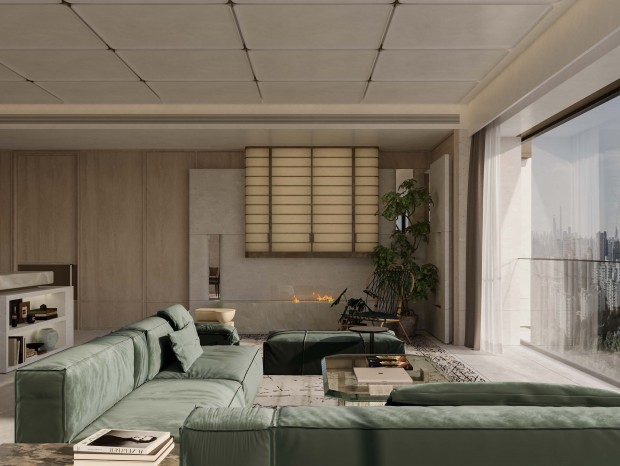
留白的剪裁结构配上质朴的自然元素,再加上光学艺术的点缀,何尝不是一种断舍离呢? The blank cut structure is complemented by rustic natural elements, plus the embellishment of optical art. 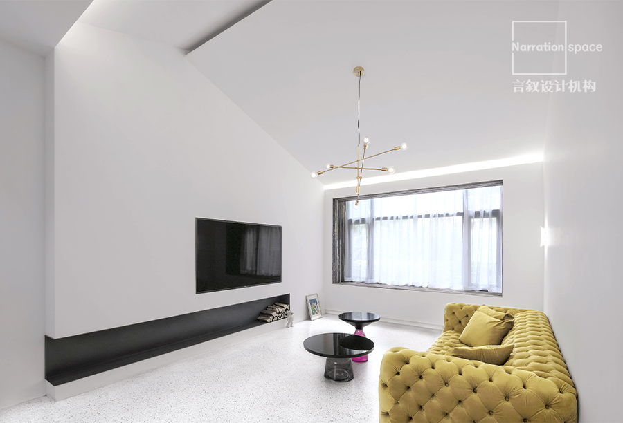
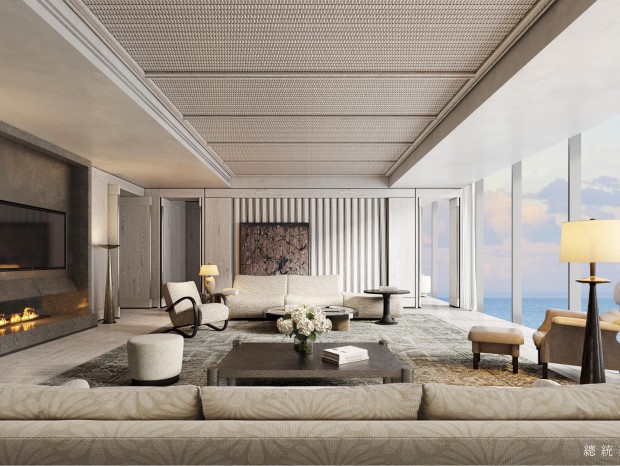
室内设计常规的平面化经常导致各种可能性的锐减就,所以我们打破二维限制,转入三维思考,斜面顶就是思考后的产物。 The conventional planarization of interior design often leads to a sharp reduction in various possibilities, so we break the two-dimensional limitation and turn to three-dimensional thinking. The bevel top is the product of thinking. 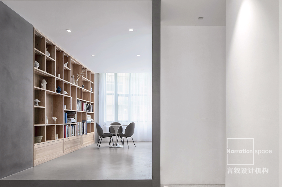

顶天立地的木作书柜和水泥立柱相得益彰。 The wooden bookcase and the cement column stand up perfectly. 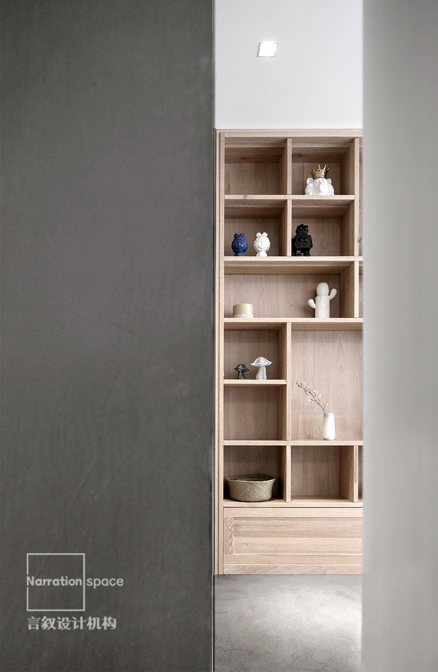
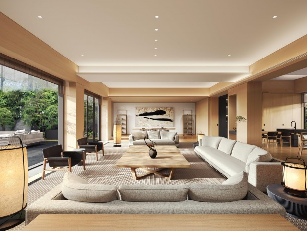
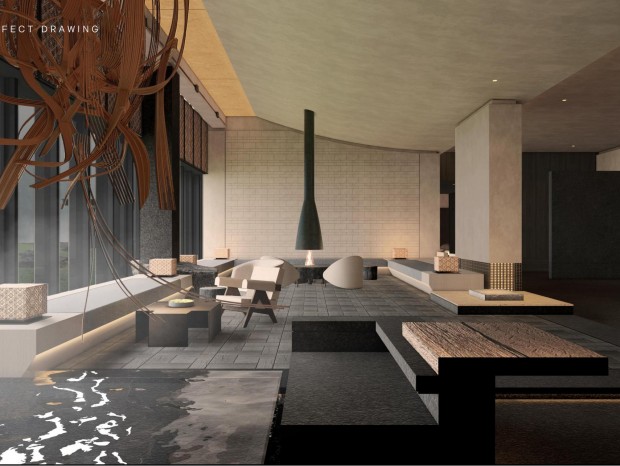
没有华奢的装饰与矫情的设计,注重自然质感,将和风与匠人精神表露无疑。 There is no lavish decoration and flamboyant design, focusing on natural texture, and no doubt revealing the Japanese style and craftsman spirit. 椅子的配色融合木色和水泥灰色,呼应侘寂美感。 The color of the chair blends wood and cement gray, echoing the quiet beauty. 水泥底座支撑起水磨石吧台,吊灯和大理石洗手台后的暖调灯带来自然温暖的视觉碰触。 The concrete base supports the terrazzo bar, and the warm lights behind the chandeliers and marble sinks bring a natural and warm visual touch. 水泥隔断和旁边的白墙形成视觉呼应,肌理与形体形成强烈的美感与力量感。 The concrete partition and the white wall next to it form a visual echo, and the texture and shape form a strong sense of beauty and power. 过道木块设计在黄金分割的空间位置中,让整个空间结构更有错落感。木头强调本质,水泥强调粗糙,极致且纯粹。 The aisle wooden block is designed in the golden section space position, which makes the whole space structure more fragile. Wood emphasizes essence, cement emphasizes rough, extreme and pure. |
精华推荐
换一换
-
lin--min--he 2020-7-29 16:59:40
淡漠未了 发表于 2020-6-14 14:40
水泥地面和水磨石地面是咋处理的,踢脚线也没有,咋顷缝的
地面水泥找平做光滑面,墙面水泥粉刷做清漆
 收藏
收藏  说两句
说两句 







3666666