|
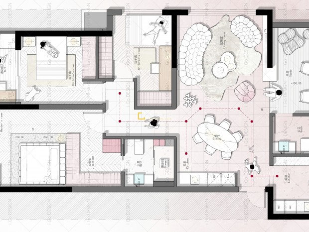
本帖最后由 DNA邸内设计 于 2021-5-15 13:42 编辑 该项目是位于杭州市的150平米公寓,方案中最大的改动是将北面采光较差的两间客房墙体拆除,融合过道空间后形成宽敞方正的空间体量,同时通光量也大幅提升,我们将之与客厅位置的进行转换,很大程度上改变了原有空间关系和生活动线。此外,通过主次卧的转换为空间增设了独立的储物间,北阳台内包设置中西厨分区,公卫干湿分区等一系列措施将改善型住宅的配置进一步提升。 This project is a 150m2 apartment located in Hangzhou. The biggest change in this project is to demolish the wall of the two bedrooms with poor lighting in the north. After the integration of the corridor space, a spacious square space volume is formed, at the same time, the amount of light is also greatly increased. We converted it into the living room, which greatly changed the original spatial relationship and the living line. In addition, by transforming the master room into a guest room, this design method adds a separate storage space to the living room. Inner package north balcony designed Chinese and western hutch zoning; a series of measures such as the dry wet zoning of toilet will improve the configuration of residential further promotion. 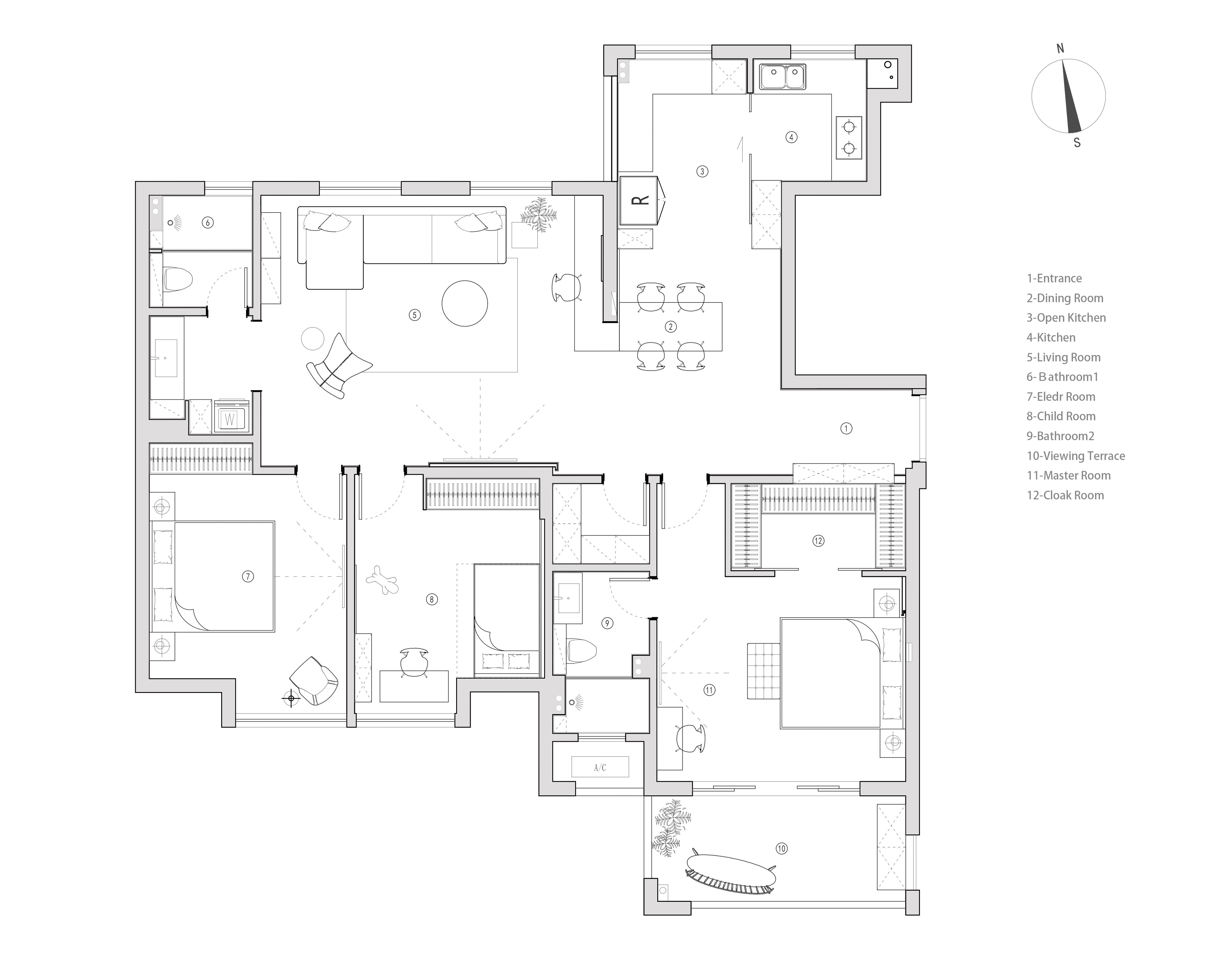
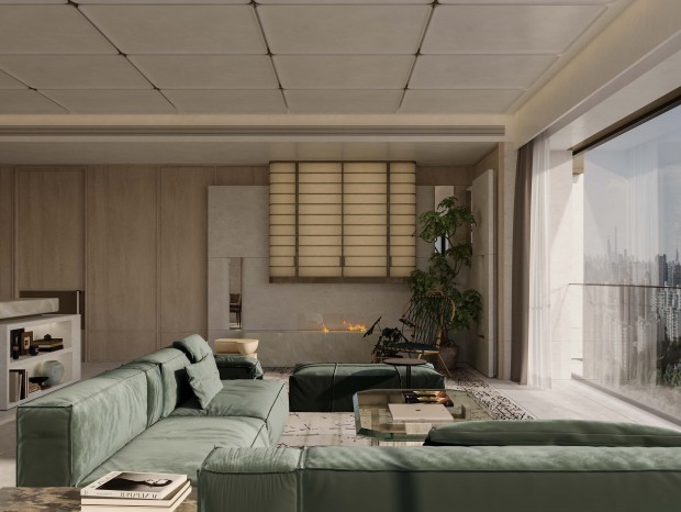
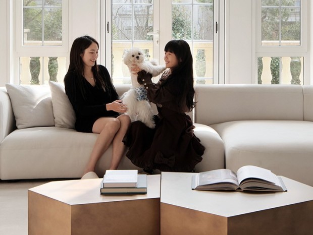
空间为表达简洁明快的视觉,材质的使用上追求连贯而分明。墙面温润的石材纹理,顶面天然的胡桃木纹,划分了空间主要的两个块面。 The space expresses concise and lively vision and the use of materials pursues coherence and clarity. The warm stone texture of the wall and the natural walnut grain on the top surface divide the two main areas of the space. 材质丰富的对立面,与之相反,是大面积的留白,为视线停留做缓和,也增强了空间对比度突出主次分明。 The opposite of the rich material is a large area of white space, which eases the line of sight, and also enhances the spatial contrast to highlight the primary and secondary distinctions. 原有承重墙体阻隔了客、餐厅,产生了生硬的空间关系。为满足屋主的轻度办公使用,将书房置于客厅一侧,将水平面向餐桌延伸,起到整合多样功能、模糊空间界限的作用。 The original load-bearing wall cut off the living and dining room, produced stiff spatial relations. In order to meet the office use of the house-owner, the study room is placed on the side of the living room, horizontally extending towards the dining table, which plays a role in integrating multiple functions and blurring the space boundaries. 从客厅望去,视线停留之处,立面层叠了各个功能区。 The view from the living room, where the line of sight stays, various functional areas are stacked on the facade. 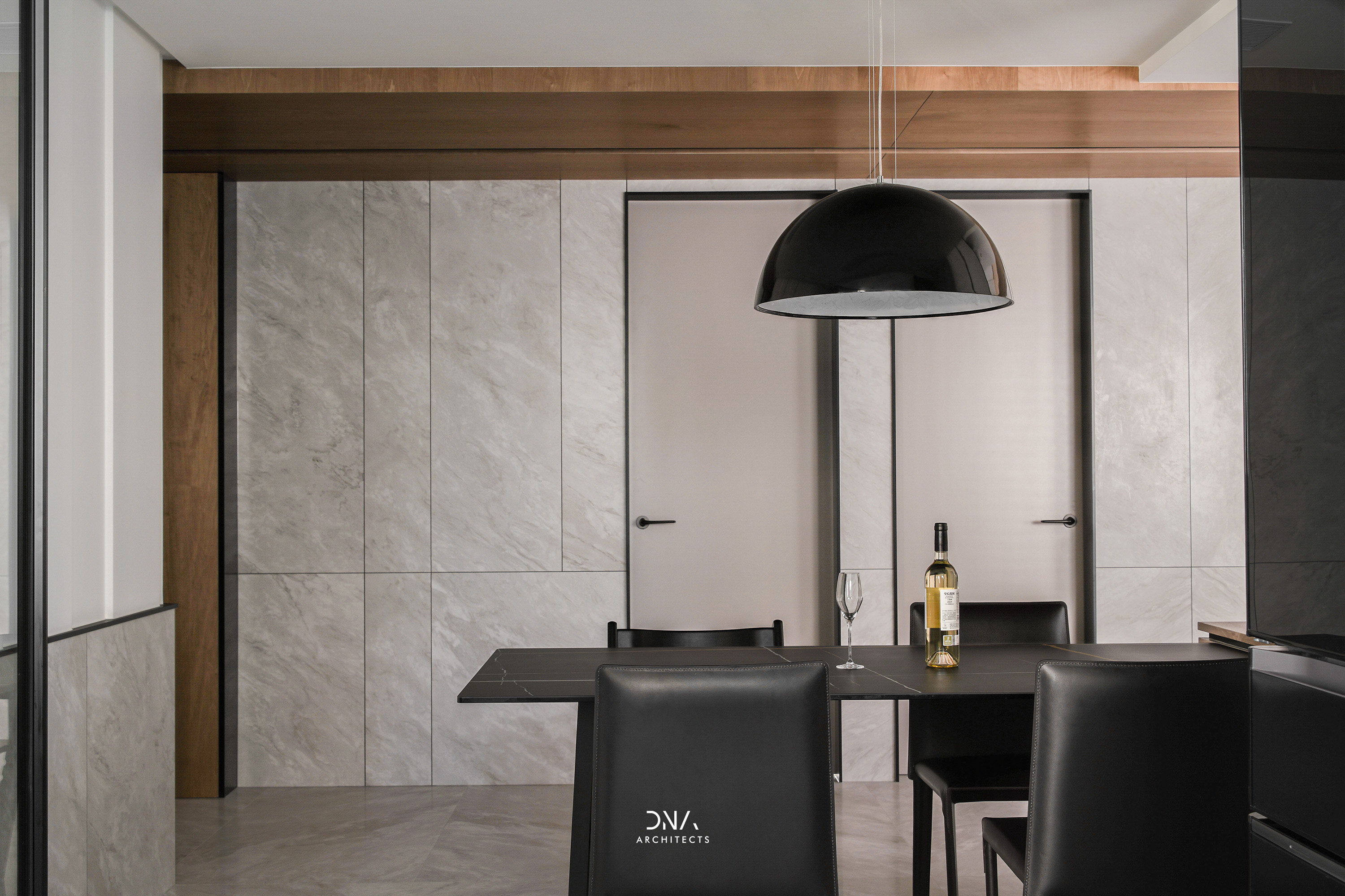
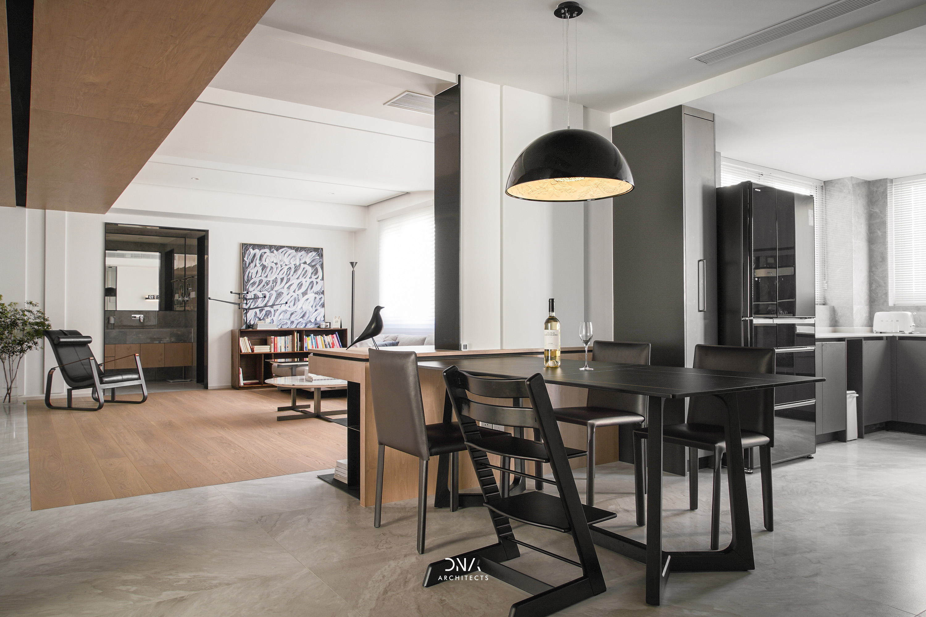
客、餐、厨各区域交互连通却又不相互干扰。 The areas of the living room, dining room, and kitchen are interconnected without interfering. 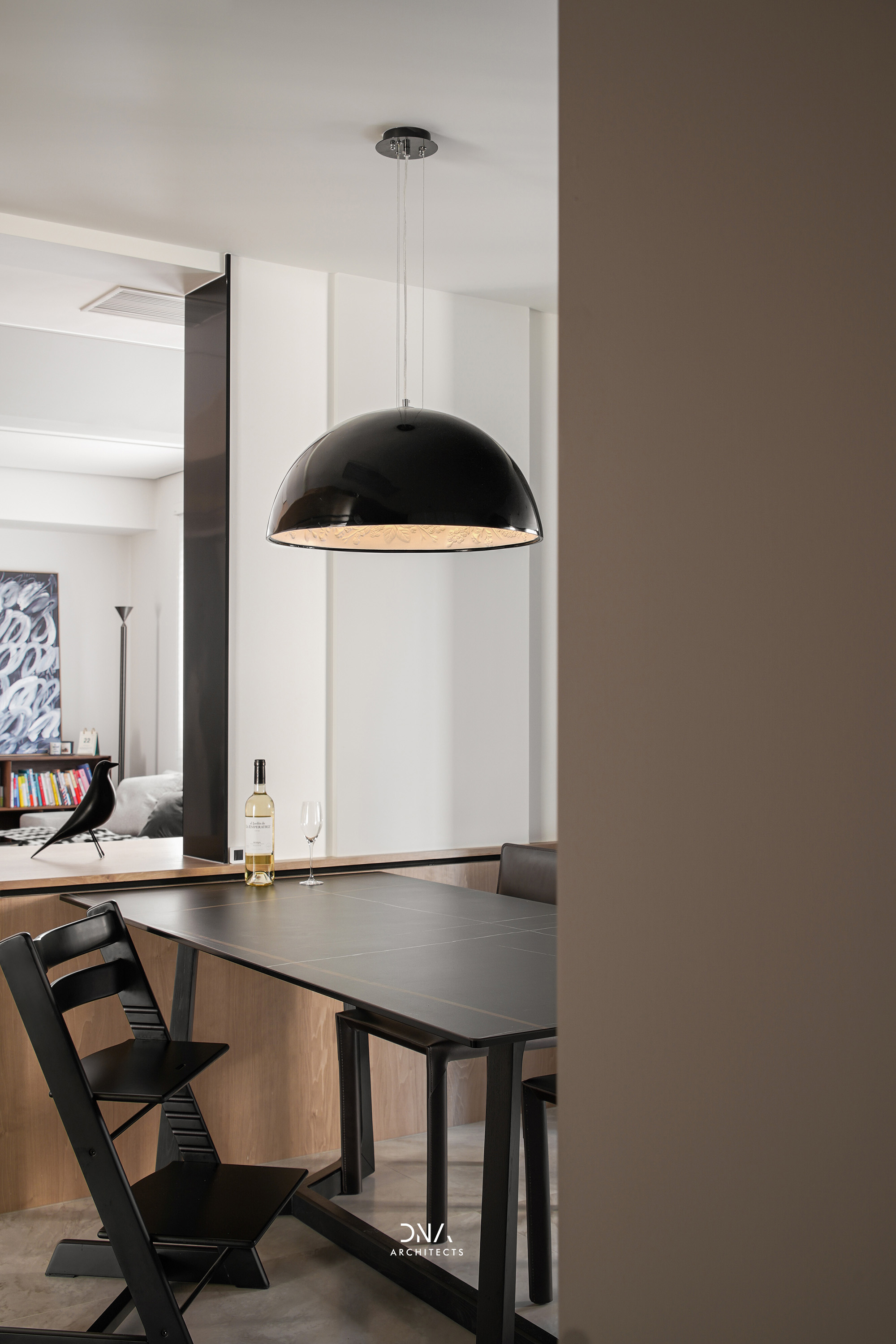
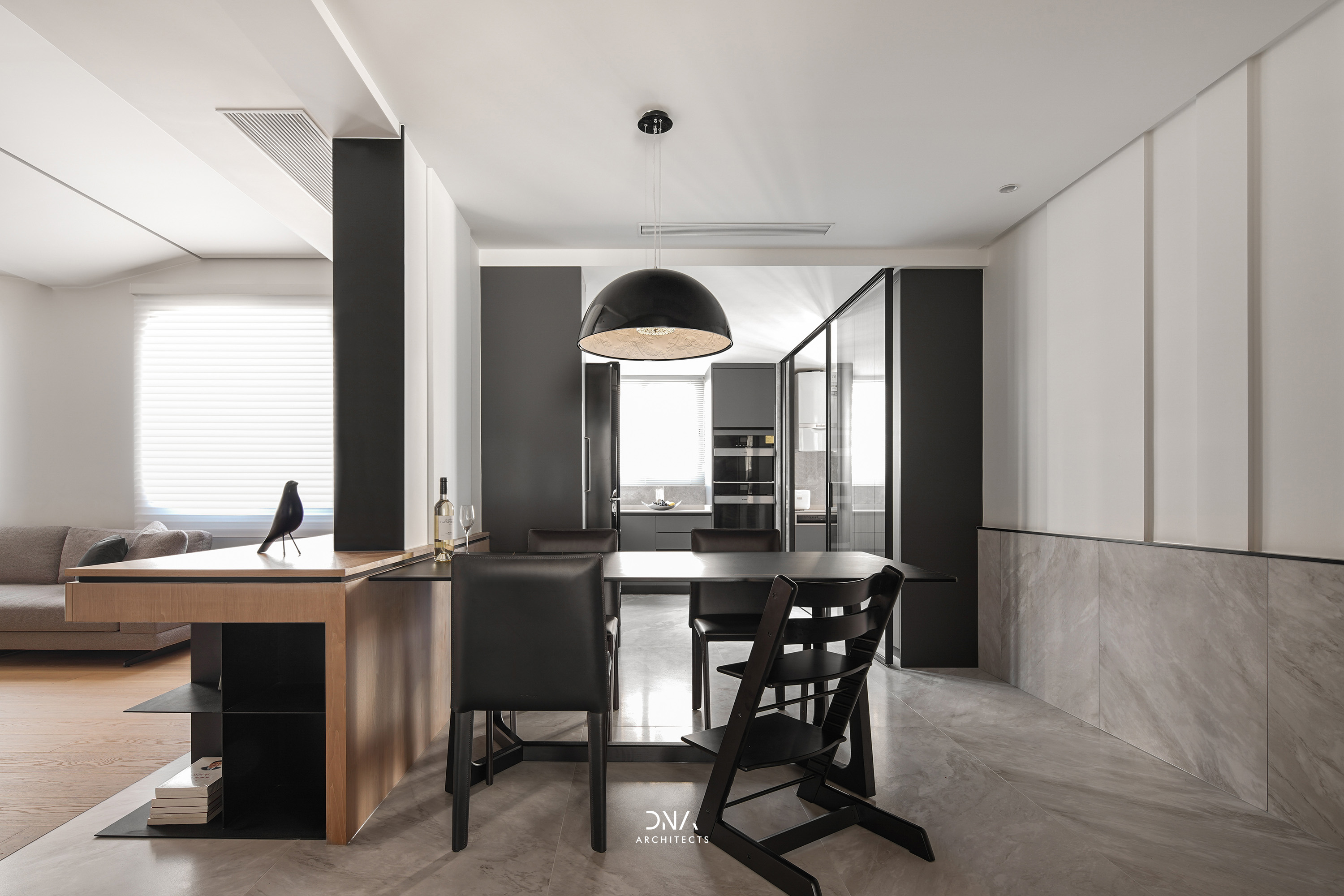
原北面阳台被改造成西厨空间,承接了餐厅和厨房之间空间过渡,原本较小的厨房空间也得到极大的扩展。 The original north balcony was transformed into a space of western-style kitchen, undertook the excessive space between dining room and kitchen, and the space of original kitchen was greatly expanded. 以白色和木色两种简单的材质来表达整个卧室空间的安静、平和,加以强烈的线条感来进一步刻画细节轮廓。 With two simple materials white and wood are used to express the quietness of the bedroom, and a strong sense of lines is used to further depict the details of the outline. 孩子的成长变化非常复杂,家具摆放也时常发生变化,在儿童房的设计上没有过多的去设计主题,而充足的阳光便是最好的颜色。 The growth and changes of children are complicated and the layout of furniture often changes. There is not too much design theme in the children's room and plenty of sunlight is the best color. 项目地点 | 中国杭州 项目面积 | 150㎡ 设计时间 | 2019.7 主案设计 | 夏伟 软装设计 | sasa 空间摄影 | 川河映像 主要材料 | 瓷砖、涂装木饰面、硬包、不锈钢、金属板 |
精华推荐
换一换
-
kanna 2022-1-17 11:09:33
 牛逼6666666666回复举报
 收藏
收藏  说两句
说两句 







发表评论4