|
「一个专注人的情绪和在空间中角色需求的齿科空间」 齿科诊所并非是一个让人开心的地方,冰冷的挂号台,令人焦虑的等候椅,充满不安的诊室门...但它理应是个带来希望的场所,至少应该是个温暖的空间,设计者希望通过空间表达温暖、传递关怀。 The dental clinic is not a happy place. The cold registration desk, the anxious waiting chair, the uneasy clinic door... But it should be a place of hope, or at least a warm space, through which designers hope to express warmth and convey care. 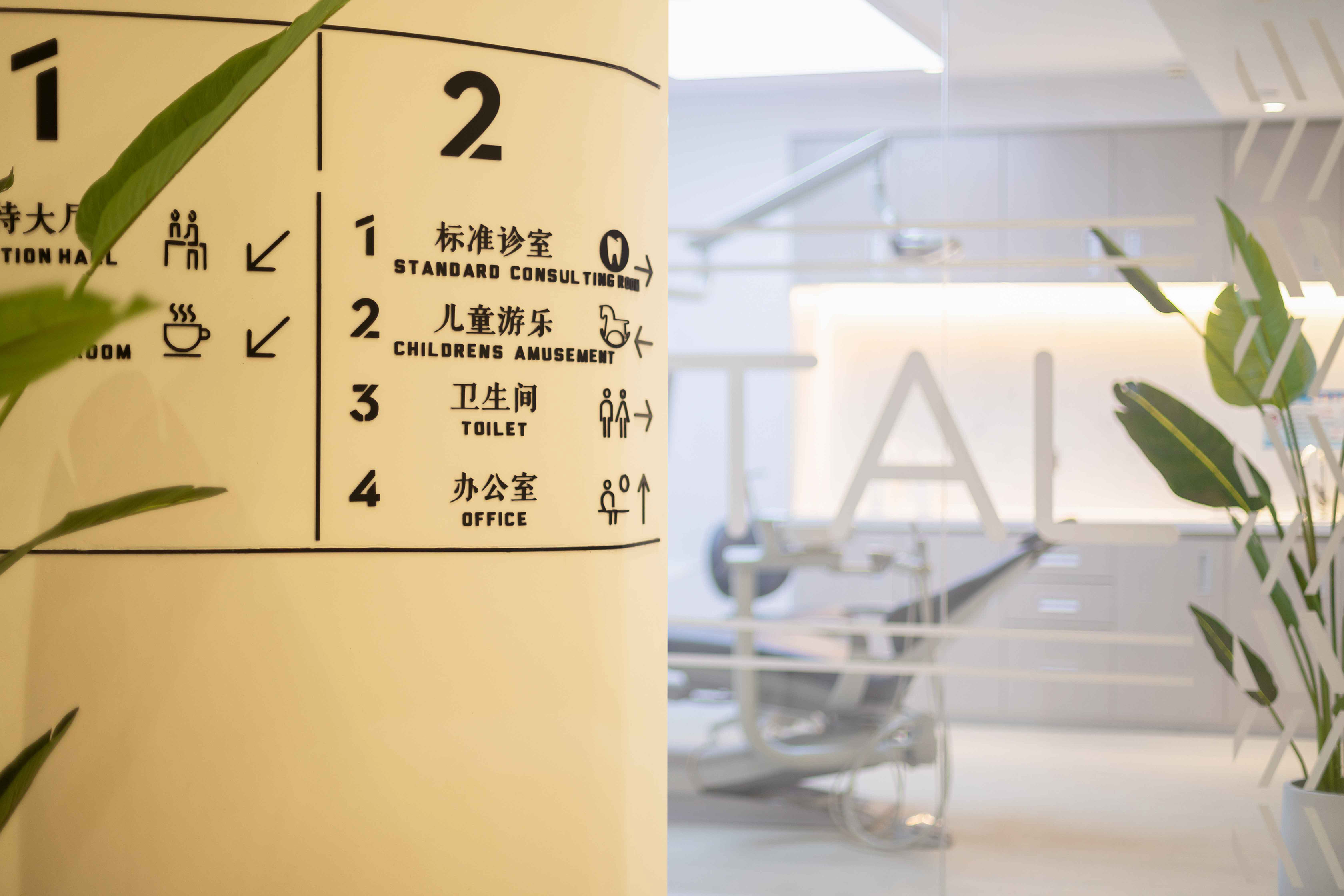
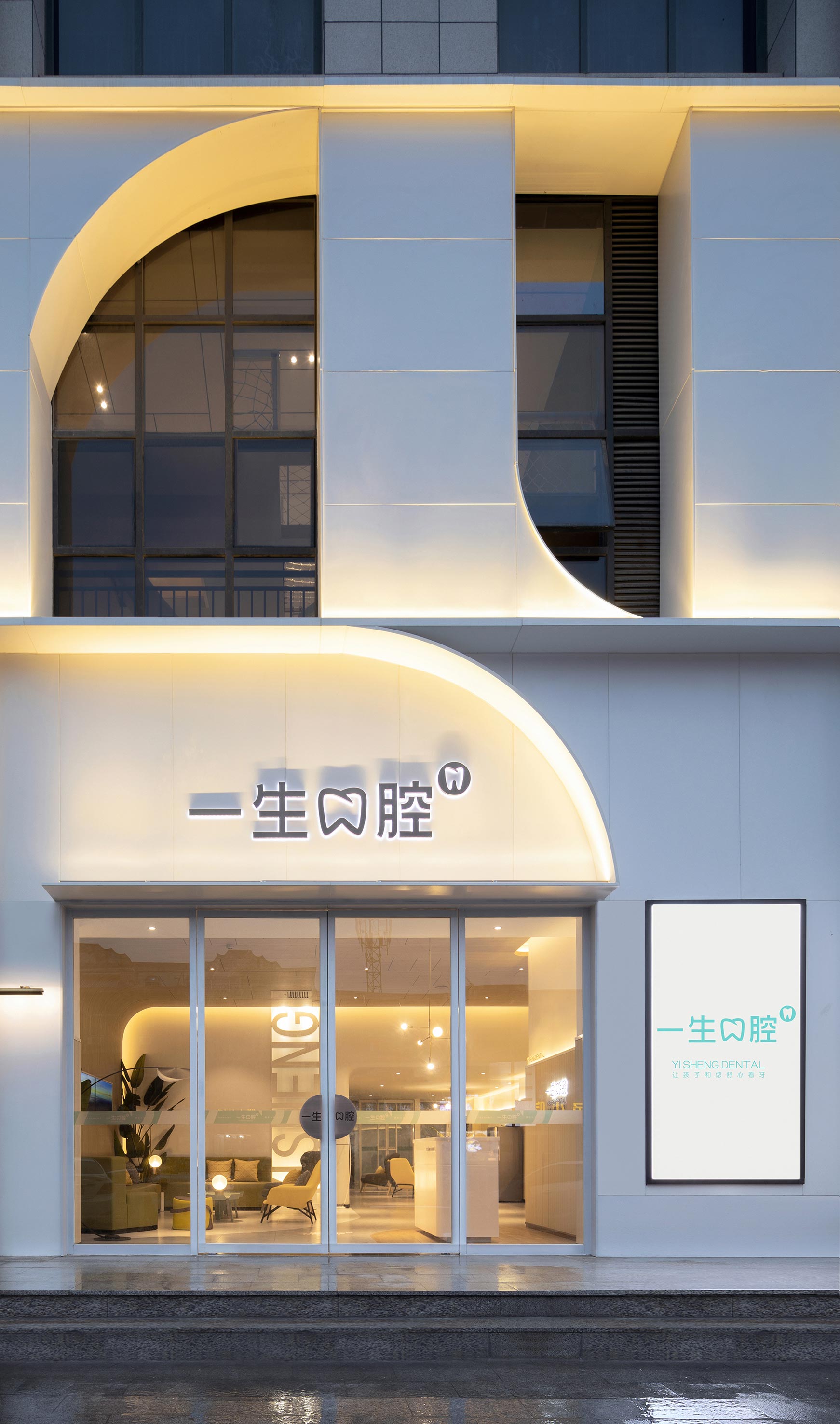
外观-弧形,像一个微笑的弧度,既突出关爱口腔主题,又是希望用弧形来表达温暖,友好,开放,沟通与笑容。 Appearance - arc, like the arc of a smile, not only highlights the theme of caring for the mouth, but also hopes to use arc to express warmth, friendliness, openness, communication and smile. 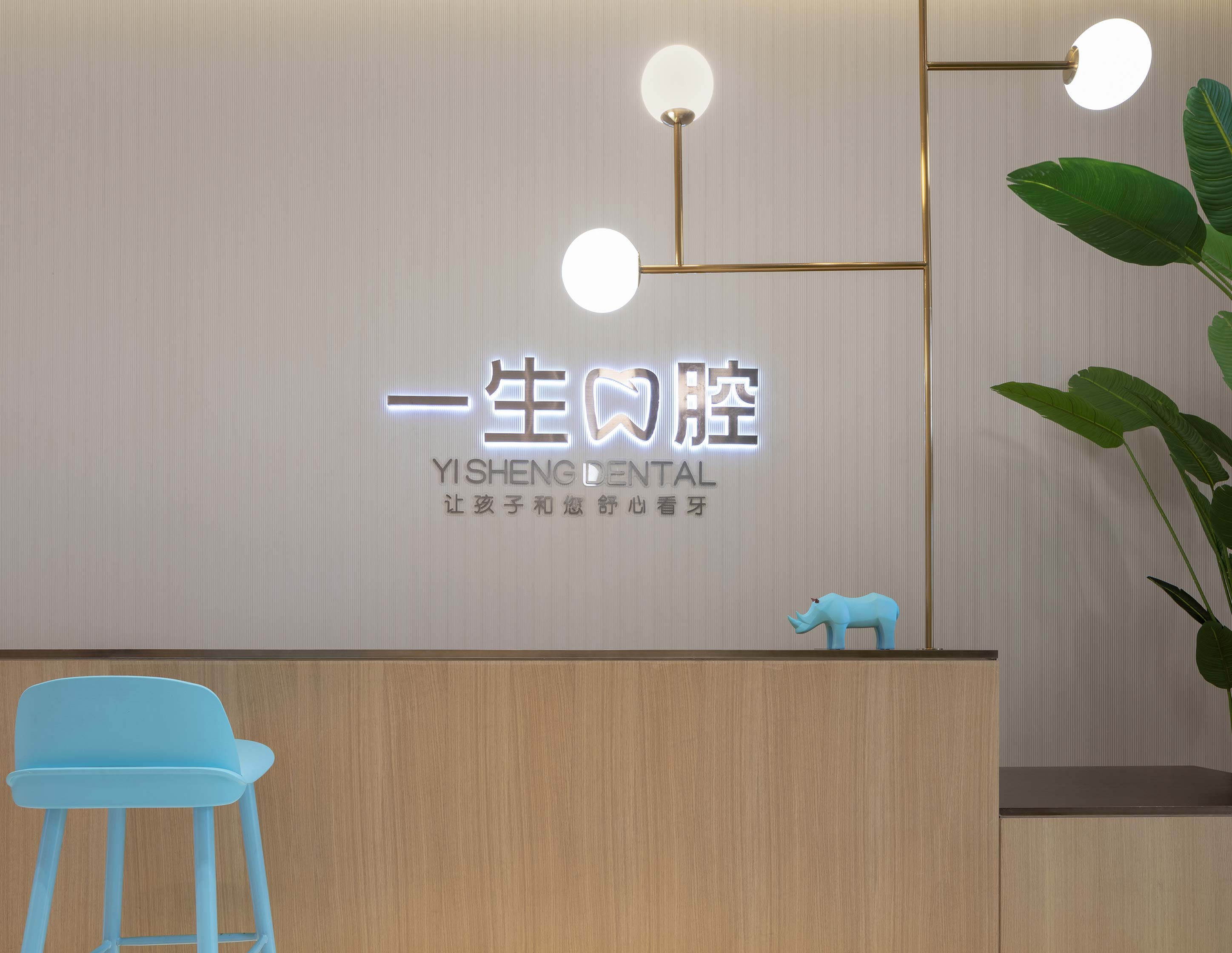
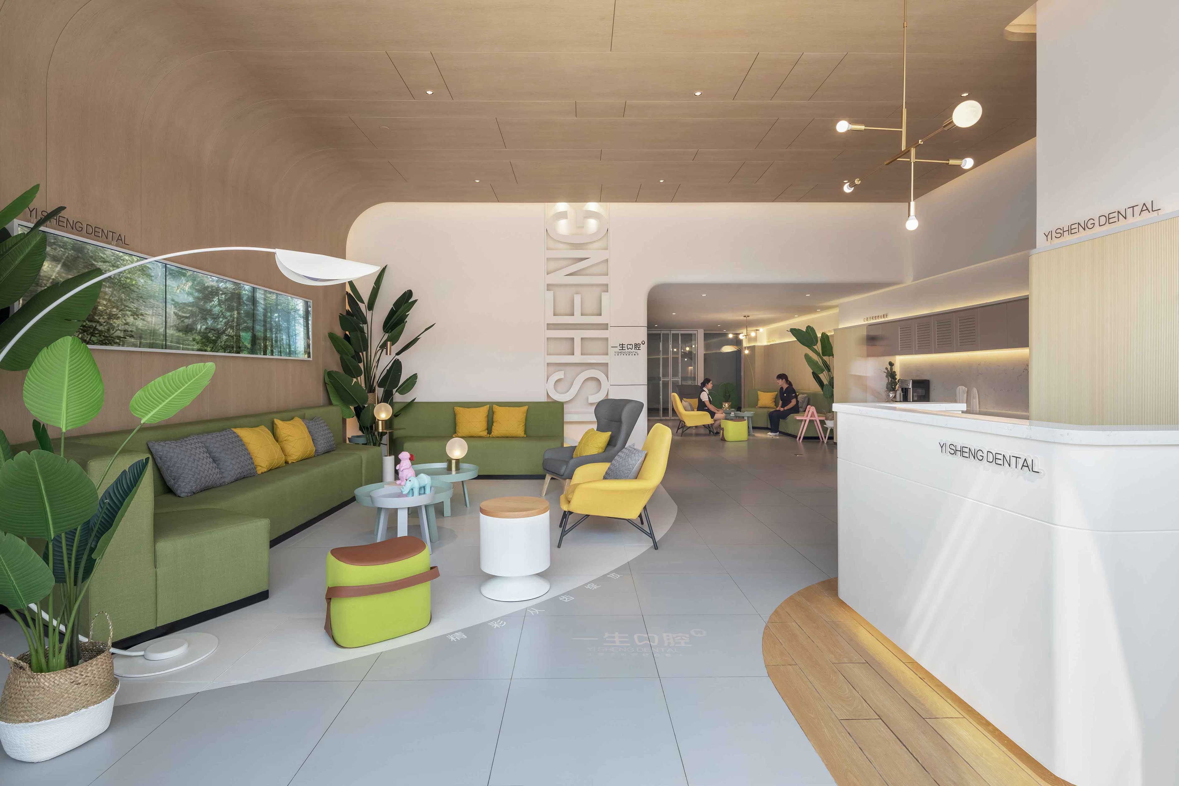
一层接待大厅以生活场景化的设计,有效减少使用者焦虑的感受。传递一生口腔温暖、关怀的气质。 The reception hall on the first floor is designed as a living scene, which can effectively reduce users' anxiety. Deliver a lifetime of warm, caring oral temperament. 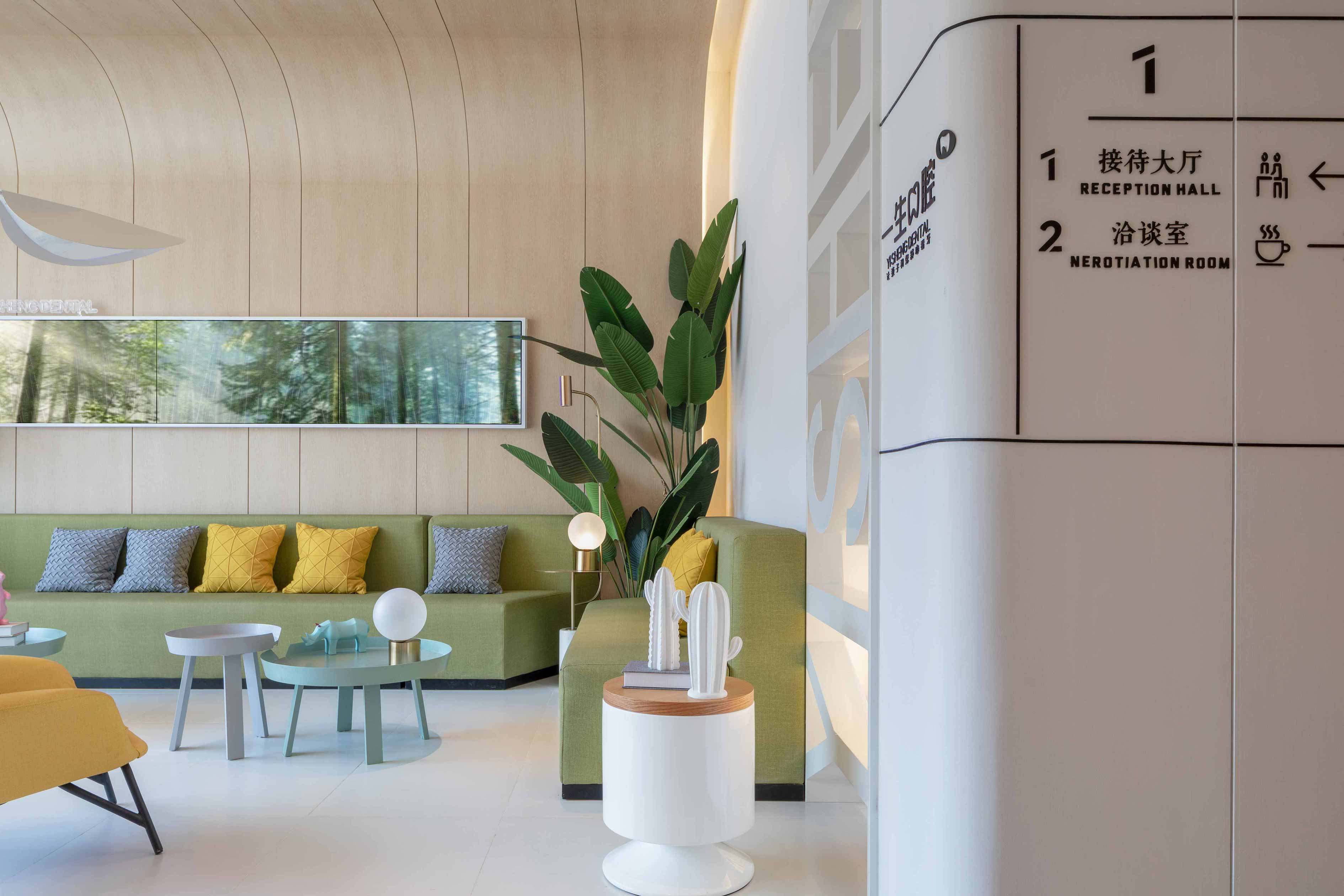
木质材料与植物绿的色彩搭配、无害的装饰材料和温暖而柔和的灯光在感官调性上传递温暖的质感。 Wood material and plant green color collocation, harmless decorative materials and warm and soft lighting in the sensory tone of the transfer of warm texture. 二层接待大厅-接待台面的高低层次设计体现了对孩子们的重视。 The reception hall on the second floor - the high and low level design of the reception table reflects the attention to children. 开放式的平面自然地起到了引导访客的作用,使其能够轻松地对环境形成认知。设计师利用材料透明度的差异,以最有利的布局策略对公共空间和私人空间进行了划分。 The open plan naturally plays the role of guiding visitors, making it easy for them to form a cognition of the environment. Using the difference of material transparency, the designer divided the public space and the private space with the most advantageous layout strategy. 室内的墙面具有不同的透明度:从等候区域可以看到接待台后方的诊区;实验室和器材消毒中心的部分玻璃隔墙覆盖以半透明的白色薄膜,为医务人员提供了半私密的工作环境。传递了诊所公开透明的理念。 The interior walls have different transparency: the diagnosis area behind the reception desk can be seen from the waiting area; Part of the glass partition wall of the laboratory and equipment disinfection center is covered with translucent white film, providing a semi-private working environment for medical staff. It conveys the idea of openness and transparency in the clinic. 室内选用的材料具有持久耐用、触感柔和以及易于维护的特征。清洁、纯净与舒适是诊室设计最重要的三个因素。 The materials chosen for the interior are durable, soft to the touch and easy to maintain. Cleanliness, purity and comfort are the three most important factors in clinic design. 每个房间的大小和室内布置根据使用目的而有所不同。定制设备尺寸、熟悉卡通元素加入,一定程度上消除孩子的陌生恐惧感。 The size and interior layout of each room vary according to the purpose of use. Customized device size and familiar cartoon elements are added to eliminate the fear of strangeness of children to some extent. 二层入口的重要位置规划了儿童体验区,各种互动游乐设施如攀爬、拉扯、摇摆、滑梯等丰富了这个空间,有效缓解等候就医孩子的焦虑。对孩子的关怀就是对成人的关怀,一个能关怀孩子的诊所某种程度上就能传递诊所的关爱与责任感。 The important position of the entrance on the second floor has planned the children's experience area. Various interactive amusement facilities such as climbing, pulling, swinging and sliding have enriched the space and effectively relieved the anxiety of children waiting for medical treatment. The care for children is the care for adults. A clinic that can care for children can to some extent convey the care and responsibility of the clinic. 空间永远不是孤立存在,人的行为在空间中的情绪和角色的需求,是我们一直希望探寻的 。 Space is never an isolated existence. The emotional and role demands of human behaviors in space are what we always hope to explore. 1F-2F原始平面图⊿ F-2F模拟动线分析⊿ 一层动线分析⊿ 二层动线分析⊿ 1F-2F最终平面图⊿ 项目名称:一生口腔 项目地址:三门峡市湖滨区和平路二街坊嘉亿城市广场 项目面积:2100㎡ 设计日期:2018.5 主要用材:百色熊乳胶漆、普隆石塑地板、韩尚木纹膜、侨兴石材、摩歌木地板 空间/软装设计:YN&NIAN壹念叁仟 |
精华推荐
换一换
 收藏
收藏  说两句
说两句 






很好的方案,感谢分享,学习了