本帖最后由 简狄设计事务所 于 2021-9-11 12:04 编辑 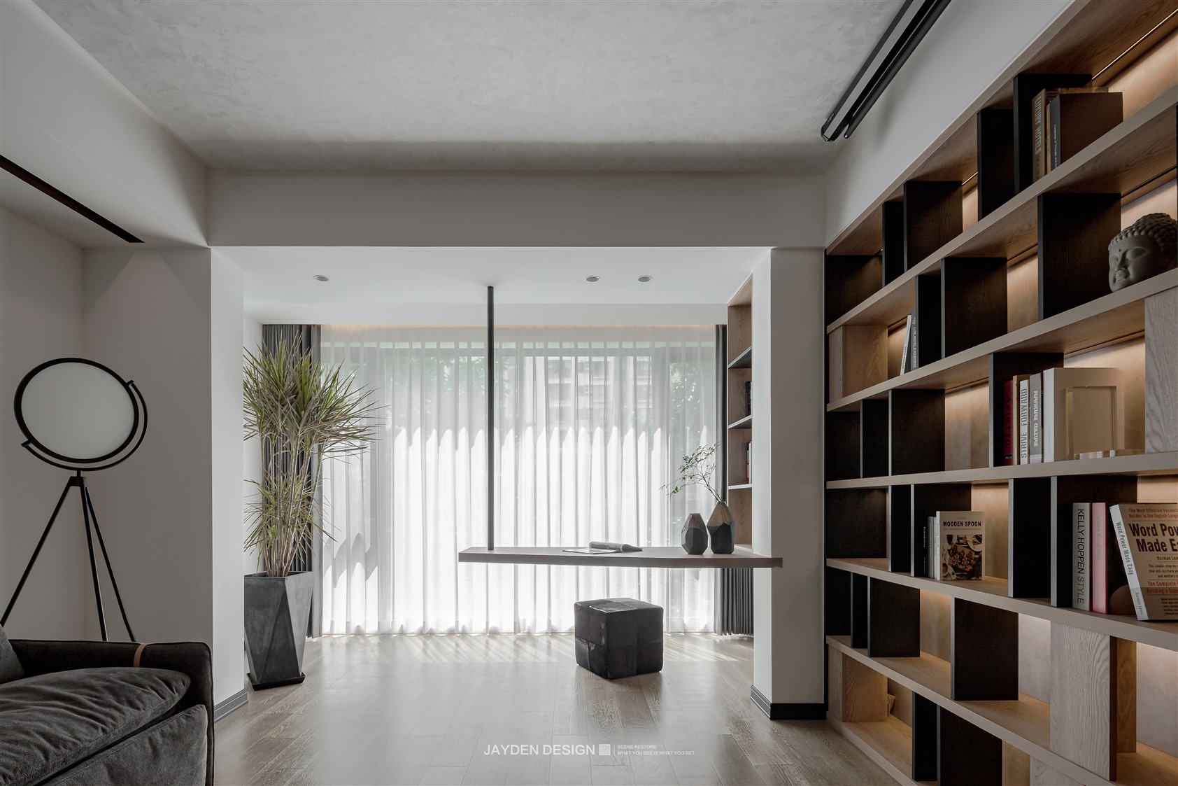
项目名称|Project Name:《家有一面书墙》 项目地址|Location:上海 · 闵行区 面 积|area:120㎡ 设计机构|Design Agency:简狄设计事务所 一套位于上海闵行区繁华地段的二手房,位置在小区的最后一排:窗外一排绿荫,一条小河,隔开了闹市的喧嚣与嘈杂,难得安于一隅的宁静正是屋主向往的理想居所。室内是南北通的两房格局,房型比较方正。屋主倾向原木主题的现代简约风格。室内改造部分,则希望公共空间和私密空间完全分隔,最重要的活动区客厅不必拘泥于传统,但必须满足他们平时的阅读、办公之需,很喜欢家庭图书馆的感觉。 改造思路: ① 客餐厅优化:将原本不对称的客餐厅拉平在一条线上。摈弃传统阳台的概念,将南北两个阳台合并入大空间,并通过隐形门的运用,让立面更加整体化。 ② 主卧优化:取消一个卫生间让房间的过道消失,主卧衣帽间兼具过道功能,并形成自由的双动线。 原始房型图|The original figure 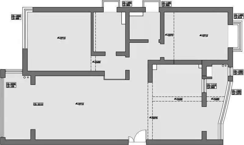
平面布置图|Floor plan 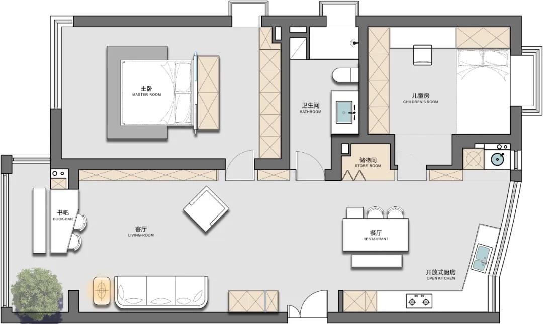
Entrance 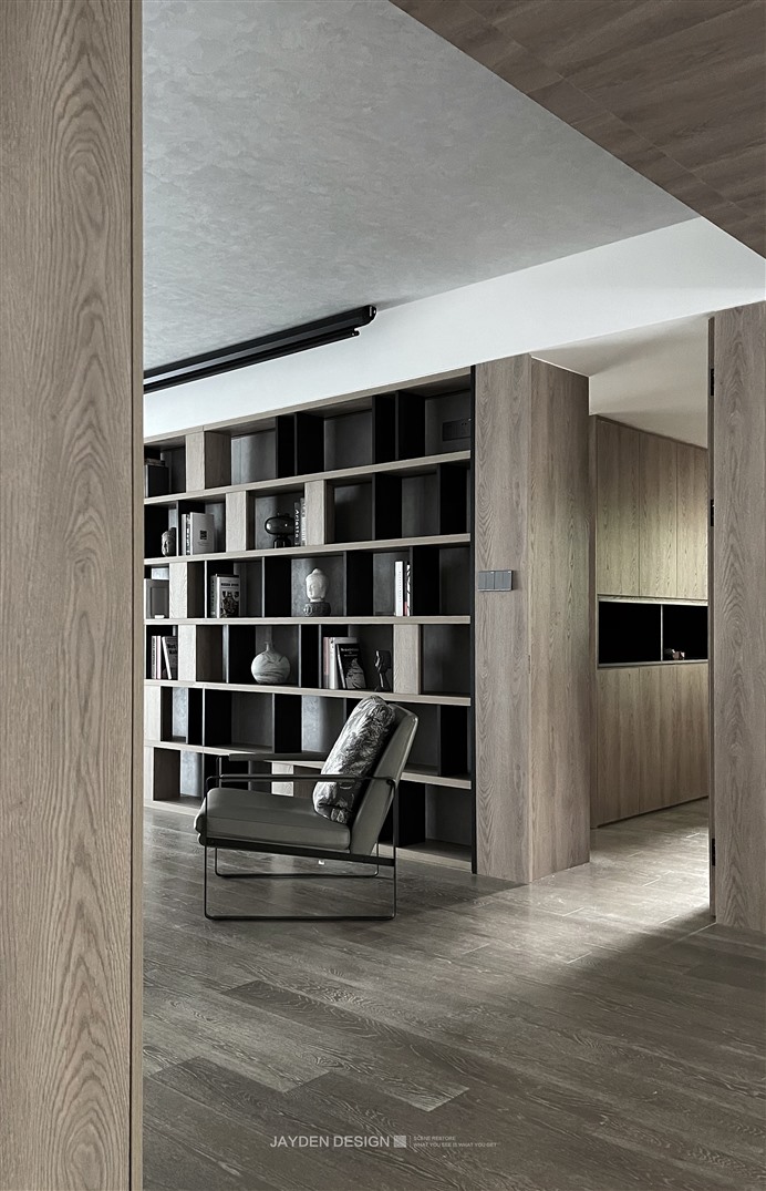
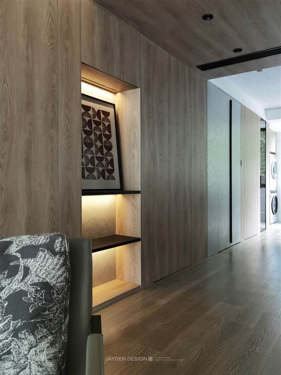
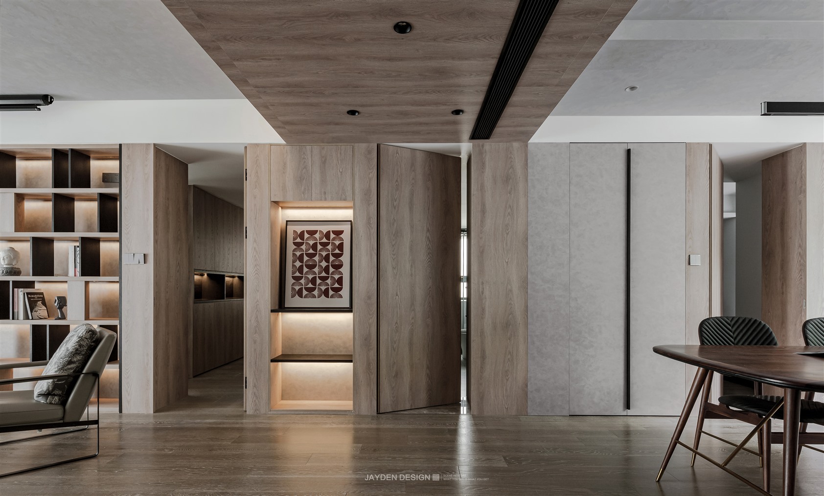
推开入户门,玄关的暖黄色灯光是不是在内心升腾起一团小小的幸福感?作为入户的第一视觉中心,玄关也是整个大空间的分割点和转折点,我们设计了壁龛的形式,力求立面上的绝对平整。 When you open the door, does the warm yellow light of the porch raise a small sense of happiness in your heart? As the first visual center for entering the house, the porch is also the dividing point and turning point of the whole large space. We designed the form of niche to strive for absolute flatness on the facade. Living room 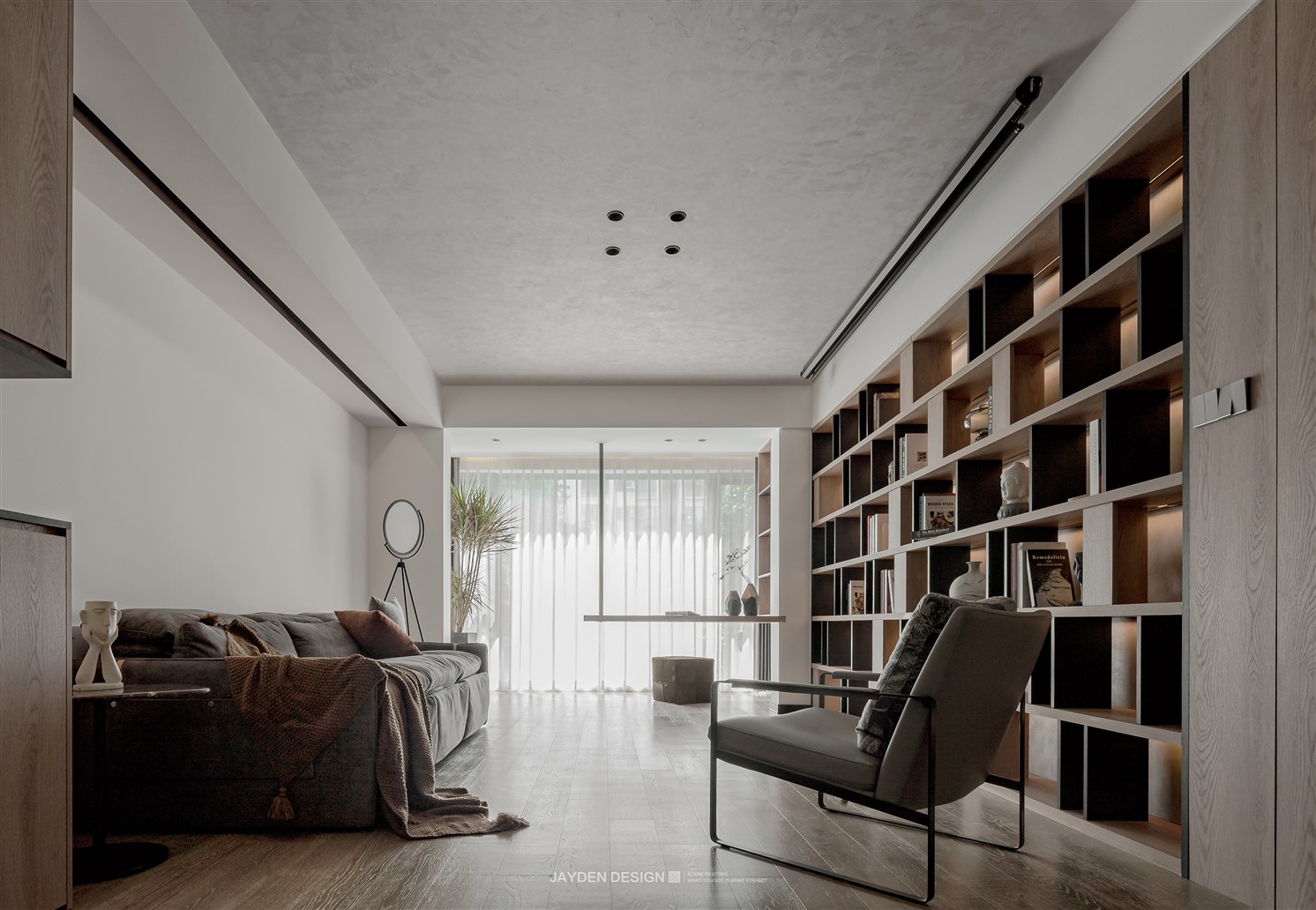
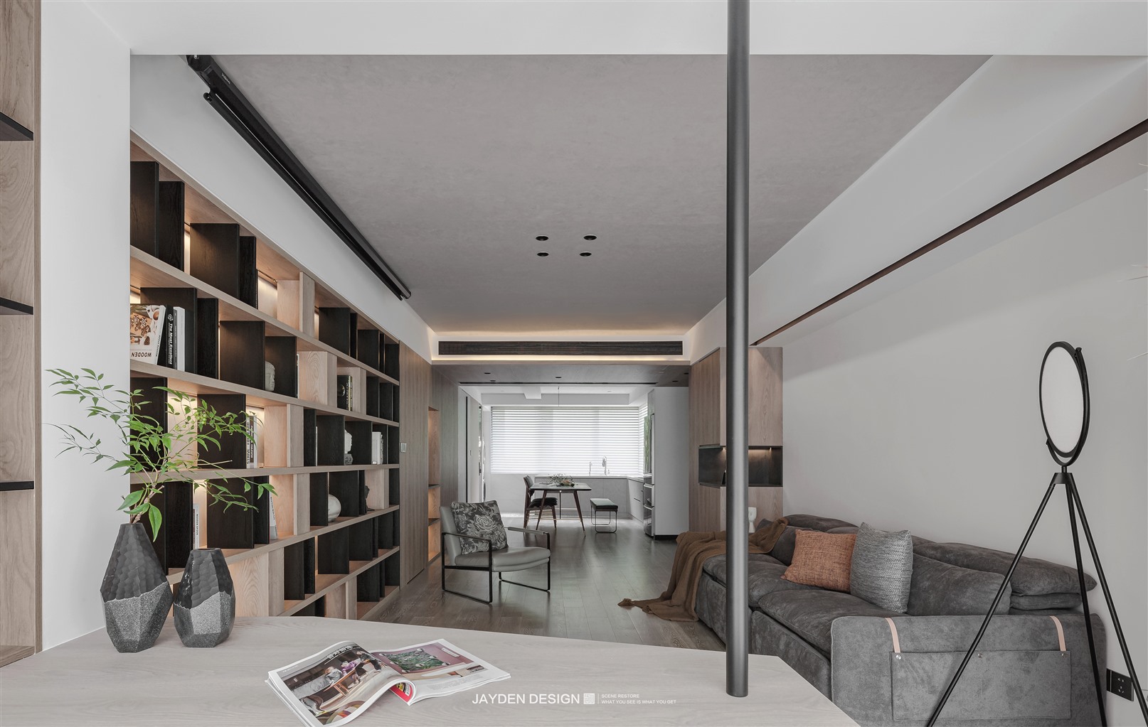
不拘泥于传统客厅的设计,我们取消了电视和背景墙,取而代之的是一整面的书架。只在顶面安装了投影,供偶尔观影所需。书架的设计也比较考究,竖向隔断选择黑色烟熏橡木,分割出大小不一的书格,疏密相间的排列方式非常有设计感。柔和的暖色灯光,营造出家庭图书馆的温馨氛围。南阳台被纳入进客厅空间,设计成开放式书房。悬挑式的书桌让视野更为通透不受阻隔,整面的落地窗把绿意和阳光引入室内,形成一道亮眼的风景线。 Not rigidly adhering to the design of the traditional living room, we cancelled the TV and background wall and replaced it with a whole bookshelf. Only the projection is installed on the top surface for} occasional viewing. The design of the bookshelf is also more exquisite. The vertical partition selects black smoked oak to divide the book grids of different sizes. The arrangement of density is very design. Soft warm lights create a warm atmosphere of the family library. Nanyang terrace is incorporated into the living room space and designed as an open study. The cantilevered desk makes the vision more transparent and unobstructed. The whole floor to ceiling window introduces the green and sunshine into the room to form a bright scenery. 统一的原木色+灰白色贯穿全屋,客餐厅的顶面使用了水泥灰的艺术漆作为过渡。入户门厅的吊顶面和立面为统一的木饰面,这样的衔接处理让门厅顶面和立面连为一体,更具仪式感和整体感。从南至北的立面被拉成一条直线,主卧、次卧和卫生间的门全部采用隐形设计,近二十米的立面连接了书架、三扇隐形门、储藏间折叠门、酒柜、餐边柜和收纳柜,不同材质的衔接非常考验木作的工艺,同时也让立面的设计极具视觉冲击力。 The unified log color + gray white runs through the whole house, and the top surface of the guest restaurant uses cement gray art paint as a transition. The ceiling surface and facade of the entrance hall are unified wood finishes. Such connection treatment makes the top surface and facade of the entrance hall integrated, which has a sense of ceremony and integrity. The facade from south to north is pulled into a straight line. The doors of the master bedroom, the second bedroom and the bathroom all adopt invisible design. The nearly 20 meter facade connects the bookshelf, three invisible doors, the folding door of the storage room, the wine cabinet, the side cabinet and the storage cabinet. The connection of different materials not only tests the woodwork process, but also makes the facade design have great visual impact. 北阳台本身就有明显的斜度,作为独立空间使用起来并不舒服。所以,我们将之归为厨房空间,并按照原有阳台的斜度,定制了整体厨柜,操作台面较之改造前似乎也并无减少。另外一侧设计了收纳空间,并内嵌洗衣烘干设备。开放式厨房和餐厅融为一体,不仅使用极为便利,围绕着美食而交织出的烟火气,更是让家庭成员之间的互动更加无间。North balcony has an obvious slope, which is uncomfortable to use as an independent space. Therefore, we classified it as kitchen space, and customized the overall kitchen cabinet according to the inclination of the original balcony. The operating table does not seem to be reduced compared with that before the transformation. The other side is designed with storage space and embedded laundry and drying equipment. The integration of open kitchen and restaurant not only makes it very convenient to use, but also makes the interaction between family members more seamless. Master BedRoom 三口之家,两房格局,一个卫生间似乎也刚好。与其保留两间憋屈的卫生间,不如合并为一个空间较大的卫生间。于是,我们取消了主卫,将释放出的空间设计成了衣帽间,并形成双动线,自由进入更私密的卧室。A family of three with two bedrooms and one bathroom seems to be just right. It's better to merge into a larger bathroom than to keep two bending toilets. Therefore, we cancelled the master bathroom, designed the released space into a cloakroom, formed a double moving line, and freely entered a more private bedroom. Children‘s room 次卧为儿子房间,已经上初中的男孩需要更加独立的起居和学习空间。我们考虑到这个年龄的孩子特征,定制了加长的悬挑书桌,一整面的衣柜和两组到顶的书架,充分满足了成长中的孩子所需。The original living room has an inner balcony. After changing to the master bedroom, the overall space is greatly increased. After the whole inner balcony is lifted one step, the level} sense of space is established, and the form of platform also provides a variety of ways for rest. The background wall is made of three different materials. The large-area art paint combined with the splicing of local terrazzo and wood grille allows the facade design to maintain a calm sense of restraint and will not feel dull. Bathroom 卫生间采用黑白对比色调,让空间更为素净简洁,超长台盆和镜柜组合完全可以满足一家三口的日常洗漱。The bathroom adopts black-and-white contrast tone to make the space more simple and concise. The combination of super long basin and mirror cabinet can fully meet the daily washing of a family of three. - end - |
精华推荐
换一换

 收藏
收藏  说两句
说两句 


有点显旧了,容易过时,不过质感做的不错,主卧床的处理有些不认同,无论是风水还是磁场都感觉不好,脚对窗户如果进风容易生病,客厅阳台吧台做的不错,值得学习