|
本帖最后由 素缘 于 2021-10-16 13:49 编辑 设计让实景落地 The design lets the real scene land. 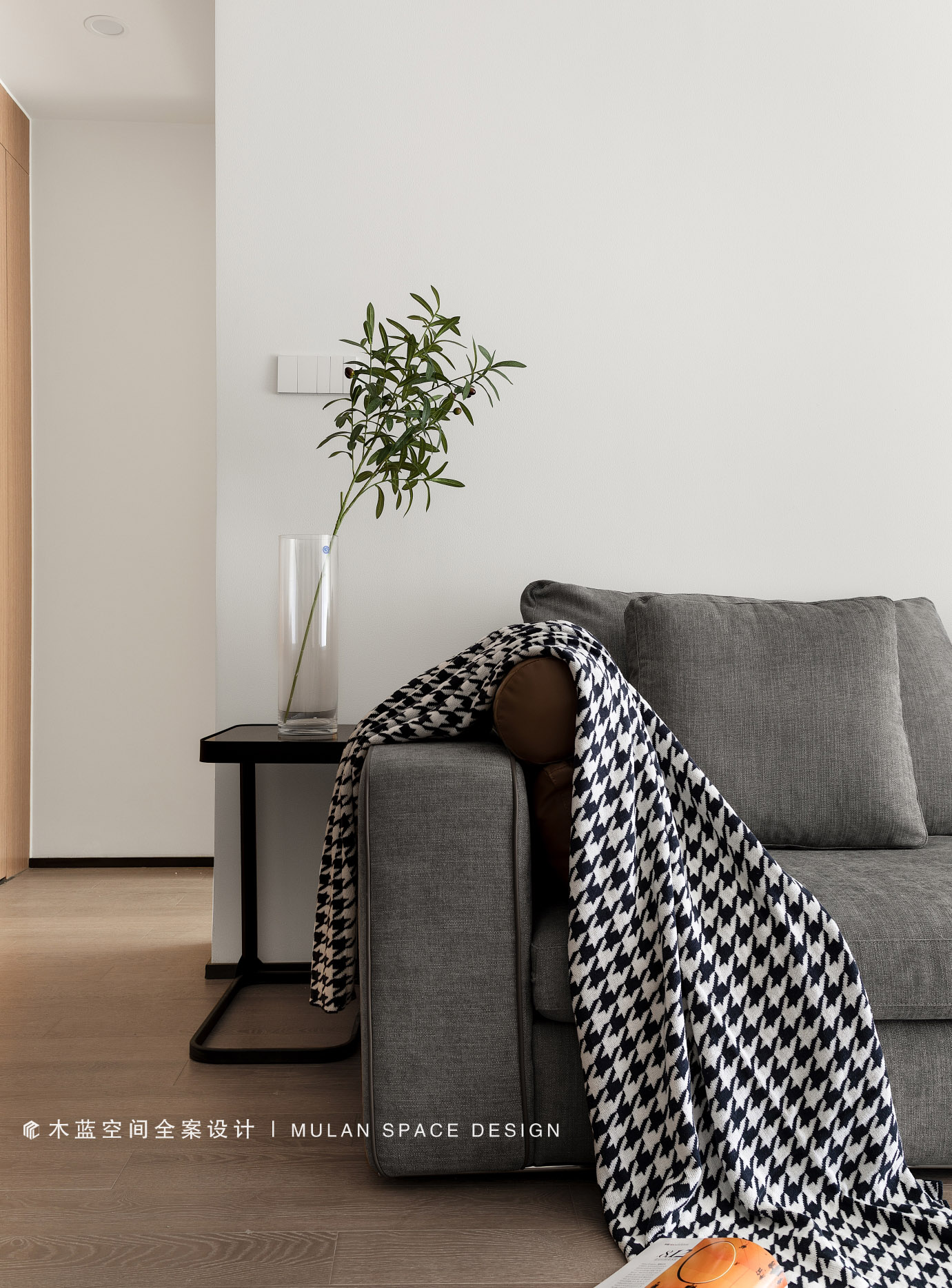
简单胜于繁复,简单即为丰富。 Simple is better than complex,simplicity is richness.
项目地址 / 南京 · 青秀城 Location | Nanjing · Qingxiu City 建筑面积 / 116平 Area | 116㎡项目设计施工 / 木蓝设计 Design and Construction | MuLan Design 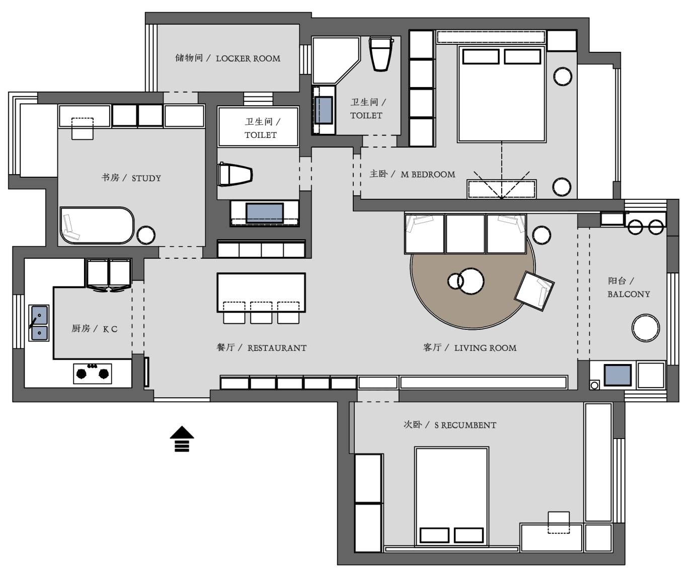
△ 平面布置图 · 始 本案为精装修项目,屋主比较喜欢现代简约的灰色调。墙体结构上没有改动,使用三面隐形门让空间线条感更强。 This case is fine decorate a project, house advocate likes contemporary and contracted gray attune quite. There is no change on wall structure, using three invisible doors to make space line feeling stronger. 原有地板更换为中性色地板,奠定色彩基础,立面主色调为经典黑白灰,搭配低饱和色系软装产品。 The original floor is replaced with neutral color floor to lay the color foundation. The main color of the facade is classic black, white and gray, with low saturation color soft decoration products.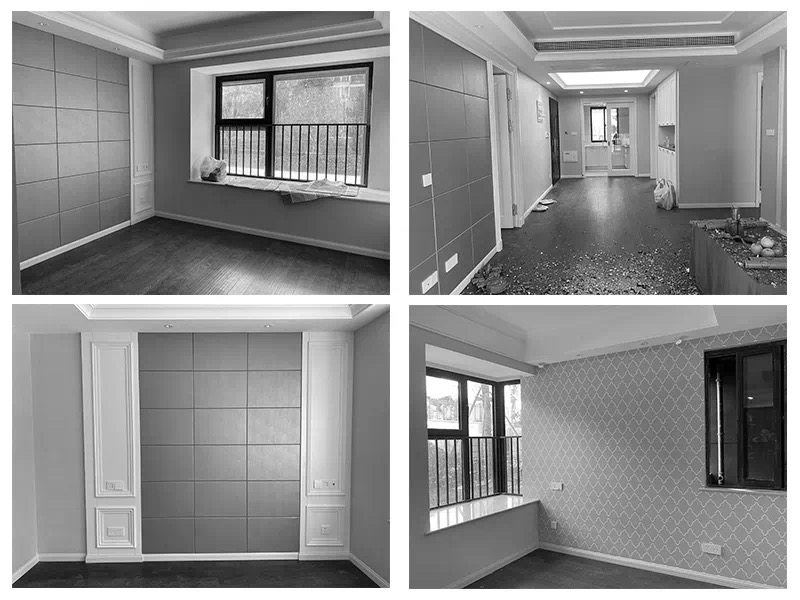
△ 改造前现场 · 新宅 对于设计不断探索,适用各种实质物料,色彩、质感、时尚的家具搭配,合理的人性空间,只为给屋主创造完善的生活空间,演绎自我的居饰品味。 For the design of continuous exploration, suitable for all kinds of material, color, texture, fashion furniture collocation, reasonable human space, only for the owner to create a perfect living space, deduce my taste of home decoration. 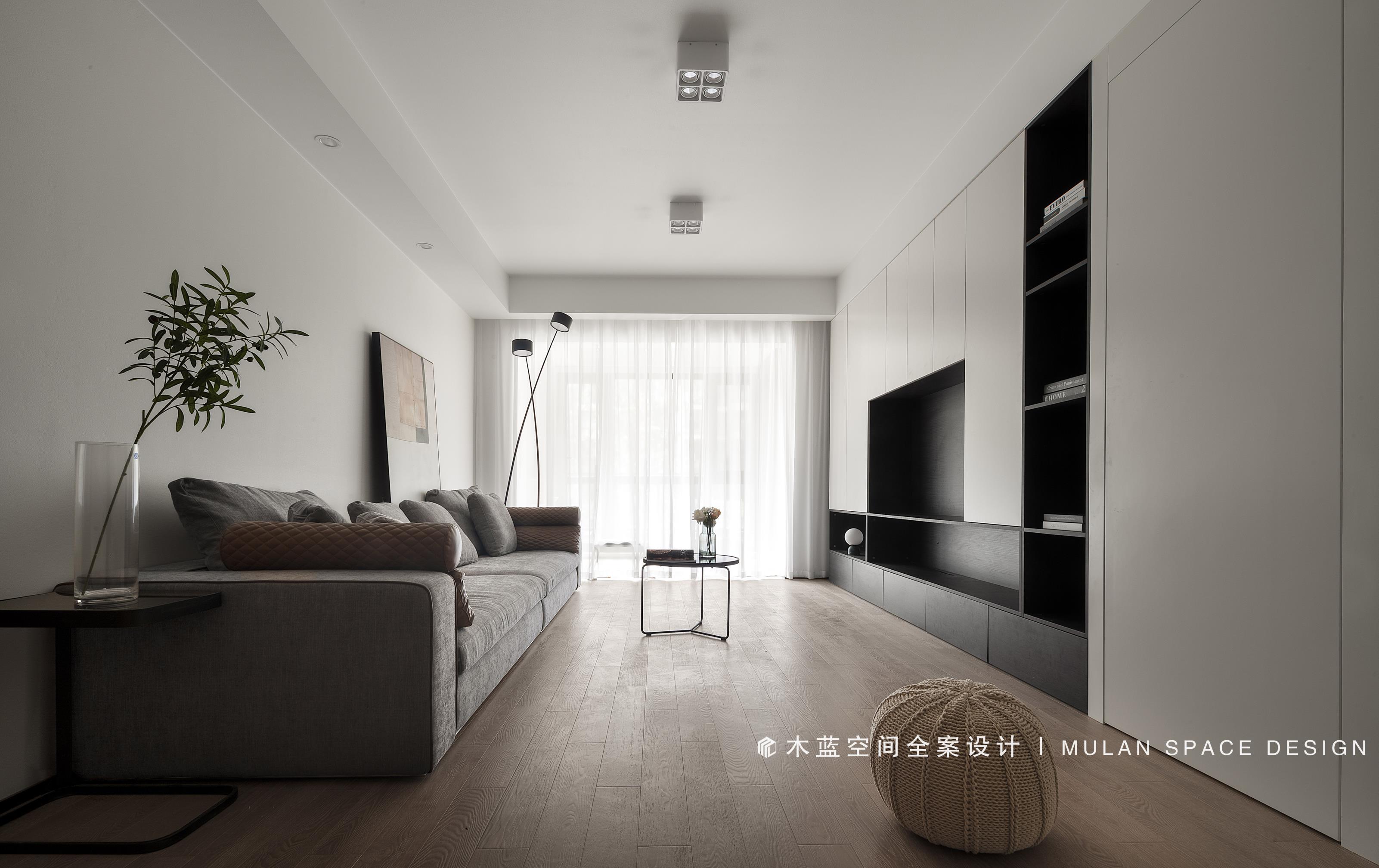
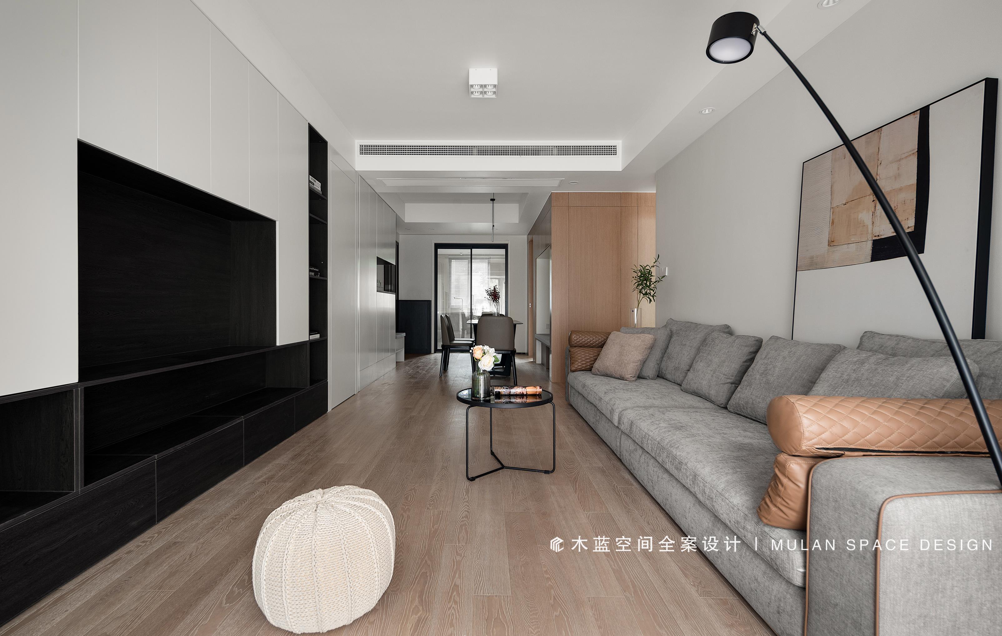
△ 客厅 / Living room 高档黑白定制柜体,淡雅中呈现微妙层次变化,无时不刻展现家的细腻。 High-grade black and white custom cabinet, elegant in the subtle level of change, always show the exquisite home. 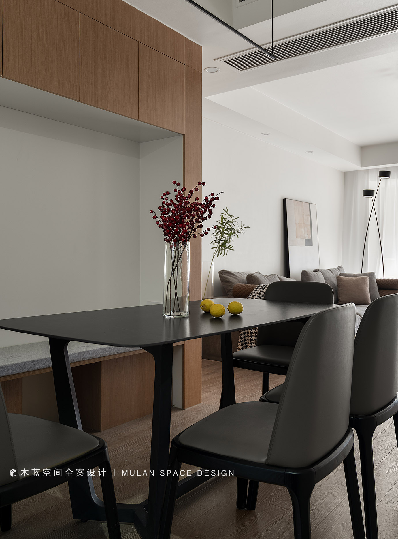
△ 餐厅 / Restaurant 餐厅应该充满生活气息,岩板餐桌搭配暖灰色餐椅,加上原木色卡座设计,满足收纳和多人用餐需求。 The restaurant should be full of life, rock plate table with warm gray dining chair, plus wood color booth design, to meet the needs of storage and dining.△ 卧室 / Bedroom 卧室采用立体感的线条,深浅色彩的组合,让空间变得高级而温柔。 The bedroom uses the line of stereo feeling, the combination of deep and shallow colour, let a space become advanced and gentle. △ 书房 / Study 白色柜体与深色家具结合营造高级感,在窗户旁书桌光线充足,兼备学习满足收纳,既美观又实用。 White cabinet body and brunet furniture are united in wedlock to build advanced feeling, desk light by the window is sufficient, have both learn to satisfy receive, already beautiful and practical.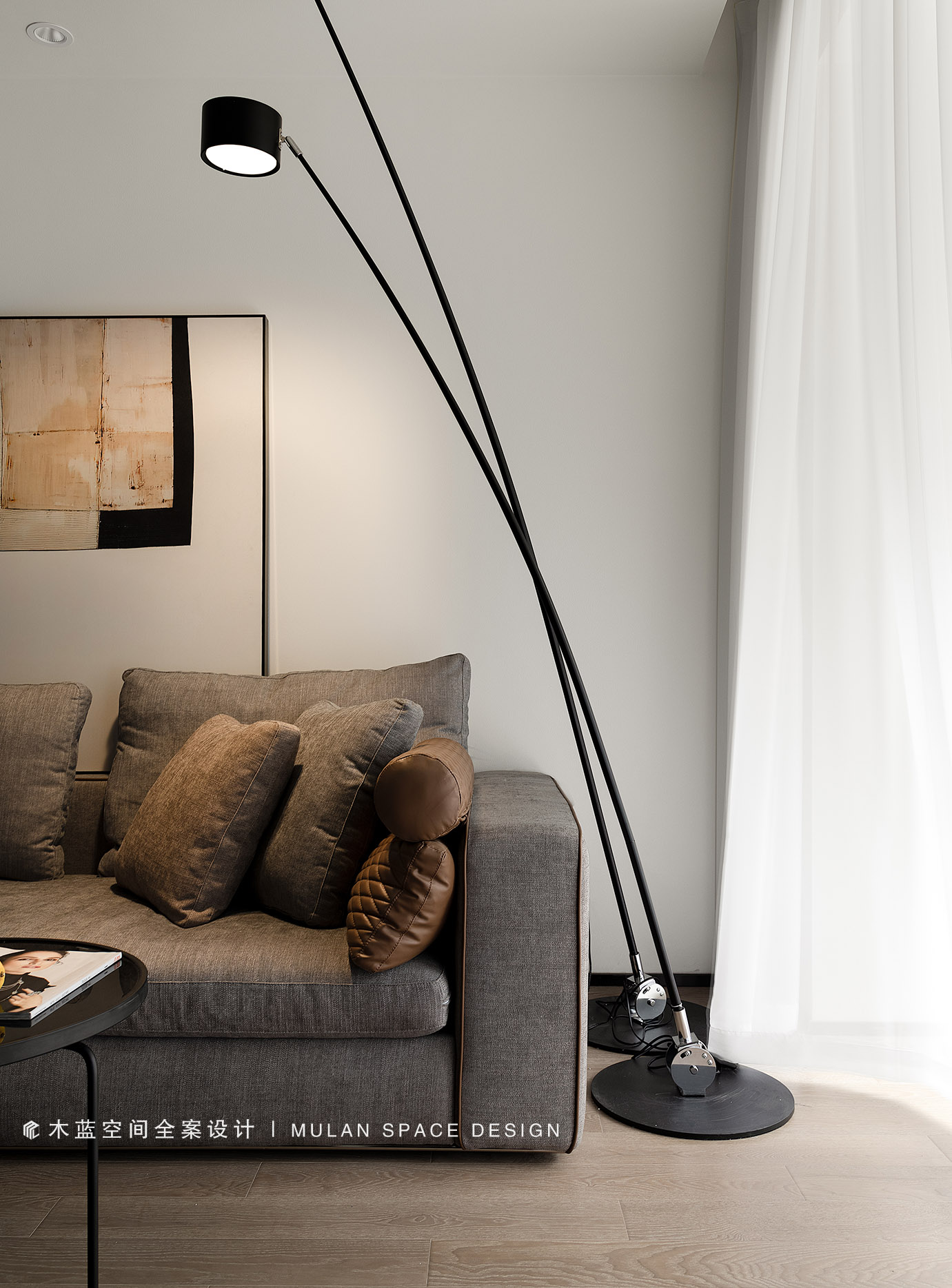
本案以“化繁为简”的审美内核,为屋主营造一个“心外无他”之地。家在此处,何必远方。 This case to "simplify the complex" aesthetic core, for the owner to create a "heart without him". Home is here, not far away. - END - |
精华推荐
换一换

 收藏
收藏  说两句
说两句 

 /1
/1 


假盒子置入功能