本帖最后由 简狄设计事务所 于 2021-10-21 11:32 编辑 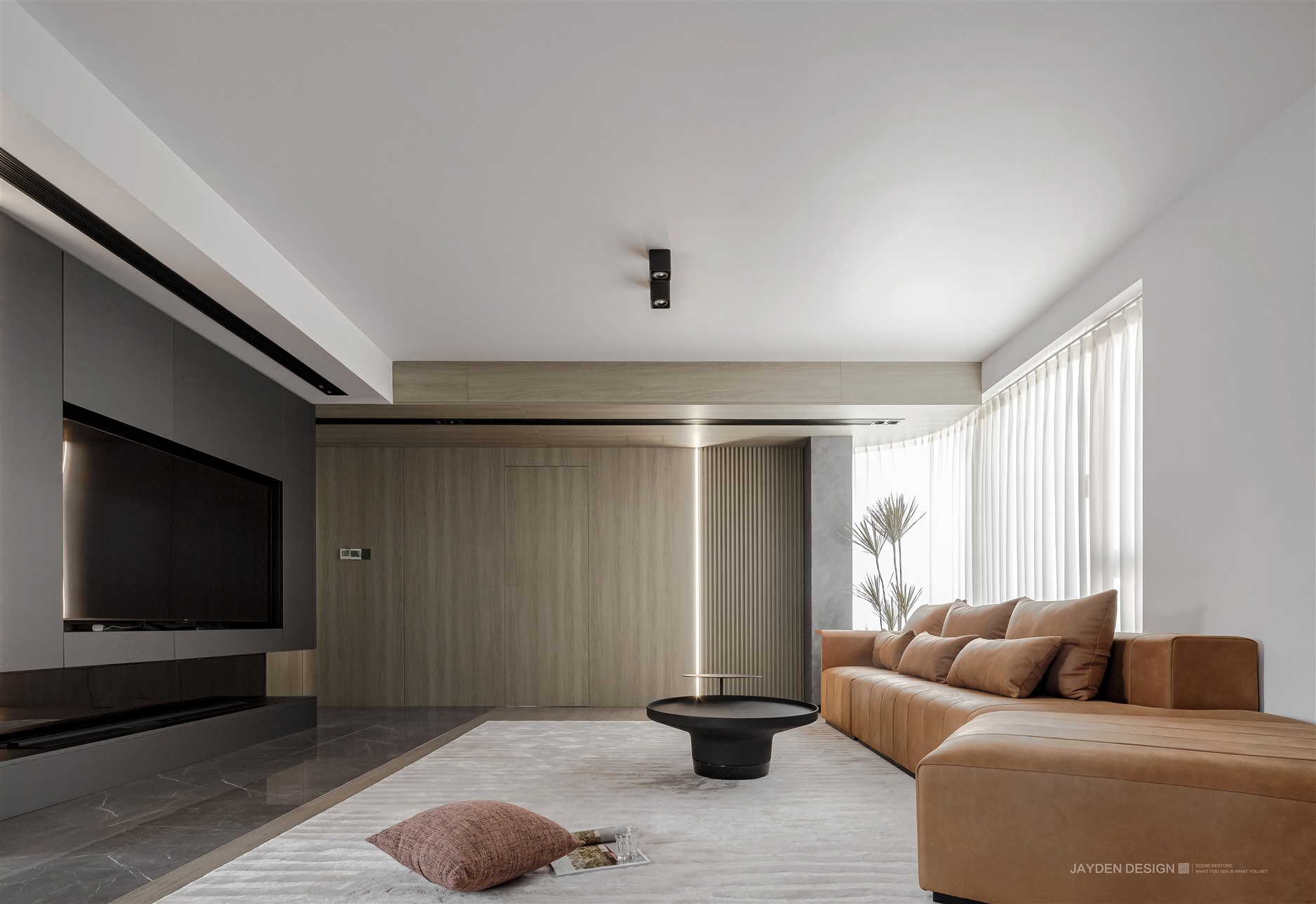
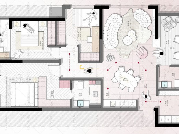
项目名称|Project Name:《FLOWING》 项目地址|Location:上海 · 杨浦区 面 积| area:150㎡ 设计机构|Design Agency:简狄设计事务所 本案位于杨浦区,是一套有些年头的二手公寓房。一家四口二孩家庭,需要保留三间卧室。原房型的优点很明显:入户有一间独立的门厅和储物间(电表间),客厅偏方正。劣势是客餐厨空间相对过于独立,三房仅一卫,对于四口人同住的家庭,还是很不方便。 # 改造 # 卫浴洗漱大变身:将传统卫生间改造成三分离的形式,洗漱干区和电视背景合二为一,电视背景墙后即是超长的洗手台盆,另外再增加一间独立的马桶间,方便一家四口平时洗漱如厕不再冲突。 环形动线乐趣多:位于房子中央的承重墙承载了双台盆和电视机背景,四周空间全部被释放出来,形成环形动线。一条环形动线不仅串起了门厅、客厅、儿童房、主卧、洗漱干区、卫生间、独立马桶间和敞开式厨房和餐厅,也让整个空间因为动线的改变而灵动有趣起来。每个点都有一条捷径可以到达你想去的地方,无阻挡的感觉简直绝绝子~~ 开放式餐厨一体化:利用原始餐厅的位置整合了开放式厨房叠加餐厅功能,让客厅面积最大化,以增加两个孩子的活动空间。 原始房型图|The original figure 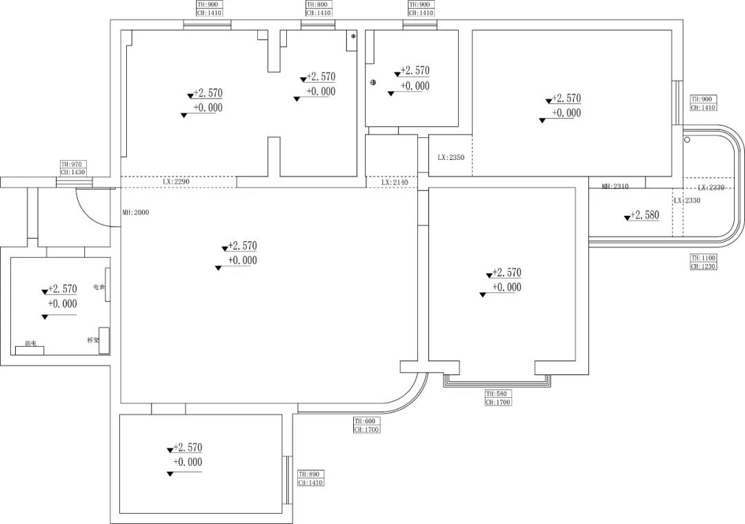
平面布置图|Floor plan 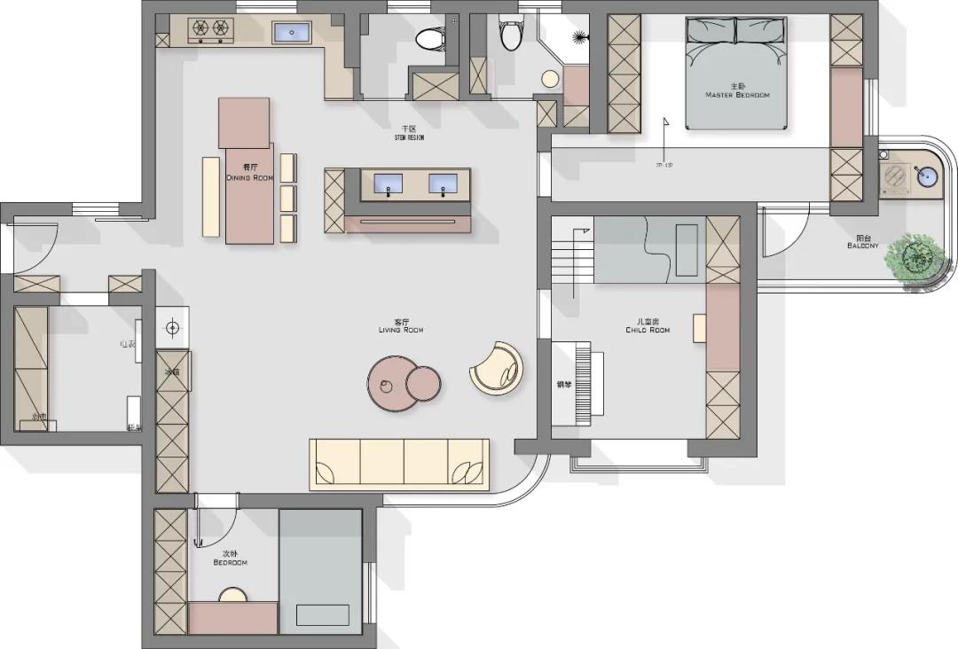
01 #Entrance# 经过入户衣帽间、落尘区,开启沉浸式回家模式 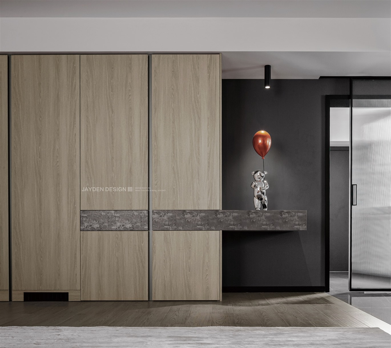
入户进来的独立空间,被规划为储物间,解决了入户鞋服及杂物的收纳问题。玻璃移门增加了空间的层次递进,同时也起到降低能耗的作用。 The independent space entering the house is planned as a storage room, which solves the storage problem of shoes, clothes and sundries entering the house. Glass sliding door not only increases the level of space, but also reduces energy consumption. 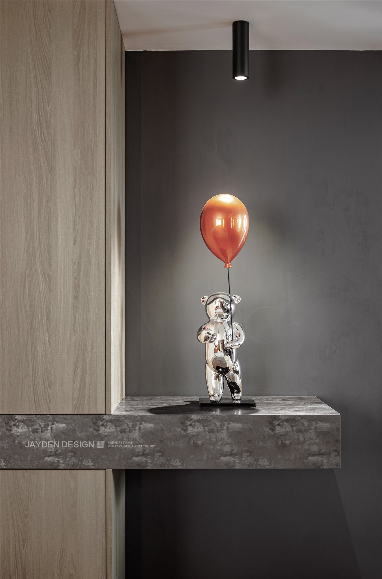
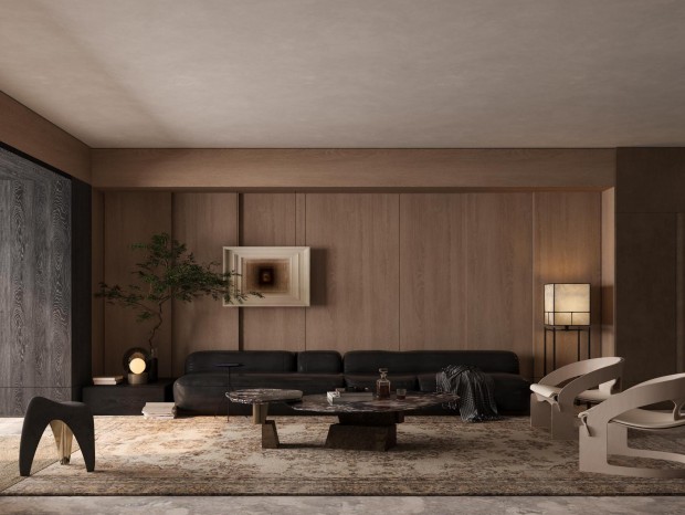
这是拉开玻璃移门的视野:双眼可及的幸福,一瞬间映射在内心最柔软的地方…… This is the vision of opening the glass sliding door: the happiness within the reach of both eyes is reflected in the softest place in the heart for a moment 02 #Living room# 无边界感+环形动线,带来自由自在的居家生活 弧形的转角大窗,让自然光照亮客厅的每处角落,敞亮而通透。 The large curved corner window allows natural light to illuminate every corner of the living room, bright and transparent. 客餐厨公共空间被全部打开,除了卫生间和卧室,我们不去封闭任一空间。以隔而不断的设计手法,将公共空间融为一体。无论在哪个视觉点,都能感受到空间的延伸和连通感。只是用地面材质来区分不同空间的功能属性。 The public space of guest kitchen is fully opened. We don't close any space except bathroom and bedroom. The public space is integrated with the design method of separation and continuous. No matter in which visual point, you can feel the extension and connectivity of space. Only the ground material is used to distinguish the functional properties of different spaces. 电视背景只是一截嵌入电视的隔断,同时也是承重结构。墙体不可能打通的情况下,我们在底部运用了镜面的反光效果,营造出电视背景的悬空感。深灰色饰面带着高级的金属光泽,内嵌极窄灯带和雾化壁炉,现代感十足。 The TV background is only a partition embedded in the TV, and it is also a load-bearing structure. When it is impossible to get through the wall, we use the reflective effect of the mirror at the bottom to create a sense of suspension of the TV background. Dark grey finish with high metallic luster, embedded with extremely narrow light band and atomized fireplace, full of modernity. 儿童房和主卧的门采用和立面统一的浅原木材质设计了隐形门,和过道的顶面衔接形成顶立面一体化的视觉效果。利用大块面的材质去重新整合顶立面的设计手法,化零为整地消除了原本空间里细碎杂乱之感。 The doors of the children's room and the master bedroom are made of shallow log material unified with the facade, and the invisible door is designed to connect with the top surface of the aisle to form an integrated visual effect of the top and facade. The design method of re integrating the top elevation with the material of large surface eliminates the sense of detail and disorder in the original space. 浅木色很好的调和了黑白灰的生硬。 The light wood color well reconciles the rigidity of black, white and gray. 03 #Dining room # 多动线的餐厅,互动无间隔 利用原始餐厅的位置整合了开放式厨房和餐厅,中岛加餐桌的形式很常见,但纳入环形动线中的中岛还是有点小趣味。上图是在洗漱干区看餐厅的视角,开放自由的动线让各个功能区之间的互动便捷无阻。 Using the location of the original restaurant, the open kitchen and restaurant are integrated. The form of Zhongdao plus table is very common, but Zhongdao included in the circular moving line is still a little interesting. The above picture shows the perspective of the restaurant in the wash dry area. The open and free moving line makes the interaction between various functional areas convenient and unimpeded.04#Master bedroom#盛满原木气息的卧室 留出通道,整体抬高,确立了不落俗套的睡眠方式。简洁的直线条,利落的线条灯,勾勒出现代极简的干净轮廓。原木白墙和肌理感的水泥灰背景墙,则填充出自然质朴的气息。 Leave a channel and raise it as a whole, establishing an unconventional way of sleep. Simple straight lines and neat line lights outline the clean outline of modern minimalism. The log white wall and the texture cement gray background wall are filled with a natural and simple atmosphere. 05 #Children‘s room# 定制化儿童房,最大化无死角的利用空间 儿童房除了活动的椅子之外,全部采用定制化设计。显而易见的优点是最大化利用空间,且无死角。家具全部统一颜色,无缝衔接,整体感非常好。高低床和书桌、衣柜全部靠墙,留出足够的活动空间给小神兽们玩乐游戏。 In addition to the movable chairs, the children's room adopts customized design. The obvious advantage is to maximize the use of space without dead corners. All the furniture are in the same color, seamlessly connected, and the overall feeling is very good. The high-low bed, desk and wardrobe are all against the wall, leaving enough activity space for the little beasts to play games. 06 #Second bedroom# 客房兼书房,功能叠加更实用 次卧面积不大,平时主要作为书房使用,偶尔长辈来留宿也可作为卧室使用,功能的叠加更具多变性。为了让整体空间更为舒适轻盈,我们依然采用定制化的方式:悬空的书桌和收纳柜,毫无压迫感。整面的细木格栅作为书桌和床头的统一背景,更具整体感。 The area of the second bedroom is small. It is mainly used as a study at ordinary times. Occasionally, the elders can also be used as a bedroom. The superposition of functions is more changeable. In order to make the overall space more comfortable and light, we still adopt a customized way: the suspended desk and storage cabinet have no sense of oppression. The whole surface of the fine wood grille as the unified background of the desk and the head of the bed has a more overall sense. 07 #bathroom# 环形动线里的洗漱区,一起愉快的洗刷刷 原始结构中,从卧室去往餐厅的唯一路径是绕过客厅。我们重新定义空间后,通过环形动线从卧室到餐厅可以走“捷径”了。对于这条“绿色通道”里的洗漱干区,我们也作为重点来设计,背景墙采用艺术真石漆涂刷出砂岩的质感,顶部的镜面材质起到提升立面的穿透效果,木格栅同样起到提升层高和引导视觉方向的作用,并且和过道尽头的木饰面完美衔接。 In the original structure, the only way from the bedroom to the restaurant is to bypass the living room. After we redefine the space, we can take a "shortcut" from the bedroom to the restaurant through the circular moving line. We also focus on the design of the dry washing area in this "green channel". The background wall is painted with artistic real stone paint to give the texture of sandstone. The mirror material on the top improves the penetration effect of the facade. The wooden grid also improves the floor height and guides the visual direction, and is perfectly connected with the wooden finish at the end of the aisle. 在实现了干湿分离之后,我们又另外增加了一间独立的马桶间,完全满足了全家的卫浴需求。 After realizing the separation of dry and wet, we added an independent toilet room to fully meet the bathroom needs of the whole family. - end - | |
精华推荐
换一换


 收藏
收藏  说两句
说两句 











超级棒