|
项目名称|Project Name:《云间》 项目地址|Location:上海 · 嘉定区 面 积| area:300㎡ 设计机构|Design Agency:简狄设计事务所 前言 # PREAMBLE # 细心的小伙伴一定不难发现,在我们以往案例里曾经介绍过一套相同户型的实景案例。而本案则更趋于用简洁的元素和手法来构建空间关系。全屋以白色的主基调贯穿始终,局部运用浅木色配以白色石材,营造出通透的广度和纯白的明度,有一种置身云端之上的轻盈感。原始户型很有特点,开发商预留了好几块挑空的区域,本身二层还附赠一个大露台。经过深入的探讨,屋主最终选择了挑空区域全部搭建的更实用的方案:一层除了通常的客餐厅、中西厨,还规划了茶室,并保留了一间长辈房兼多功能房;二层则为主人房、两个女儿的套间和洗衣房。搭建部分大大拓展了两层的使用空间,加上全屋大面积的落地窗,不分南北朝向都能享受全天无死角的自然采光和绝佳的高层视野。所以本案中,房型结构本身的优势和设计师对房子的优化设计,共同成就了一套优秀的落地作品。 原始房型图 The original figure 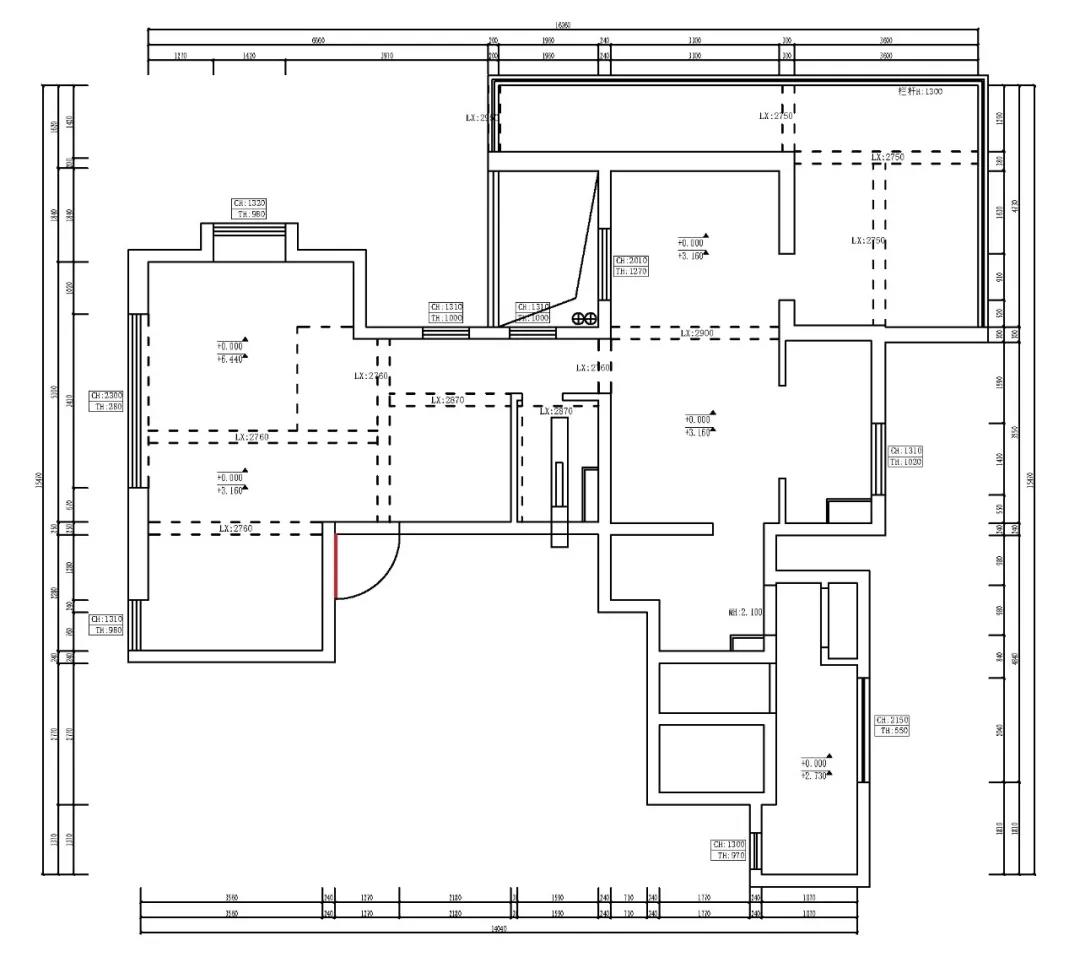
-F1- 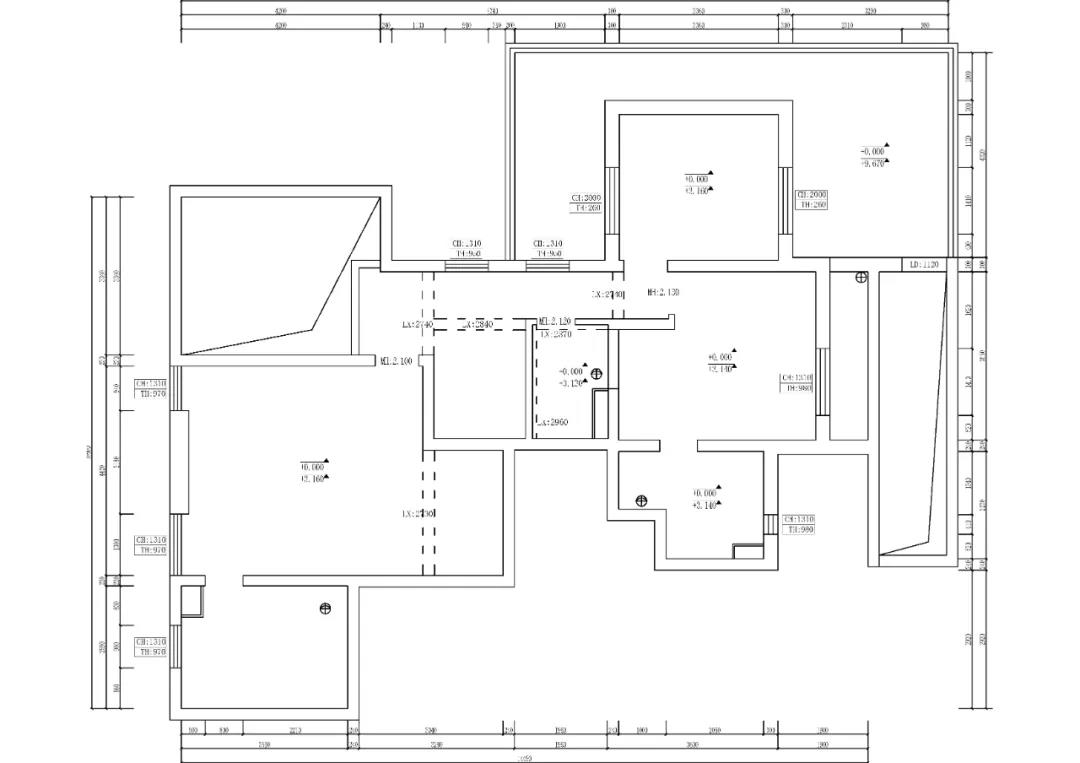
-F2- 平面布置图 Floor plan 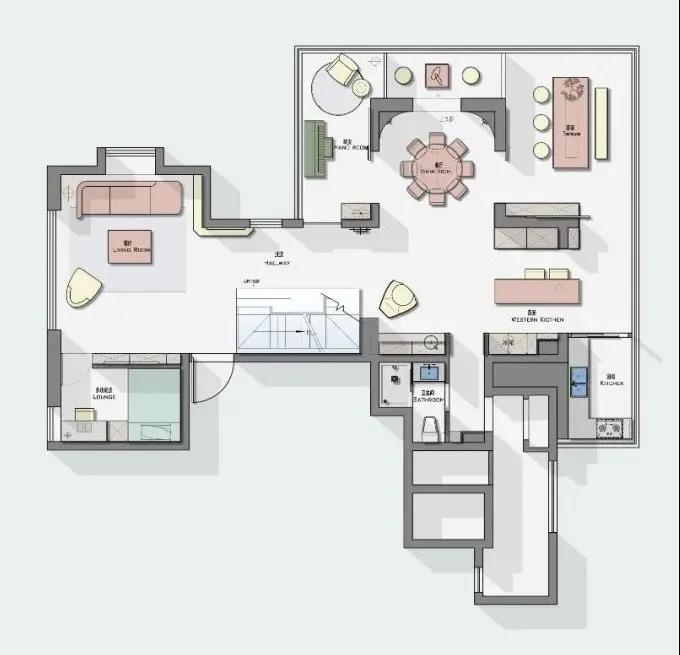
-F1- 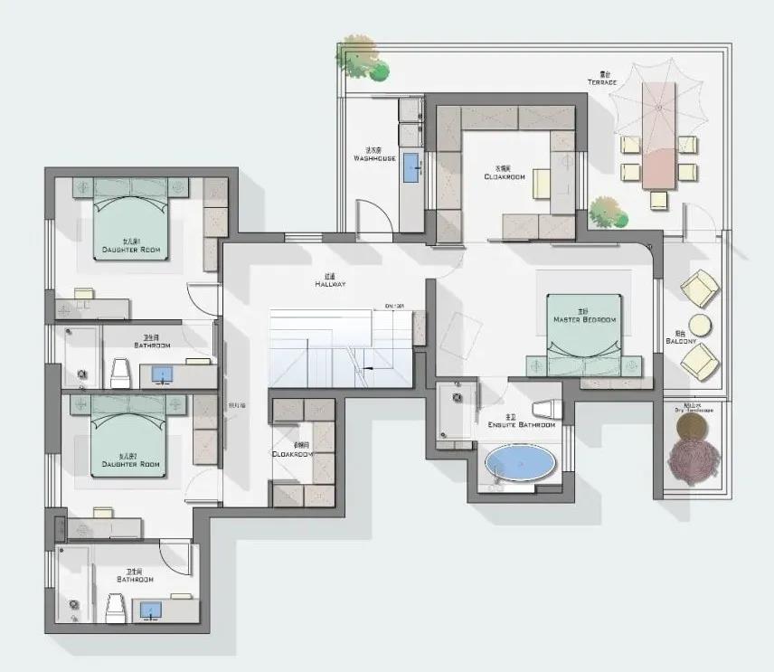
-F2- 01 #Entrance# 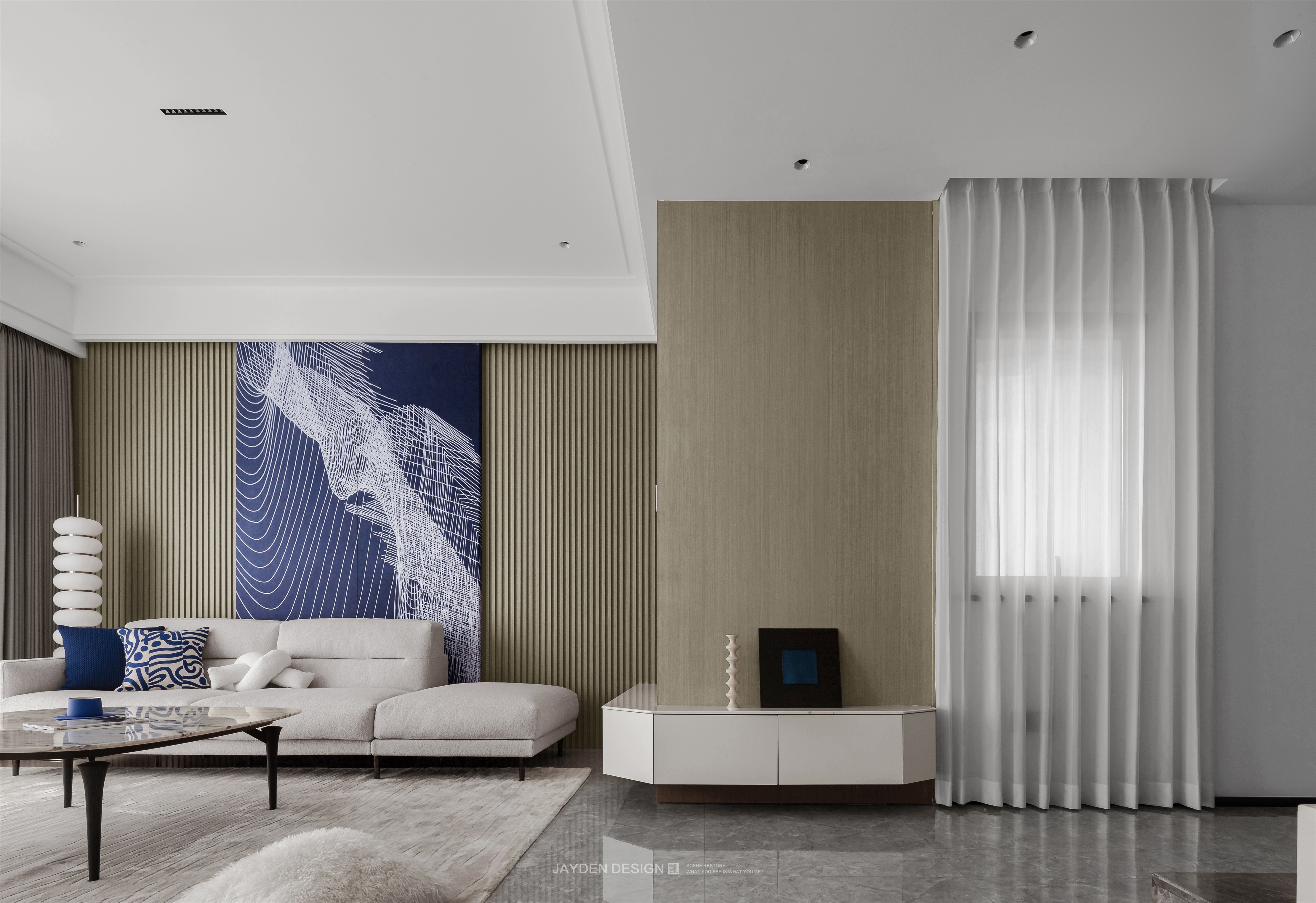
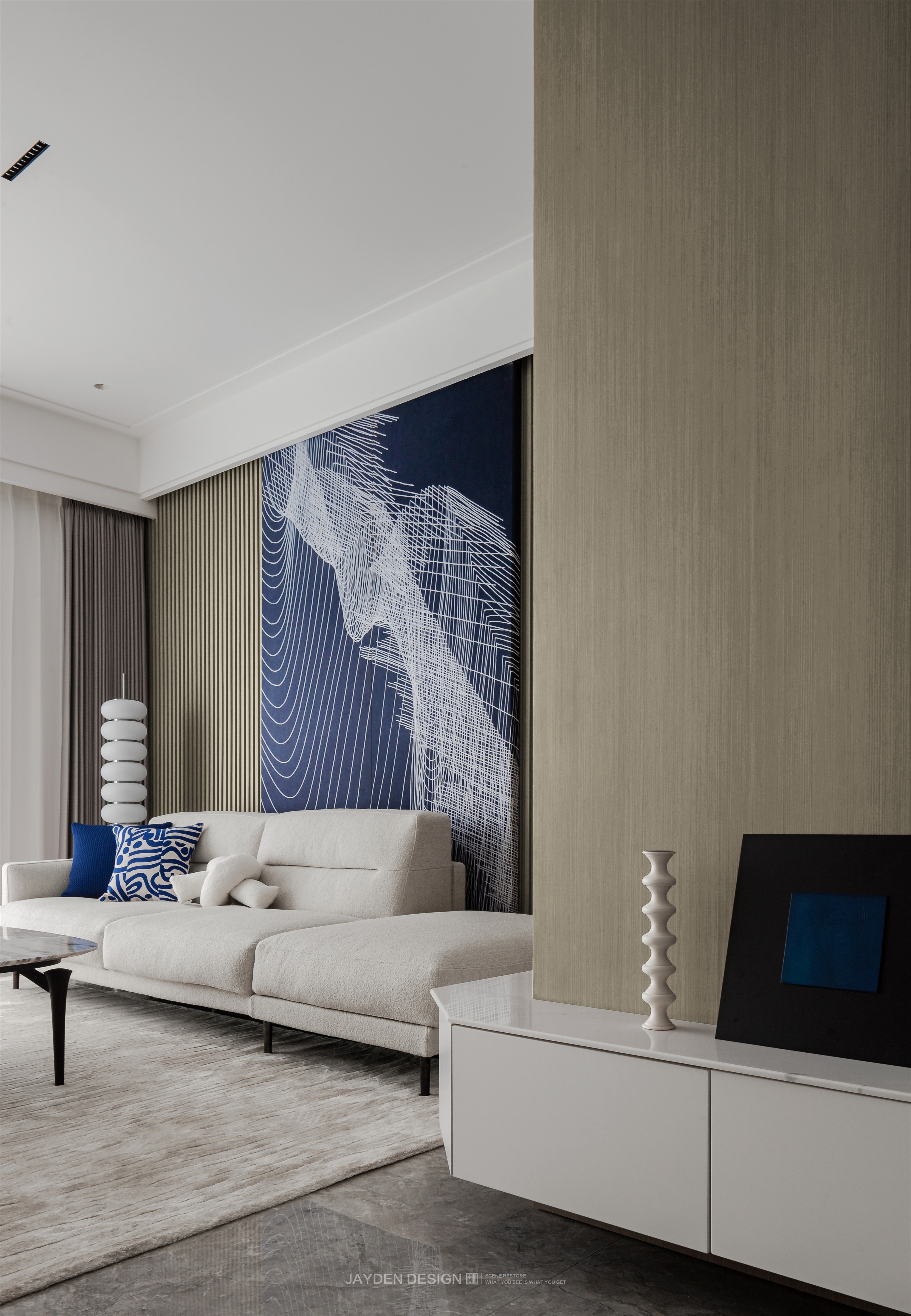
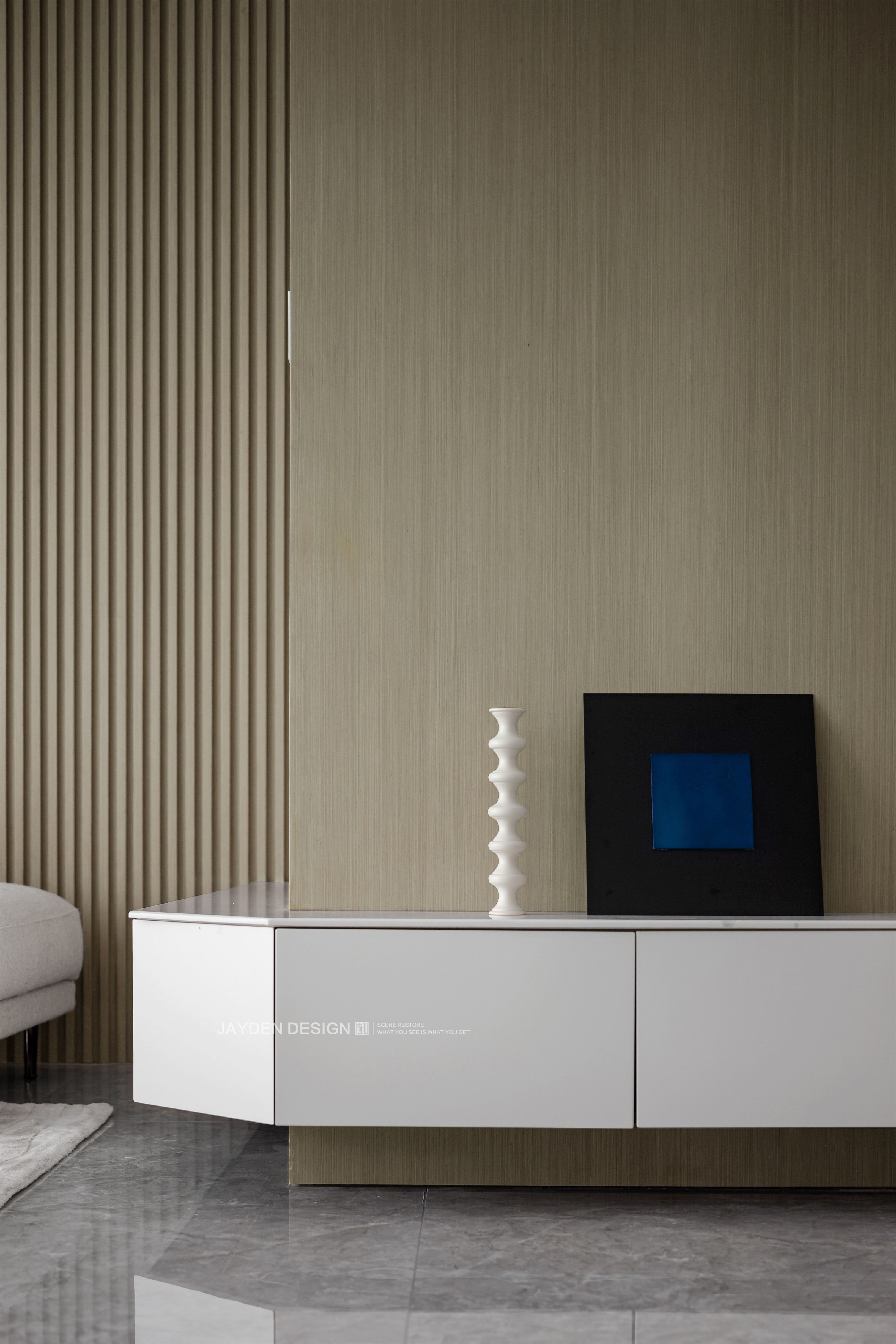
作为入户的第一视角,我们希望更多的体现空间的开阔。玄关绝非一个疏离的形式化的存在,而是要融入整个空间中,既不突兀又要有一定的视觉聚焦。我们用统一的木饰面将玄关和客厅沙发背景连接起来,仅用一组实用的白色悬挑柜赋予它展示和收纳的意义。 As the first perspective of entering the house, we hope to more reflect the openness of space. The porch is by no means a formal existence of alienation, but should be integrated into the whole space, not abrupt but also with a certain visual focus. We connect the porch with the sofa background of the living room with a unified wood finish, and only use a group of practical white cantilever cabinets to give it the meaning of display and storage. 02 #Living room# 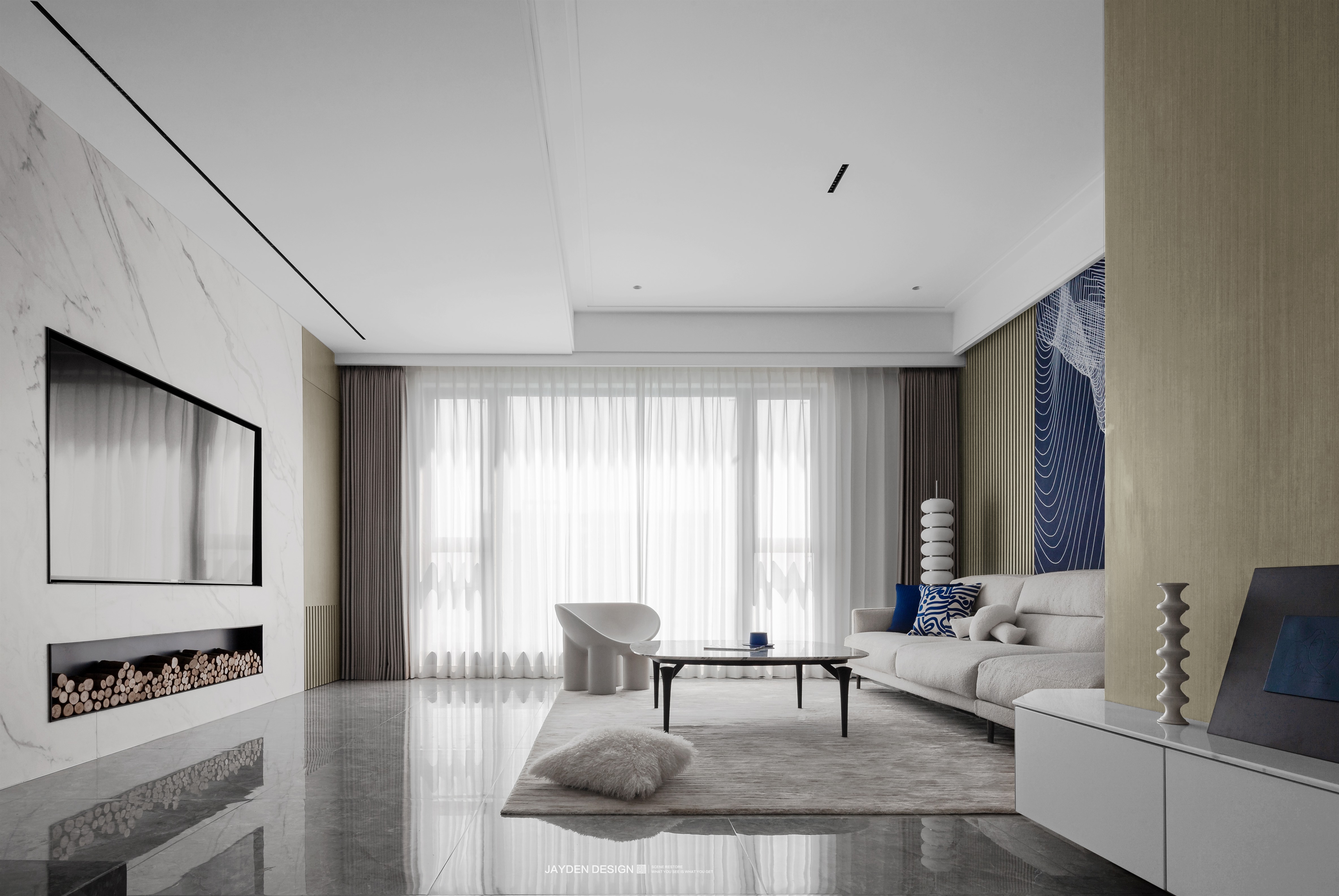
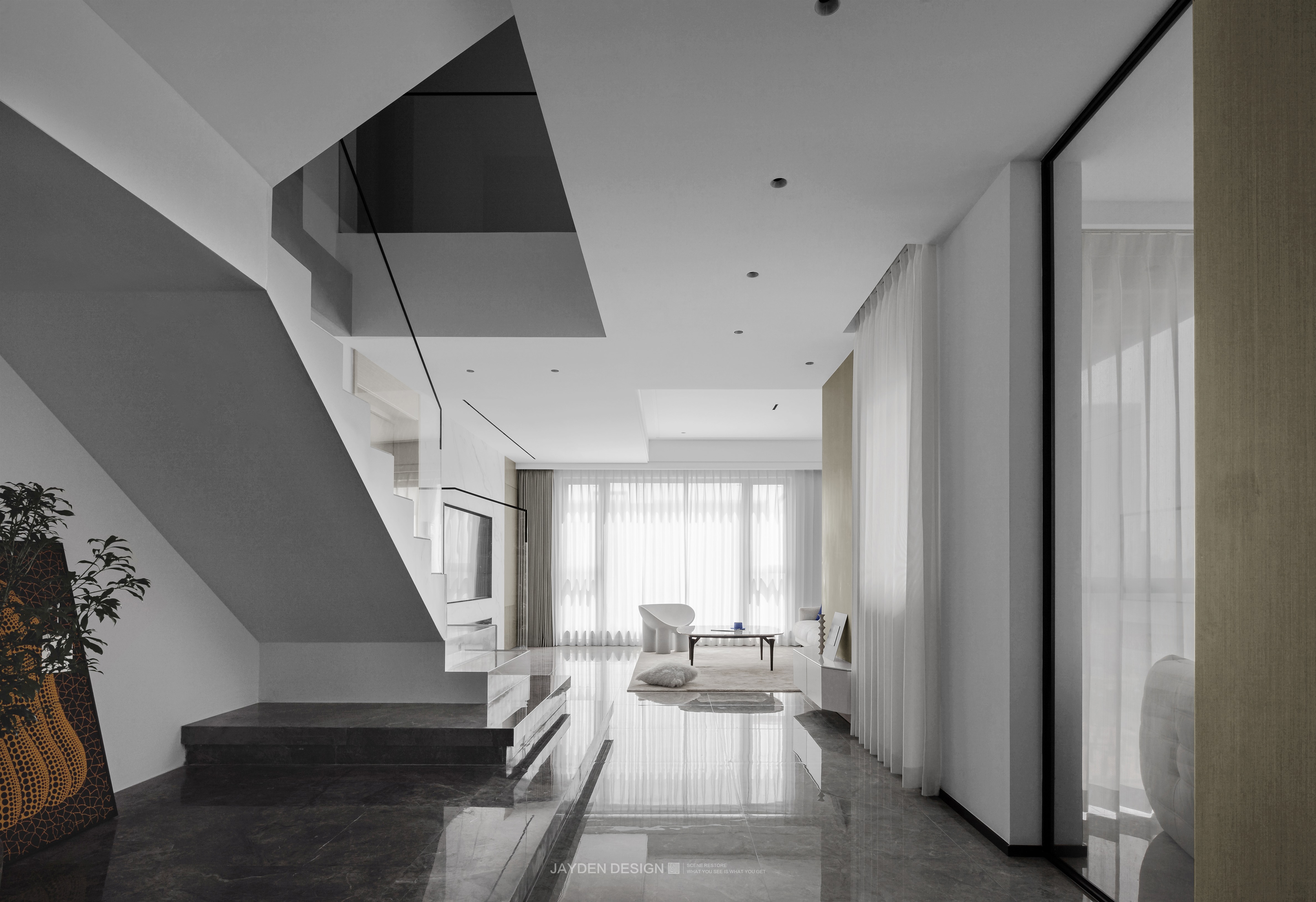
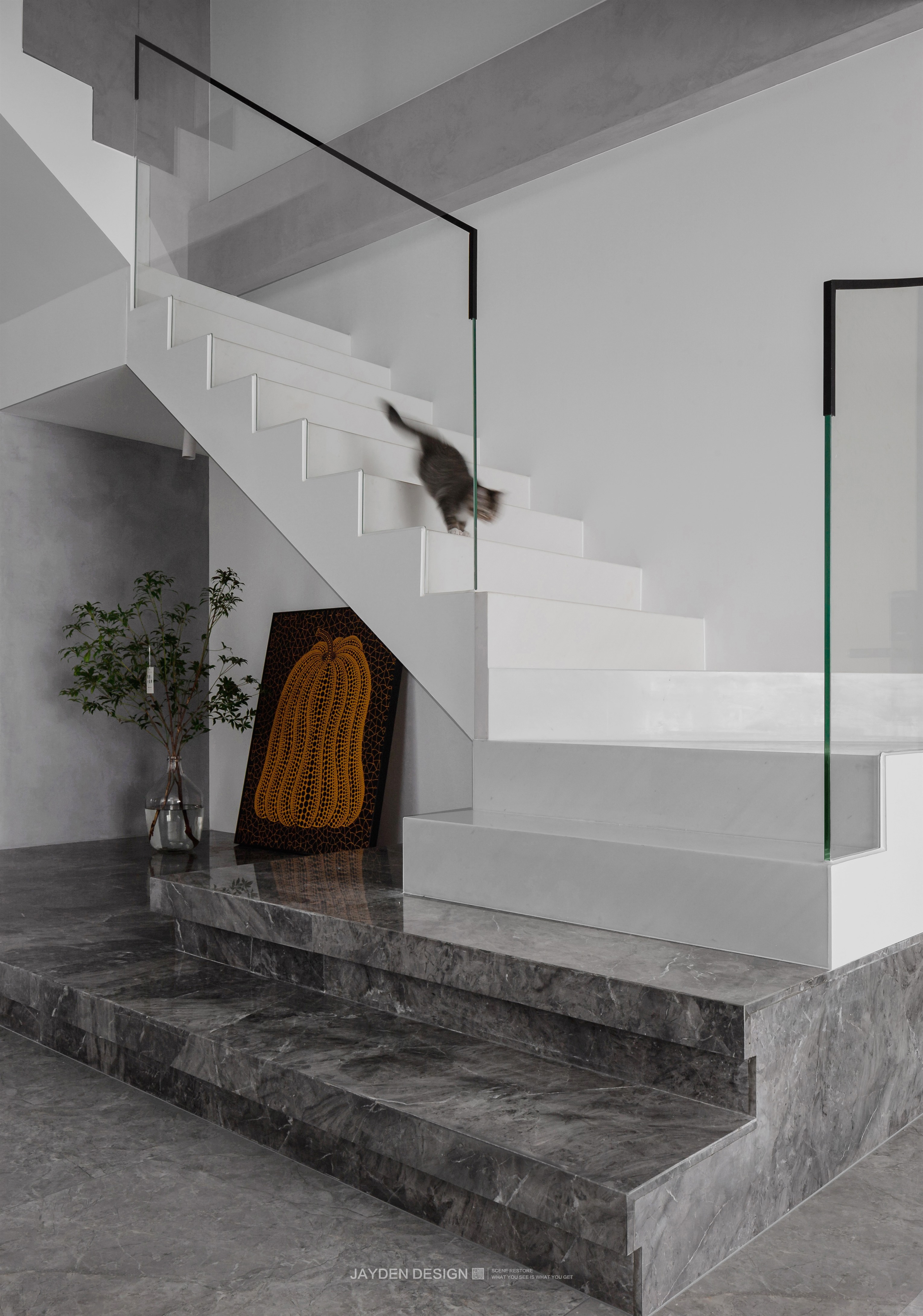
竖向的楼梯被改造成横向,将截断的两个空间打通,实现了南北的长距离贯通。楼梯主体为白色石材配以玻璃扶手,增加了视觉通透感。第一二层的楼梯踏步则选用深灰色大理石材质,整体扩展为地台的形式,和白色楼梯形成对比关系。 The vertical staircase is transformed into a horizontal one, which connects the two truncated spaces and realizes the long-distance connection between the north and the south. The main body of the stairs is white stone with glass handrails, which increases the sense of visual permeability. The stair steps on the first and second floors are made of dark gray marble, which is expanded into the form of platform as a whole, forming a {contrast with the white stairs. 硬装上大面积的纯白色调配以浅灰色地面,给人一种素净而高级的感觉,原木色的运用中和了空间的清冷。软装上使用了包容性很高的米白,比如沙发、茶几、单椅和地毯……和硬装的主基调相互呼应。 A large area of pure white color is hard installed with light gray ground, giving people a simple and advanced feeling. The use of log color neutralizes the coolness of the space. Rice white with high inclusiveness is used on soft clothes, such as sofa, tea table, single chair and carpet... Echoing the main tone of hard clothes. 沙发背景为整面的木格栅造型,一幅顶天立地的巨幅抽象艺术画分外醒目。艺术画安装于暗藏轨道内,可以左右移动,完美遮挡住了沙发后面一扇影响整体感的窗户。深邃而浪漫的克莱因蓝,和白色调和出高雅的艺术气息。 The background of the sofa is a wooden grid shape on the whole surface, and an indomitable huge abstract art painting is particularly eye-catching. The art painting is installed in the hidden track and can move left and right, perfectly shielding a window behind the sofa that affects the overall feeling. The deep and romantic Klein Blue and white blend out an elegant artistic atmosphere. 03 #Dining room# 餐厅的设计体现出外方内圆的仪式感,正圆的餐桌对应正圆形吊顶造型,弧形的立面也与之呼应。白色大理石餐桌搭配黑金相间的FLOS大吊灯,尽显低奢。休闲区、榻榻米地台和茶室,对称分布于餐厅外围。无论坐在任意位置,视野都能透过外层空间眺望到窗外美景,并享受到来自不同角度的自然采光。同时,多功能区的有趣穿插分布,也为家人日常生活带来更多互动性。 The design of the restaurant reflects the sense of ceremony outside and inside. The round dining table corresponds to the shape of the round ceiling, and the arc facade also echoes it. White marble dining table with black and gold Flos chandeliers shows low luxury. The leisure area, tatami terrace and teahouse are symmetrically distributed outside the restaurant. No matter where you sit, you can see the beautiful scenery outside the window through the outer space and enjoy the natural lighting from different angles. At the same time, the interesting interspersed distribution of the multi-functional area also brings more} interaction to the daily life of the family. 04 #Kitchen# 西厨空间标配2.5米长的大岛台,左右分别是一组顶天立地的电器高柜和收纳柜。收纳柜内嵌双开门冰箱,全部采用门板封闭,显得整洁而统一。电器高柜则整合了蒸烤箱、酒柜和收纳空间,酒柜采用高级感十足的黑玻,暖黄的灯光透过玻璃器皿折射在黑玻上,混合了美酒的微醺,氛围随即拉满。 The western kitchen space is equipped with a 2.5-meter-long island platform as standard, and a group of towering electrical high cabinets and storage cabinets are respectively on the left and right. The storage cabinet is embedded with a double door refrigerator, all closed by door panels, which looks neat and unified. The electric high cabinet integrates the steaming oven, wine cabinet and storage space. The wine cabinet adopts high-grade black glass. The warm yellow light is refracted on the black glass through the glassware, mixing the slight intoxication of good wine, and the atmosphere is filled immediately. 一间拥有整面落地窗的厨房,和自然无缝衔接,这种体验感实在妙不可言。大L型操作台面和宽敞的开间,即使多人同时操作,也游刃有余。暖灰色下柜和象牙白上柜这种下深上浅的搭配,让吊柜更显轻盈。 A kitchen with full floor to ceiling windows seamlessly connects with nature, which is a wonderful experience. Large L-shaped operating table and spacious Bay make it easy for many people to operate at the same time. The combination of warm gray lower cabinet and ivory upper cabinet makes the hanging cabinet more light. 05 #Tearoom# 我们给这间空中茶室取名为“云庐”。茶室位于餐厅一侧,和餐厅之间用玻璃移门和水晶砖加以分隔,让光线可以更多面的投射进来。风格上并没有走传统中式路线,我们并不愿去人为符号化空间,而是把每个空间做得足够舒适与和谐,通过软性的例如绿植、茶具等摆件来定义出空间该有的属性。 We named this air teahouse "Yunlu". The teahouse is located on the side of the restaurant, which is separated from the restaurant by glass sliding door and crystal brick, so that the light can be projected in more aspects. We don't follow the traditional Chinese line in style. We don't want to go to artificial symbolic space, but make each space comfortable and harmonious enough to define the attributes of space through soft ornaments such as green plants and tea sets. 06 #Bedroom# 主卧位于二层,拥有独立衣帽间和卫生间。针对睡眠区,我们的原则是尽量做减法,大面积留白结合局部木饰面和艺术涂料的使用,营造一种宁静放松的休憩氛围。床对面的一面白墙是特意预留给投影的位置,夜晚卧室里的观影体验还是非常棒的。衣帽间则结合了梳妆和办公的功能,连同飘窗区域进行整体定制,具有很好的统一性,空间的利用率也达到最高。 The master bedroom is located on the second floor, with independent cloakroom and toilet. For the sleeping area, our principle is to subtract as much as possible, leave a large area of blank space, and combine the use of local wood finishes and artistic coatings to create a quiet and relaxing atmosphere. The white wall opposite the bed is specially reserved for projection. The viewing experience in the bedroom at night is still very good. The cloakroom combines the functions of dressing and office, and carries out overall customization together with the bay window area, which has good unity and the highest utilization rate of space. 07 #Stairway# 楼梯连接多个层面,往往是室内设计的重点,本案里楼梯的设计体现了现代极简的设计理念,力求用简练的直线条表达结构原本的美感。立面以大面积留白的处理手法结合展示架,配以极窄线条灯、壁灯等光源来烘托气氛。 Stairs connect multiple levels, which is often the focus of interior design. In this case, the design of stairs reflects the modern minimalist design concept, and strives to use concise straight lines to express the original beauty of the structure. The facade is treated with a large area of white space, combined with the display rack, and equipped with extremely narrow line lamps, wall lamps and other light sources to set off the atmosphere. -end- |
精华推荐
换一换
 收藏
收藏  说两句
说两句 


悬空柜是怎么固定的