|
非设计装饰空间,而是依托空间呈现设计。 Not design decoration space, but relying on the space to present the design. 
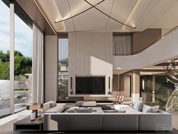
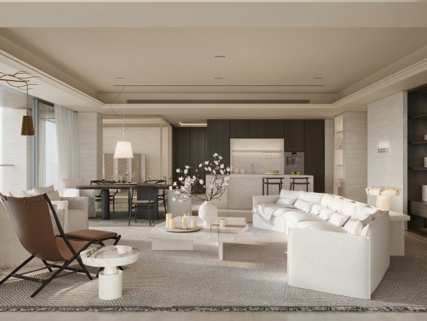
Living room / 客厅 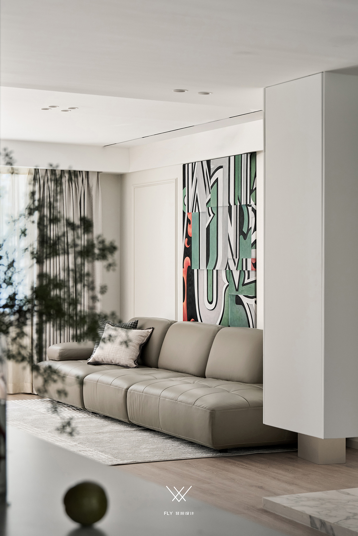
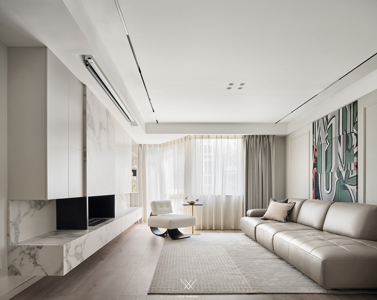
在以空间互动的前提下拒绝不必要的空间串联,松弛有度有收有放,改而择优的功能利用,纳入与客厅所邻阳台,非一板一眼的面也给空间带来更多的可观性。 Refuse unnecessary space series connection on the basis of space interaction, flabby have degree have close have put, change and use for more optimized function, bring into adjacent balcony with sitting room place, irregular face also brings more considerable sex to the space. 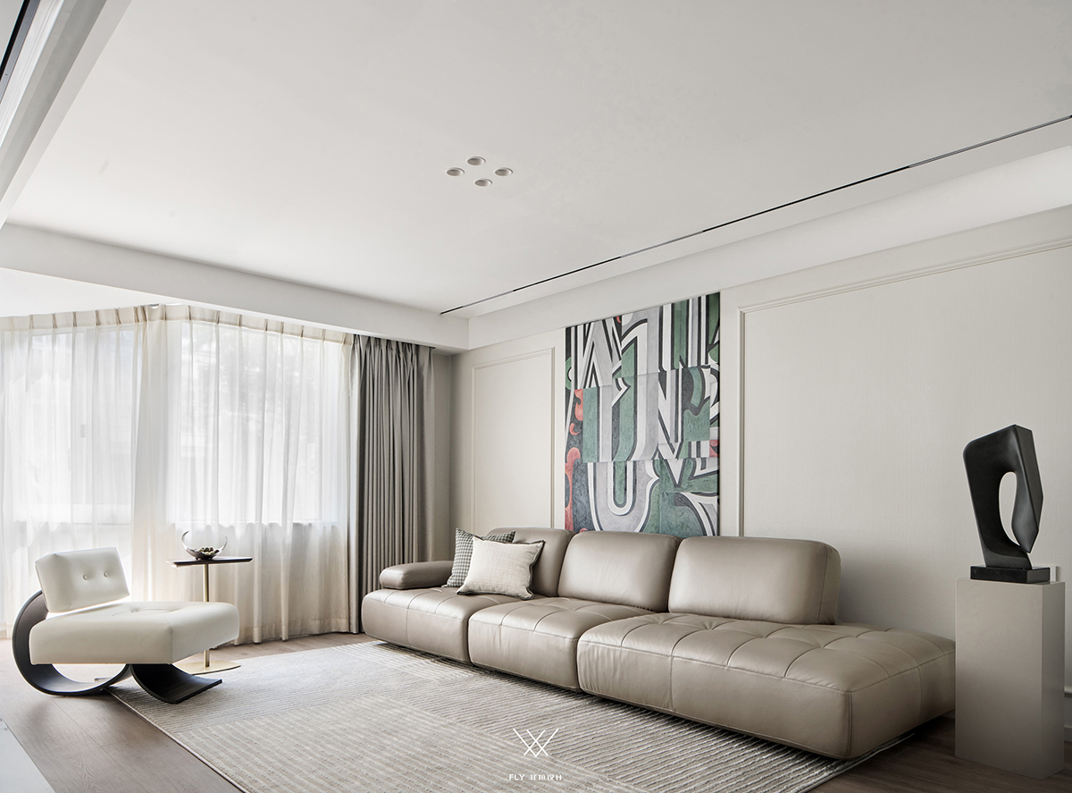
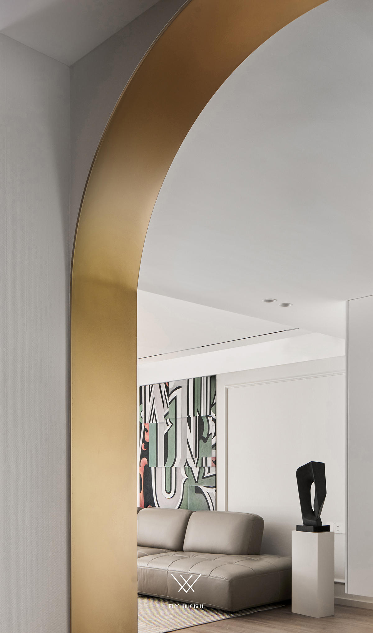
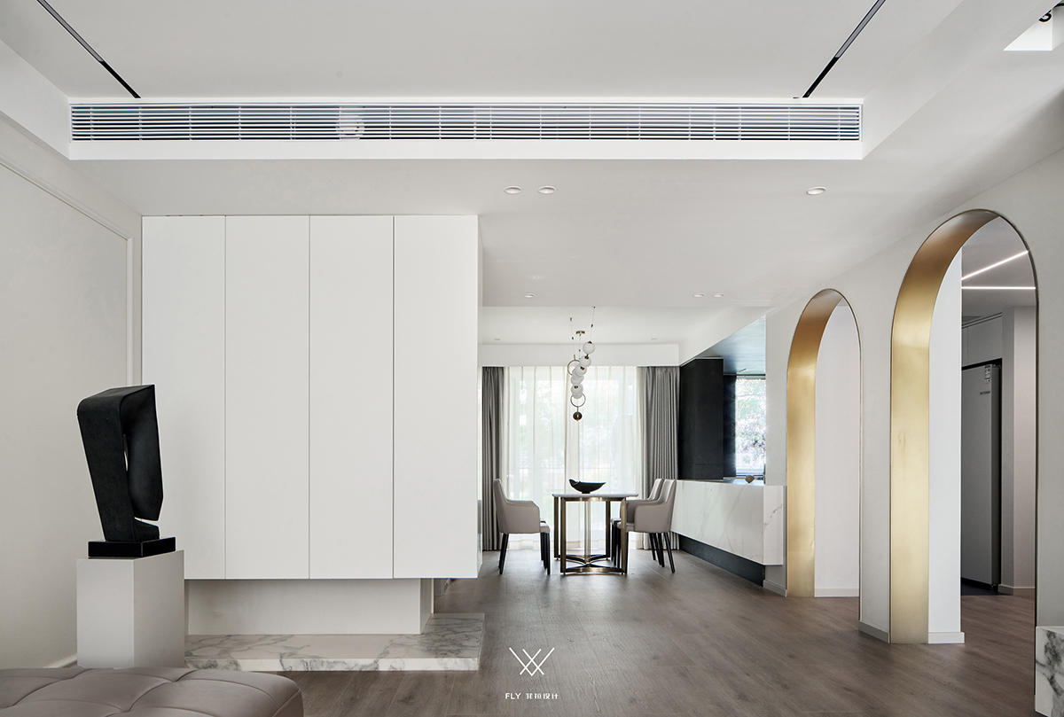
看似因美感而出彩的双拱形门造型,实则是空间整合与设计碰撞的火花,双拱门是务实之形式,是形式之美学。 Look like the double arch door modelling that gives color because of aesthetic feeling, actually is the spark of space optimization and design collision, double arch is practical form, is the aesthetics of form. 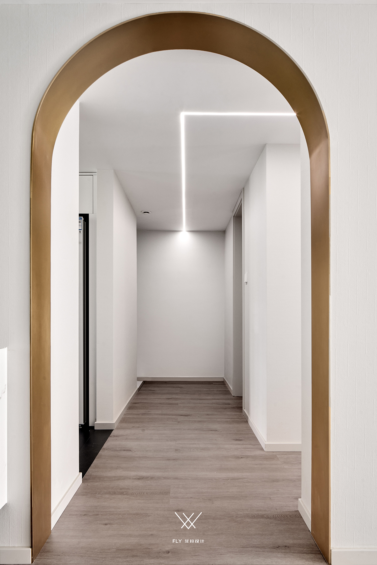
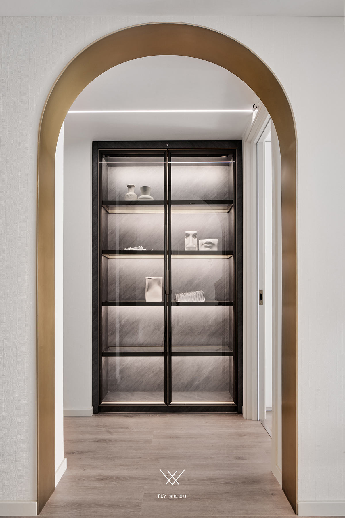
美在这里不只是虚无的表达,基于户型本身所带阻碍而来的掩饰,它的外在表现便存在更多的意义。 The United States is here not just the expression of nihilism, be based on door model itself place to take hinder and come cover up, its external expression has more meaning. 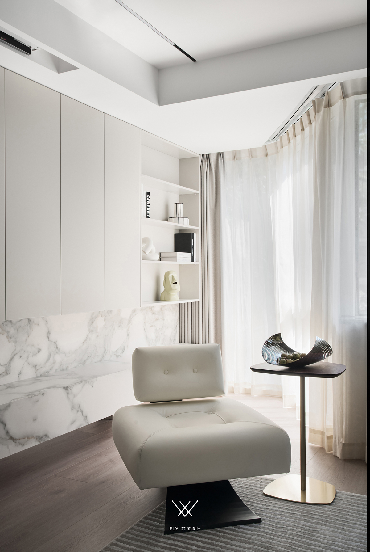
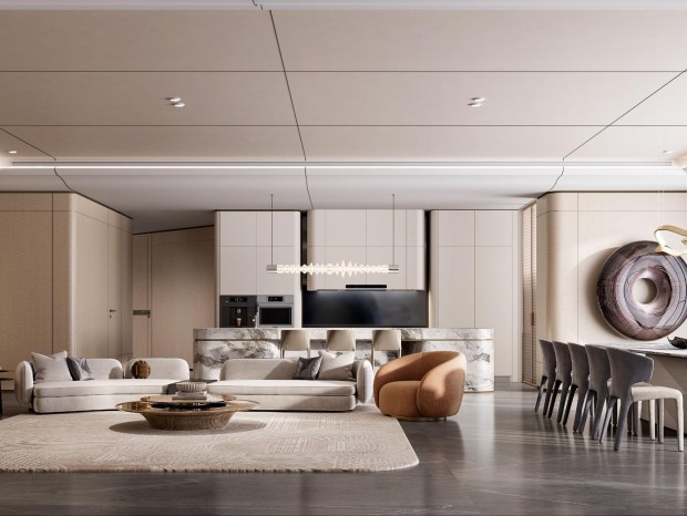
Restaurant&Kitchen\ 餐厨区 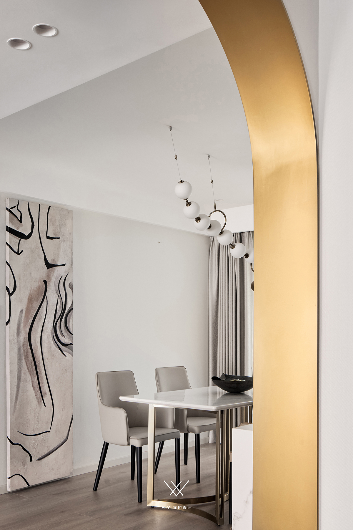
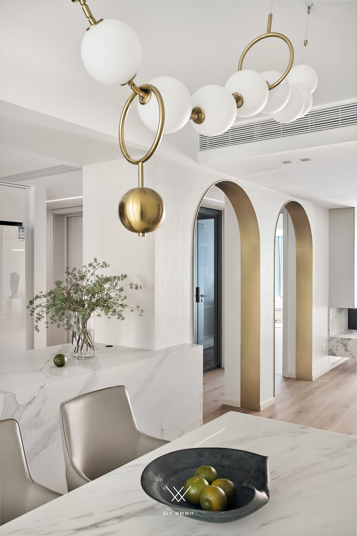
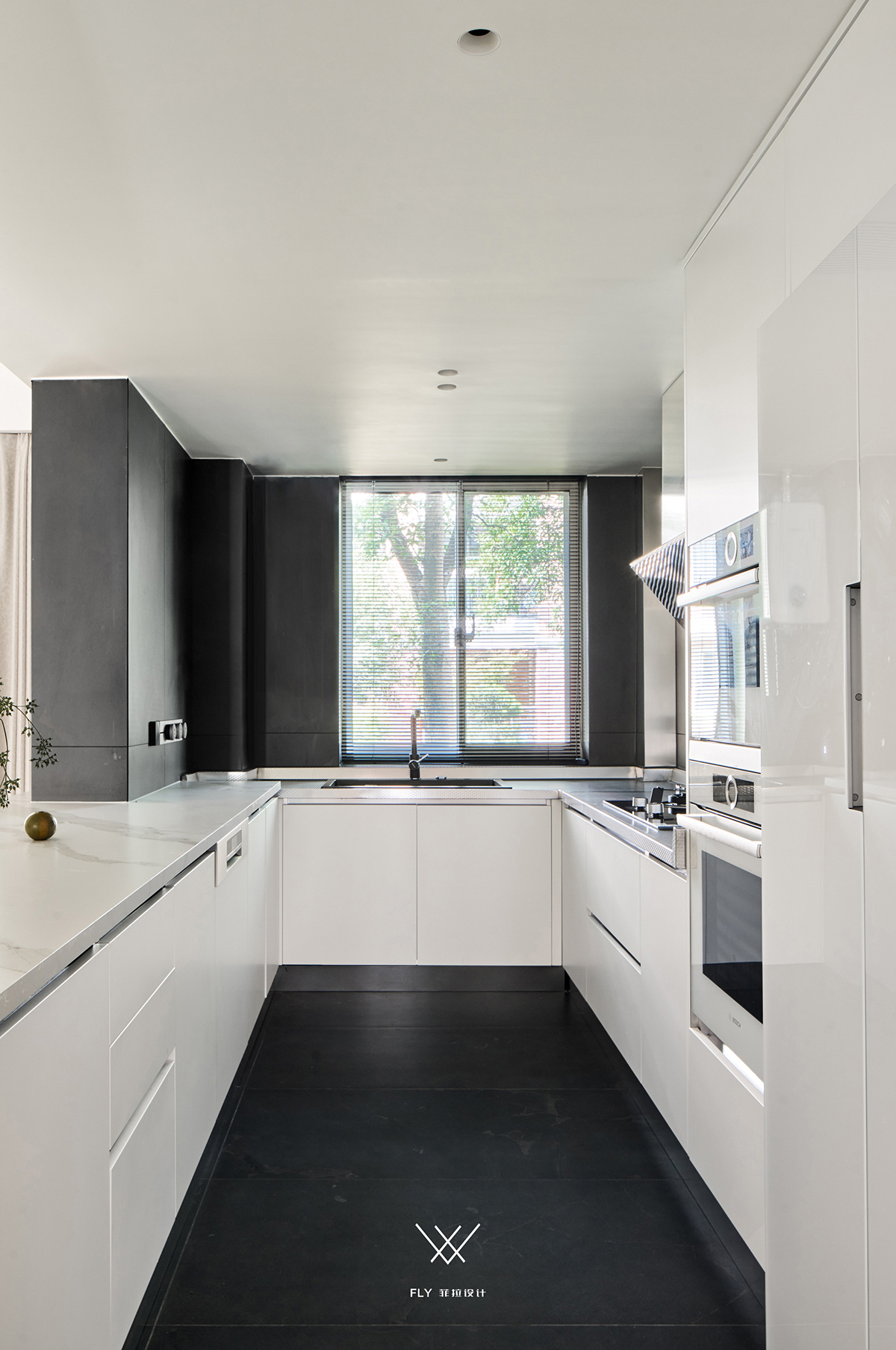
厨房入口转而由餐厅改至走廊内,入口动线的变动便是极尽可能开发可取空间,且让贤于餐厨的互动。 Kitchen entrance changes to corridor inside by dining-room instead, the alter of entrance moving line is extremely as far as possible development desirable space, let xian for eat hutch interaction at the same time. 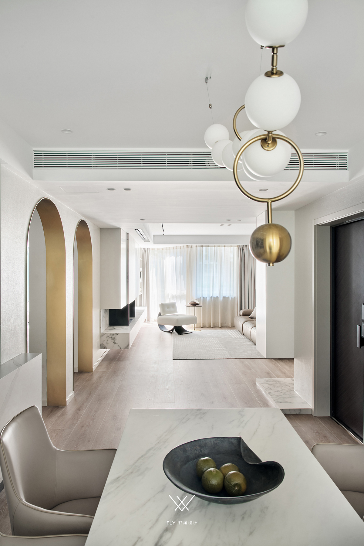
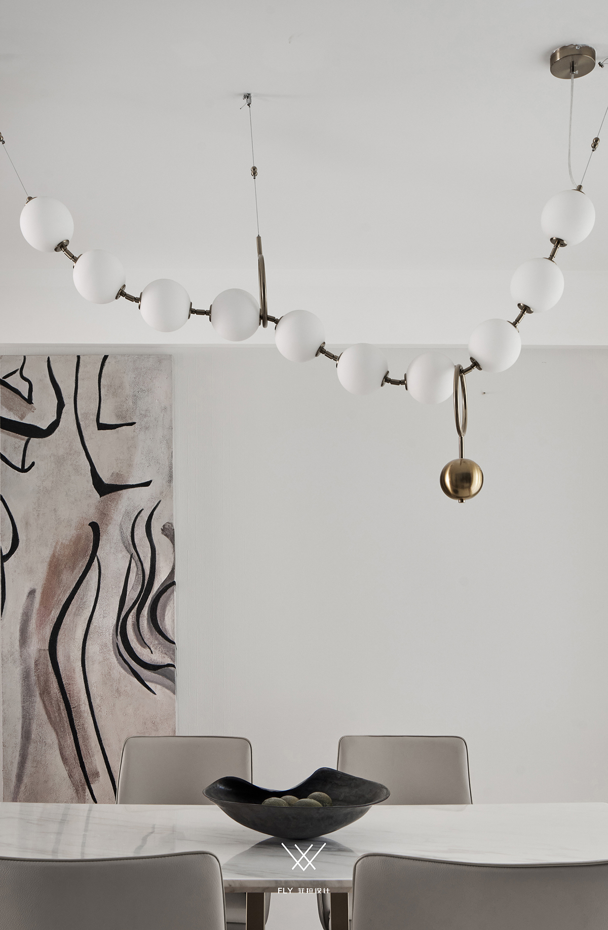
画作、灯具依据不同的呈现形体, 结合三维概念优化空间视觉层次,丰富内容多样性。 Paintings, lamps and lanterns are based on different forms, and combined with three-dimensional concepts to enrich the spatial visual level, as well as the diversity of content. 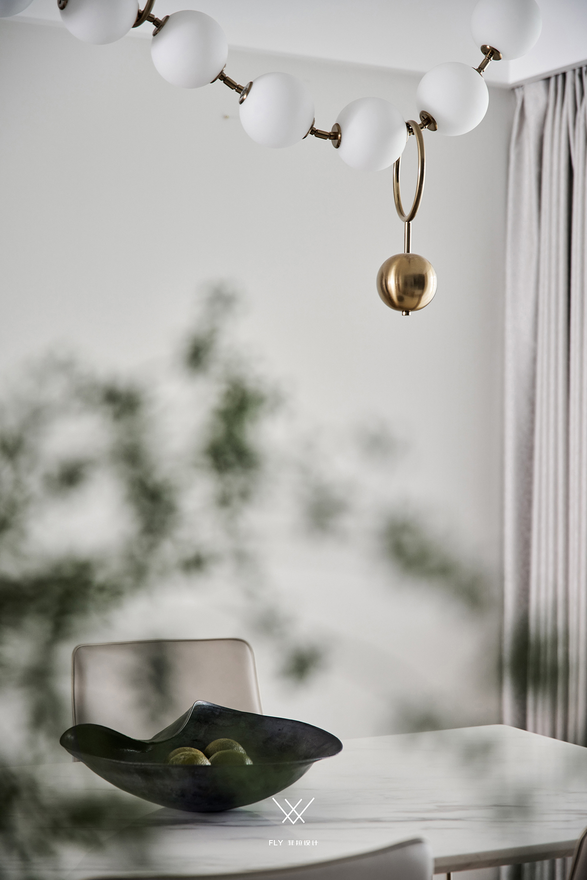

Master bedroom / 主卧 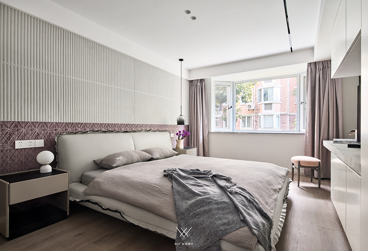
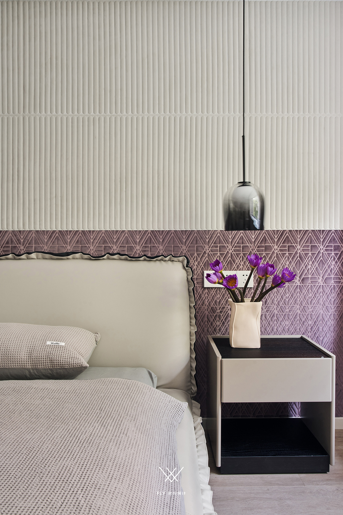
绒布壁纸拼接式半裙处理,色调 肌理结合适宜的比例结构,材质上的舒适与视觉上的温柔共为增色。 Flannelette wallpaper splicing type half skirt processing, tonal texture to grasp modelling proportion structure, the comfort on material and the gentlness on vision add color altogether. 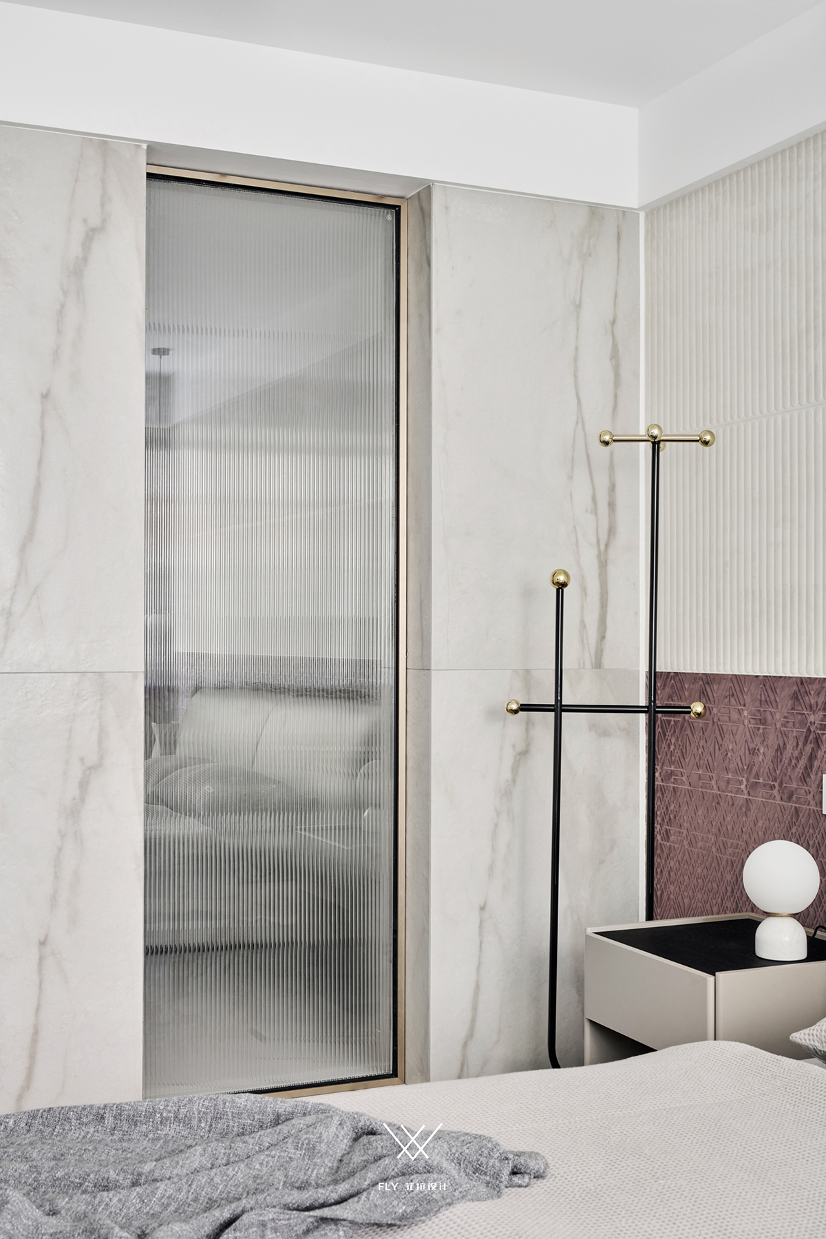
Children room / 儿童房 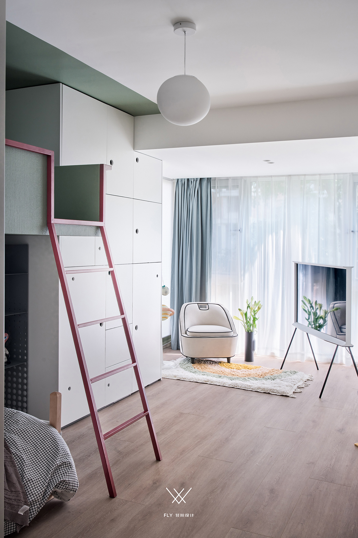
豆绿、暗红活跃孩童空间,恰好的烂漫色彩搭配水蓝色窗帘,阳光折射出氤氲的梦幻美好。 Bean green, dark red active child space, just brilliant color collocation water blue window screen, sunshine refraction gives dense dream is beautiful. 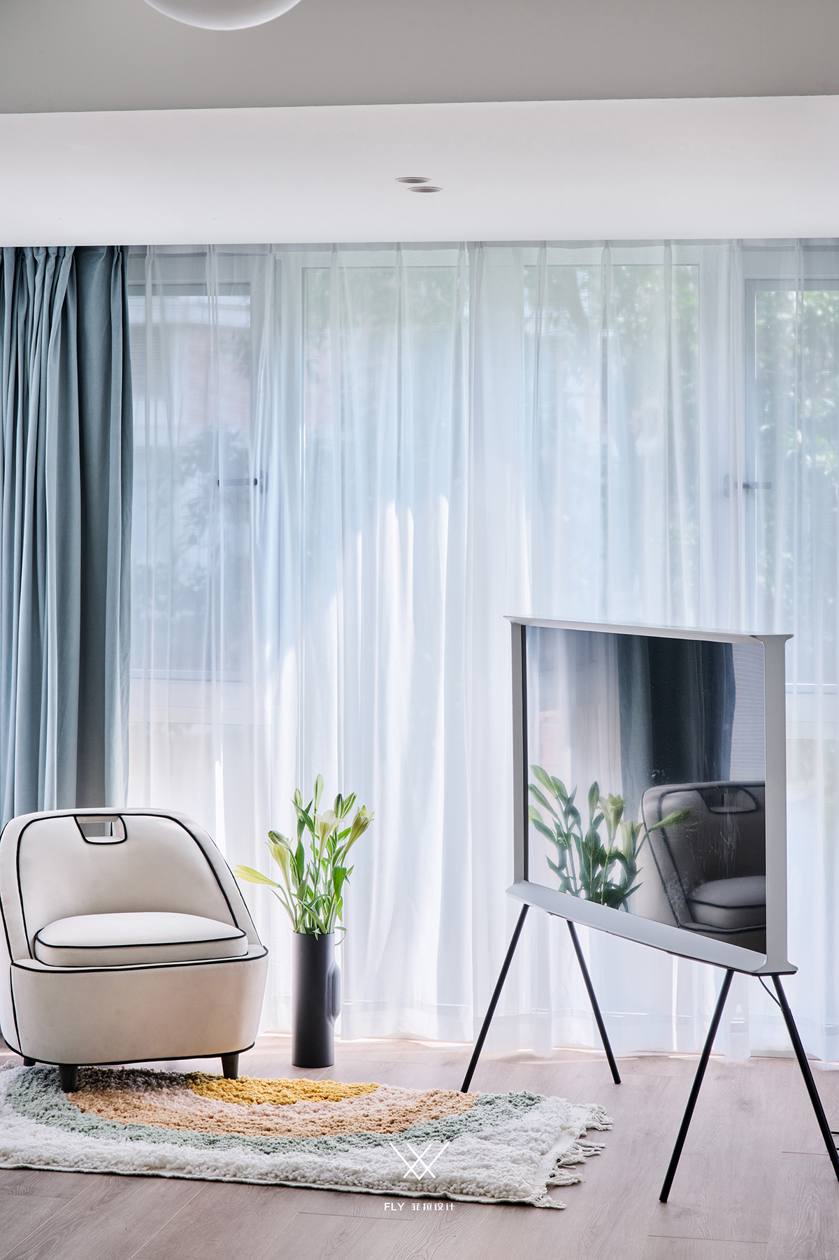
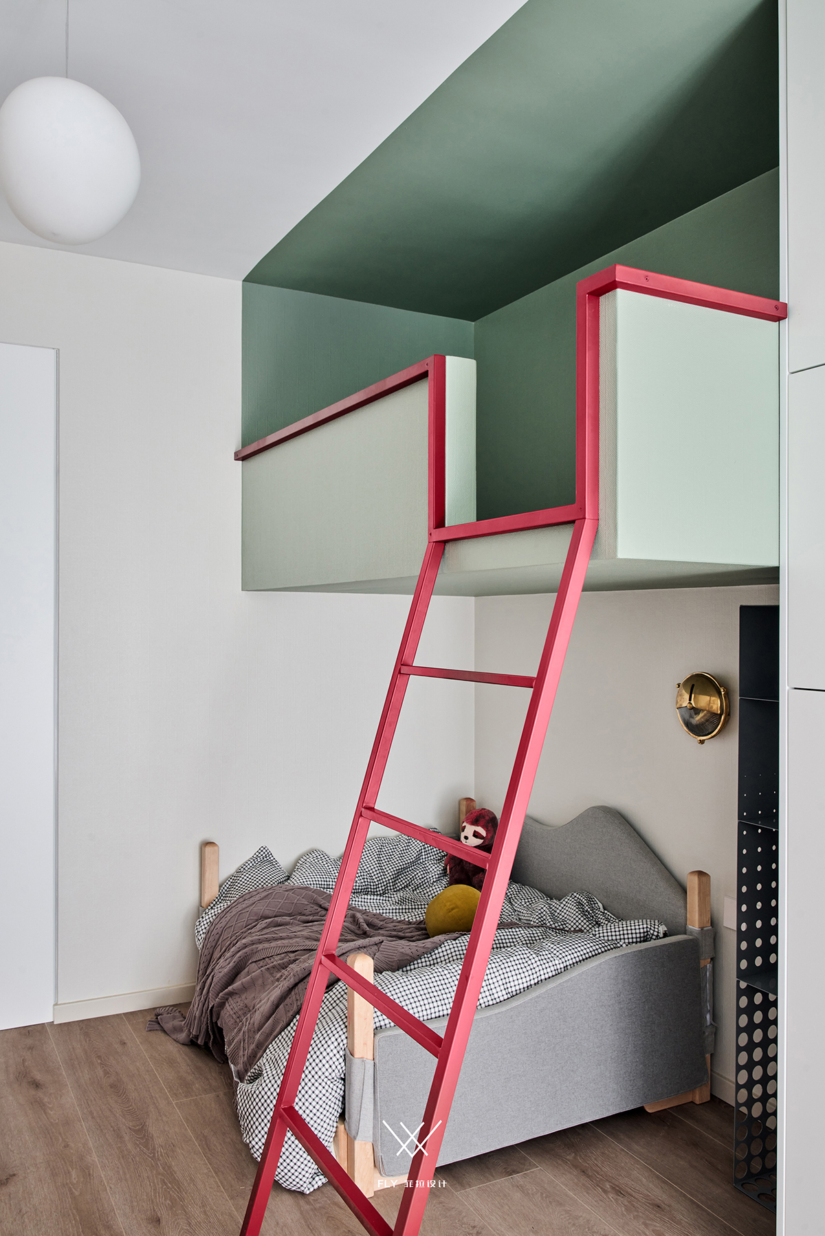
上铺所邻三墙浸色,与床体形成围势空间做到有呼有应, 有所依,有所联动,有所观之趣味。 The three walls adjacent to the upper shop are immersed in color, forming a surrounding space with the bed body to achieve the call and response.Have to depend on, have linkage, have the interest of view. 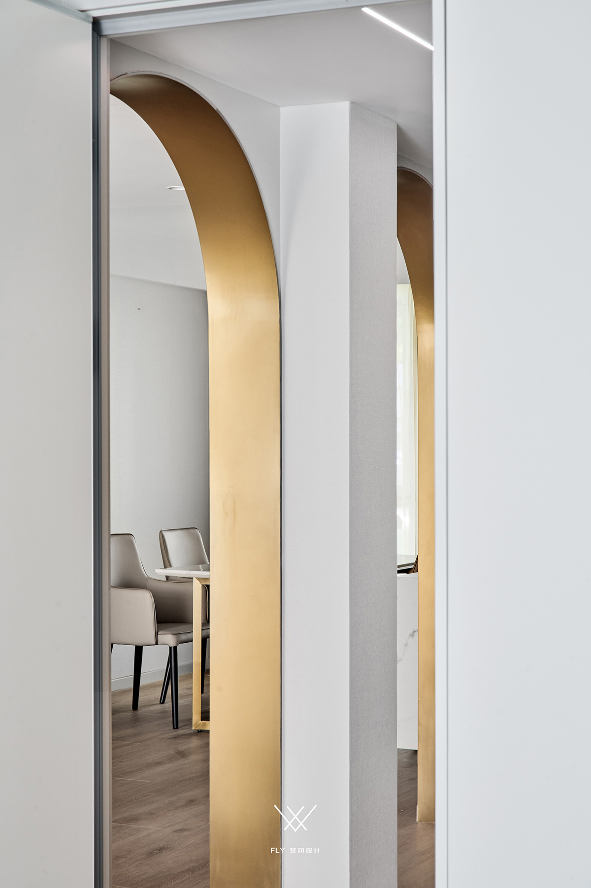
Master bathroom / 主卫 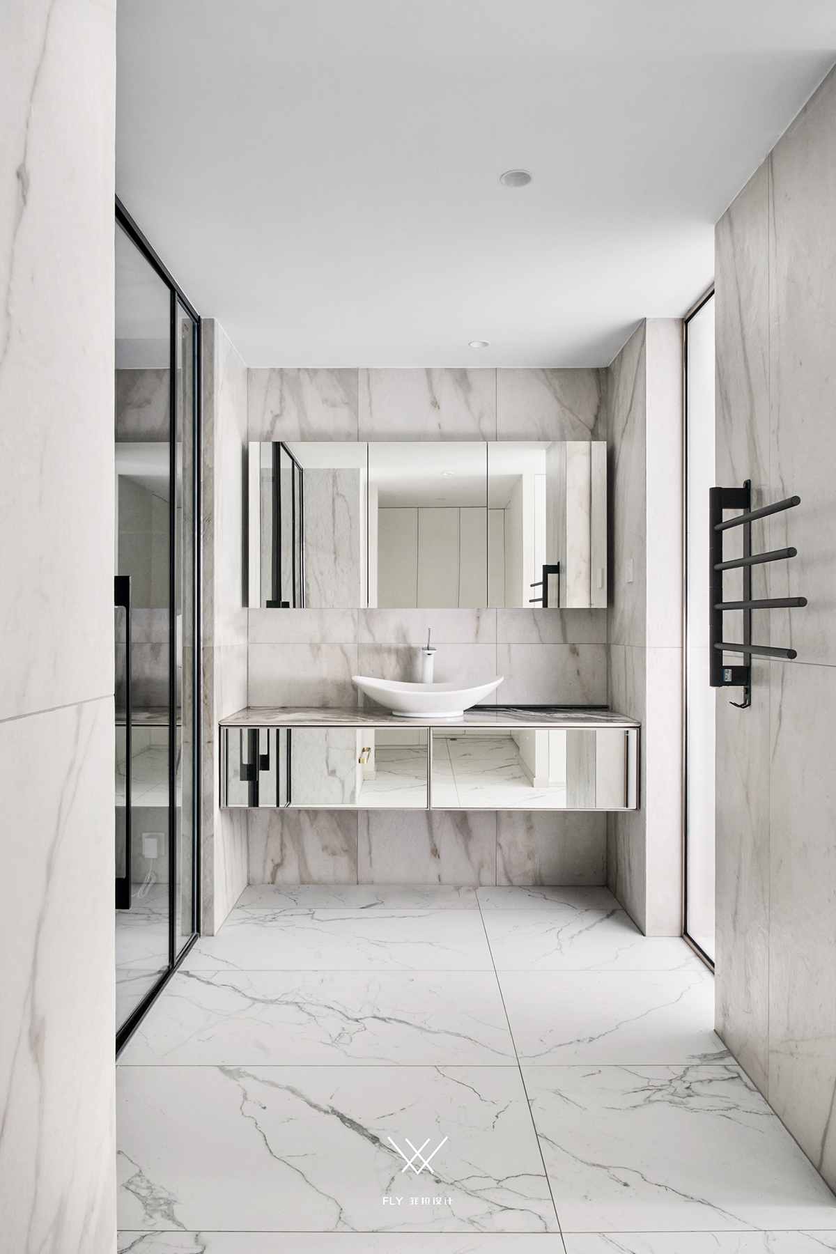
自立不自独,是乃为计之巧。 It is a clever trick to stand on one's own, not single. 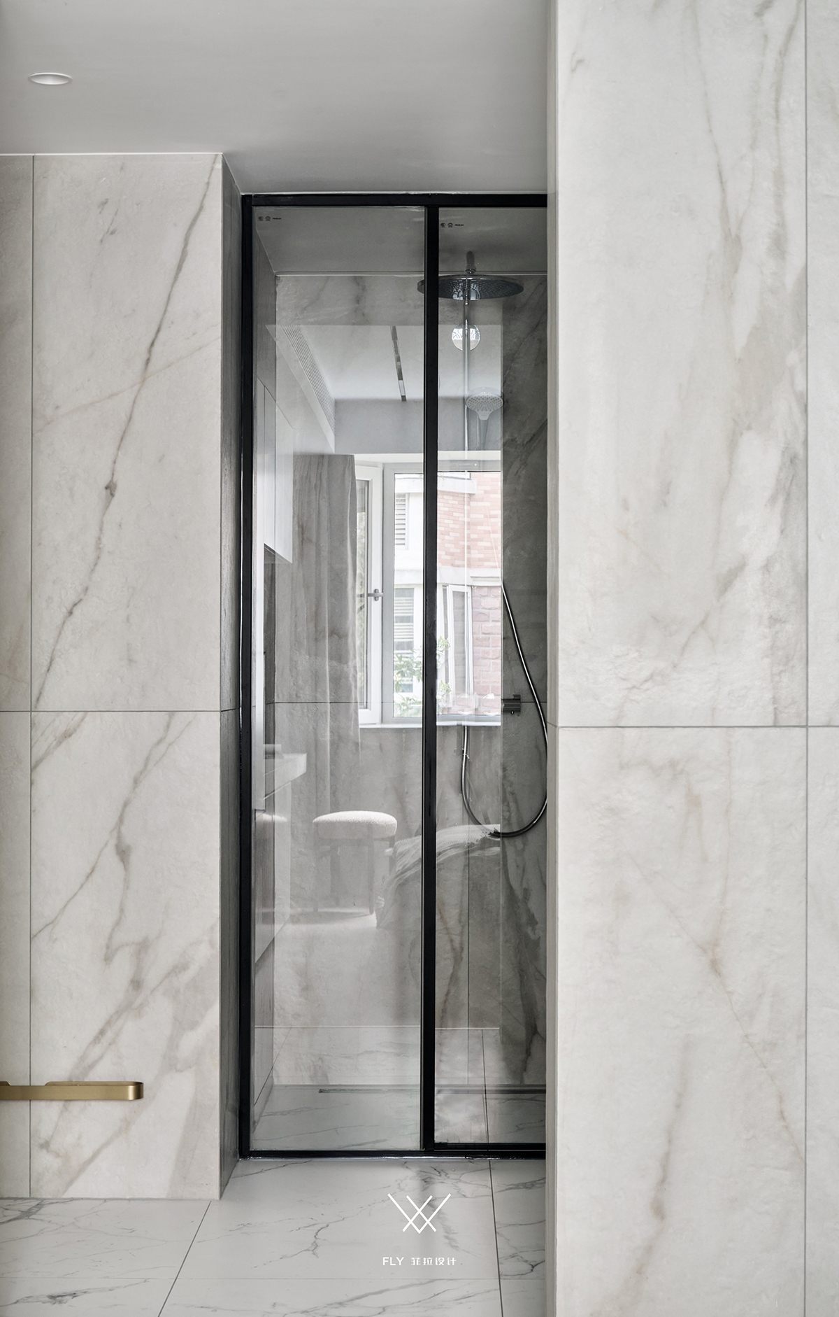
Second bathroom / 次卫 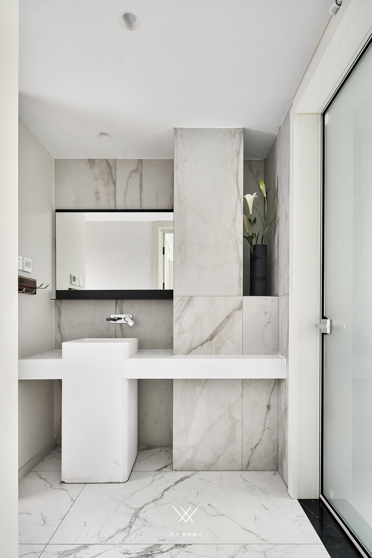
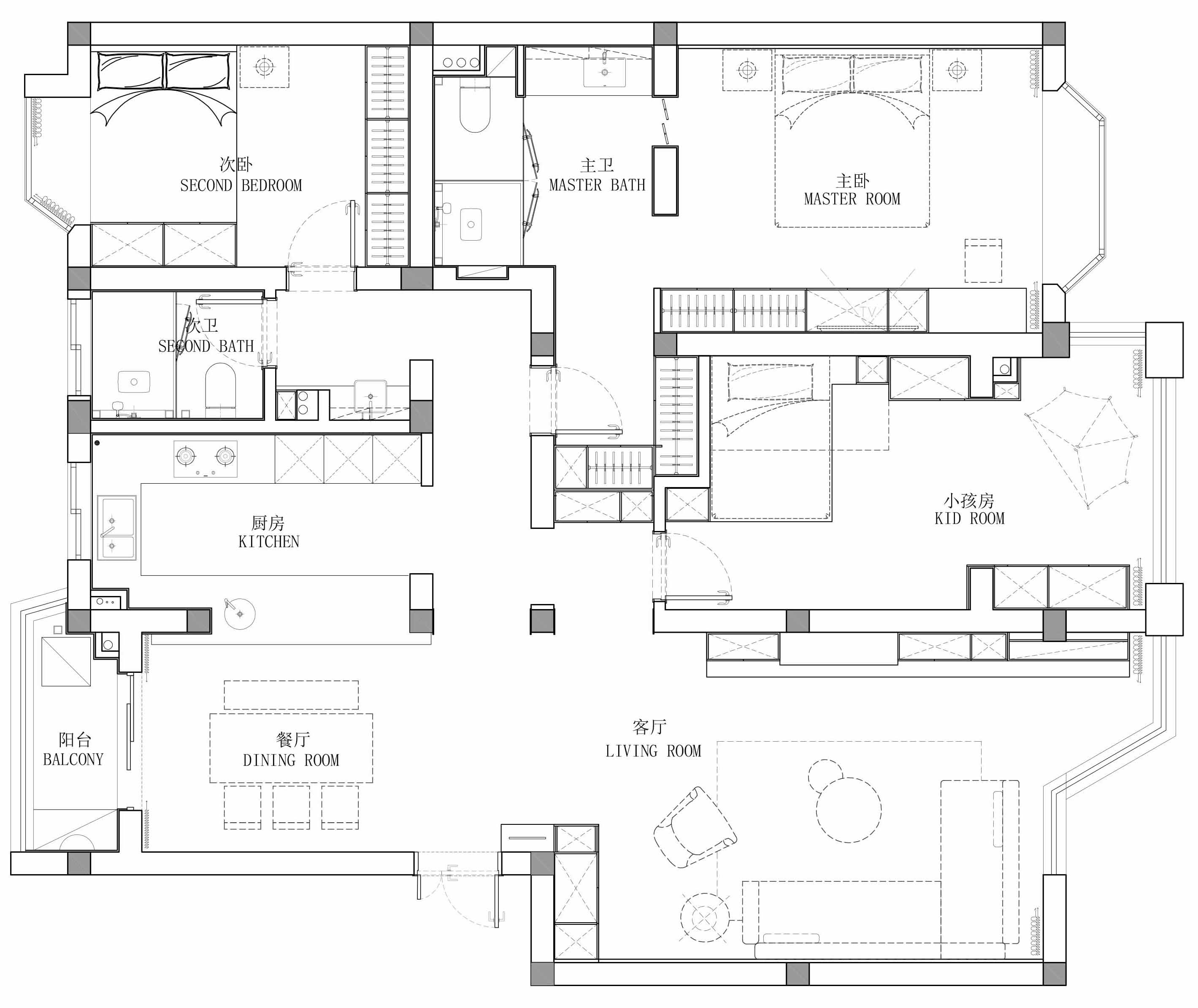
原始结构&平面设计图 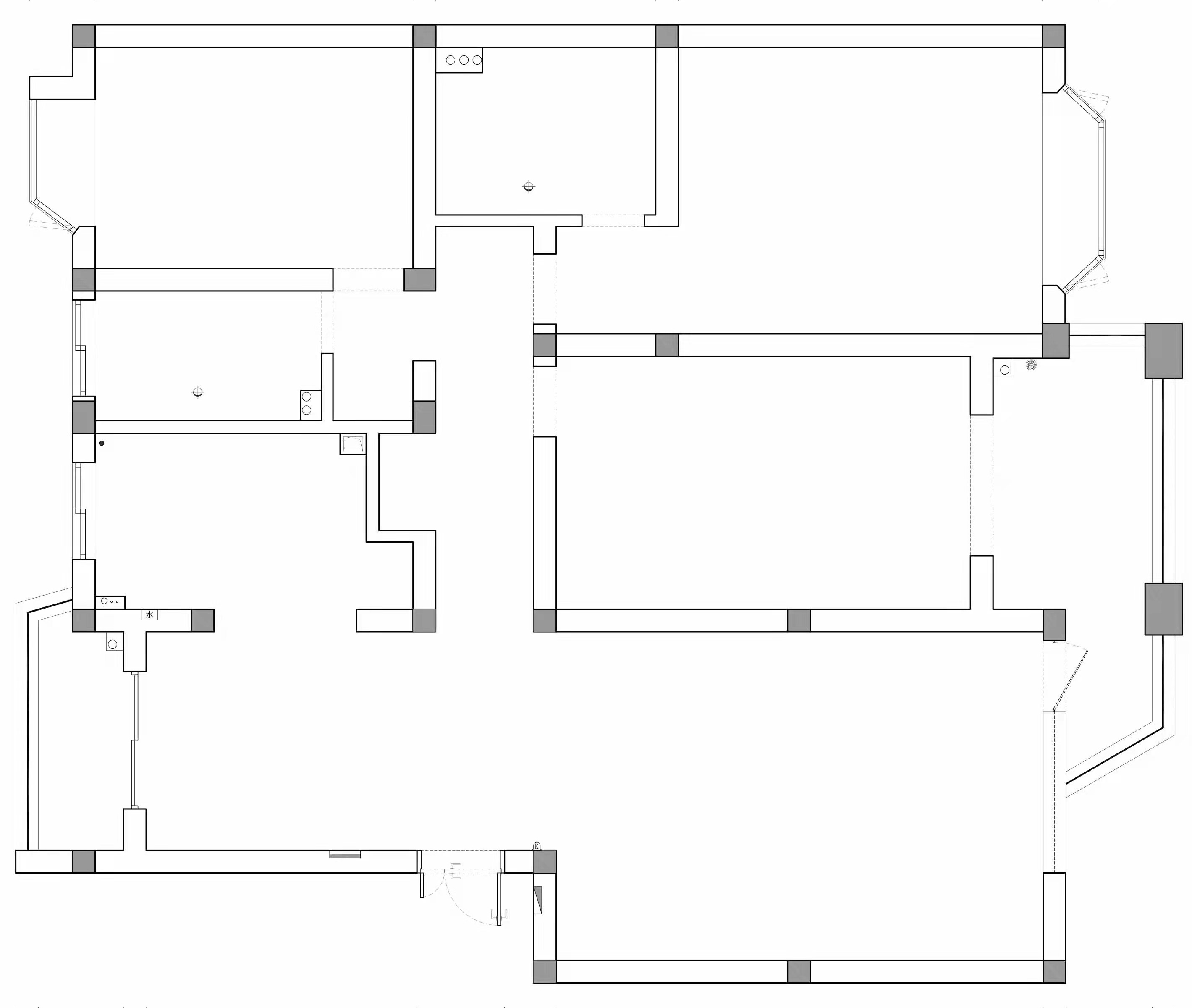
|
精华推荐
换一换
 收藏
收藏  说两句
说两句 





施工还差点意思