|
本帖最后由 杭州菲拉装饰 于 2021-12-12 13:57 编辑 罗列空间模块再组合,80%白+15%灰+5%黑,体块与色调所持有的比例,在诉说适度是个温柔而又曼妙的词语,体块化后的空间新角度再定义,它在挽留生命中的诗意。 Listing the space module recombination, 80% white +15% gray +5% black, the proportion of the volume and tone, in telling moderate is a gentle and graceful word, the space of the new Angle after the volume, it is to retain the poetry in life. Living room / 客厅 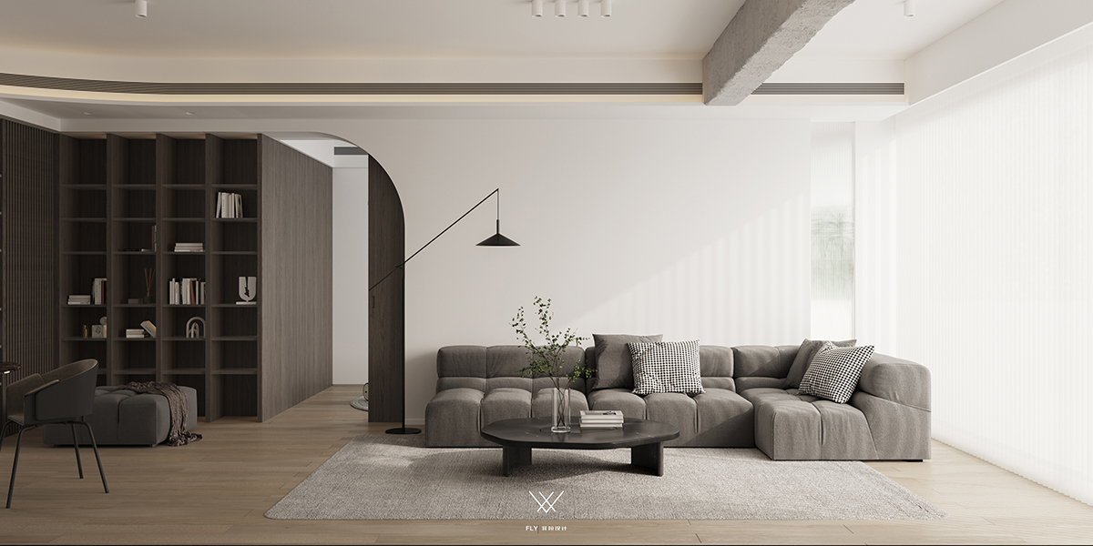
效果图&实景图 
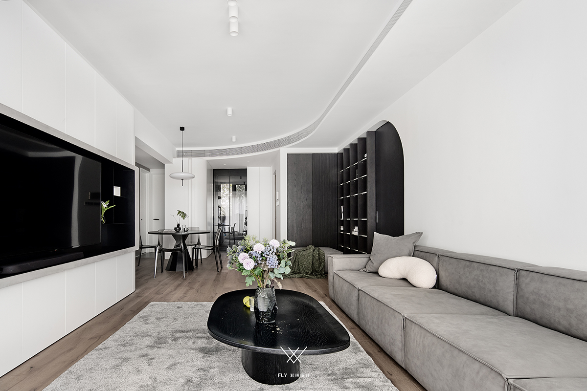
弧形与拱门元素搭配表现的移门,连贯展览架呈黑色通体,转角色彩一体承接空间延展性,顶面顺滑曲线将被区块化的空间重新聚拢,上下呼应不吝啬于柔美的表达。 The curved and arch elements are matched to display the moving door. The coherent exhibition frame is black, and the corner colors are integrated to accept the ductility of the space. The smooth curve on the top surface will be gathered again by the block space, echoing the expression of softness and beauty. 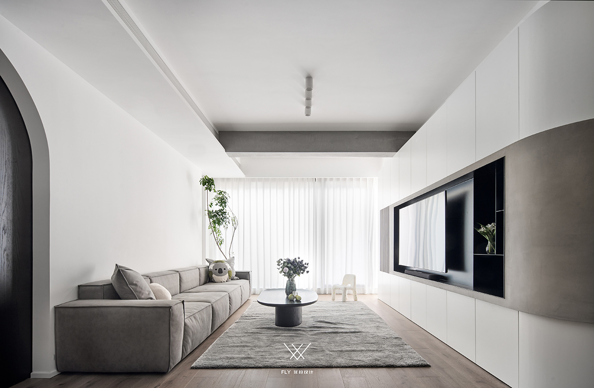
色彩与体块的结合伴随角度与造型置入有序,顶部横柱以灰色抑制大面积白的飘忽,舒适闲散却也沉稳可控。 The combination of color and block is accompanied by orderly placement of Angle and shape. The top horizontal column is gray to restrain the drift of large white area, which is comfortable and carefree but also calm and controllable. Restaurant / 餐厅 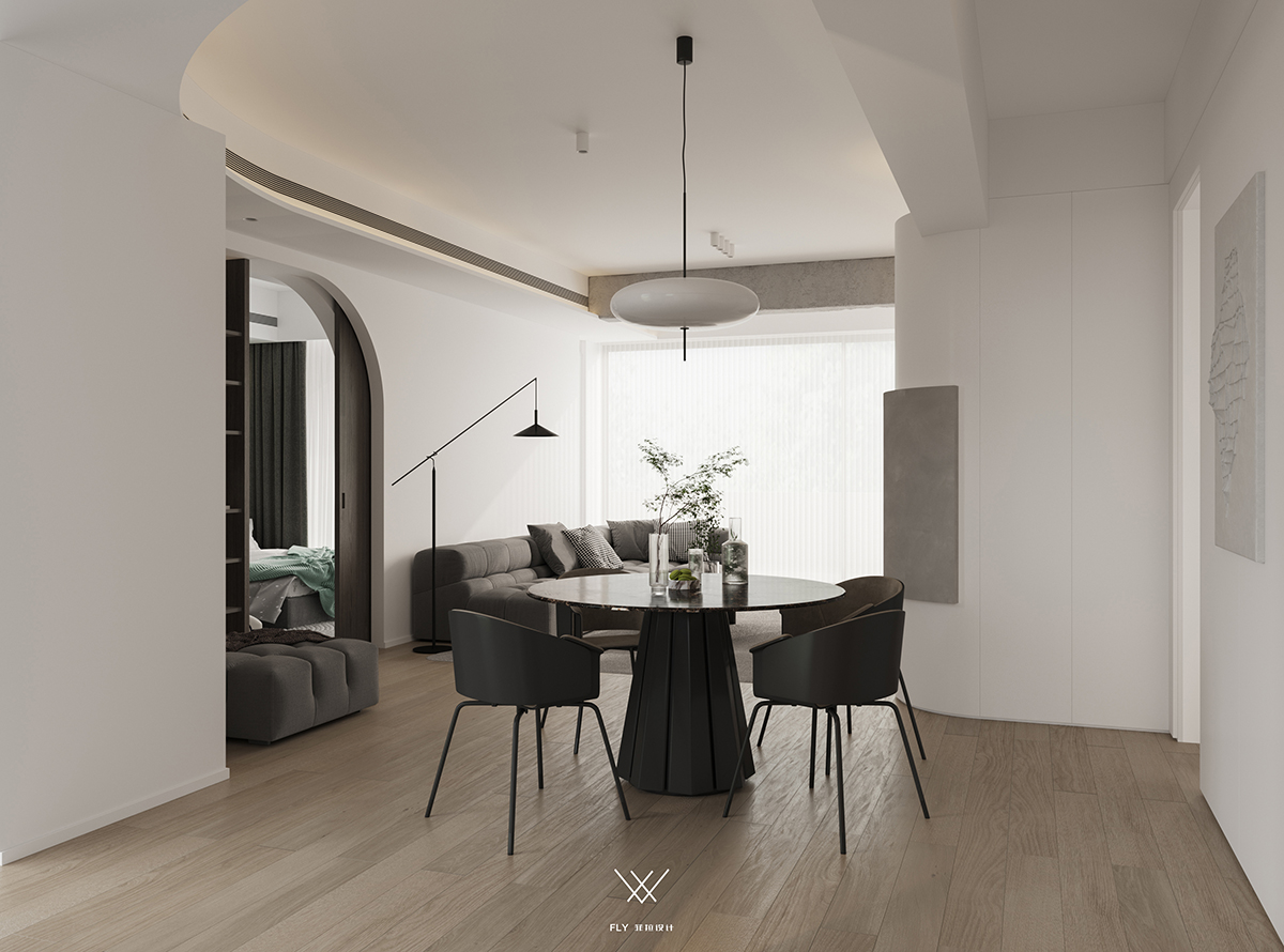
效果图&实景图 利用墙体和柜体对梁的咬合法,凭借功能间的辅助削弱顶部横梁对餐厅空间的影响。 The bite method of the wall and cabinet to the beam is used to weaken the impact of the top beam on the dining room space with the help of the functional room. 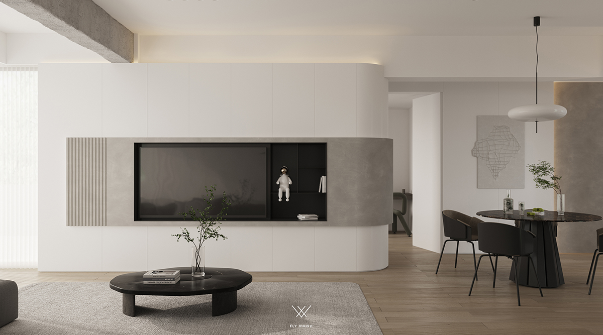
效果图&实景图 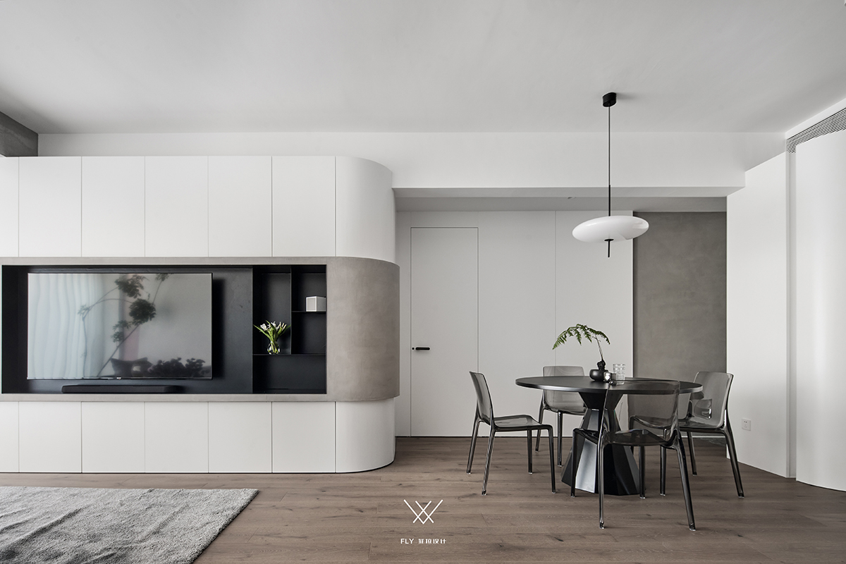
拐角处以弧度造型优化空间动线,建以线条与结构交错的美感。 The arc shape at the corner optimizes the spatial moving line, and builds the aesthetic feeling of staggered lines and structures. 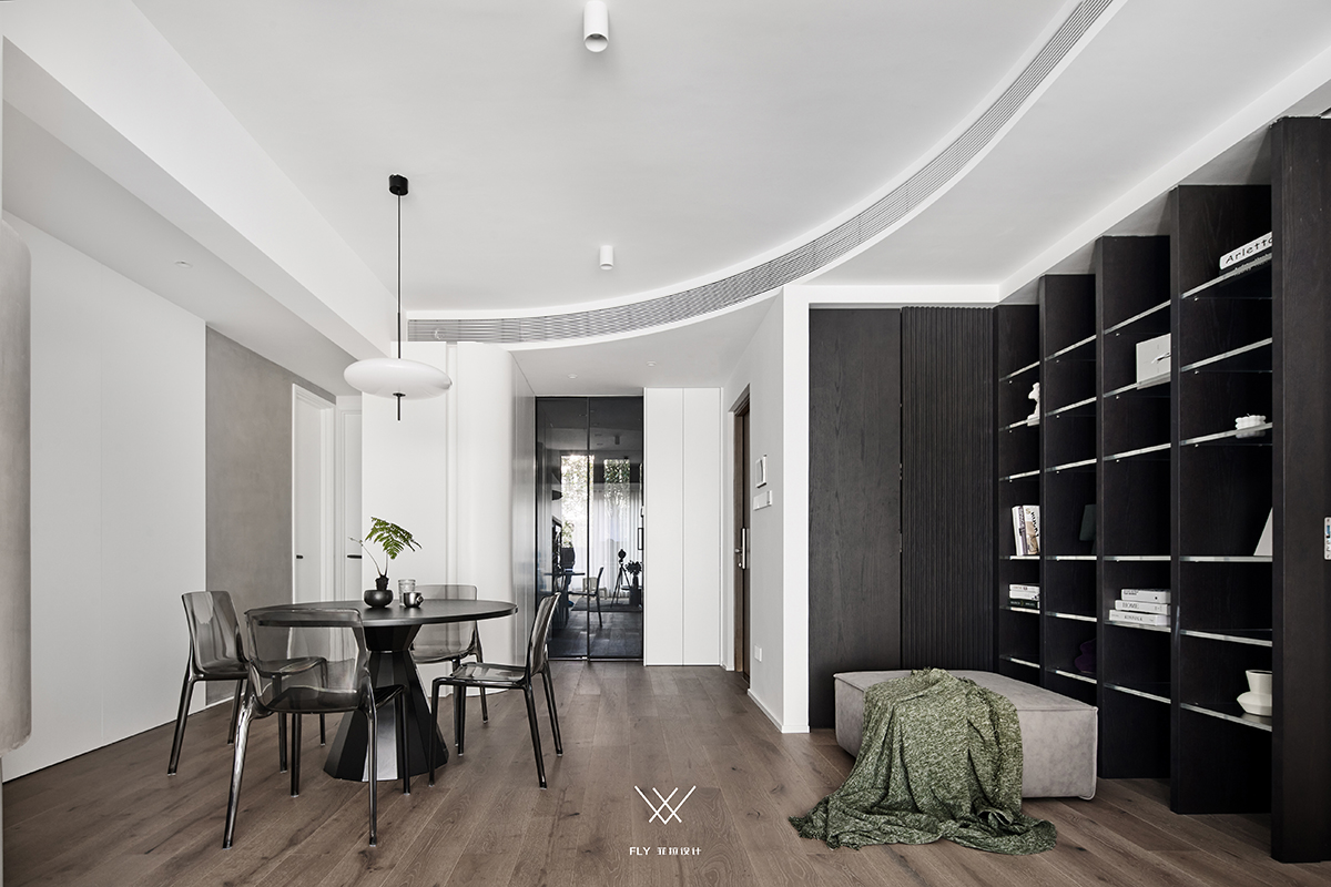
处于房屋中心位的餐厅更具开放性,圆形餐桌、通透餐椅,以观感角度融入展现,自有它独属的区域美感。 The restaurant located in the center of the house is more open, with round tables and transparent dining chairs, which are integrated into the show from an aesthetic perspective and have its own regional aesthetic feeling. Master bedroom / 主卧 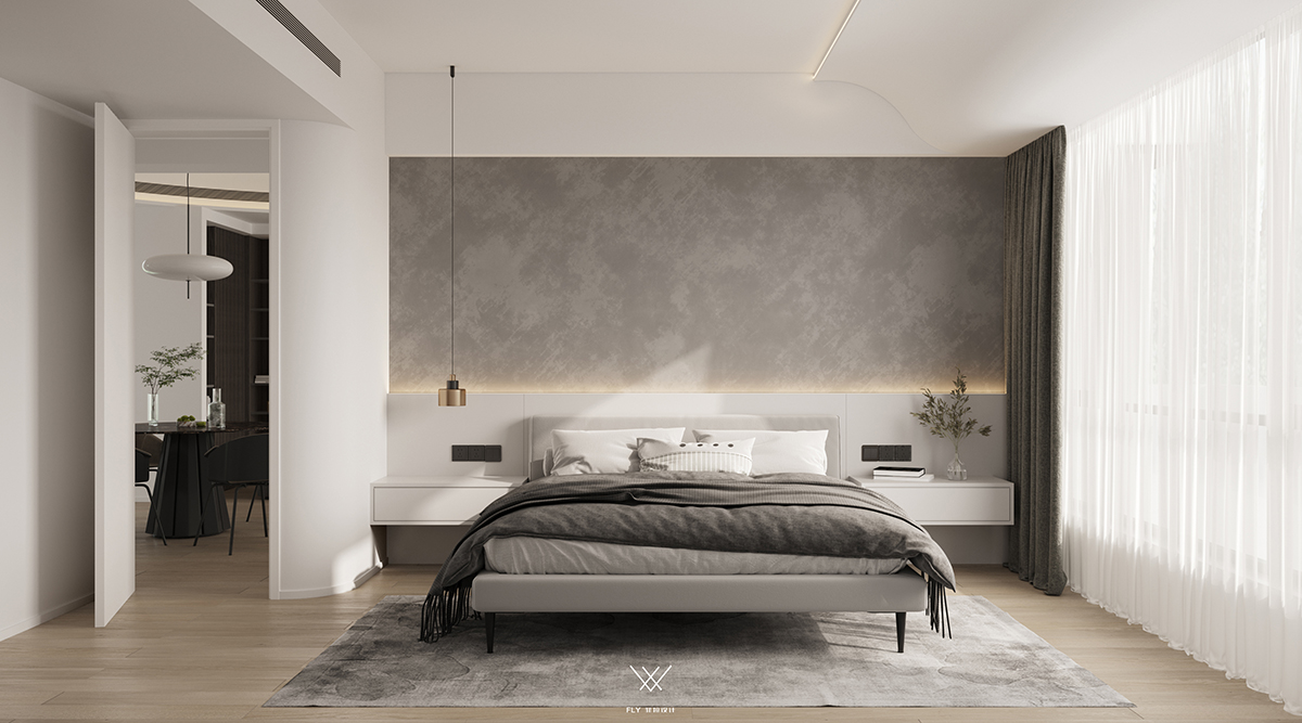
效果图&实景图 顶部波浪式延伸造型,为温润柔和的睡眠空间平添几分灵动。 The wavy extended shape at the top adds a little flexibility to the warm and soft sleep space. 曲面联络转角空间,自然流畅的面的展现始于细节的温柔。 The curved surface connects the corner space, and the natural and smooth surface shows the tenderness from the details. Toilet / 卫生间 House type&Plane design / 原始结构&平面设计图
|
精华推荐
换一换


 收藏
收藏  说两句
说两句 


吊顶做得不错