|
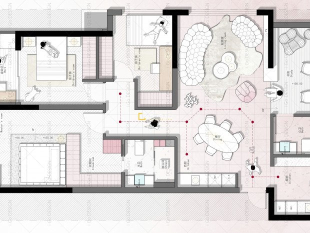
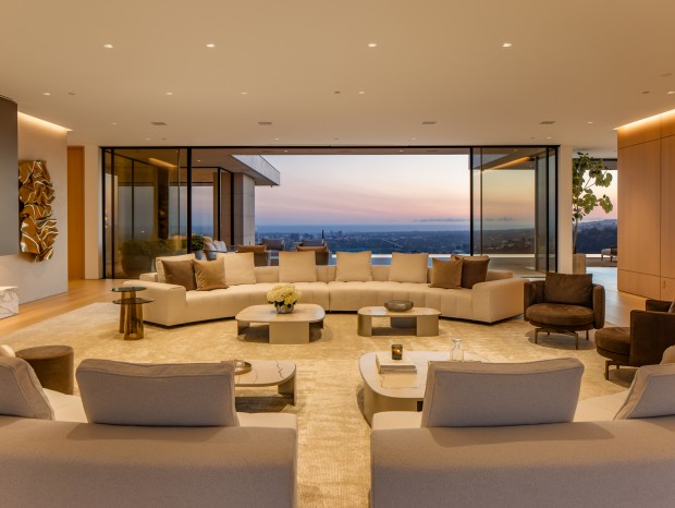
本案项目虽是在杭州,但业主在澳洲工作和我们素未谋面,设计全程皆是线上沟通,从设计风格到施工细节的敲定,我们事无巨细一一核对为完美呈现理想中家的容貌;业主多方找寻设计公司,最后被我们的作品吸引方才敲定下来,对美、对细节苛求的彼此,最终答卷如何让我们拭目以待吧。 Although the project is in Hangzhou, the owner works in Australia and we have never met. The whole design process is online communication, from design style to construction details, we check every detail to perfectly present the appearance of the ideal home. The client looked for the design company in many ways, and finally was attracted by our work before they settled. We will see how each other who are demanding on beauty and details will finally answer the question. 一层 | First floor 一楼空间定位为服务于客餐厨的公共空间,整体以大开大合呈现,每个空间各得其所亦与其他区域有所联系有所互动。 The space on the first floor is positioned as a public space serving the guest kitchen. The whole is presented in an open and cooperative manner. Each space has its own place and is also connected and interactive with other areas. 入户玄关以仙人掌植物为端景,外加橘色渐变玻璃,拉近室内空间与自然之间的氛围联系。 The entrance porch is the end view, with cactus plants as the end view, plus orange gradient glass to narrow the atmosphere between indoor space and nature. 沙发背柜以吊柜形式分隔玄关与客厅界限,下方留有少许空间保有两个区域间的互动,通透收敛。 The sofa back cabinet separates the boundary between the porch and the living room in the form of a hanging cabinet, leaving a little space below to maintain the interaction between the two areas. 地表以不同材质的表现形式明确空间主动线与功能区域之间的划分,在大空间里以婉转的方式有所指引,排列有序。 The surface defines the division between the spatial active line and the functional area in the form of different materials, and provides guidance and orderly arrangement in a tactful way in the large space. 客餐厅之间存在一定的错层,需设几步台阶作为空间衔接,在相邻台阶处以卡座形式与转角沙发呼应,玄关-台阶-卡座-电视柜衔接一体,把握区域间的交流,利用高低差因势利导呈现的客厅更具沉浸感。 There are some staggered floors between the guest restaurants, which need several steps as the spatial connection. The adjacent steps echo the corner sofa in the form of card seat, and the porch step card seat TV cabinet is integrated to grasp the communication between regions. The living room presented by taking advantage of the height difference is more immersive. 餐厅背柜做对称关系,上部留空呈现T形态填充粗犷石皮装饰,灯带所营造光感打造就餐氛围的同时,也对比材质之间的混搭、碰撞,增强空间视觉冲击感。 The back cabinet of the restaurant has a symmetrical relationship, and the upper part is left blank in the form of T, filled with rough stone skin decoration. The atmosphere light created by the lamp belt not only creates the dining atmosphere, but also compares the mixing and collision between materials to enhance the visual impact of the space. 二层 | Second floor 二楼以儿童房和父母房的居住空间为主,业主目前虽处于独身状态,但考虑到未来生活的可能性,在此楼层增设一男一女两间儿童房为日后规划做足准备。 The second floor is mainly the living space of children's room and parents' room. Although the owner is single at present, considering the possibility of future life, two children's rooms for a man and a woman are added on this floor to make full preparations for future planning. 二楼设立起居室,给父母与孩子之间留有一个更为密切的亲子互动区域;空间内两根圆柱实为新风管道,以圆柱木皮包裹的形式呈现的装饰外壳。 A living room is set up on the second floor to leave a closer parent-child interaction area between parents and children; The two columns in the space are actually fresh air pipes, and the decorative shell is presented in the form of cylindrical wooden skin. 三层 | Third floor 三楼整层空间为业主服务,一侧为书房兼具水吧功能,另一侧为睡眠空间,除了就餐之外,此层空间可基本满足他的日常起居。 The whole floor space on the third floor serves the owner. One side is a study with the function of water bar, and the other side is a sleeping space. In addition to dining, this floor space can basically meet} his daily living. 布景电梯直面墙壁,加持进入专属于个人空间的仪式感。 The elevator doors face the wall, enhancing the ritual feeling of entering the exclusive personal space. 应业主需求卧室略带轻奢氛围,吊灯两侧加入灯带使其中间板呈现虚浮感,增添空间多重趣味。 According to the needs of the owner, the bedroom has a light and luxurious atmosphere, and light strips are added on both sides of the chandelier to make the middle plate show a sense of vanity and add multiple interests to the space. 结合业主喜欢整面墙的洁净状态,卫生间大面积铺设岩板,淋浴间选用粗犷毛石,将自然元素拉入室内。 In combination with the owner's preference for the clean state of the whole wall, the toilet is paved with rock slabs in a large area, and the shower room is made of rough rubble to pull natural elements into the room. 地下空间 | Basement 地下空间包括负一、负二层,不同于上层空间,地下空间更聚焦于娱乐属性,影音室、健身房、酒水区等等,以粗犷的材质、浓郁的色彩、注重光影间的结合,打造娱乐空间的专属气氛。 The underground space includes the negative first floor and the negative second floor, which is different from the upper space. The underground space focuses on the entertainment attribute, such as video room, gym, wine area, etc. with rough materials, rich colors and the combination of light and shadow, it shapes the exclusive atmosphere of the entertainment space. 顶部以金属色穹顶搭配灯光烘托空间氛围,考虑到地下层高较低,地面选用镜面石材呈现空间倒影,在视觉上提升层高感、通透性。 The metal arc dome with lights on the top shapes the space atmosphere. Considering the low underground floor height, the mirror stone is selected on the ground to present the space reflection, so as to visually} improve the floor height and permeability. 家庭影视厅以灰黑色调应和观影所需氛围,光感布局无论是顶部还是地表都满含设计心思。 The family film and television hall responds to the atmosphere required for viewing with gray and black tone, and the light sense layout is full of design ideas both on the top and on the ground. House type&Plane design \ 原始结构&平面设计图 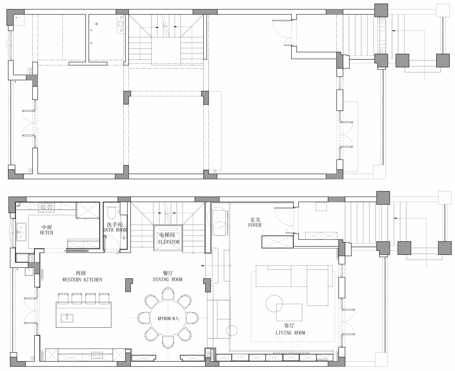
一楼 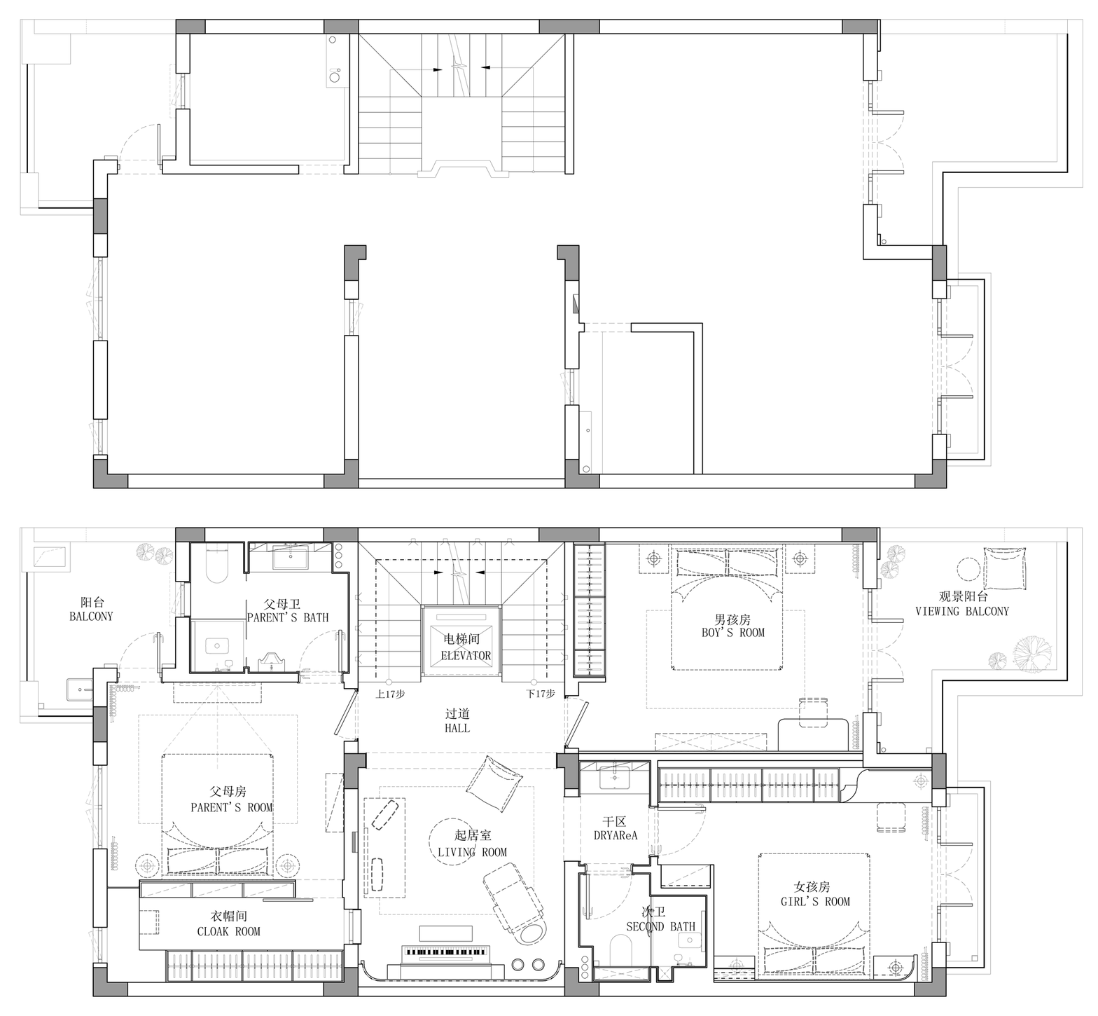
二楼 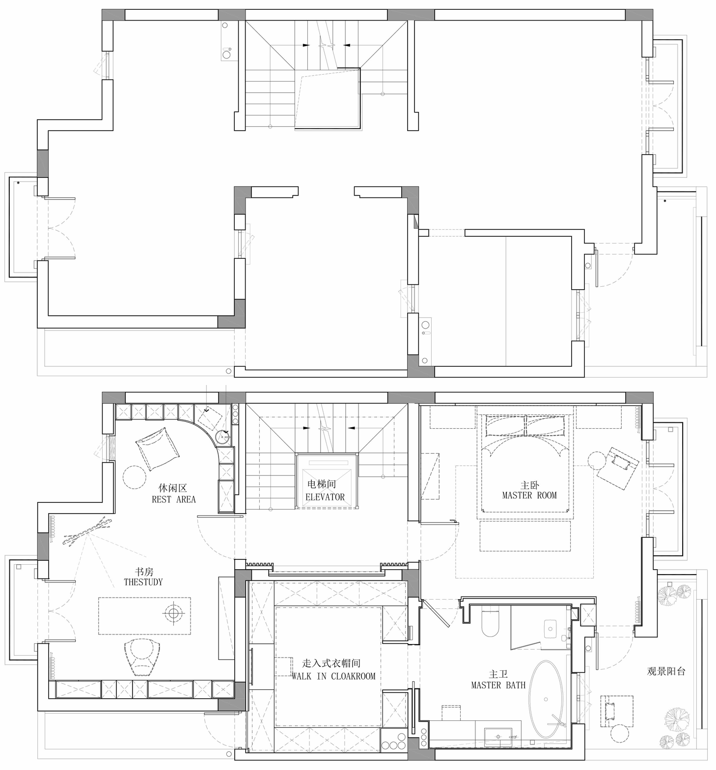
三楼 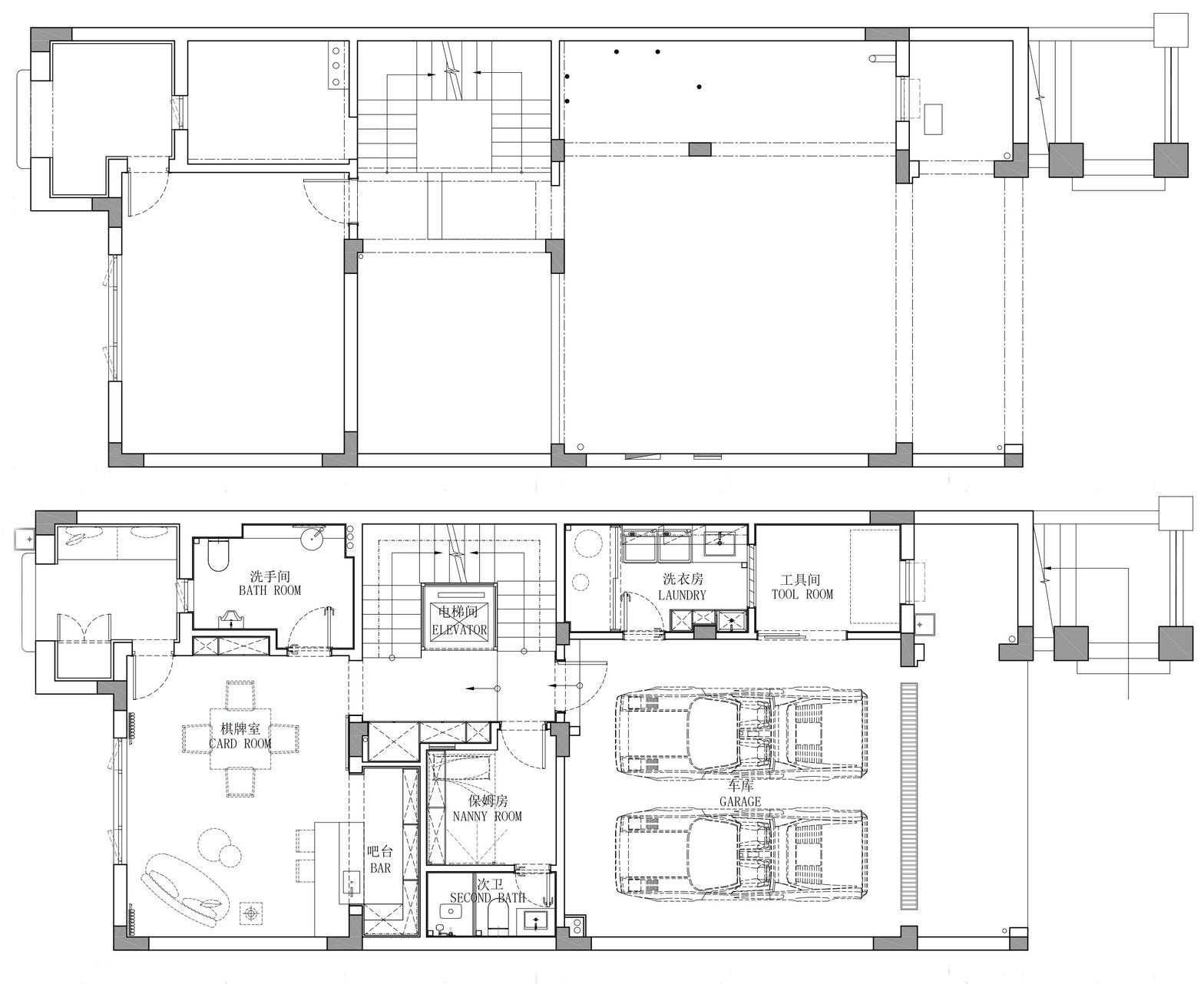
负一楼 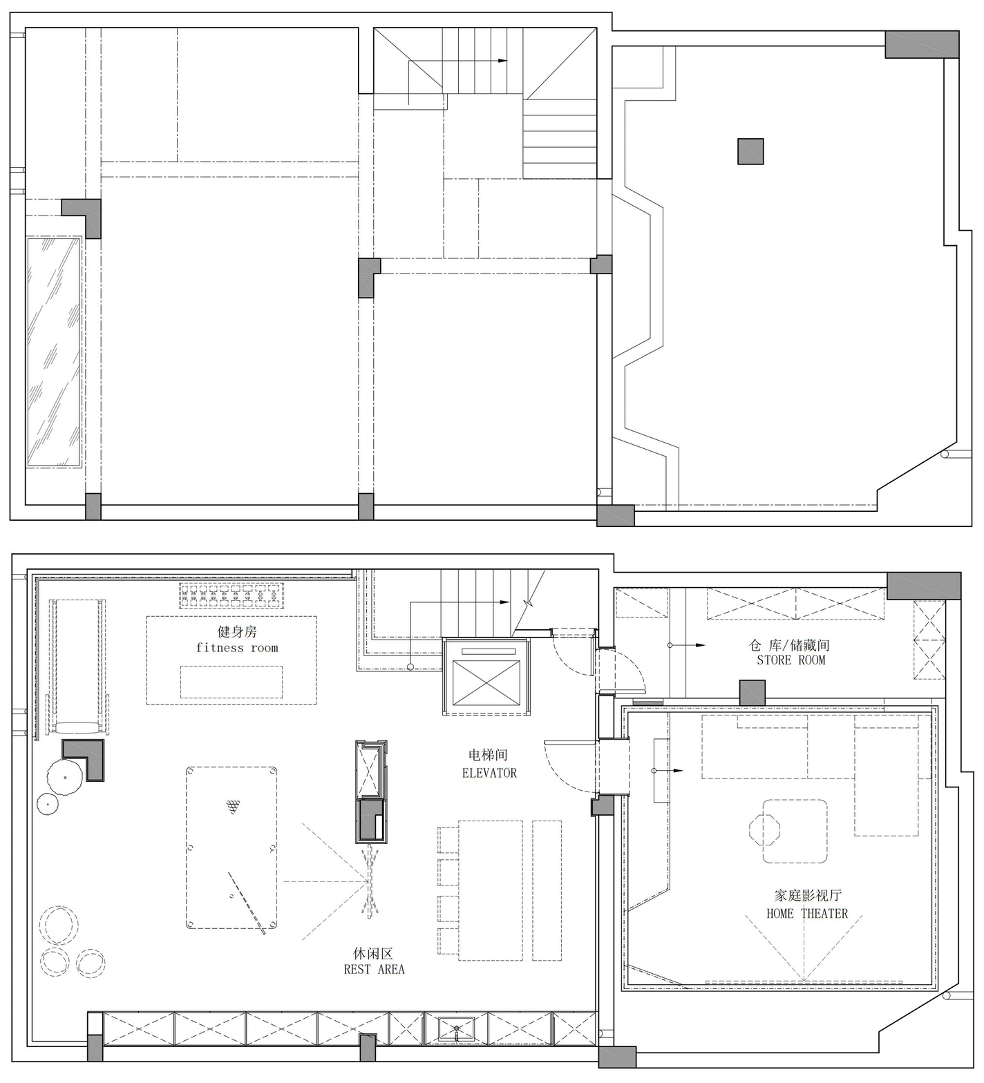
负二楼 阁楼 设计机构 I Designer Department:菲拉设计 项目地址 I Project address:浙江杭州 ·大华西溪风情五期悦宫苑 项目类型 I Project type:硬装设计,软装宅配 面积 I Square Meters:560㎡ 户型 I Door Model:别墅 视觉表现 I Photography:銀合视觉 主案设计师 创始人/设计总监:宋雄飞 专业:环境艺术设计 抛弃固有思维 寻求一切可能 让设计回归生活 宋雄飞,专注于室内空间设计,创立了自己的品牌公司“菲拉设计”。带领着一批具有崇高设计梦想的青年团队,一直在设计的矛盾中寻求突破。善于结合生活将空间重组,把空间特色发挥到极致,强调功能与美感平衡,尊重使用者的真实需求。生活方式决定空间形态,为众多业主量身打造属于他们自己别具一格的家。 主要业绩及获奖情况: 设博会华鼎奖十佳杰出设计青年; 中国空间设计艺术大赛-创新中国-最佳设计作品金奖; 创新中国空间设计艺术大赛十佳杰出设计青年; 亚太空间设计百强设计师 ; 台湾TINTA金邸提名奖; 好好住营造家奖; 《第八届大金内装设计大赛》综合设计 公寓组 铜奖; 《第七届大金内装设计大赛》全国综合设计 公寓组 铜奖; 国际空间设计大奖《艾特奖》 入围奖; 中央财经频道CCTV2《交换空间》栏目受邀设计师; 杭州电视台3频道《生活大参考》栏目受邀设计师; 杭州电视台4频道《家居我来帮》栏目受邀设计师; 作品在《神韵东方》《LUXE炫》《拓者优秀作品集》《豪宅风格大观》《现代装饰》《软装设计师手册》等书籍中出版 作品发表《装修情报》《家居视界》《杭州城报》等平面媒体 设计案例: 绿城-蓝庭伍重院、绿城-桃花源、绿城-翡翠城、绿城-绿园、新湖-武林国际、滨江-城市之星、万科大都会、信达滨江壹品、九龙仓碧玺、MONTO微水泥体验馆、FIFA办公室、雅戈尔-御西湖、风雅钱塘、金基晓庐、钱江时代等 |
精华推荐
换一换
 收藏
收藏  说两句
说两句 






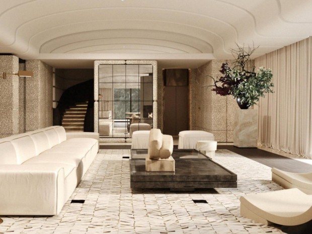




餐厅这个背景 抄的好像呀