|
本帖最后由 zyp2185623 于 2022-3-10 09:22 编辑 李宅的业主生活在河南郑州,感受过了城市的喧嚣繁杂后,便希望在市郊选择一个风景秀丽的地方,让生活慢下来。 三口之家对于生活的思考是这样的,满足好休息空间尺寸与功能,更多的面积让给公共空间,给予孩子更大的玩耍空间。
01/ 客厅 Living room 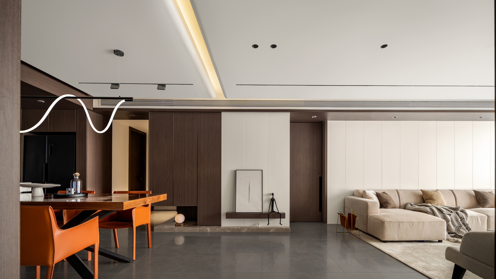
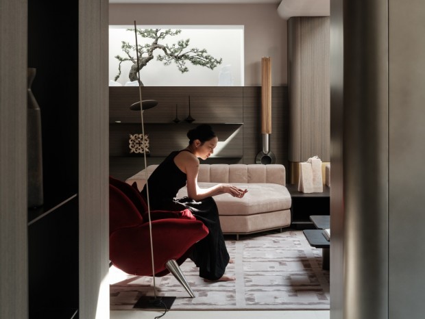
进门之后便是开阔的客餐厅空间,玄关则在平衡和串联空间。 客厅沙发与地台的连动给我们提供更多可能的生活场景,既可以当做舒适的沙发,也可以在地台上舒适的享受午后阳光。
After entering the door is the open dining room space, and the porch is in the balance and series space. The connection between the living room sofa and the floor provides us with more possible life scenes, which can not only be used as a comfortable sofa, but also comfortably enjoy the afternoon sunshine on the floor.
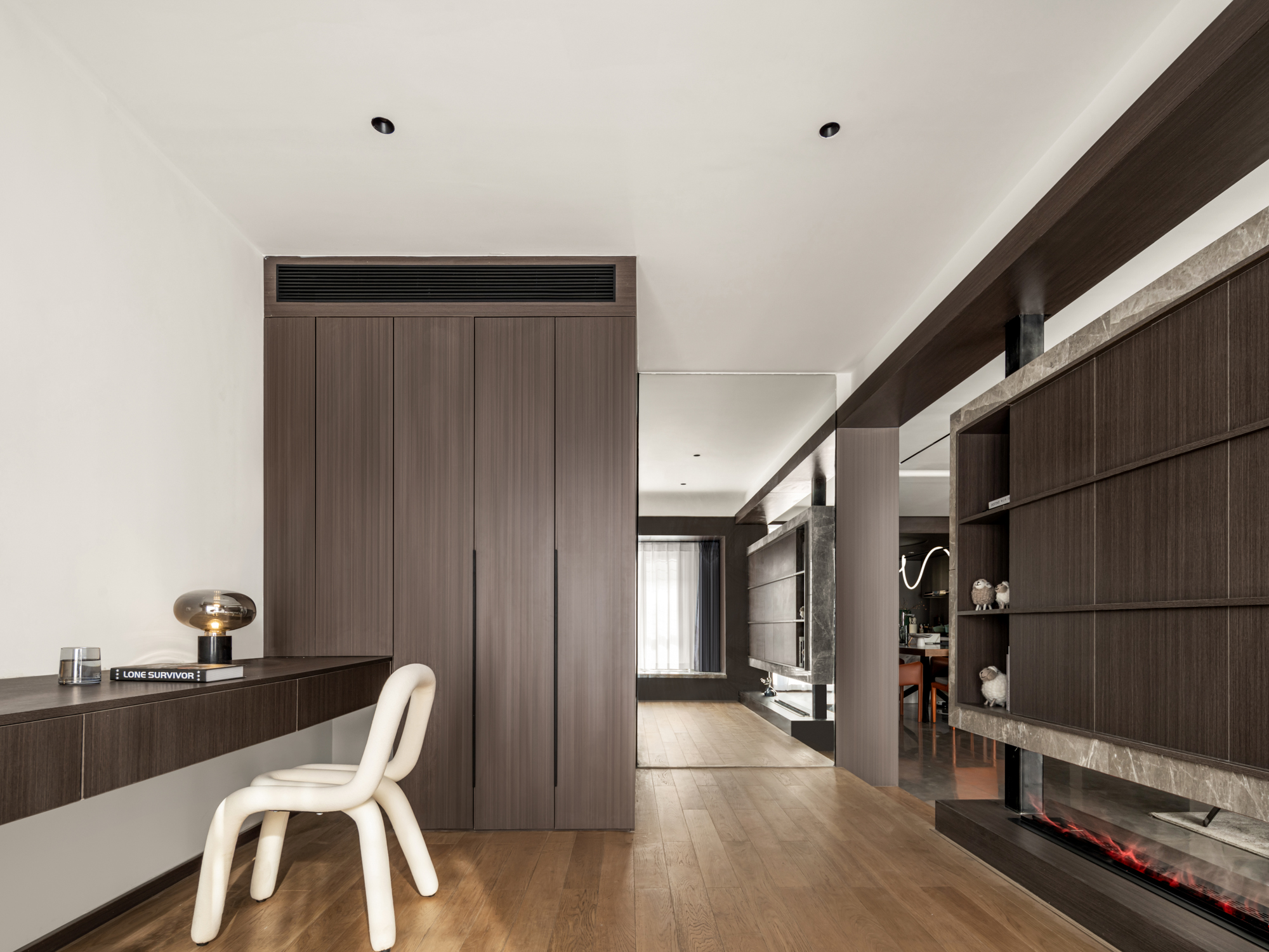
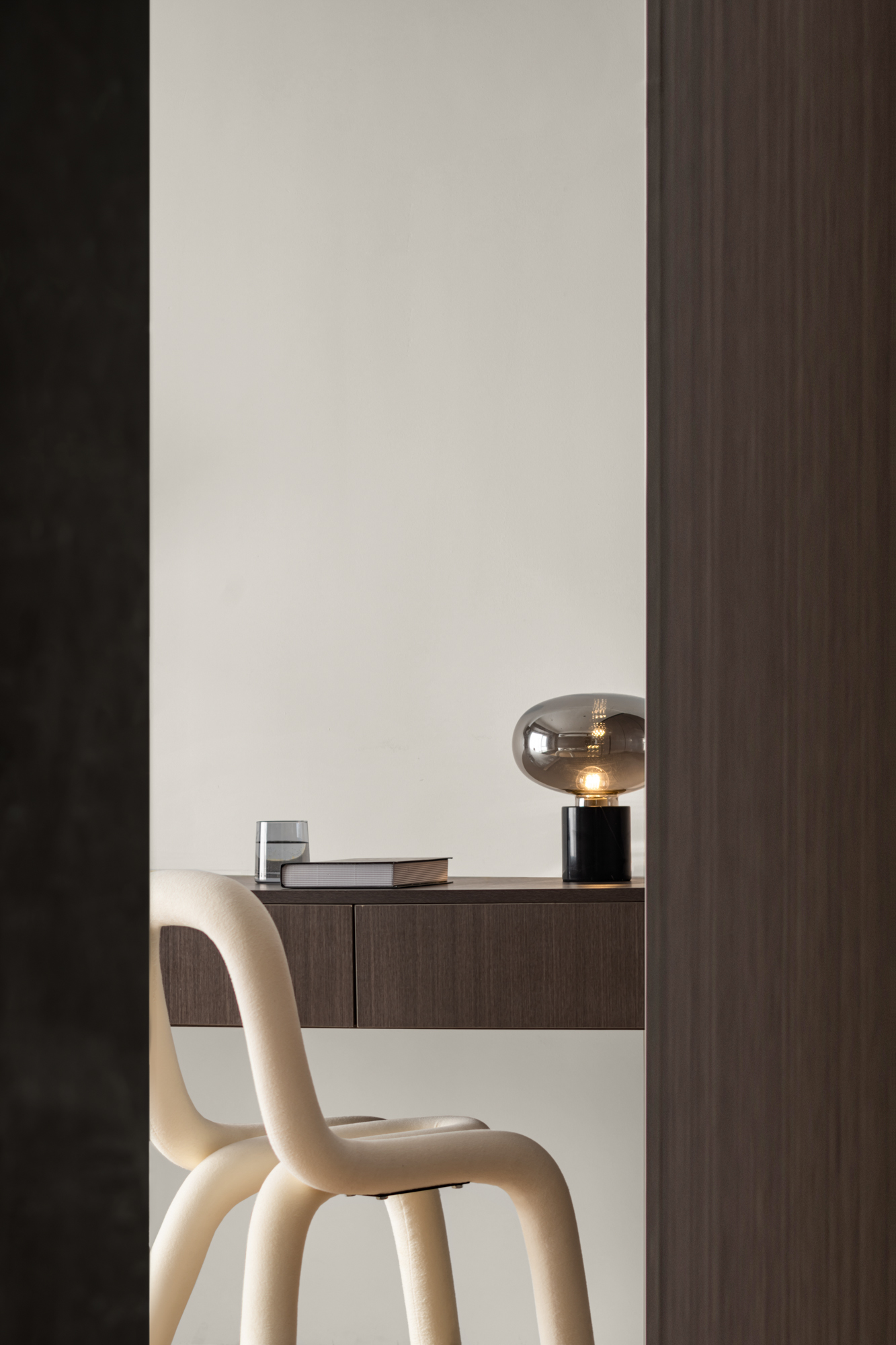
02/ 书房 Study 一个房间与客厅联动作为开放书房,拓宽客厅的前后视野,于上下的间隙中产生互动。
A room is linked with the living room as an open study to broaden the front and rear vision of the living room and interact in the gap between up and down. 03/ 餐厅 Dining room 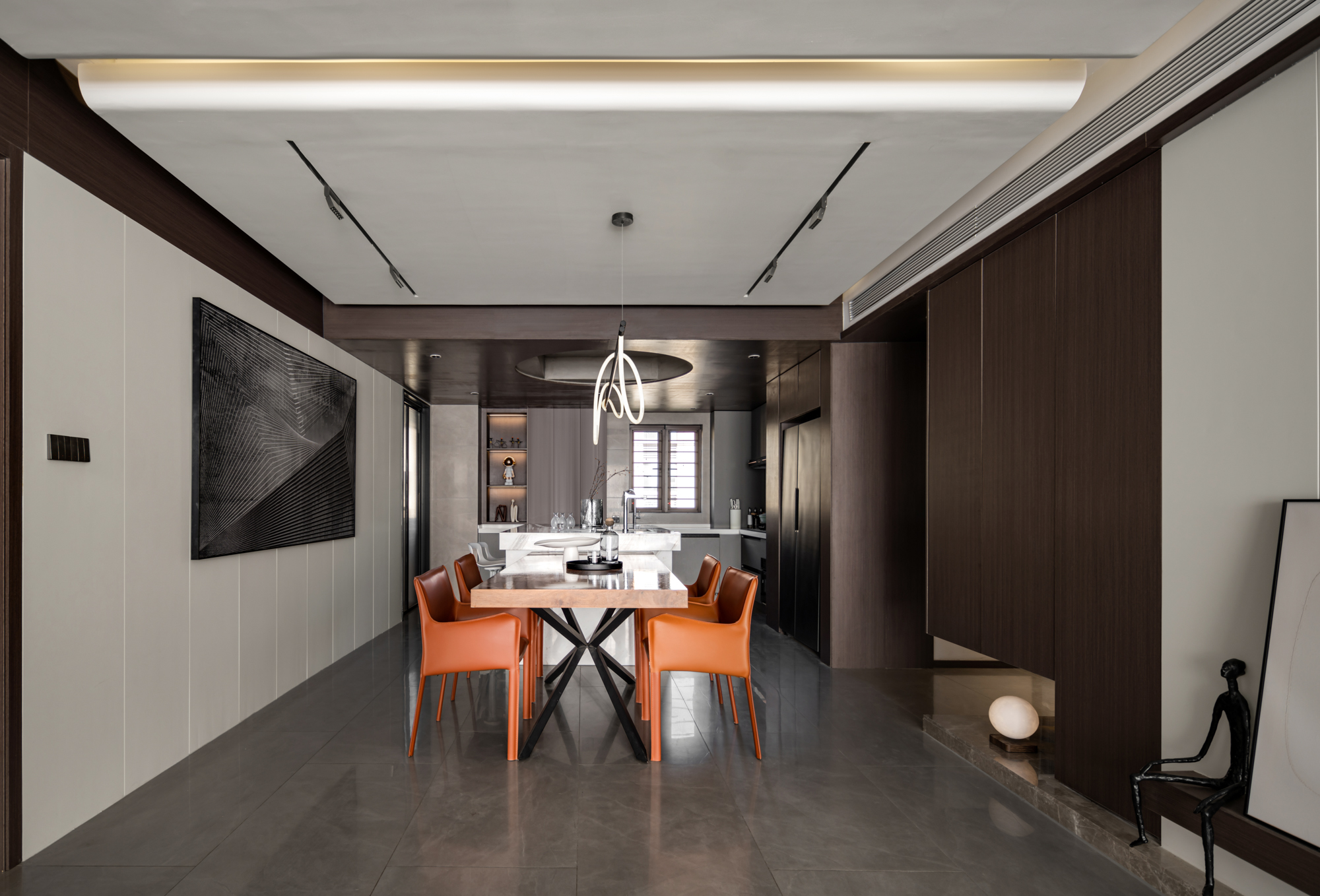
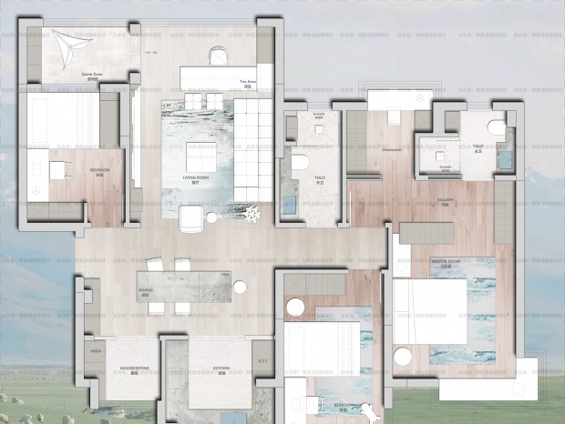
厨房与餐厅重新调整了格局,改变之前尴尬局面。 同时增加水吧台,长餐桌。厨房旁的房间考虑让出一部分空间给予客餐厅,让客餐厅成为一个规整的空间。 内部划为家政间,解决洗衣收纳晾晒问题。
The kitchen and restaurant readjusted the pattern and changed the previous embarrassing situation. At the same time, add water bar and long table. The room next to the kitchen is considered to give part of the space to the guest restaurant, so that the guest restaurant can become a regular space. The interior is designated as housekeeping room to solve the problem of laundry storage and drying. 04/ 厨房 Kitchen 05/ 卧室 Dedroom 主卧则考虑与卫生间联动起来,卫生间的台面挑空装上玻璃。干净且整洁,主卧的浪漫感也油然而生。
The master bedroom is considered to be linked with the bathroom, and the countertop of the bathroom is empty and equipped with glass. Clean and tidy. The romance of the master bedroom also arises spontaneously.
Layout plan 平面方案 Project information 项目信息 项目地点:郑州碧桂园 项目面积:150㎡ 项目造价:硬装35w,软装5w 主案设计:翟玉鹏 空间摄影:梵境空间摄影 |
-
baizhu15 2022-3-11 15:10:43
&黟敏& 发表于 2022-3-11 09:02
客厅电视背景墙整个悬挑会好一些,竖向一根金属管感觉有点
可能他觉得落地更加重要吧= =
-
yxs0008 2022-3-11 13:46:16
&黟敏& 发表于 2022-3-11 09:02
客厅电视背景墙整个悬挑会好一些,竖向一根金属管感觉有点
我估计原本设计也是这么想的 但是后面发现挑的有点大怕方管支不住哈哈哈

 收藏
收藏  说两句
说两句 






6666666