|
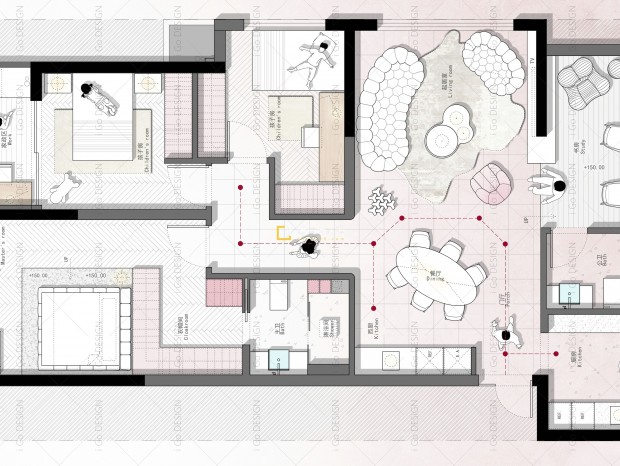
01 关于设计About the design 本期案例在设计之初,业主无需考虑到两房三房这样的刚性需求,平时生活也比较简单,在整个家中的生活,也希望能够更加的自如舒适,所有希望在设计上能够尽量的纯粹整体一些,不希望繁杂的装饰在衬托空间,越简单的设计反而更加耐看。 02 - 玄关空间 Entrance space En tering the do or, it is a corner of the living room, and the entire inward extending locker forms a visual guide, allowing people to walk into it naturally through the aisle. 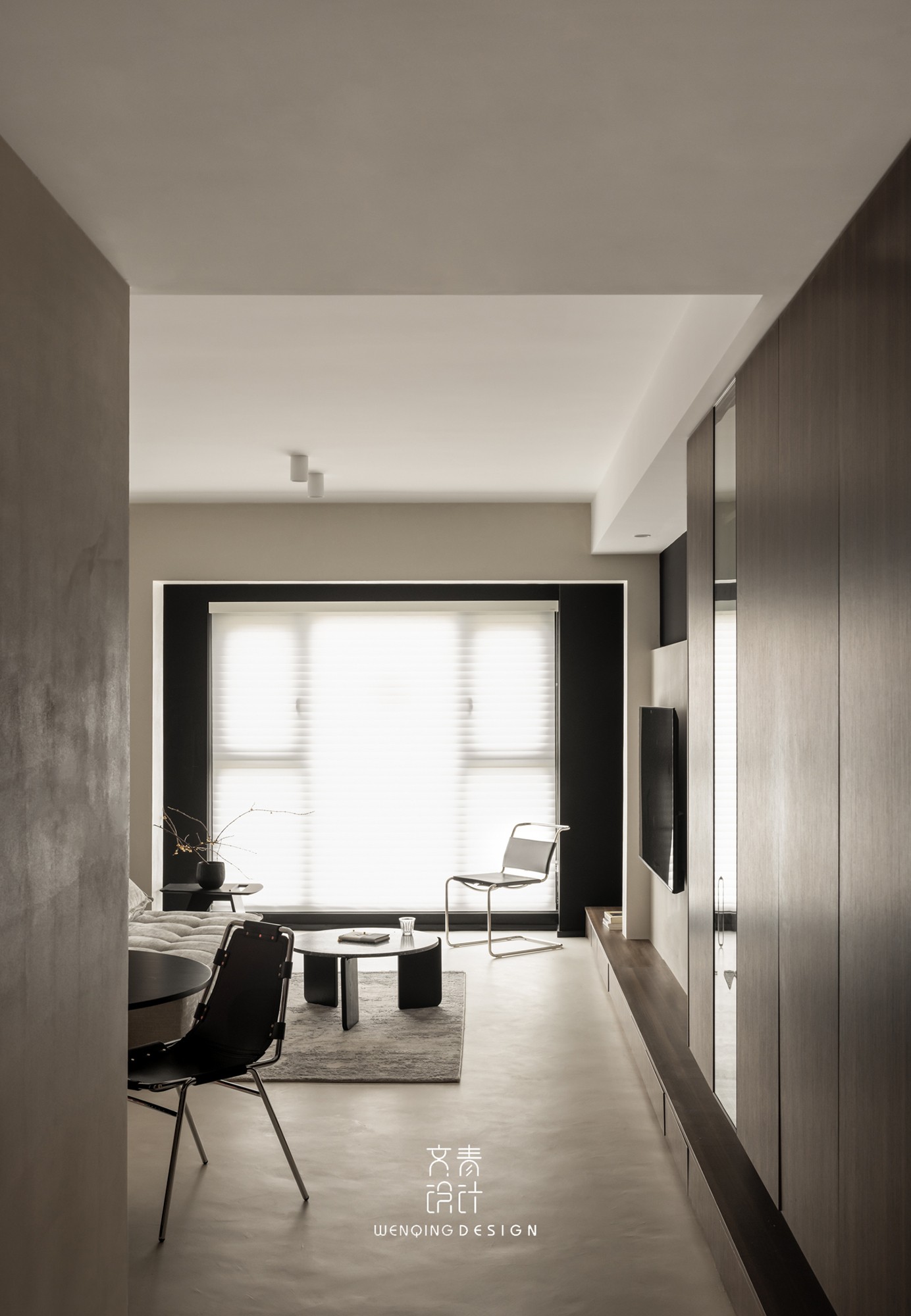
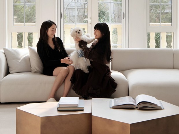
03 - 客厅 restaurant这种开放性的基调中,灵活和随性才是空间所围绕的中心,看似随性的布局,实则是在多方衡量之后,给予空间的最优解。 In this open tone, flexibility and randomness are the centers around the space. The seemingly random layout is actually the optimal solution for the space after multiple measures. 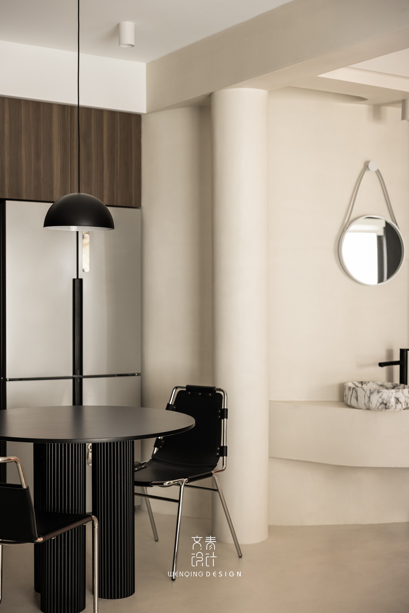
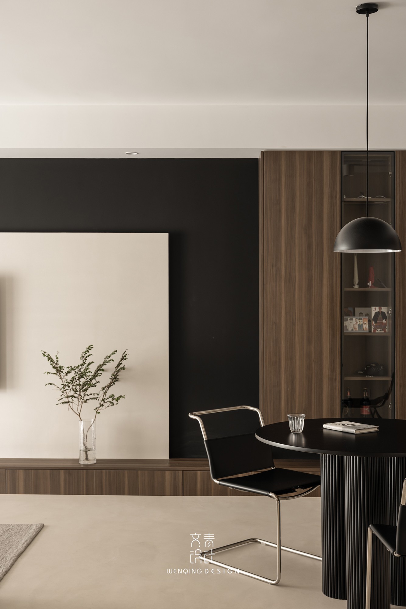
原本公卫的直墙位于过道太过硬朗,于是我们将直墙改造成弧形干区,让空间多一些柔软元素的同时,也能将过道扩大,提升居住体验感。 Originally, the straight wall of the public bathroom was too tough in the aisle, so we transformed the straight wall into an arc-shaped dry area to add more soft elements to the space, and at the same time to expand the national road and enhance the living experience. 
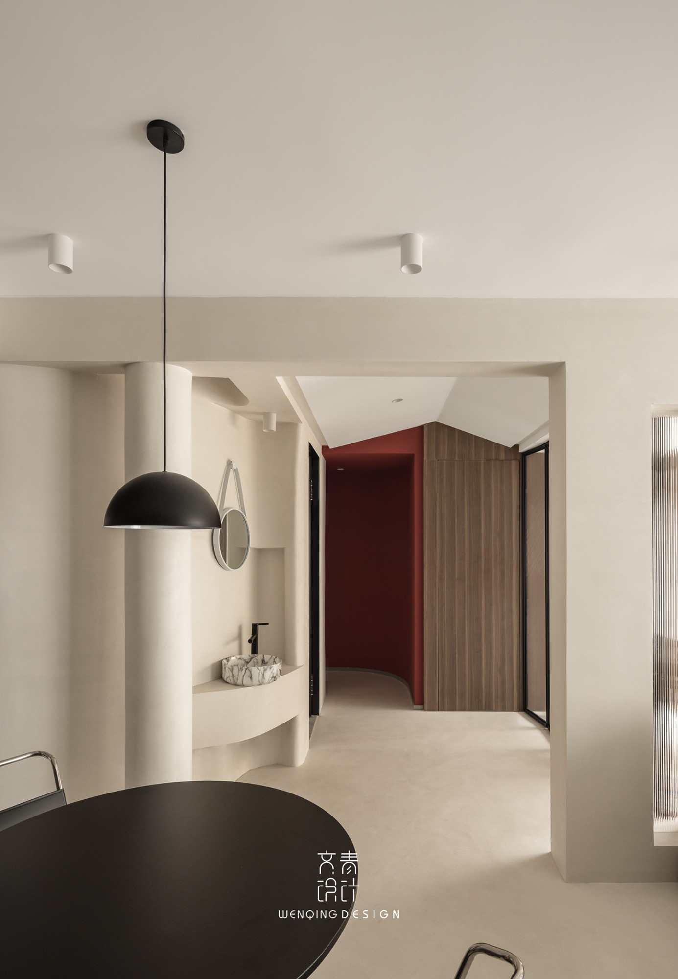
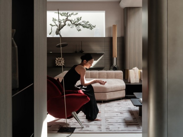
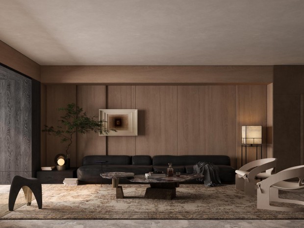
04 - 客厅 Living Room 开放空间从顶到地全屋刷就微水泥,尽量克制的往空间中添加一些木制元素,赋予客厅区域多重的质感交错。 In the open space, micro-cement is applied to the whole house from the top to the ground, and some wooden elements are added to the space as restrained as possible, giving the living room area multiple textures. 在整体设计上减少了空间材料的使用,统一的调性提供最大限度的包容性,简单的材料和纯粹的色彩,让处于家中便能感到无比轻松自在。 In the overall design, the use of space materials is reduced, and the unified tone provides maximum inclusiveness. Simple materials and pure colors make you feel extremely relaxed and comfortable at home. 通过落地窗将光线引入室内,经由漫反射浸润整个空间,光线在室内的流动,也弱化了空间的边界感。 The light is introduced into the room through the floor-to-ceiling windows, and the entire space is infiltrated through diffuse reflection. The flow of light in the room also weakens the sense of boundary of the space. 05 - 多功能房 Mult-function house多功能房两侧通过玻璃移门分隔空间,作为临时休息空间也能保证足够的隐私。平时两侧敞开的双向动线设计,也能增添了人与空间的互动感。 The two sides of the multi-functional room are separated by glass sliding doors, which can also ensure sufficient privacy as a temporary rest space. The two-way moving line design that is usually open on both sides can also add a sense of interaction between people and space. 06 - 洗衣房 Laundry room运用跳脱大胆的红色来划分洗衣房区域,正如我们希望的那样:在整体深色的空间中,有个色彩能够跳脱出来,赋予视觉冲击感。 The use of jumping out of the bold red to divide the laundry room area is as we hoped: in the overall dark space, there is a color that can jump out and give a sense of visual impact. 07 - 卧室 Bedroom卧室空间回归安静与自然。温润厚重的木质元素,沉稳朴拙的涂料,不同材质之间的融合,小小一方休息空间,自然的散发出一种别样宁静。 The bedroom space returns to quietness and nature. The warm and thick wooden elements, the calm and simple paint, the fusion of different materials, and the small resting space naturally exudes a different kind of tranquility. 08 - 厨房 Kitchen |
精华推荐
换一换

 收藏
收藏  说两句
说两句 








不会的,下面留了一点缝隙,看的不是很清楚,你仔细看看