本帖最后由 几何共社 于 2022-4-24 15:50 编辑 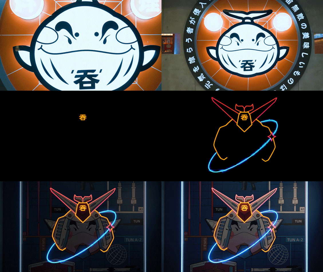

吞是芜湖本土日料品牌。2017年第一家店「吞 · 创意日料」在新芜路开门营业,面积虽小,但吞怀着该有的细腻与真诚,出道便俘获了大批食客们的芳心。 经过四年的努力,创始人以“吞”为支点,撬开了一个包罗万象的日料王国,无论是「吞 · 创意日料」,还是「吞 · 元气满满」,都是想要传递出一个年轻时尚的潮流日料品牌。创始人坚信只有充分地融合、跨界、混搭,品牌才越丰富,印象才能越深刻。 TUN is a local Japanese food brand in Wuhu. In 2017, the first store "Tun · creative materials" opened for business on Xinwu road. Although the area is small, Tun has captured the hearts of a large number of diners with its due delicacy and sincerity. After four years of efforts, the founder took "swallowing" as the fulcrum and pried open an all inclusive kingdom of Japanese materials, whether it is「Tun · Chuangyi Riliao」 or 「Tun · Yuanqi Manman」 all want to convey a young and fashionable trend daily materials brand. The founder firmly believes that only through full integration, cross-border and mix and match, can the brand be richer and more impressive. 
本次第三代形象店选址芜湖苏宁广场,由HMZ几何共社联手黑铅笔操刀设计并制作,「吞 · 元气食堂」完全颠覆过去,打破传统刻板的日料店形象。将日漫,二次元,主题剧情结合当下潮流元素将品牌渲染到另一高度。 The third-generation image store is located in Suning square, Wuhu. It is designed and produced by HMZ geometry Co., Ltd. jointly with black pencil and knife. The "Tun · 「Yuanqi Shitang」completely subverts the past and breaks the traditional stereotyped image of Japanese material store. The brand will be rendered to another height by combining the Riman, the second dimension and the theme plot with the current trend elements. 
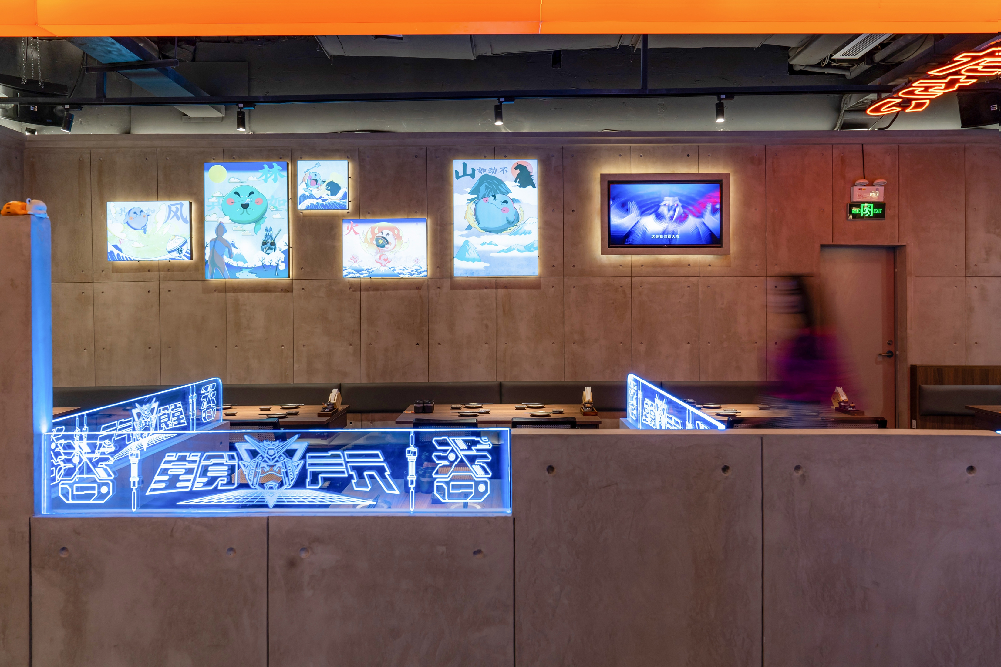
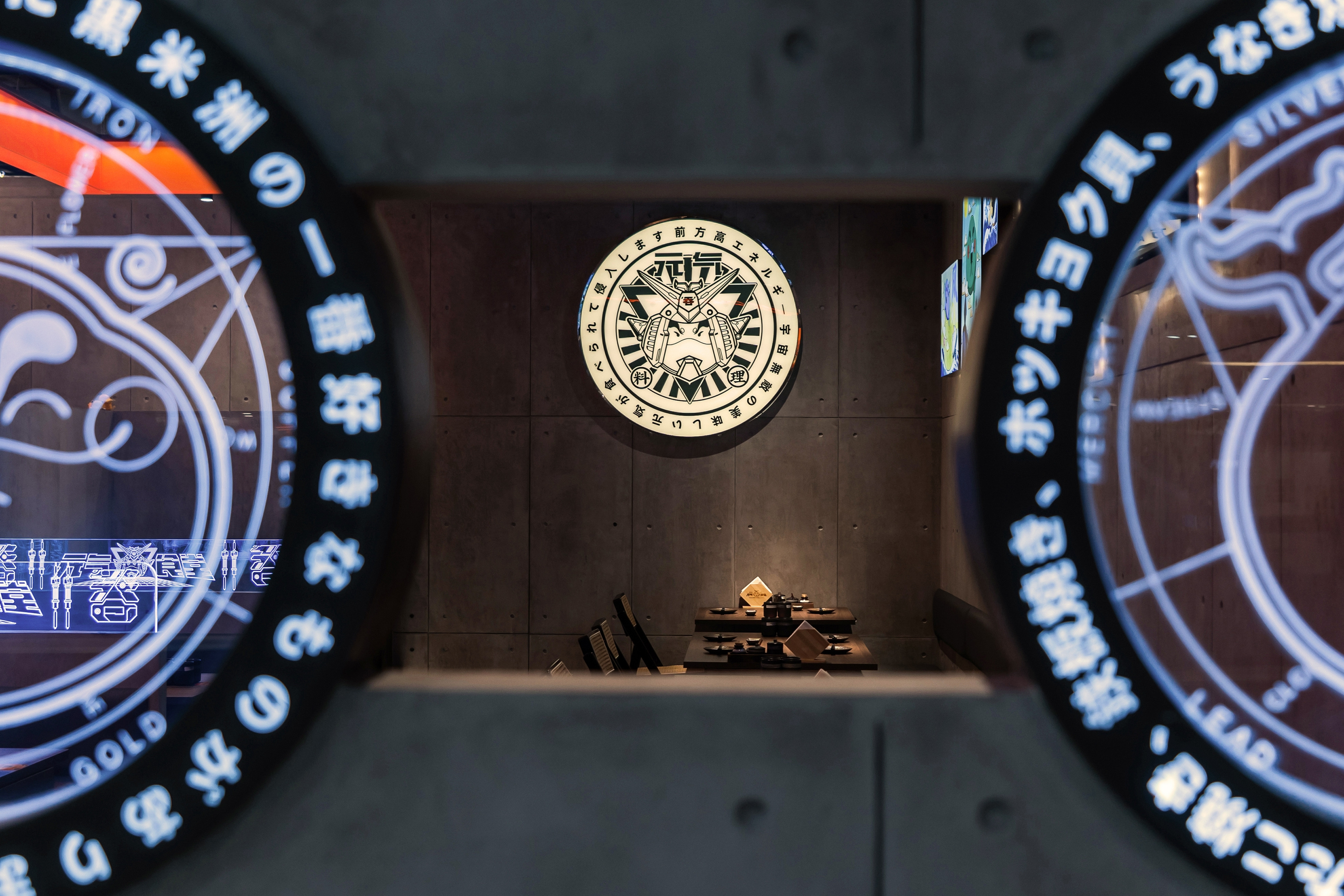
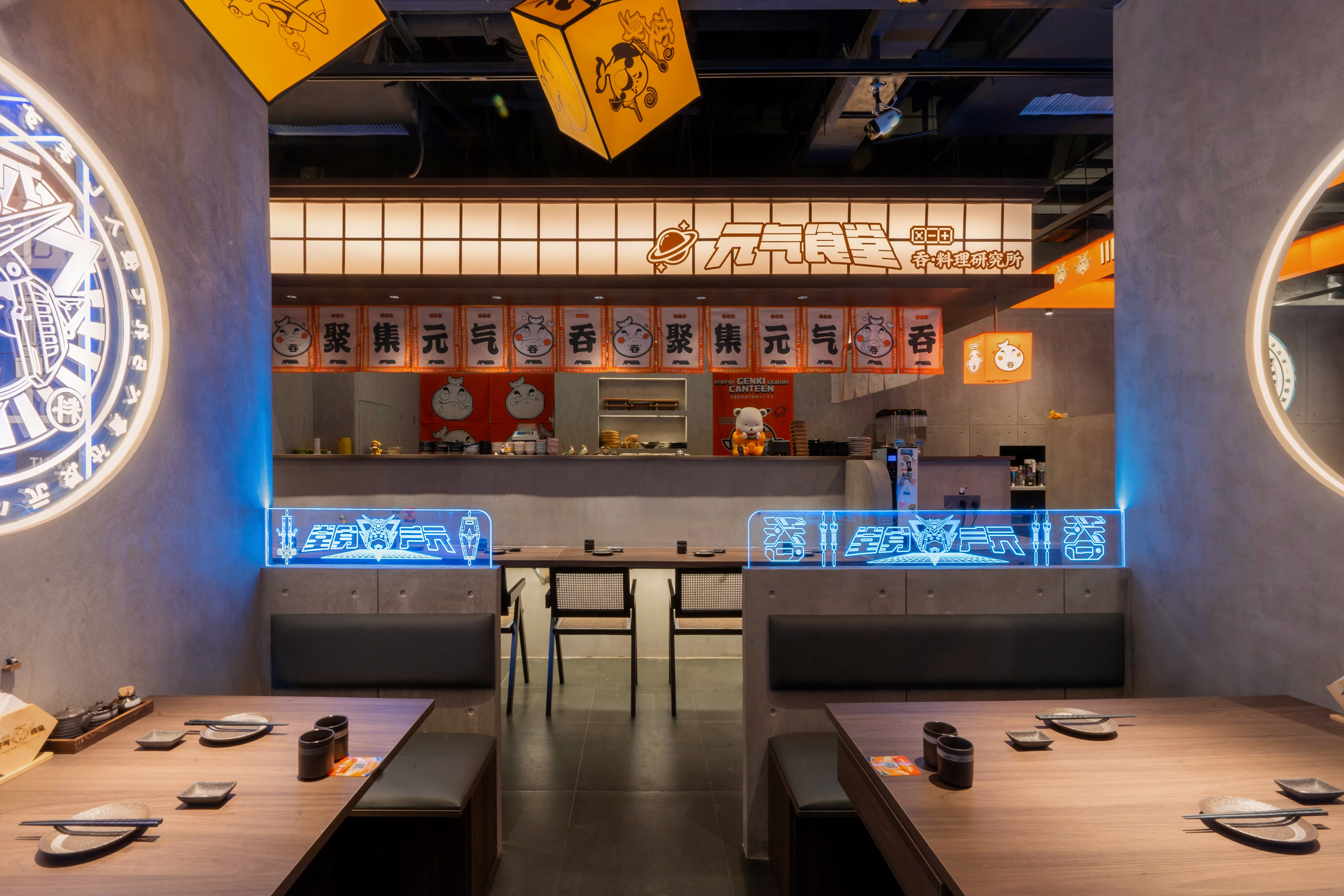

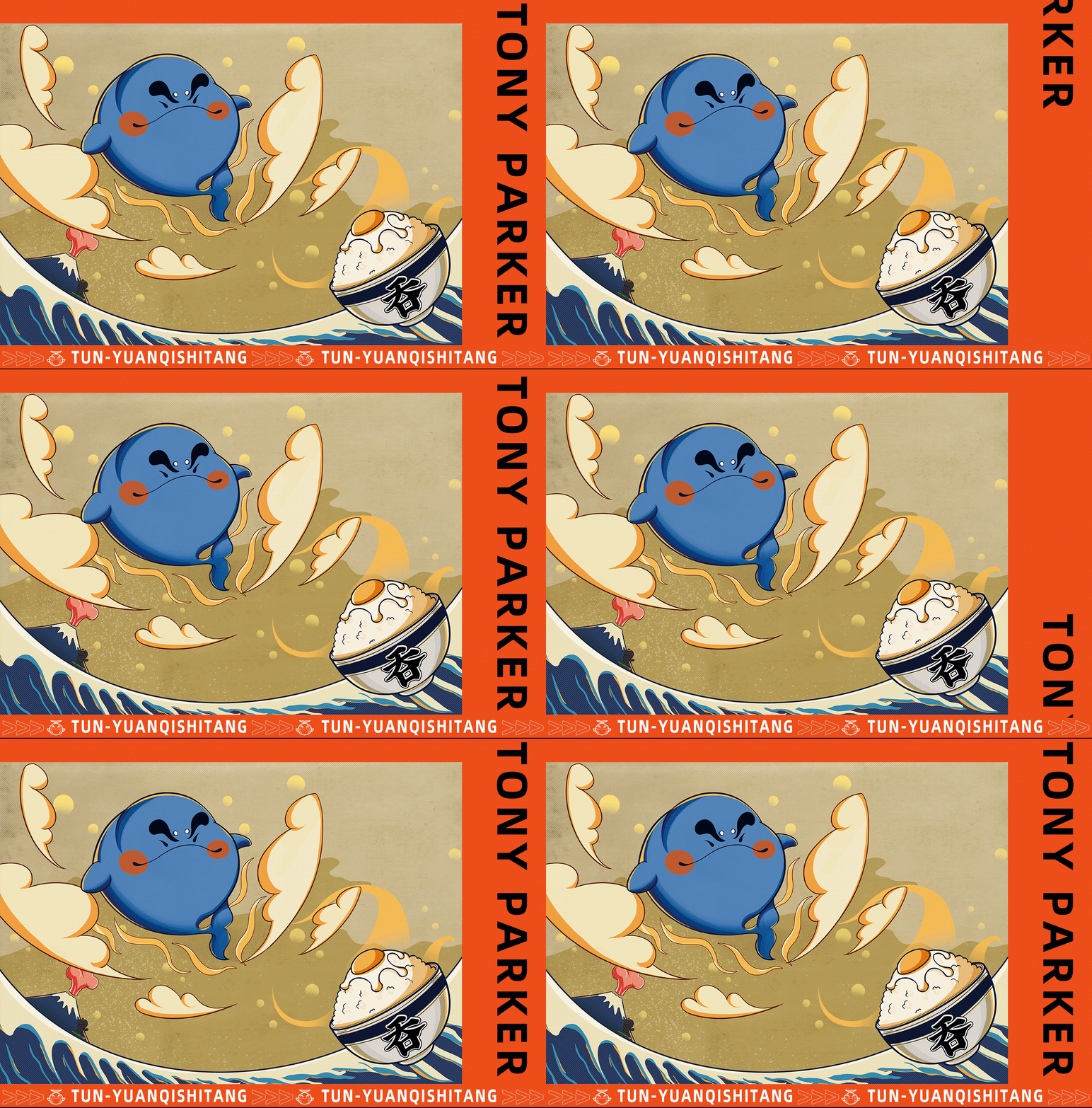
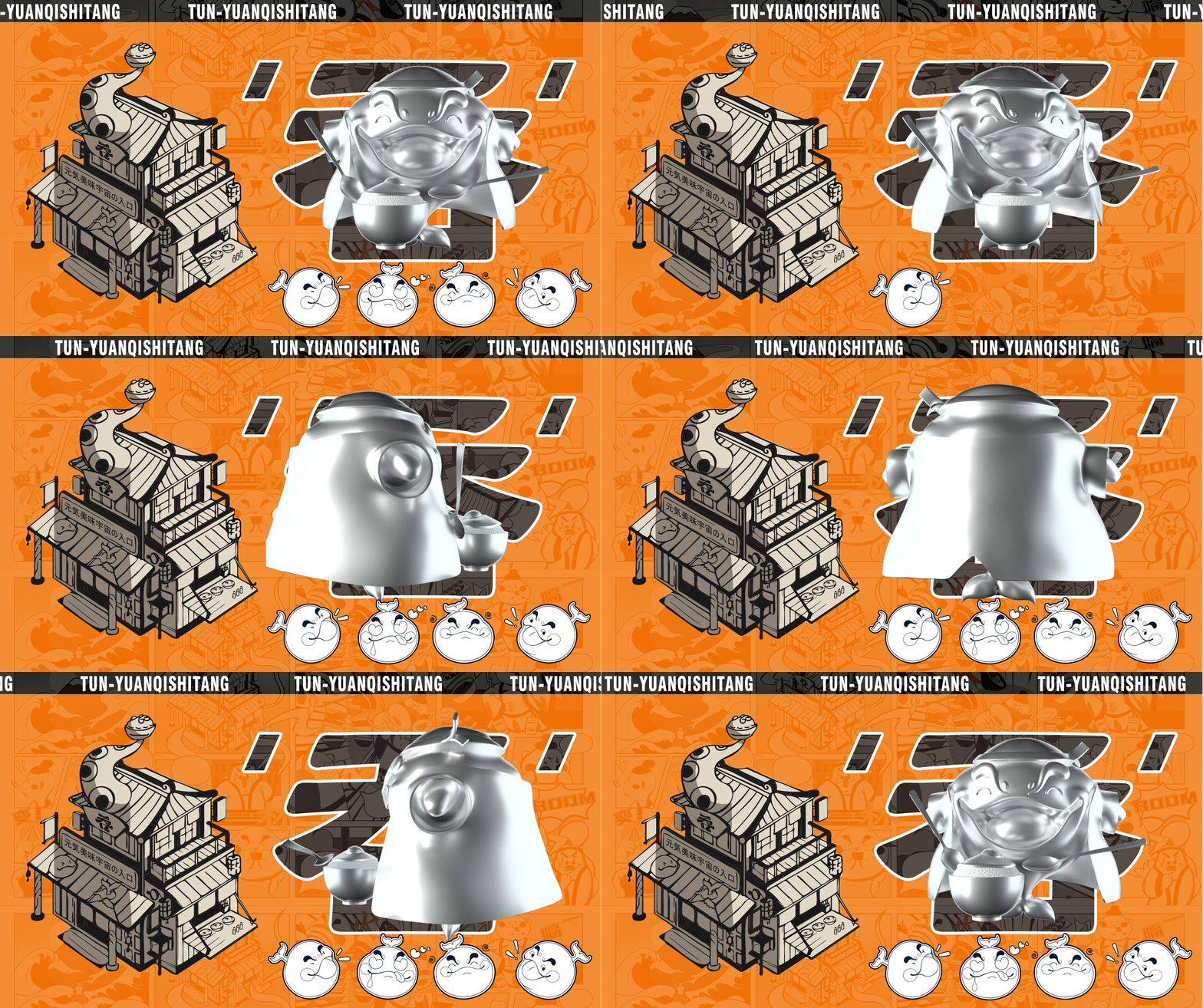
思路. THINKING 在三店「吞·元气食堂」项目前期,创始人跟我们交流,希望我们能够给三店带来新潮、创意的综合元素,借由我们之手,让他的品牌理念能够更突出的展现。 于是,经过多次团队探讨,发现“吞”所表现的不仅是品牌名称,还能被赋予成有元气、爱美食的小神兽形象。 基于鲸鱼不会咀嚼,进食都靠大口吞,便巧妙的在鲸鱼的原型上进行创作,运用丰富、夸张的表情以及逗趣、生动的姿势映照出品牌文化,驱动着品牌与年轻消费者真实的互动起来。 In the early stage of the "Tun · Yuanqi canteen" project of Sandian, the founder communicated with us, hoping that we can bring trendy and creative comprehensive elements to Sandian, and let his brand concept be more prominent through our hands. Therefore, after many team discussions, it is found that "Tun" not only represents the brand name, but also can be endowed with the image of a small divine beast with vitality and love for food. Since whales can't chew and eat by swallowing, they skillfully create on the whale prototype, use rich and exaggerated expressions and funny and vivid gestures to reflect the brand culture and drive the real interaction between the brand and young consumers. 开场即为亮点,以新潮有趣的IP元素不绝于耳仿佛告诉每一位食客侵入者我们不但有“趣”更有“味”。 The opening is the highlight, with trendy and interesting IP elements, as if to tell every diner intruder that we are not only "interesting" but also "interesting". 整体空间以清水混凝土为基调。由于商场内部顶面管道设施及设备繁杂,因此设计师采用裸顶的处理的手法,以此保证空间的层高及通透性。顶部多用广告灯箱元素与炫彩照明去营造整体气氛,让用户有更放松愉悦的心情。 The overall space is based on fair faced concrete. Due to the complexity of pipeline facilities and equipment on the top of the mall, the designer adopts the method of bare top treatment to ensure the floor height and permeability of the space. Advertising light box elements and colorful lighting are used at the top to create an overall atmosphere, so that users} have a more relaxed and pleasant mood. 以氛围作为开场,温润的水泥酷炫的灯光与板前的厨师似剧场的演绎,热烈低回并置的结构融合人物的往来,设计师多用当下潮流新名词:二次元、蒸汽波、数码科技、高街等营造出别有洞天的情境。 With the atmosphere as the opening, the warm cement, cool lights and the chef like theater interpretation in front of the board, and the warm and low back juxtaposition structure integrate the exchanges of characters. Designers often use new terms of the current trend: secondary element, steam wave, digital technology, high street and so on, creating unique situations. 唯心料理 为心料理 料理是一场原地的旅行 Only heart cooking For heart cooking It's a journey in place 项目名称: 吞 · 元氣食堂 Project Name:Tun · YuanQi ShiTang 项目地点: 苏宁广场6F 丨 芜湖 Project Address:Suning Market 6F丨WuHu 项目面积: 约168㎡ Project Area:About 168㎡ 总设计师: 何世洲 Chief Designer:He Shizhou 空间设计:HMZ 几何共社 Space Design:HMZ ARCH DESIGN Co.,Ltd 平面设计: 黑铅笔 Construction Unit:Made in WanJiang 主要用材: 镀锌钢板、透光亚克力、光导条、水泥漆、饰面板 Main materials: Galvanized sheet, Acrylic, Light guide strip, Cement paint, Decorative panel Project Photography:Wu Keming、Ye Liangwei 完工周期:45天 Completion period:45 days |
精华推荐
换一换
 收藏
收藏  说两句
说两句 




厉害,!点赞!