|
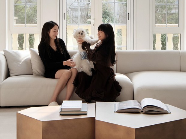
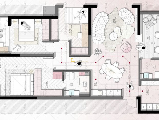
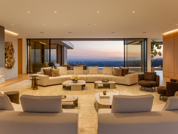
本帖最后由 大小设计 于 2022-7-11 18:05 编辑 这是 DAXO 两年前的一套作品,2021年尾拍了毕业照。依然是极简的白木,有一丝台式休闲的美感。 This is a set of DAXO works 2 years ago, and a graduation photo was taken at the end of 2021. It is still a minimalist white wood, with a touch of desktop casual beauty. 家是让人感受宁静,远离烦嚣的地方, 岁月安然,不慌不忙,不紧不慢。 Home is a place where people feel peaceful and away from the hustle and bustle.The years are safe, not in a hurry, not in a hurry. ▲ 项目地址 保利城·誉峰花园 C区 2020年的春天,在了解项目属性之后,年轻业主把这套房子交给我们设计,希望家可以简单不需要太多的色彩,打造一个黑白灰+原木极简格调的居所。 In the spring of 2020, after understanding the properties of the project, the young owner handed over the house to us to design, hoping that the home could be simple and not need too many colors, creating a minimalist residence with black and white ash + logs. ▲ 空间动向 · 01 DINING/KITCHEN 餐厅/厨房 - 入口处,打通了厨房过廊隔墙,步入空间,豁然开朗。 At the entrance, the partition wall of the kitchen and corridor is opened, and when you step into the space, you are suddenly enlightened. 原木系统柜结合格栅门也成了餐厅空间背景,空间被规整,塑造在简单与自由之间。 The log system cabinet combined with the grille door has also become the background of the restaurant space. The space is organized and shaped between simplicity and freedom. 白色岛台横亘在中西厨中间的位置,可以当作备餐区、休闲区或装饰隔断来使用,能直观带入家人烹饪,亲友陪伴在侧,偶尔杯盏交叠的闲聊氛围。 The white island lies in the middle of the Chinese and Western kitchens. It can be used as a meal preparation area, a leisure area or a decorative partition. It can be directly brought into family cooking, accompanied by relatives and friends, and the occasional chat atmosphere with overlapping cups. · 02 LIVING ROOM 客厅 - 白色空间被原木地板衬托得温柔可亲,长时间共处,也相看不厌。奶油白的布艺沙发,营造出舒适的居家氛围。 The white space is set off by the original wooden floor so that it is gentle and amiable. Cream white fabric sofa, creating a comfortable home atmosphere. 无主灯设计的吊顶干净利落,朝南超大采光面的加持下,仅用内嵌灯带和射灯作为补充照明便已足够。客餐厅做开放式格局设计,通过形态与色彩,展示空间多面性,沉静内敛,但含蕴着力量,令人不知不觉在重复且不重复中游离体验。 The ceiling with no main light design is clean and neat. With the blessing of the large south-facing lighting surface, it is enough to use only built-in light strips and spotlights as supplementary lighting. The guest restaurant is designed in an open-plan layout. Through form and color, it shows the multi-faceted space. It is quiet and introverted, but it contains power, which makes people feel free to experience in repetition and non-repetition. · 03 STAIRCASE 楼梯 - 一直觉得楼梯在空间中是特殊的存在,作为垂直交通的功能组件,亦是设计重心,突破循规蹈矩的秩序,这次设计处理成阶梯半通透,视觉上得到舒展,轻盈通透,打破了空间的沉重压抑。 I always feel that stairs are a special existence in space. As a functional component of vertical traffic, it is also the focus of the design. It breaks through the rules and order. This time, the design is treated as a semi-transparent staircase, which is visually stretched, light and transparent, breaking the space. of heavy depression. 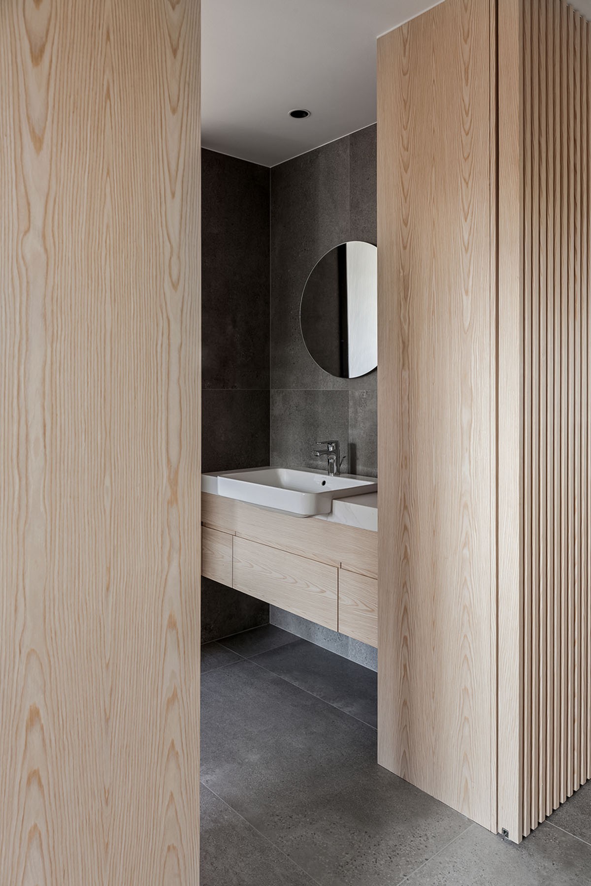
· 04 ELDER ROOM 长辈房 - 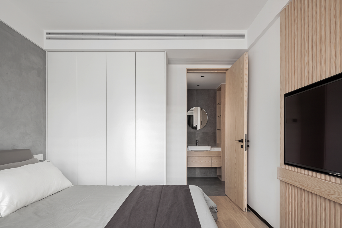
拆除了原先封闭飘窗台,释放出一定的空间感。 床尾的桌台简单好用。 The original closed bay window sill was removed to release a certain sense of space. The table at the end of the bed is simple and easy to use. 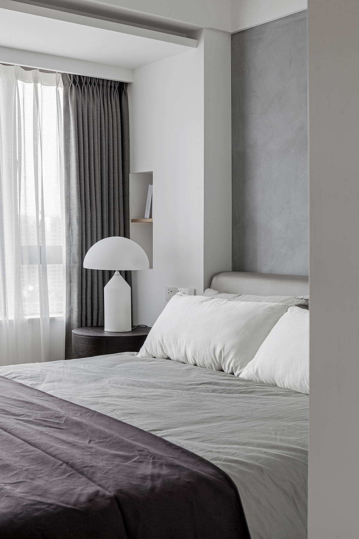
· 05 MASTER BEDROOM 主卧 - 
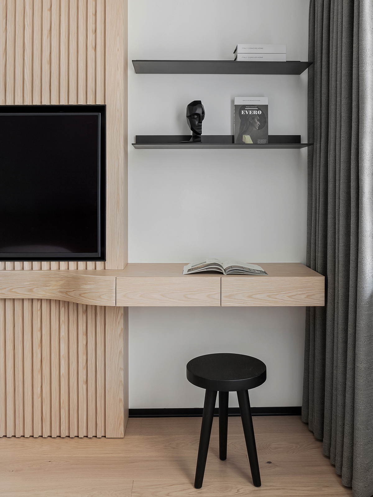
主卧依然是干净清爽而不冰冷的白木配色,无主灯设计搭配简约白板+格栅背景,流露出沉静隽永之美。 The master bedroom is still a clean and refreshing but not cold white wood color scheme, no main lamp design with a simple whiteboard + grille background, showing a quiet and meaningful beauty. 大面积木饰面上墙,让空间更显内敛大气。电视直接嵌入,不占空间也十分美观。两侧隐形门分别通往衣帽间、书房。 A large area of wood veneer is placed on the wall, making the space more restrained and atmospheric. The TV is directly embedded, which does not take up space and is very beautiful. Invisible doors on both sides lead to the cloakroom and study respectively. · 06 STUDY + CLOAKROOM 书房+衣帽间 - 一侧的隐形门后面,纯白极简的衣帽间收起了生活的所有杂乱,让生活更显整洁精致。 Behind the invisible door on one side, the pure white and minimalist cloakroom hides all the clutter of life, making life more neat and delicate. 心居之所,是为书房。简洁有力的黑色钢板壁架,为空间增加了展示书籍和陈设物品的空间;超长的办公桌可满足夫妻俩日常的办公需求。 The place where the heart resides is the study. The simple and powerful black steel wall shelf increases the space for displaying books and furnishings; the extra-long desk can meet the daily office needs of the couple. 卫生间与整体风格保持一致,秉持着简的态度,构建空间极简的逻辑。设计了独立马桶间和淋浴间+独立浴缸配套。 The bathroom is consistent with the overall style, adhering to the attitude of simplicity, and constructs a minimalist logic of space. Independent toilet room and shower room + independent bathtub are designed. 阳台放一把原木藤椅,散发出闲适慵懒的味道。坐在这里看看风景、晒晒太阳、放空心情都是极佳的。 A log rattan chair is placed on the balcony, exuding a sense of leisure and laziness. Sitting here looking at the scenery, basking in the sun, and letting go of the mood are all excellent. 隐形移门关上,卧室就自成两个酒店的套间。 When the invisible sliding door is closed, the bedroom becomes a suite of two hotels. · 08 BADROOM 卧室 - 纯白的卧室空间,无需过多的装饰,摒弃一切冗余,挂一吊灯悬浮于空中。通透的卫浴空间,让空间更加时尚通透。 The pure white bedroom space does not need too much decoration, abandons all redundancy, and hangs a chandelier suspended in the air. The transparent bathroom space makes the space more fashionable and transparent. · 09 PRIVATE TOILET 私卫 - 私卫盥洗区延长到入门,提前规划好预埋龙头和壁挂马桶空间,让一切井然有序。 The private bathroom area is extended to the entrance, and the pre-buried faucet and wall-mounted toilet space are planned in advance to keep everything in order. 卧室飘窗台拆除设置了边柜同时很好链接异形床头柜,实用能收纳,也略显轻盈。 The bay window sill in the bedroom is dismantled and set up with a side cabinet, which is also very well connected to the special-shaped bedside table. It is practical and can be stored, and it is also slightly light. · 10 项目名称:Z-house 极简私宅 项目地址:福建 莆田 项目面积:170+㎡ 设计公司:大小设计工作室 主创设计:苏清华 参与设计:黄萍萍 卓建凡 设计年份:2020 施工单位:李建施工 项目摄影:杨耿亮 |
精华推荐
换一换

 收藏
收藏  说两句
说两句 


 谢谢
谢谢 666666







6666666