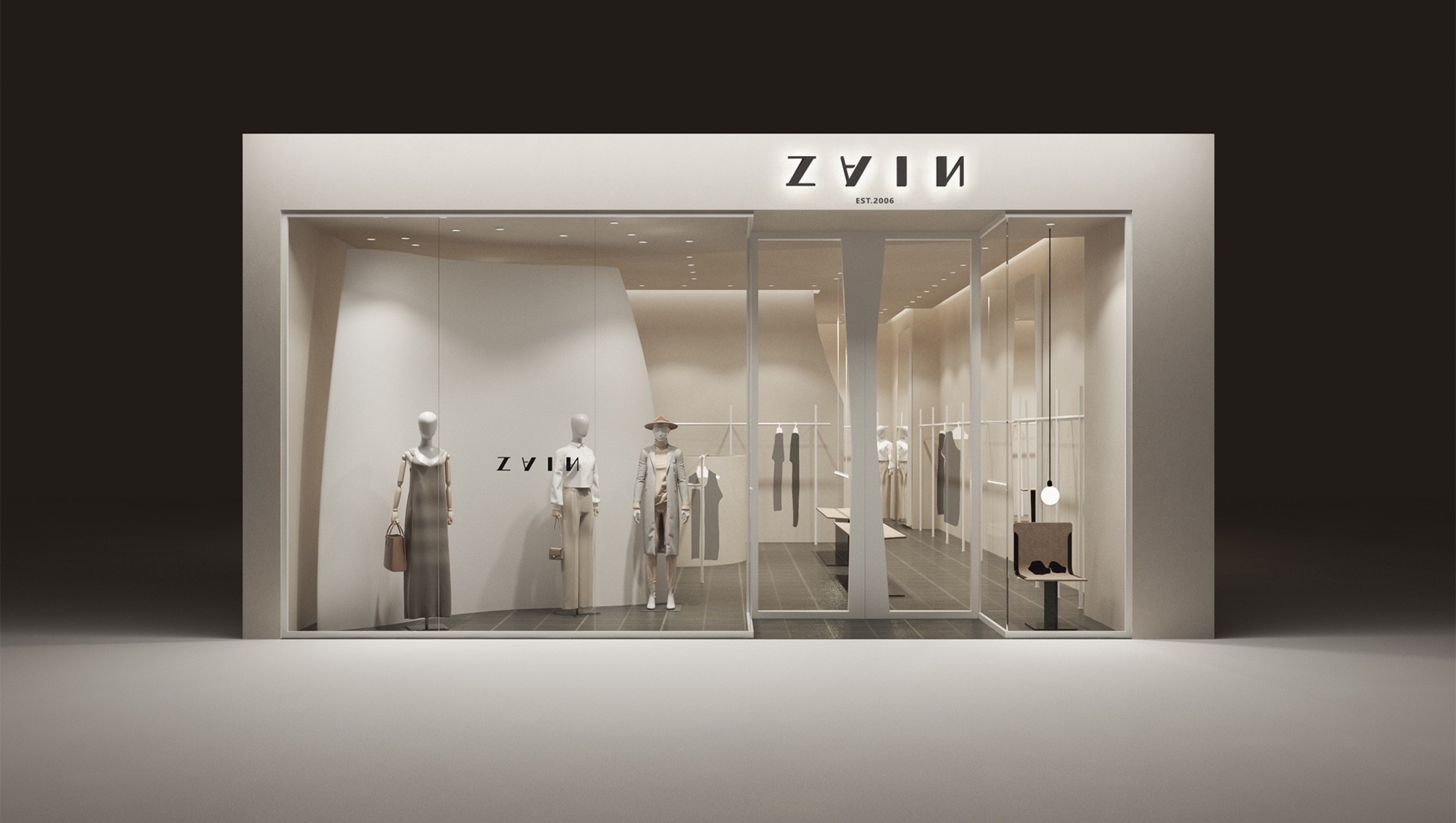
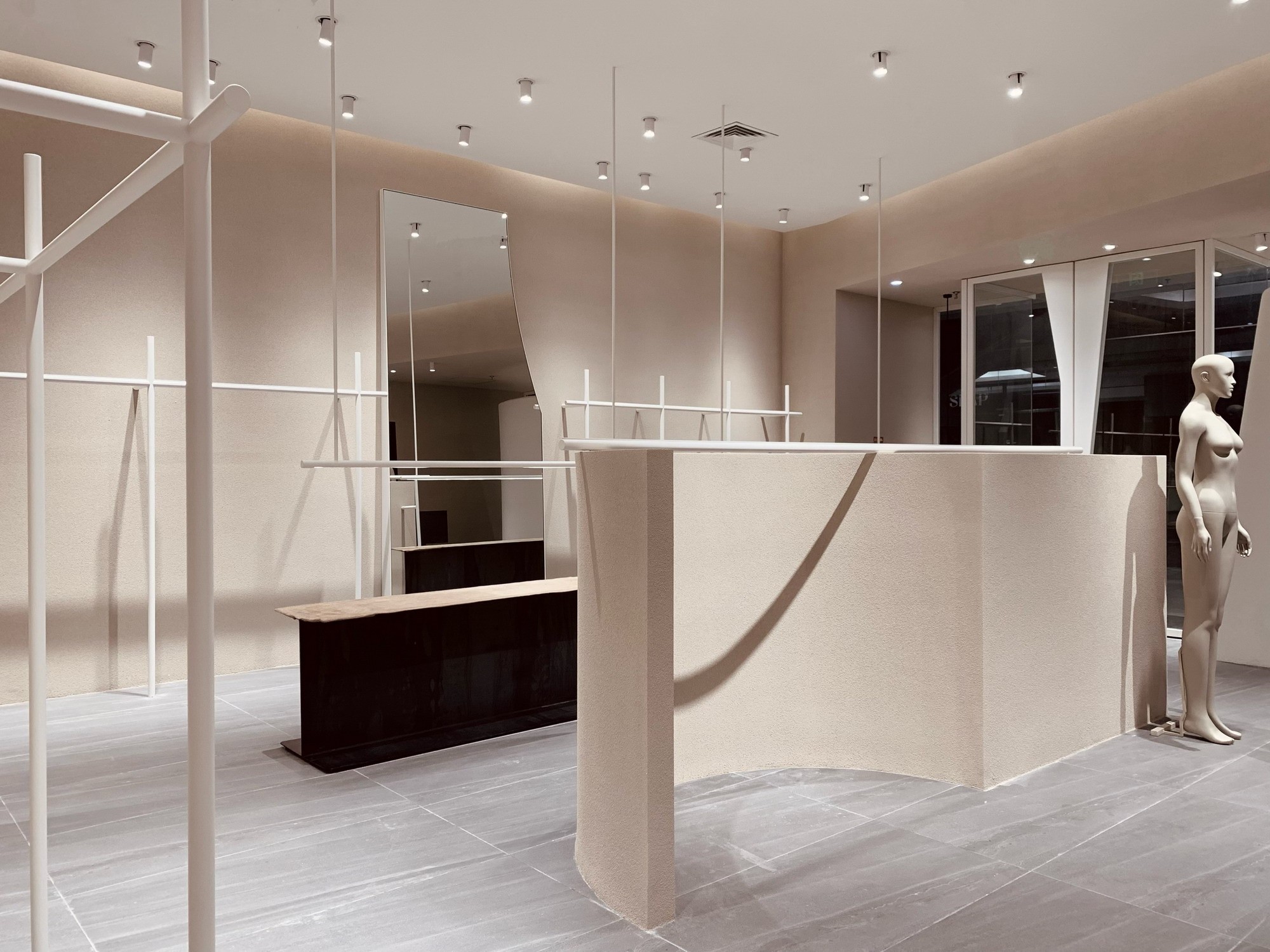
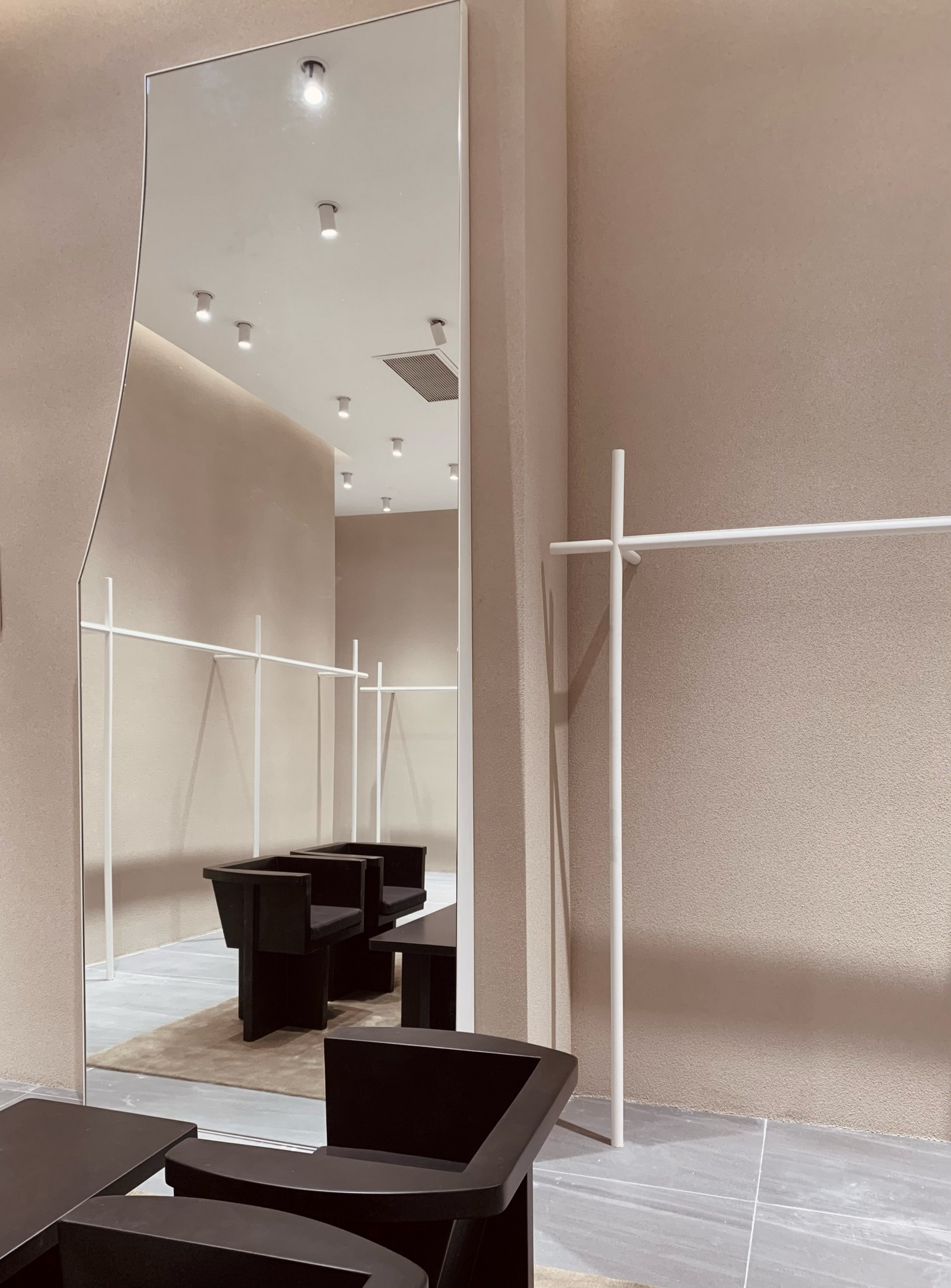
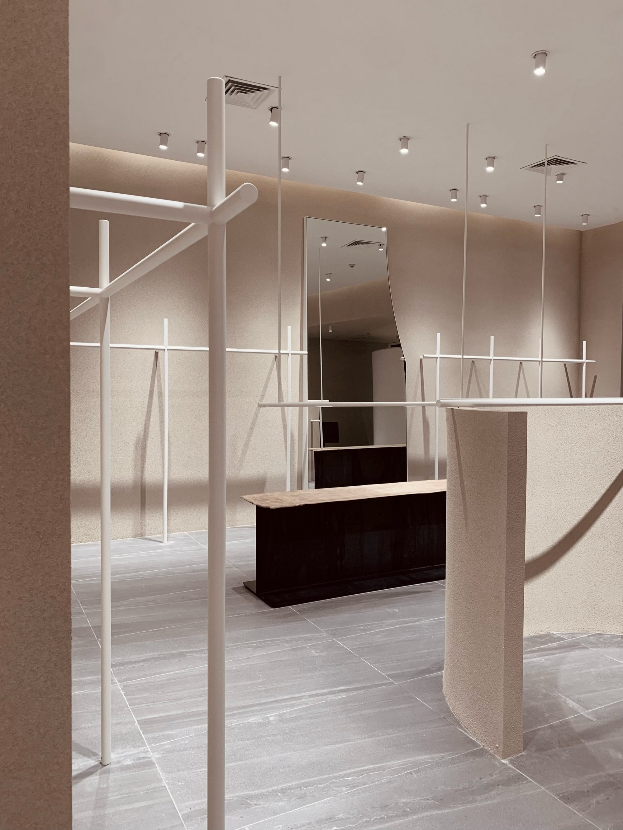
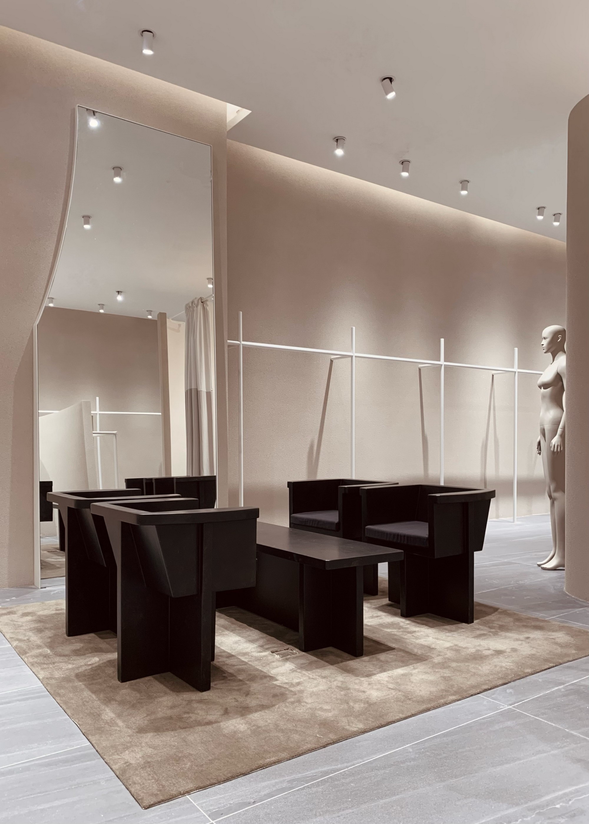
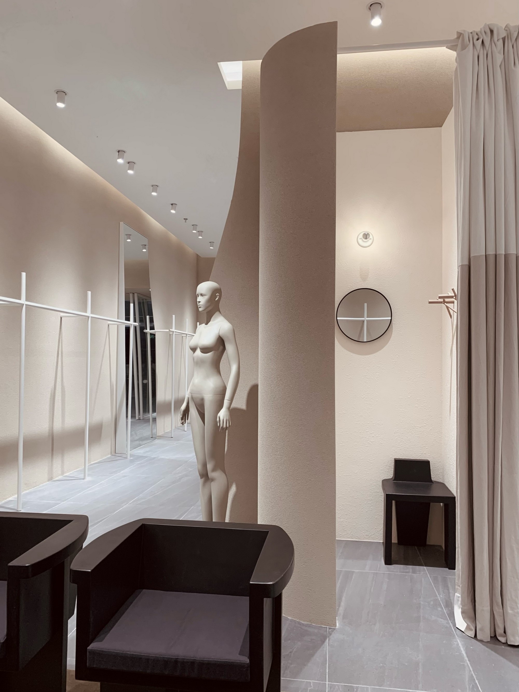
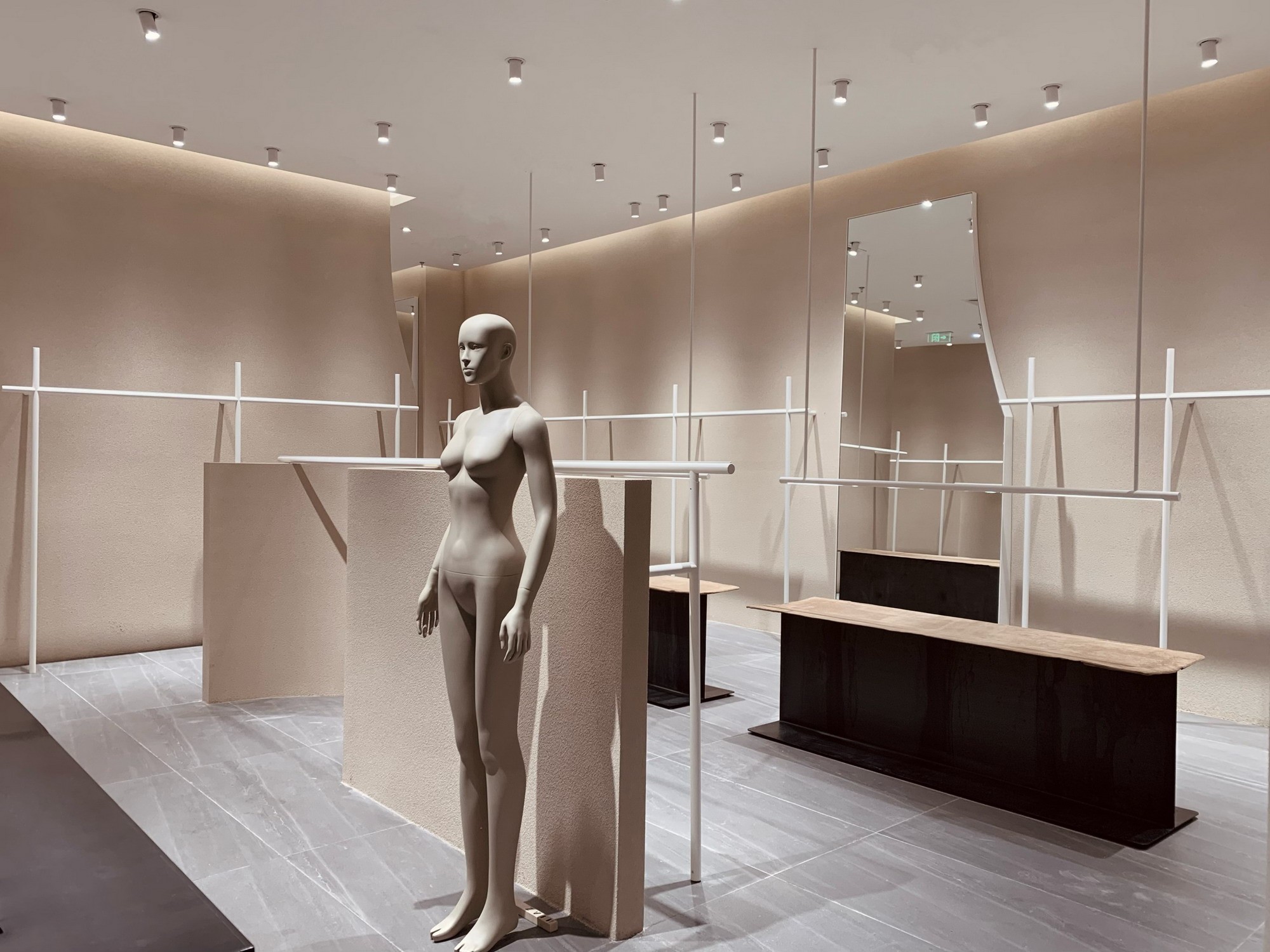
ZAIN厦门SM店设计概念 2022 ZAIN形上厦门SM片全新概念店,延续ZAIN一贯简约大气,极具艺术气息的品牌理念,且从独特建筑空间美学视角出发,从LOGO到店面形象都做了全新的升级。 全新LOGO保留了原来简洁大气的气质基础上,再加以提炼,笔画粗细的对比更加凸显出字母的节奏感,A和N分别做了左右和上下的颠覆,但却不失字母辨认度,却又增加了趣味性和设计感,提高了LOGO整体的时尚度,LOGO下方还特别加以EST 2006的后缀词,即提醒了品牌的初创时间概念,也增强了LOGO的精致度。 店铺设计整体采用大量”留白“的概念,无论色彩还是线条结构,无不充分体现ZAIN低调不露声色却又暗含饱满的内涵情感,色彩上大面积采用偏裸色调的哑光灰杏色,配以局部米白色,再利用道具的啡黑色点缀其中,视觉干净透气,传递出一种低调的高级感。从不对称的门框拉手到橱窗异形背景结构。。。。。。再到场中层次分割墙以及故意做缺口状的靠镜。。。。。。和大块面墙体的体积感和拉伸至天花的线条感,统统凌驾在一种极具建筑空间美学和艺术视觉张力的氛围之上。 略带工业感的几组展示单品道具,运用牛皮,玻璃钢及金属烤漆等材质的有趣对比手法,结构简约利落且具厚重感,很好的平衡了和点缀在整体”留白“概念当中。 整个店铺设计与品牌产品本身做了一次很好的融合,无声但浓郁的空间美学情感传递,令人过目难忘。。。。。。 Designconcept of ZAIN Xiamen SM store In 2022, ZAIN is a brand-new concept store of SM film in Xiamen. Itcontinues the brand concept of ZAIN, which is alwayssimple, atmospheric and artistic. From the perspective of unique architecturalspace aesthetics, it has made a new upgrade from logo to store image. The new logo retains theoriginal simple and atmospheric temperament, and then refines it. The contrastbetween the thickness of strokes highlights the sense of rhythm of the letters.A and N subvert the left and right and up and down respectively, but do notlose the letter recognition, but increase the interest and sense of design, andimprove the overall fashion of the logo. The suffix EST 2006 is specially addedbelow the logo, which reminds the brand of the concept of the start-up time, Italso enhances the refinement of the logo. The overall design of thestore adopts a large amount of "blank space" "In terms of colorand line structure, all of them fully reflect ZAIN's low-key and unspoken but full of connotation and emotion. In color, alarge area adopts the matte grey apricot color in partial nude color, withlocal off white, and then uses the brown black of the props to decorate it. Thevision is clean and breathable, conveying a low-key high-level sense. From theasymmetric door frame handle to the abnormal background structure of thewindow... And then to the middle level of the scene Cutting walls and deliberatelymaking notched mirrors...... The sense of volume of the wall and the sense oflines stretching to the ceiling are all above an atmosphere with greatarchitectural space aesthetics and artistic visual tension. Several groups of displayitems with a slight sense of industry use interesting comparison methods ofmaterials such as cow leather, glass fiber reinforced plastics and metal paint.The structure is simple and clean with a sense of massiness, which is wellbalanced and embellished in the overall "blank" concept. The whole store design iswell integrated with the brand product itself, and the silent but rich spaceaesthetic emotion transmission is unforgettable...... 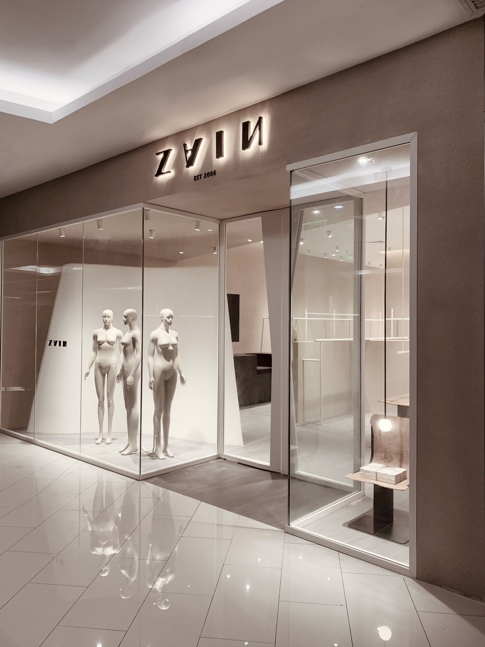


项目名称:ZAIN厦门SM生活广场旗舰店 Project Name: ZAINXiaMen SM PLAZA flagship store 项目地址:厦门 Location:XiaMenCHINA 设计单位:RSXS深圳睿上形素室内设计有限公司 DesignCompany: RSXS studio 主案设计师:JAYSONKU ChiefDesigner: JAYSONKU 辅助设计师:YUIYIN CHUI AssistantDesigner:YUIYIN CHUI 项目面积:160㎡ Area:160㎡ 项目造价:60万 Cost:RMB 600,000 设计起止日期:2022/2-2022/5 DesignCycle: 2022/2-2022/5 完工时间:2022/6 Completiontime: 2022/6 主要材料:艺术漆/金属喷砂烤漆/钢板/皮革 MainMaterials: Art paint / Stoving varnish / Steel plate / Leather 业主名称:ZAIN ClientName: ZAIN 项目摄影: JAYSONKU Photographer:JAYSONKU 联系方式邮箱:RSXS_design@163.com 微信:Jason424502 |
精华推荐
换一换





发表评论0