F L Y ¢ D E S I G N ⊙ # INALCO英纳克展厅 # 来自西班牙的INALCO(英纳克)品牌于1970成立,专注于岩板制造,着重创新发展,是岩板制造的先驱,致力于通过领导全球范围的创新来激发变革,找到新的解决方案、创造未来趋势。源自意大利的国际家具领航者Poliform高端家具品牌专供岩板、意大利豪华家具品牌Rimadesio所用岩板便来自于INALCO,INALCO展厅将落地于杭州滨江第六空间;以起源、自然形态为灵感起点,材质的构想、延伸,物质的形态与窥察之角度为基点,在有限的区域里释放空间给予的欲望、猜想。 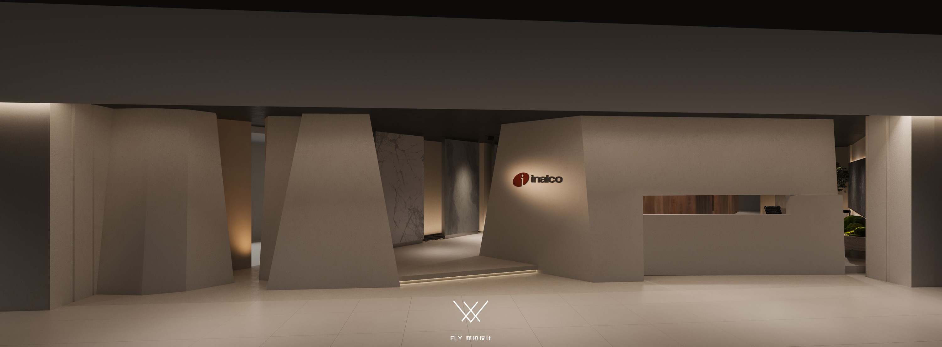
入口 / Entrance 岩板给人的初始印象坚硬中实,自然联想到山之岩石,以及国画描写的山水形式,由近及远、层次递进错落有致;采之于山、提之于画、以山水画的表现手法为建筑体态灵感,山体抽象化以几何梯形显现,作为展厅外立面造型;梯形外立面材质以岩板呈现,通过造型与岩板的结合表现山石与岩板的感官联系。 The initial impression of the rock plate is hard and solid, which is naturally associated with the rocks of the mountain and the landscape forms described in traditional Chinese painting; Inspired by the expression of landscape painting, the mountain is abstracted by geometric trapezoid, which is used as the exterior facade of the exhibition hall; The rock slab is attached to the trapezoidal facade, and the combination of modeling and rock slab shows the sensory connection between rocks and rock slabs. 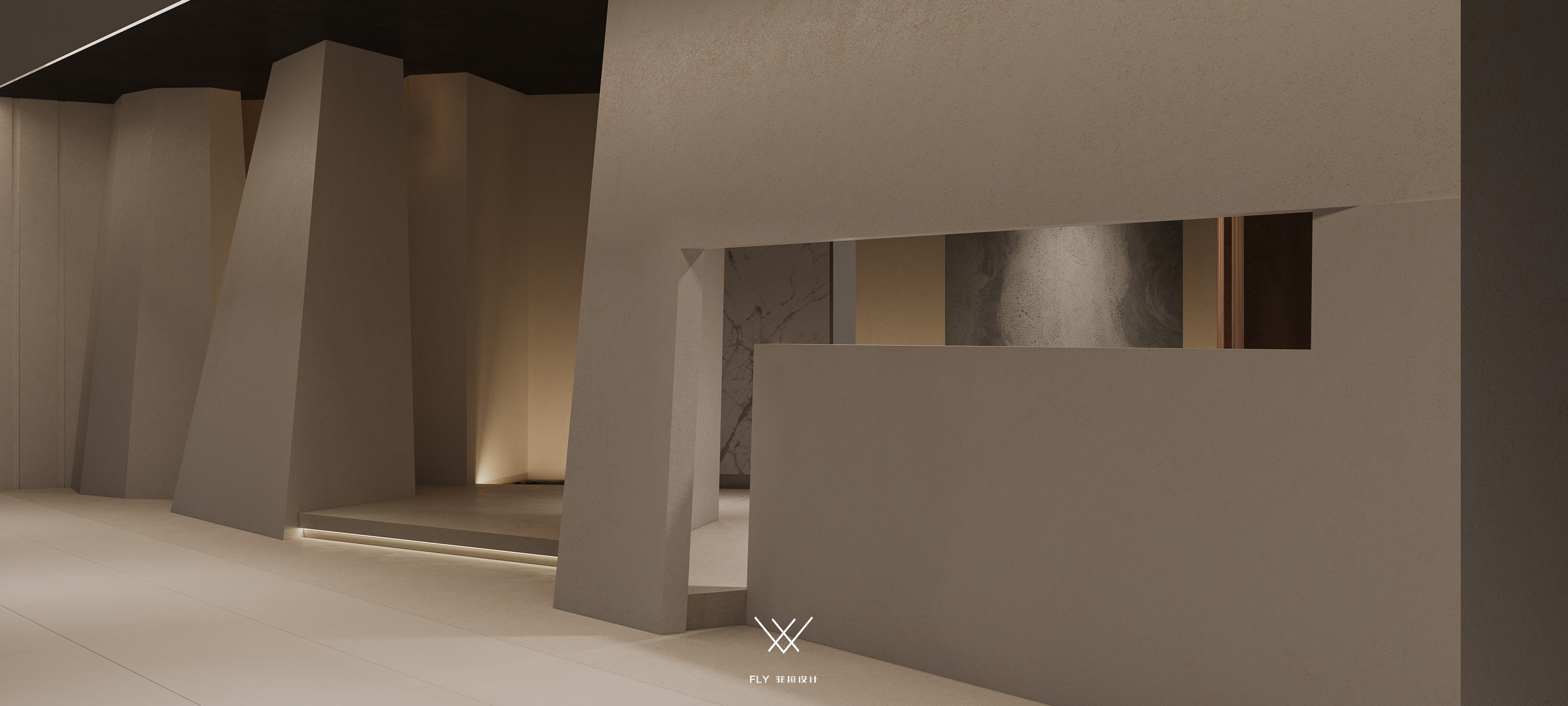
入口 / Entrance 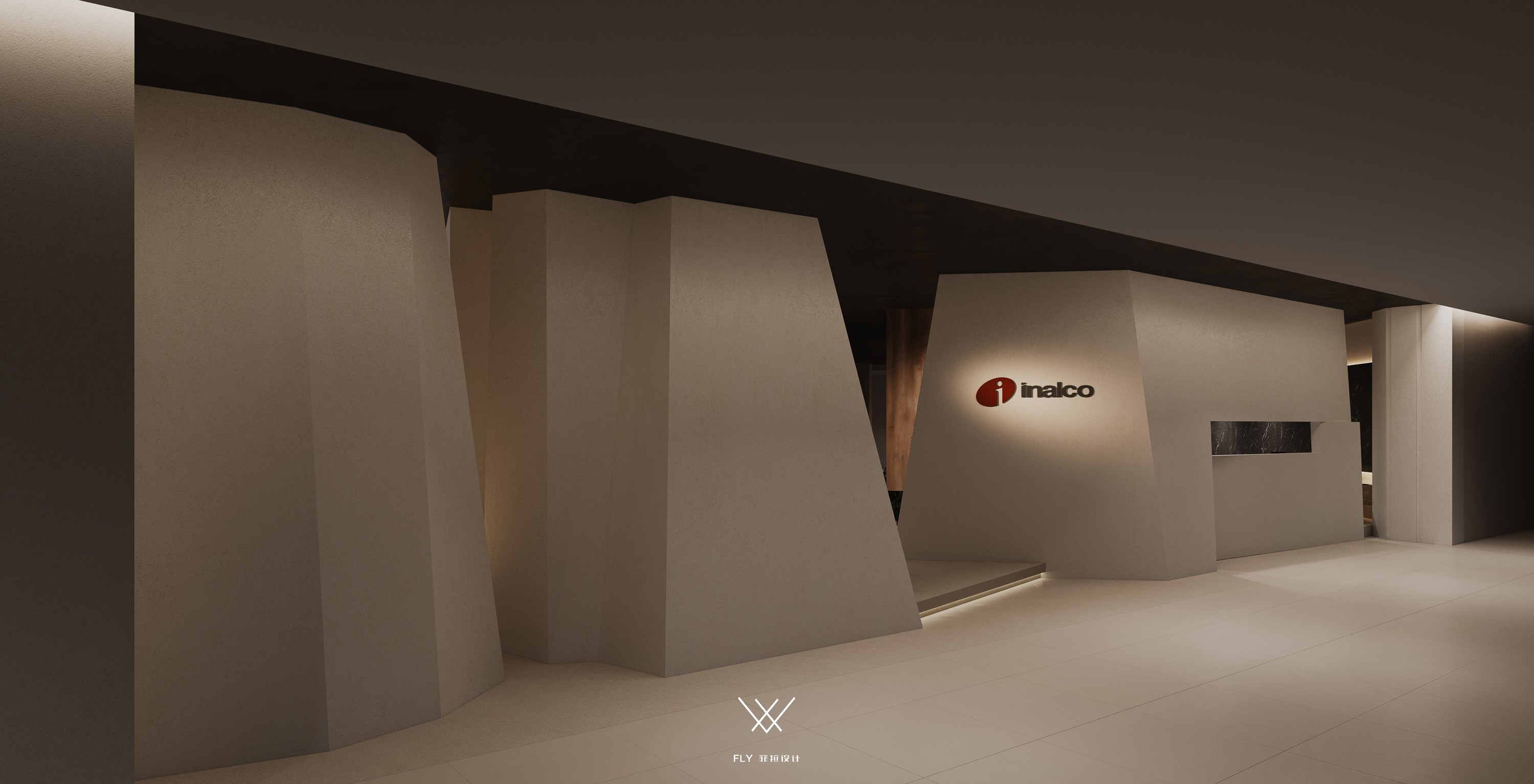
入口 / Entrance 把握展厅主体在整个大空间之内的关系,主入口构筑一斜面与入口产生垂直面,且这扇斜面处于商场入户门正对面,将品牌logo放在此面上,利用位置优势结合空间规划加强展厅的商业表现力。 Grasp the relationship between the main body of the exhibition hall and the whole large space, and build a slope to create a vertical plane between the main entrance door and the entrance, and this slope is directly opposite the entrance door of the mall. Put the brand logo on this plane, and combine the space planning with the location advantage to strengthen the commercial expression of the exhibition hall. 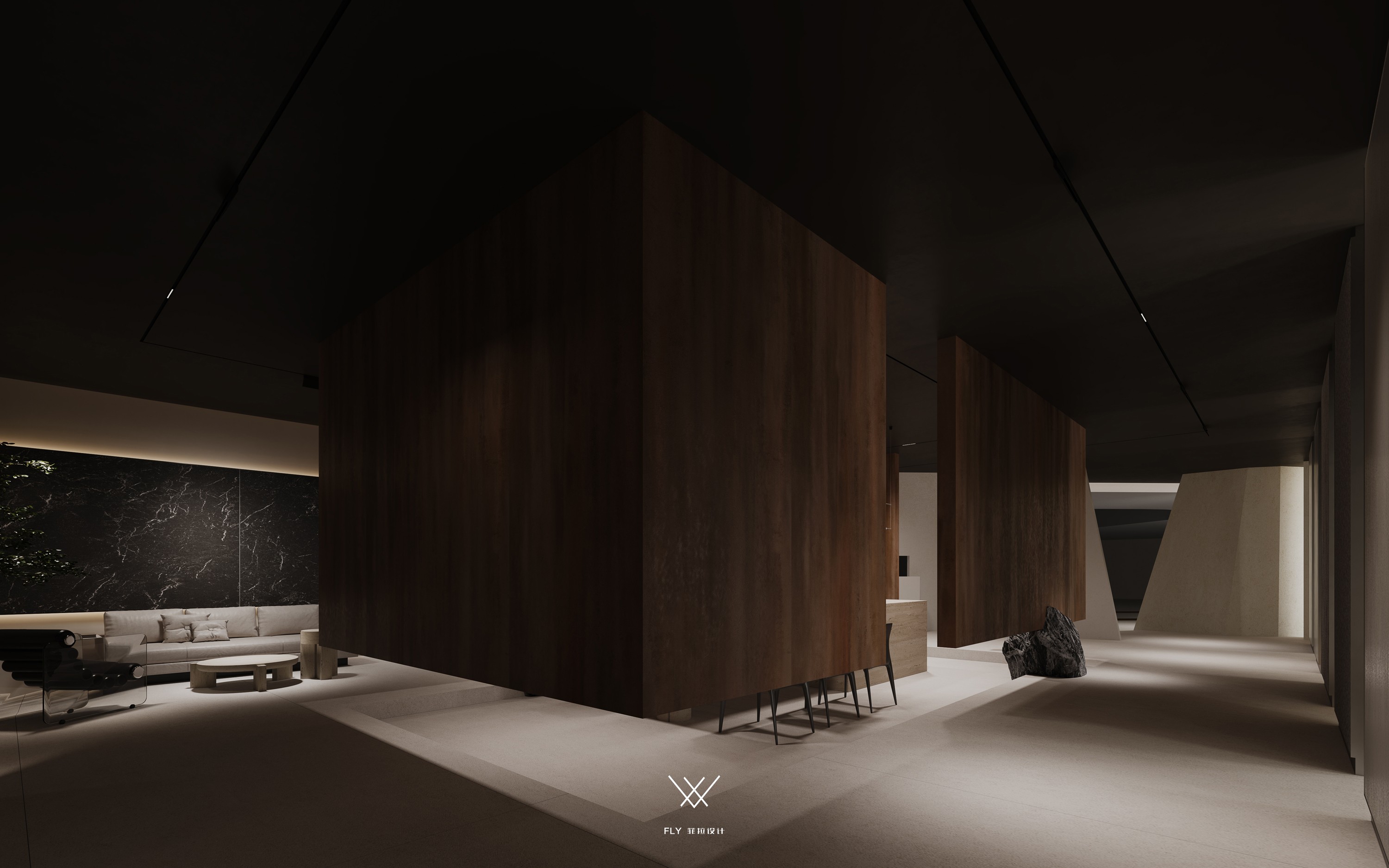
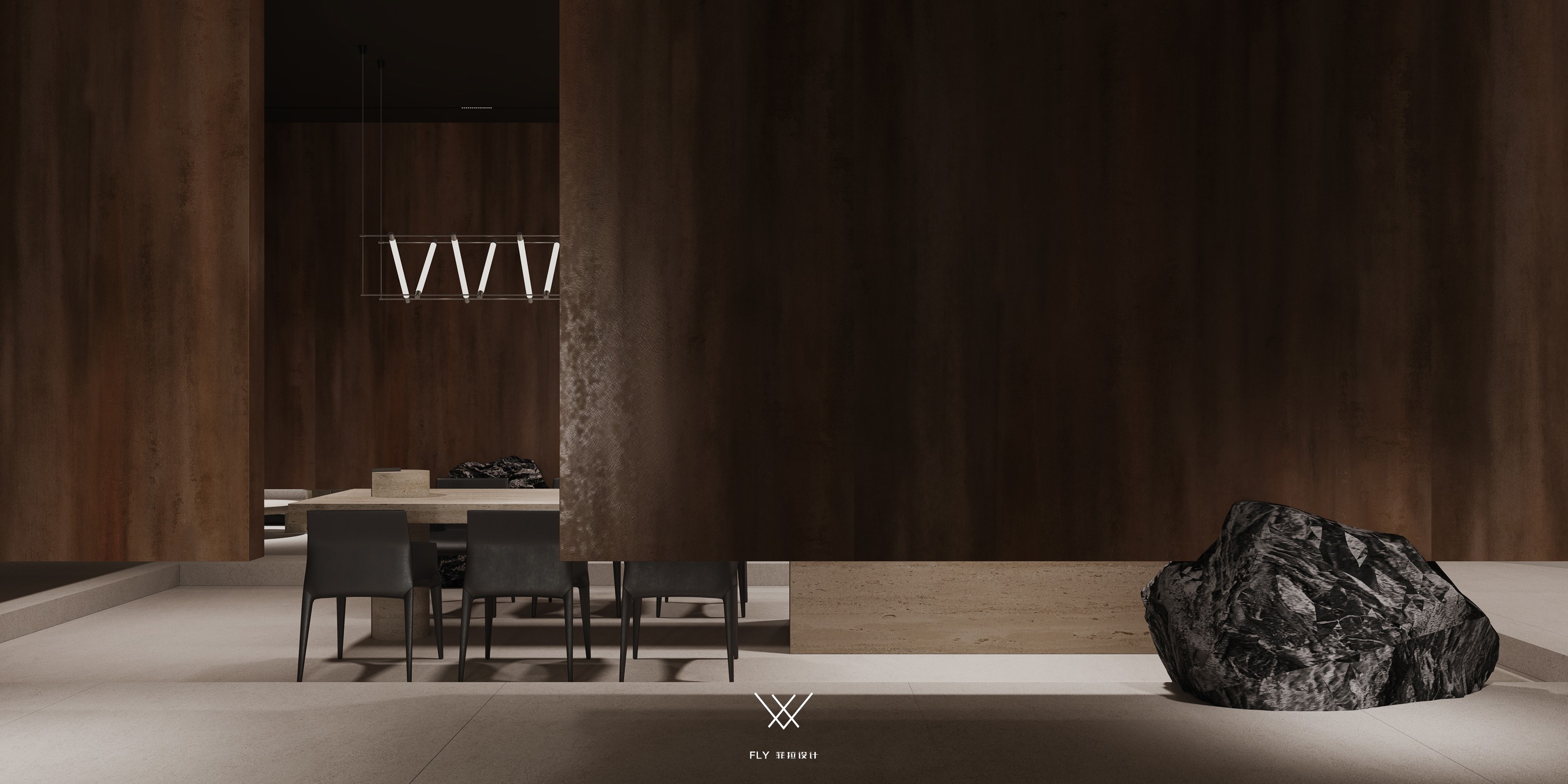
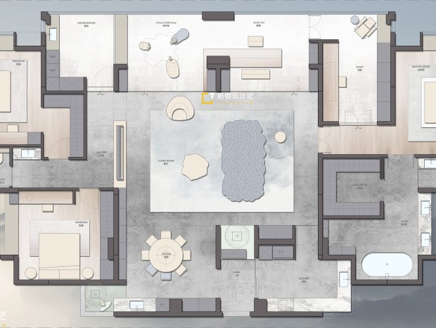
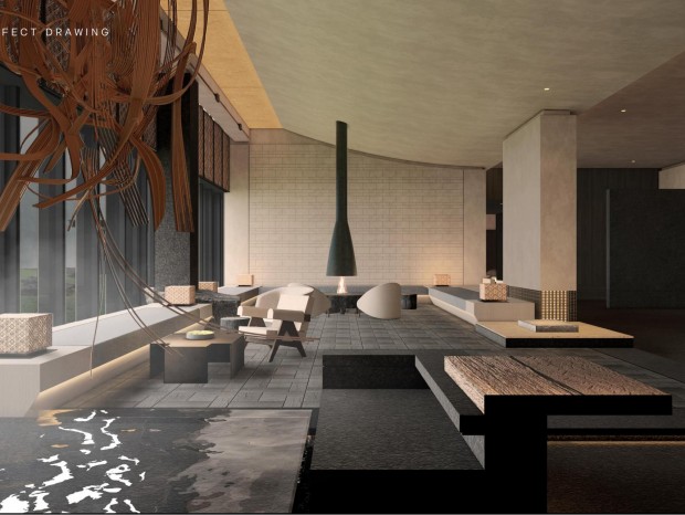
展示区 / Exhibition area 在有限的空间里面希望展厅可以有更大的空间气量,不被面积所囿,重新梳理动线的走势、区域的限定分隔,以环绕中心的游园式动势,分为内外三层空间,迂回手法让展厅不再是窥一隅而见全貌。移步易景的构造激发访客对展厅探索的欲望。 In the limited space, it is hoped that the exhibition hall can have a larger space capacity, not be limited by the area, and reorganize the trend of the moving line and the limited division of the area. With the garden like movement around the center, the exhibition hall can be divided into three layers of space, inside and outside. The roundabout approach makes the exhibition hall no longer a corner to see the whole picture. The structure of Yijing arouses visitors' desire to explore the exhibition hall. 展示区 / Exhibition area 第一层是展厅最外面的框架结构,其间加入一些中式景观与营造的山石印象有所呼应。通道墙壁亦承担着岩板展示的功能。 The first floor is the outermost frame structure of the exhibition hall, in which some Chinese landscapes are added to echo the stone impression. The wall of the passage also serves as a display of rock slabs. 展示区 / Exhibition Area 展示区 / Exhibition Area 为了渲染空间的神秘感及其调性,利用视觉感官与人物心理,调动人物对于空间的探索欲,展厅灯光大多是昏暗氛围。展厅内配备有两路灯光,一路为上图的昏暗氛围,一路是下图的明亮空间,当有客户要选样本时可将其打开以保证展厅的实际使用性。 In order to render the mystery and tonality of the space, the visual senses and characters' psychology are used to mobilize the characters' desire for space exploration. The exhibition hall lighting is mostly dark atmosphere. The exhibition hall is equipped with two lights, one is the dark atmosphere of the above picture, and the other is the bright space of the following picture. When customers want to select samples, they can open them to ensure the actual usability of the exhibition hall. 展示区 / Exhibition Area 第二层是展厅的主通道,通道侧边以可旋转式的岩板呈现,正反面都有岩板强化其商业展示的功能属性。 The second floor is the main channel of the exhibition hall. The side of the channel is presented with rotatable rock plates, and both the front and back have rock plates to enhance the functional attributes of its commercial display. 展示区 / Exhibition Area 展示区 / Exhibition Area 考虑到岩板本身的体量与展厅的层高,在墙壁上用横向的方式将岩板以画轴的形式铺开,是展示之需也是装饰之功能。这条通道相较于前半段空间较大,增添游览过程中豁然开朗的奇趣感受。 Considering the volume of the rock slab itself and the height of the exhibition hall, the rock slab is spread on the wall in the form of a scroll in a horizontal way, which is both a display need and a decorative function. Compared with the first half of the passage, this passage has a larger space, which adds an unexpected sense of fun during the tour. 洽谈区 / Negotiation Area 自进入展厅的入口处、展厅中心的洽谈区,都可见台阶元素,利用上下高度差打造空间的层次感与区域氛围,亦是馆长希望空间有楼梯台阶的形式表现岩板可用之处的广泛性。 Steps can be seen at the entrance to the exhibition hall and the negotiation area in the center of the exhibition hall. The difference between the upper and lower heights is used to create a sense of space hierarchy and regional atmosphere, which is also the way the curator hopes that the space has stairs to show the universality of the availability of rock slabs. 洽谈区 / Negotiation Area 第三层便是展厅的中心——洽谈区,四周以悬挂式墙体围合,通过下方黑山石来支撑,天然山石、抽象山体、多维度丰富空间故事感,打造展厅的视觉冲击力。 The third floor is the center of the exhibition hall - the negotiation area, which is surrounded by suspended walls and supported by real stones below. The real rocks, abstract mountains, and multi-dimensional rich spatial stories create the visual impact of the exhibition hall. 洽谈区 / Negotiation Area 将洽谈区放在展厅的中心方便去往四周挑选样本,反反复复挑选的过程,将洽谈区放在此处节省时间精力更为便捷。同时打造的下沉式空间,与四周的悬挂Box相呼应将此处呈围合沉浸之势,区域的包裹感、安全感更能够让客户安定下来,更深度地了解品牌产品。 Place the negotiation area in the center of the exhibition hall to facilitate the selection of samples from all around. It is more convenient to place the negotiation area here to save time and energy. The sinking space created at the same time echoes the hanging boxes around it, which makes this place surrounded and immersed. The sense of wrapping and security in the area can help customers settle down and have a deeper understanding of the brand products. 洽谈区 / Negotiation Area 洽谈区 / Negotiation Area 为展现INALCO英纳克岩板可做热弯工艺的性能,结合洽谈区餐桌,以桌腿的形式做圆柱形展现,在此区域也是更容易、更方便给客户做介绍了解。 In order to show the performance of the Innak rock plate that can be used as a hot bending process, the table in the negotiation area is combined with a cylindrical display in the form of table legs, which is also easier and more convenient to introduce to customers in this area. 洽谈区 / Negotiation Area 悬挂墙体的设计在下端留有50公分的高度,展厅内部人员可从这部分空间观察到是否有访客进入,随时做好接待准备。 The design of the hanging wall leaves a height of 50 cm at the lower end, from which the internal staff of the exhibition hall can observe whether there are visitors entering and be ready for reception at any time. 洽谈区 / Negotiation Area 平面图 原始图 主案设计师 创始人/设计总监:宋雄飞 专业:环境艺术设计 抛弃固有思维 寻求一切可能 让设计回归生活 宋雄飞,专注于室内空间设计,创立了自己的品牌公司“菲拉设计”。带领着一批具有崇高设计梦想的青年团队,一直在设计的矛盾中寻求突破。善于结合生活将空间重组,把空间特色发挥到极致,强调功能与美感平衡,尊重使用者的真实需求。生活方式决定空间形态,为众多业主量身打造属于他们自己别具一格的家。 主要业绩及获奖情况: 设博会华鼎奖十佳杰出设计青年; 中国空间设计艺术大赛-创新中国-最佳设计作品金奖; 创新中国空间设计艺术大赛十佳杰出设计青年; 亚太空间设计百强设计师 ; 台湾TINTA金邸提名奖; 好好住营造家奖; 《第八届大金内装设计大赛》综合设计 公寓组 铜奖; 《第七届大金内装设计大赛》全国综合设计 公寓组 铜奖; 国际空间设计大奖《艾特奖》 入围奖; 中央财经频道CCTV2《交换空间》栏目受邀设计师; 杭州电视台3频道《生活大参考》栏目受邀设计师; 杭州电视台4频道《家居我来帮》栏目受邀设计师; 作品在《神韵东方》《LUXE炫》《拓者优秀作品集》《豪宅风格大观》《现代装饰》《软装设计师手册》等书籍中出版作品发表《装修情报》《家居视界》《杭州城报》等平面媒体 设计案例:绿城-蓝庭伍重院、绿城-桃花源、绿城-翡翠城、绿城-绿园、新湖-武林国际、滨江-城市之星、万科大都会、信达滨江壹品、九龙仓碧玺、MONTO微水泥体验馆、FIFA办公室、DIO展厅、东方福邸、雅戈尔-御西湖、风雅钱塘、金基晓庐、钱江时代等 电话&微信/ 13456976319 QQ / 2696964275 抖音 / 菲拉设计 网址/ www.91flydc.com 邮箱/ flydc_co@qq.com 地址/杭州市江干区高德置地中心2号楼2单元1101室 来自群组: 杭州菲拉装饰 |
精华推荐
换一换
 收藏
收藏  说两句
说两句 







发表评论0