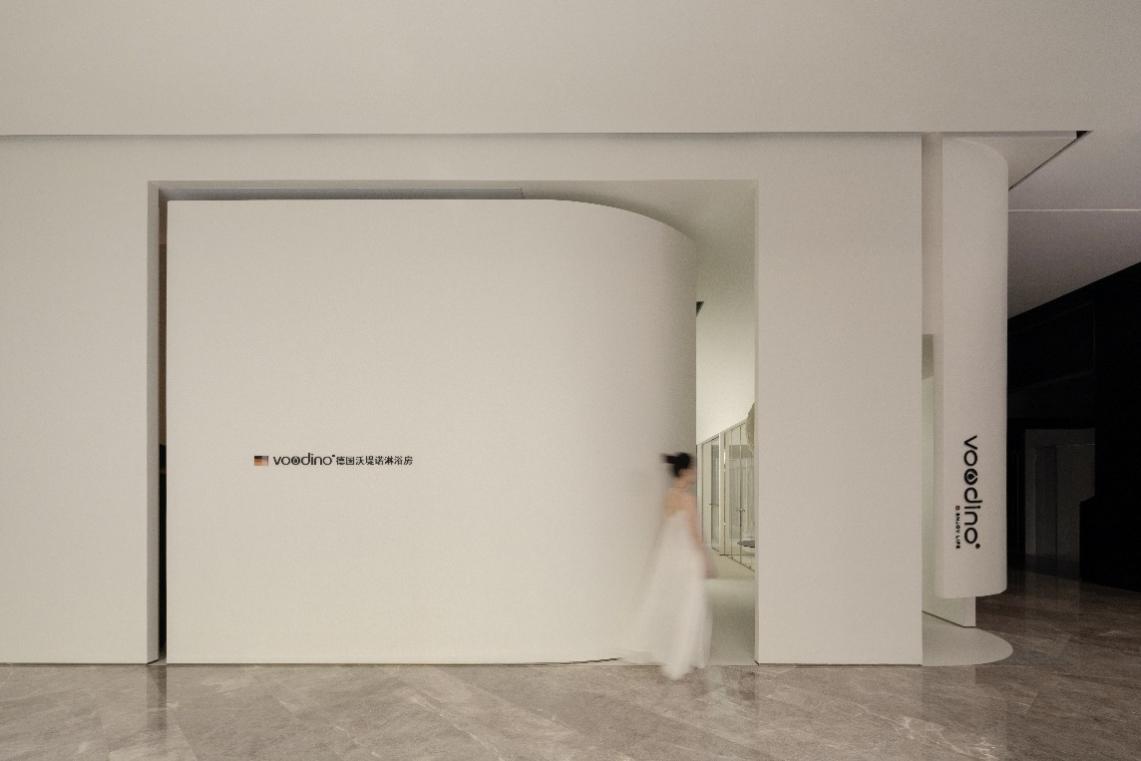
01 概念阐述 Concept of this paper 初期接触到品牌VOODINO产品时,从产品材质本身融合金属、玻璃到极简元素的线条造型都透露出德国品牌的产品调性。再三与品牌主理人沟通设计需求之后,了解产品背后的故事,设计解读上就有了起点,我们发现产品本身理性的外表之下包裹着一些感性,甚至优雅,每一个直线条都做了细节的圆润处理,镶嵌施华洛世奇水晶的拉手及概念产品圆弧型淋浴房,最让我们感觉到惊喜的是追溯着经典的基因,数字几何形态的构成,以线条、几何、材质、色彩、光影构建出品牌空间的理想场景,唤醒经典质感与美学符号的共鸣。 When I first came into contact with the brand VOODINO product, the line modeling from the product material itself, which integrates metal, glass and minimalist elements, revealed the tonality of German brand products. After repeatedly the principle with the brand design needs to communicate with people, know the story behind the product, design interpretation has a starting point, we found that the product itself rational under the appearance of a package with some emotional, even elegant, every detail was made in the straight line fruity and processing, the shake handshandle of swarovski crystal Mosaic and concept product circular arc shower room, What surprises us most is that tracing the classic gene, the composition of digital geometry forms, lines, geometry, material, color, light and shadow to construct the ideal scene of brand space, awakening the resonance of classic texture and aesthetic symbols. 03 前期分析 The early stage of the analysis ▼平面原始结构图 Original planar diagram 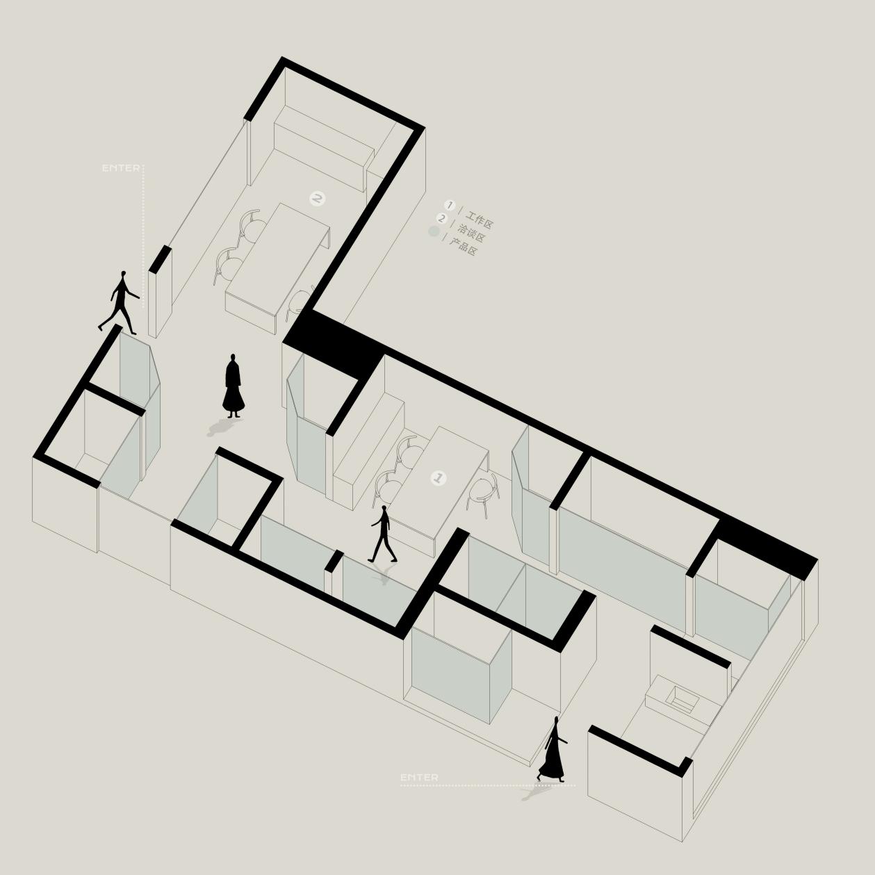
▼平面轴测图 The floor plan 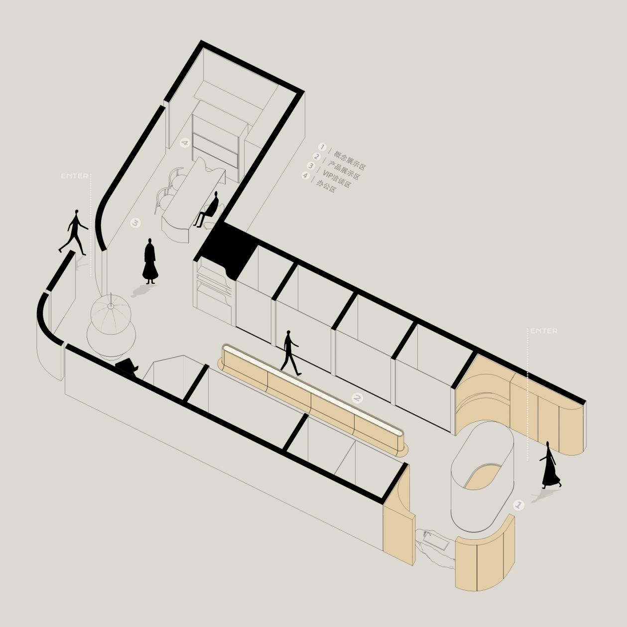
整个空间的使用面积不大,是一个L型形态空间,方正又狭长,为了明确产品属性与使用功能的场景需求,我们重新优化动线,明确一个主题就是视觉焦点,提炼品牌的产品形象,运用曲线来营造视线观感上的惊喜与转折。设计团队也一致认为,空间是为产品服务的,如何让客户短时间内高效的体验到空间、了解到产品是重点考量的因素。 The use area of the whole space is small, which is an L-shaped state space, square and narrow. In order to clarify the scene requirements of product attributes and functions, we re-optimized the moving lines, identified a theme as the visual focus, refined the product image of the brand, and used curves to create surprises and twists in sight perception. The design team also agreed that space serves products, and how to make customers experience space and understand products efficiently in a short period of time is the key consideration. 设计氛围在整体空间的考量上偏向于安静、自然,沉浸式的包裹感能让人有停留的意愿。并利用层高,做了高而深的拱形天花,对应过去是一个窄小的门洞,以曲面分割而不分离空间的设计形式来呼应表达。它不仅是一个展厅,还是关于品牌与产品艺术的结合造物,彰显空间格调。 The design atmosphere tends to be quiet and natural in terms of the overall space, and the immersive sense of package can make people willing to stay. And the use of the height, made a high and deep arch ceiling, corresponding to the past is a narrow door, with curved surface segmentation and do not separate the design form of the space to echo expression. It is not only an exhibition hall, but also about the combination of brand and product art, highlighting the style of space. 产品展示区中间是一个透光展示台,透过灯光指引,形成回字形动线,让来者逗留时间加长,且可随意变换动作依靠交谈。所有展示产品的上方基本没做可见灯,全采用暗藏灯膜的设计,希望营造光线像天窗一样进入的感觉,构建一种安静的氛围。 In THE MIDDLE OF THE PRODUCT DISPLAY AREA IS a TRANSPARENT display table, which is guided by lights to form a zigzag moving line, so that visitors can stay longer, and can arbitrarily change their actions depending on conversation. All display products above the basic do not do visible light, all use the design of hidden lamp film, hoping to create the light like a skylight into the feeling. 04 空间场景 Space scene VOODINO品牌调性塑造是偏向最开始的理念“理性、优雅、气质“,设计线索上思考借助留白、引线、缓缓展开,让几何韵律在小尺度的比例空间延展更多可能性。多层次的形态交织,产品融合,细微处都蕴含着美学经典与产品场景的空间对话。 The tonal shaping of VOODINO brand is inclined to the original concept of "rationality, elegance and temperament". In the design clue, we think about the use of white space, lead and slow expansion, so that the geometric rhythm can extend more possibilities in the small scale proportional space. The multi-level form interweaving, product fusion, and details all contain the spatial dialogue between aesthetic classics and product scenes. ▼门厅 The hall 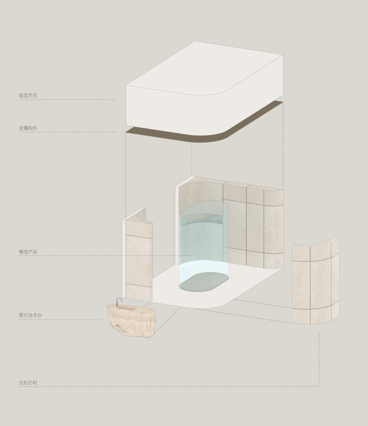
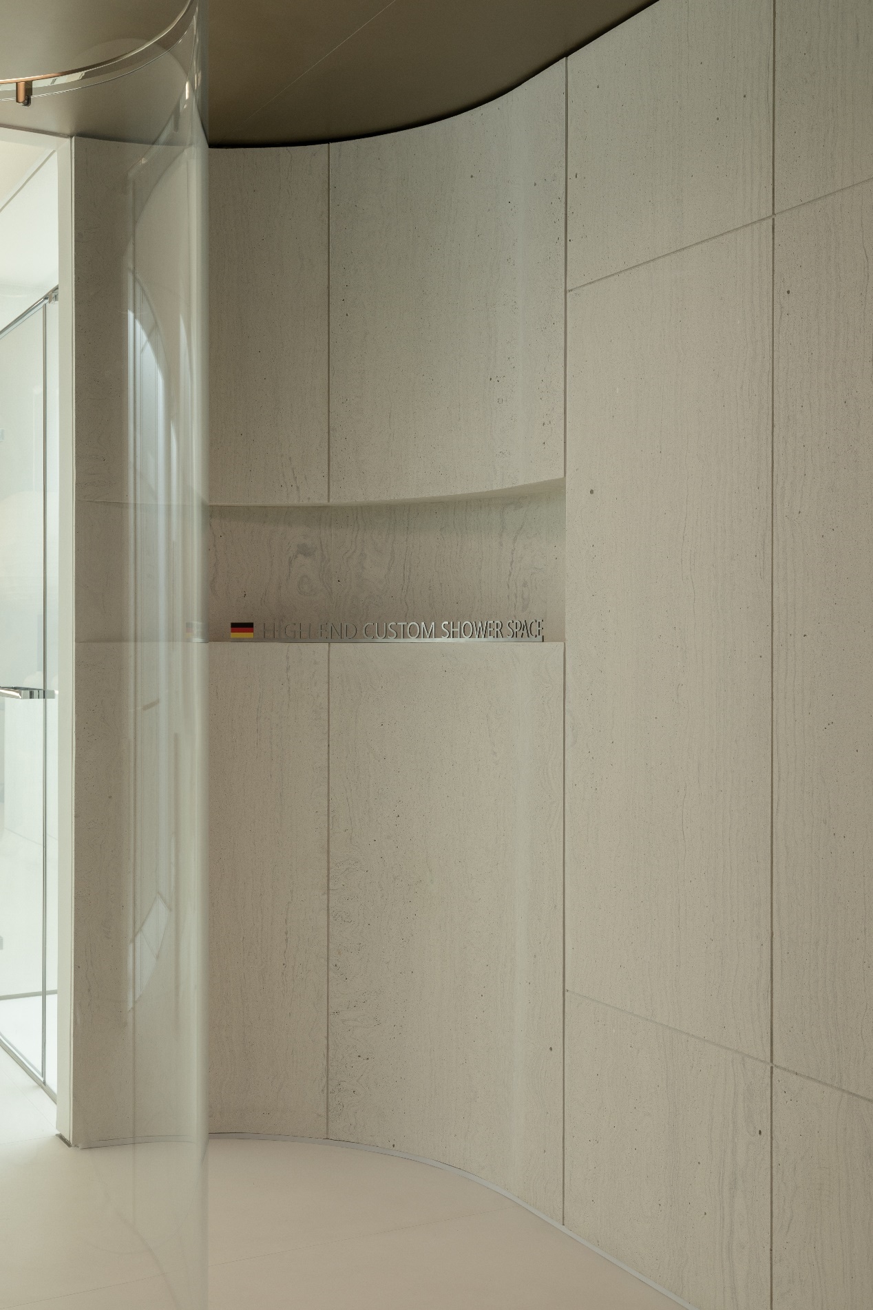
▲门厅品牌展示 Foyer brand display 整个流线型门厅结构,对原有的空间格局进行了打破重组,创造出内外之间多变的空间呼应关系,从门厅的概念产品陈列展示,到极有视线感的产品展示区传达一种品牌的气质,产品本身也是这个状态,在这样的空间存在,用最好的形象为以后的用户提供好的服务。 VOODINO品牌在空间设计上专注于情绪理性,产品感性,“独处是时间性的,交往是空间性的“。设计本质本身也是借助艺术的语言、材质运用的方法将空间呈现,同时表达有序。 Streamline the whole hallway structure, to break the original spatial pattern of restructuring, create a variable space echo relationship between inside and outside, from the hallway, the concept of product display, to full of sense of vision products exhibit convey the temperament of a brand, the product itself is also one of the state, in such space, using the best image for users to provide good after service. VOODINO brand focuses on emotional rationality and product sensibility in space design. "Solitude is temporal, communication is spatial". The essence of design itself is to use the language of art and the method of material application to present the space and express the order at the same time. ▼产品展示区 Product Display Area 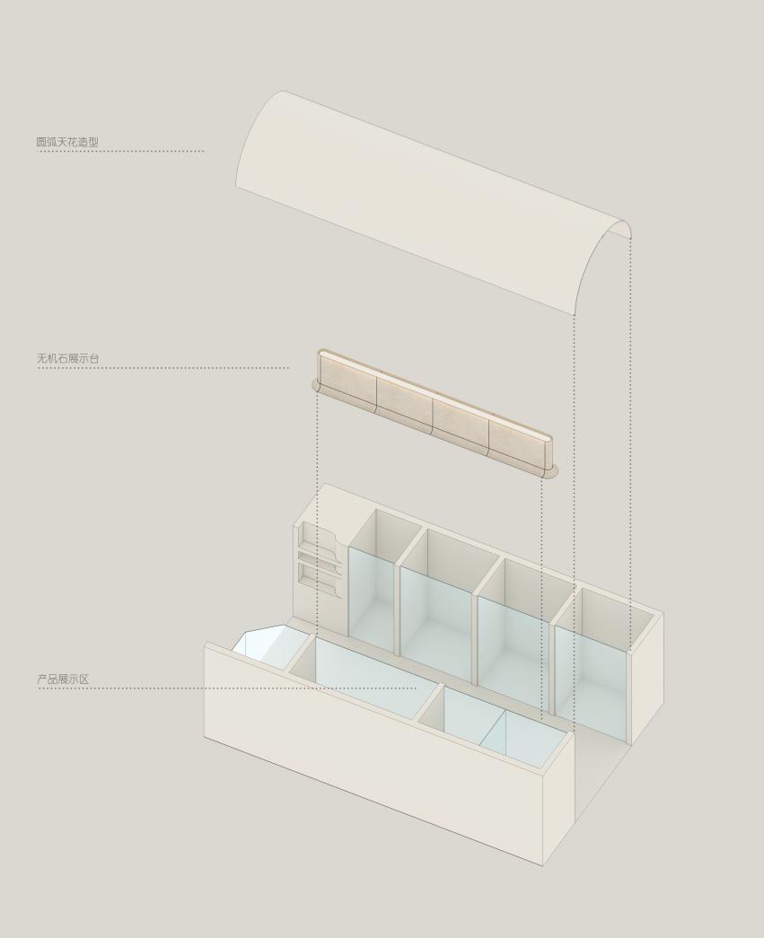
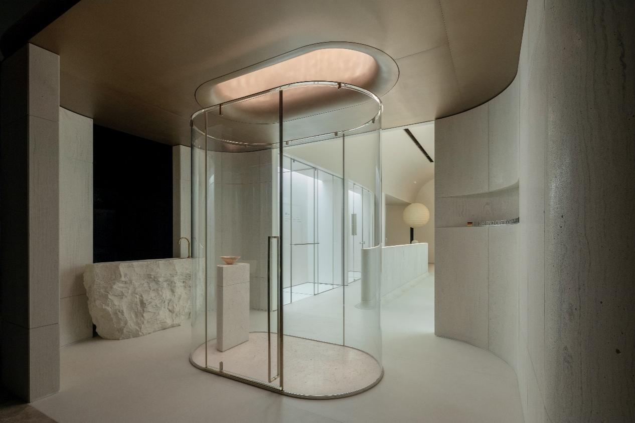
▲概念产品展示区 Concept Product Display Area 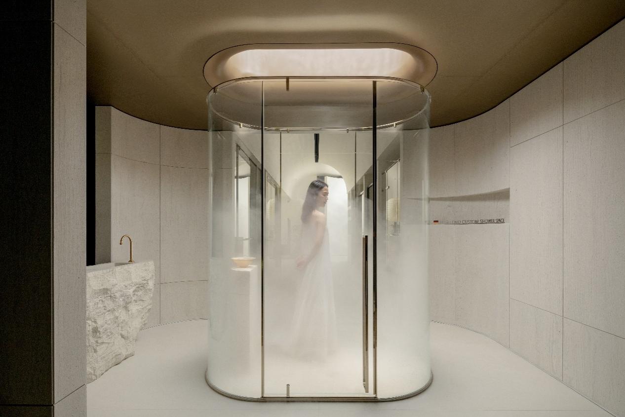
▲概念产品展示区 Concept Product Display Area 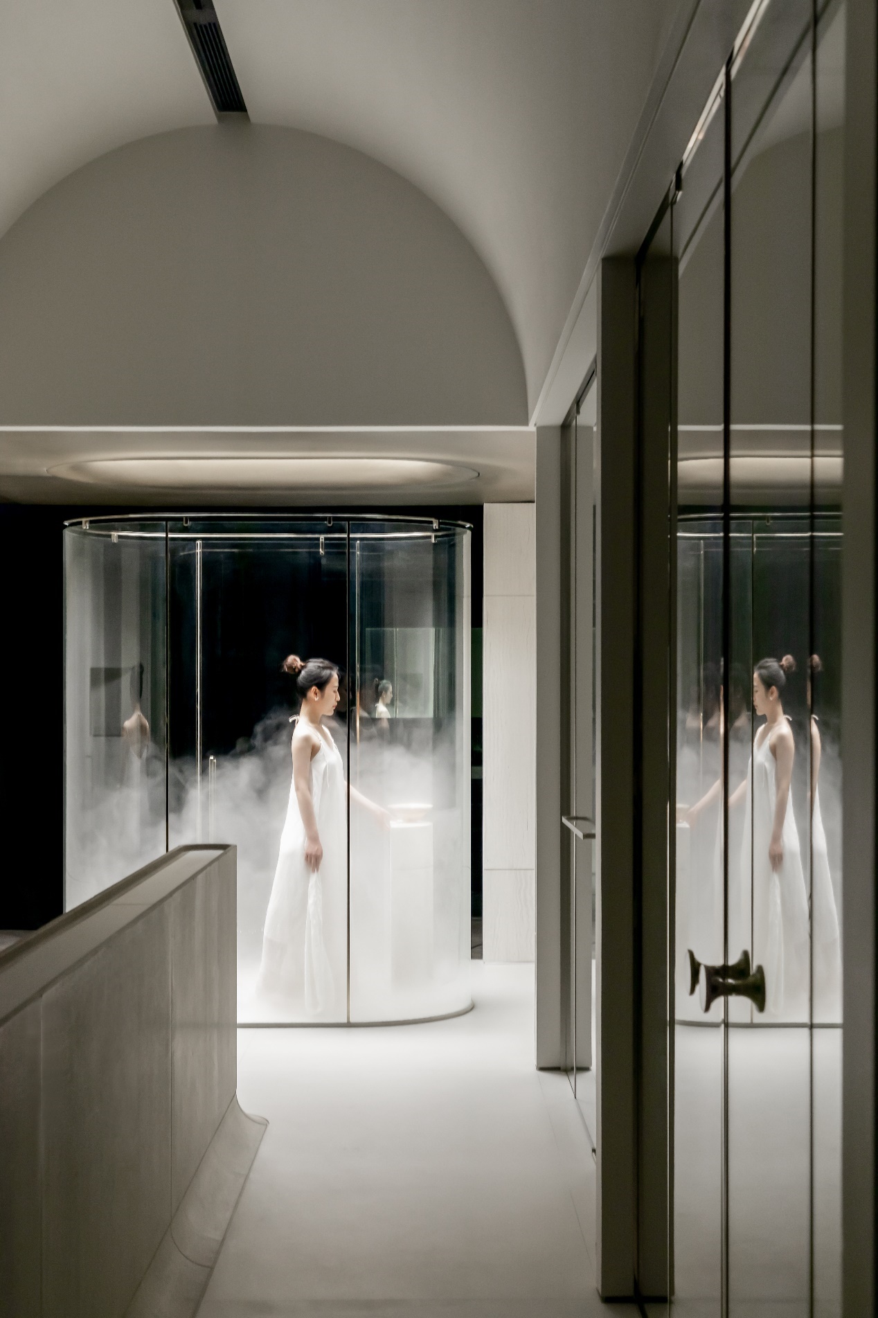
▲概念产品展示区 Concept Product Display Area 人物在场景之中,产品在空间之里,无论是否被记忆,它们都相互存在,即使个体,也是融合。 Characters are in the scene, products are in the space, no matter whether they are remembered or not, they all exist with each other, even if they are individuals, they are also integrated. 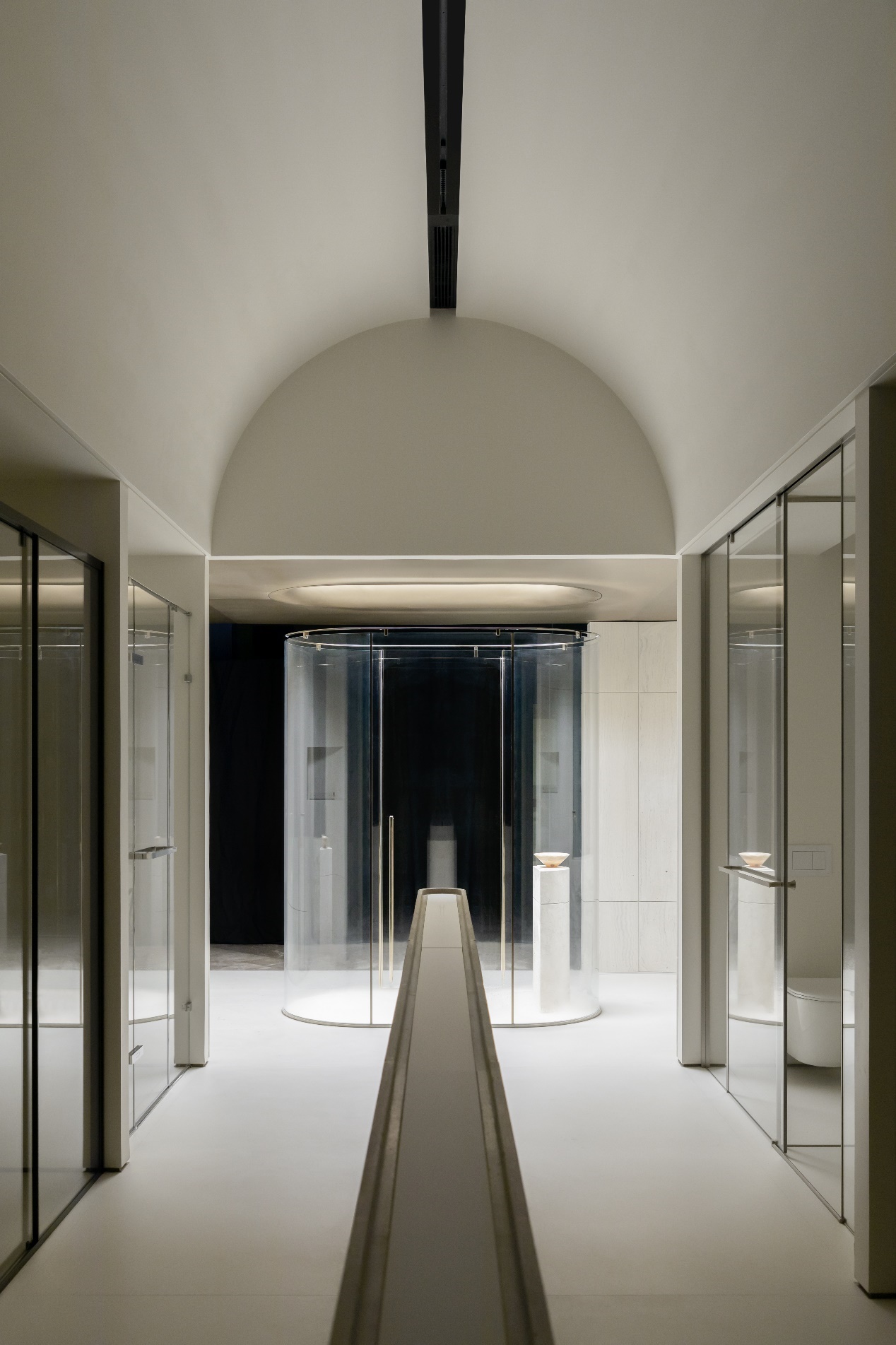
▲概念产品展示区 Concept Product Display Area 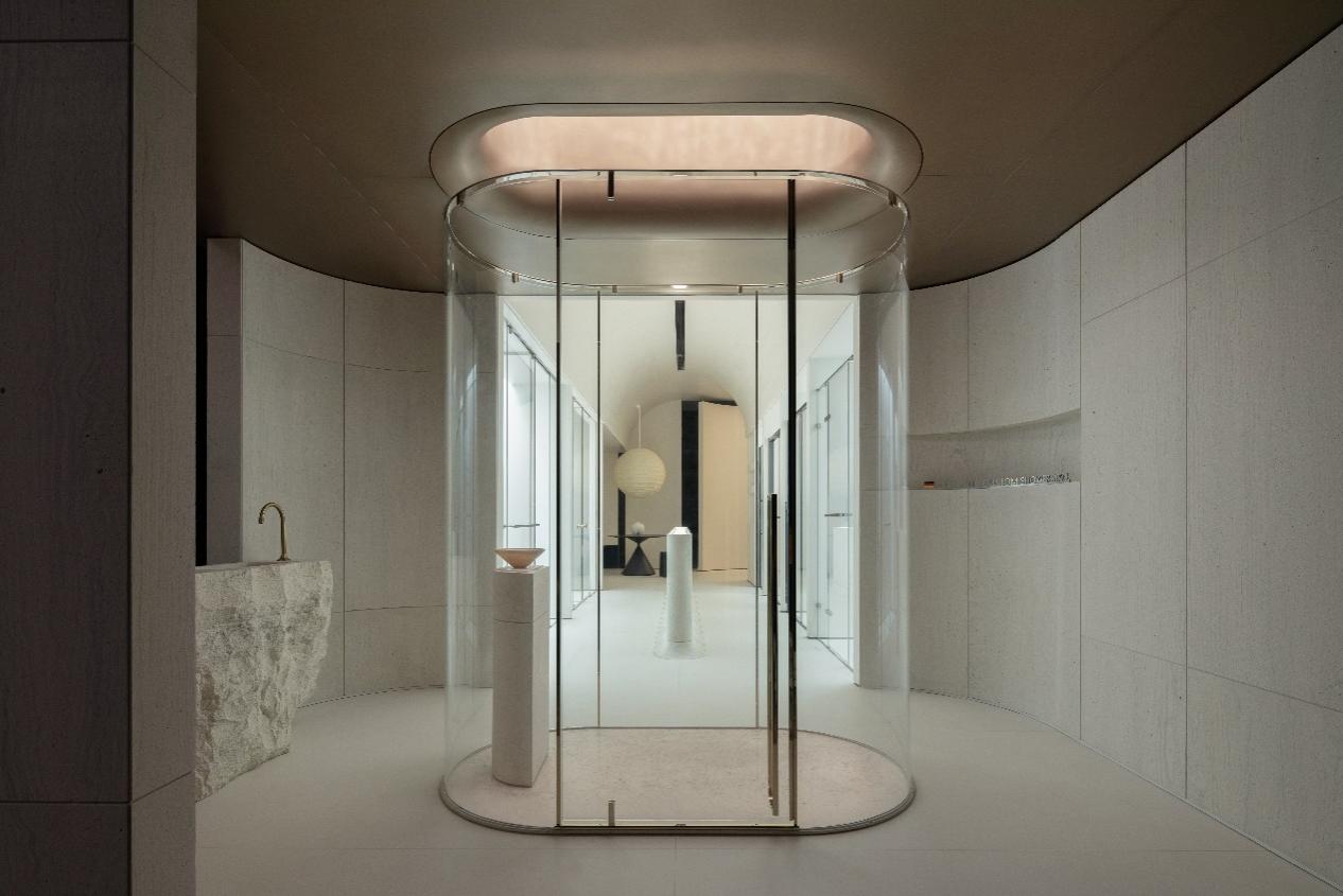
▲概念产品展示区 Concept Product Display Area 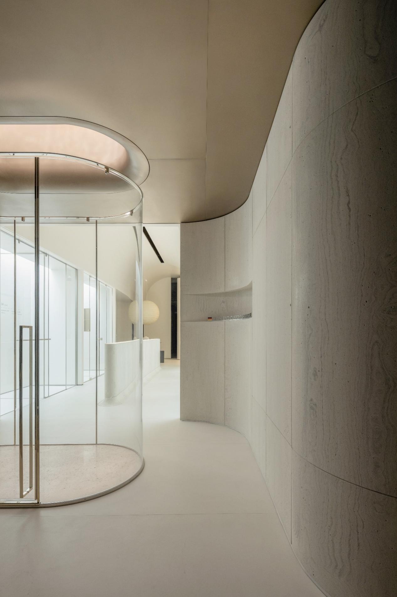
▲概念产品局部细节展示 Concept Product Display Area 利落的几何形态奠定出作品的整个空间基调,水平弧形元素的门厅与水平线交织的立柱在空间载体里予以呼应,动线表达空间脉络,整个陈设设计师反复挖掘与解构艺术之外的内涵,营造优雅的空间气质。 The neat geometric form lays the whole space tone of the work, the horizontal arc element foyer and the horizontal line interwoven column are echoed in the space carrier, and the moving line expresses the space vein. The whole display designer repeatedly excavates and deconstructs the connotation outside the art to create an elegant space temperament. ▲概念产品展示区 Concept Product Display Area ▲门厅*A产品区 Foyer *A Product area ▲门厅*B产品区 Foyer *B Product area ▲窄门洞结构 Narrow door structure ▲概念产品展示区 Concept Product Display Area ▲概念产品展示区 Concept Product Display Area 空间递进,颠覆大众对于淋浴这方面的普通印象,表达产品工艺精湛且强调设计焦点所带来的体验感。 The progressive space overturns the general impression of the public on the shower, expressing the experience brought by the exquisite workmanship of the product and emphasizing the design focus. ▲概念产品展示区 Concept Product Display Area ▲概念产品展示区 Concept Product Display Area 优雅氛围、彰显空间的生命力,在美的隐喻之下,观者也被调性和光线包裹,带来舒适的氛围与丰富的产品变化体验,几何线面构成的美感,彰显材料在空间中的着墨,丰富空间设计之下的生机。 The elegant atmosphere reveals the vitality of the space. Under the metaphor of beauty, the viewer is also wrapped by tonality and light, bringing a comfortable atmosphere and rich experience of product changes. The aesthetic feeling formed by geometric lines and surfaces highlights the ink of materials in the space and enriches the vitality of space design. ▲概念产品展示区 Concept Product Display Area ▲概念产品展示区 Concept Product Display Area ▼展示台细节 Display Table Details ▼墙面结构细节 Wall structure details 密斯凡德罗说过,”上帝存在于细节之中”。每种产品材料都有它特殊的魅力,为了强化品牌的空间属性,设计师在动线之中营造出视觉的焦点,盛放各类产品的特性,令观者在美学于体验之中互动。结构上以曲线窥探为起,落地以纹理坚固为终,最终是到访者透过整个设计来观察对产品的憧憬。 Mies van der Rohe said, "God is in the details." Each product material has its special charm. In order to strengthen the spatial attributes of the brand, the designer creates a visual focus in the moving line, displays the characteristics of various products, and makes the audience interact in aesthetics and experience. The structure starts with curve snooping, and the landing ends with solid texture. Finally, visitors observe the vision of the product through the whole design. ▼洽谈区 Discuss the area ▲VIP洽谈区 VIP negotiation area ▲VIP洽谈区 VIP negotiation area ▲VIP洽谈区 VIP negotiation area ▲VIP洽谈区 VIP negotiation area 每一次的游走与介绍,都在赋予观者好的趣意,随着空间在不同区域的变化,光影的语言,以柔美曲线为指引,充盈着品牌活力。 Each walk and introduction gives the viewer a good sense of interest. As the space changes in different areas, the language of light and shadow, guided by soft curves, is full of brand vitality. ▲概念产品洗手台 Concept product wash basin ▲概念产品洗手台 Concept product wash basin ▼材质细节 Material details 外立面以退为进,转角处全以弧形处理,呼应内部造型,琢磨细节所形成的空间形态,带来细腻而自在的空间气质。 Facade to retreat into, corner all with arc processing, echo the internal shape, consider the details of the space form, bring exquisite and comfortable space temperament. ▲门厅外立面 Entrance hall facade ▲外立面 facade ▲外立面 facade ▲外立面 facade FUN STUDIO的设计之中,VOODINO展厅作为品牌方与消费者之间的媒介,如何表现出产品属性跟品牌属性,并在二者之间创造互动对话,是达成这次设计目的的重点。设计本身就在创造,它使得品牌的生命力不断生长,本次设计也借助视觉语言艺术在不断链接空间体验与品牌产品,在欣赏的片刻,已然诠释新的生活方式。 In FUN STUDIO's design, the VOODINO showroom serves as a medium between brand owners and consumers. How to express product attributes and brand attributes, and create an interactive dialogue between them, is the key point to achieve the purpose of this design. The design itself is in the creation, it makes the vitality of the brand constantly growing, this design also with the help of visual language art in the continuous link between space experience and brand products, in the moment of appreciation, has interpreted the new way of life. 05 创作团队 Creative team 项目名称:VOODINO广州旗舰店 项目类型:展厅 项目地址:广州市罗浮宫 项目面积:145㎡ 设计时间:2022年4月 完工时间:2022年7月 设计公司:FUN STUDIO 主创设计:陈小燕 林泽峰 空间摄影:WM STUDIO 主要品牌:广州华卓建材/USCER(优舍)进口瓷砖/衍石筑造 /本源灯光设计/意大利尤勒贝特艺术涂料 品牌服务:绽微文化 Project name: Voodino brand Project type: Exhibition hall Project address: Louvre Museum, Guangzhou Project area: 145 square meters Design date: April 2022 Completion date: July 2022 Design company: FUN STUDIO Chief Designer: Chen Xiaoyan Lin Zefeng Photography is by WM STUDIO Main brands: Guangzhou Hua Zhuo Building Materials /USCER (USCER) imported ceramic tile/Yan stone construction/origin lighting design/Italy Yule Bete art paint |
精华推荐
换一换

 收藏
收藏  说两句
说两句 





发表评论0