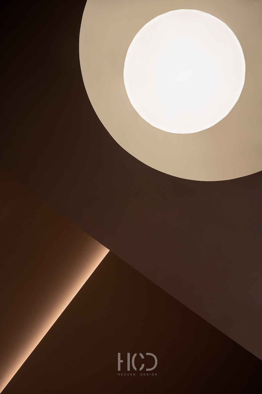
作为展厅设计,七间商铺横向联通的狭长空间是其原始形态。如何消解展示动线狭长可能导致的平铺直叙,如何在场景美学中凸显商业价值,如何建构一个区别于传统品牌与产品陈设展示的新体验……一系列提问的开端,触发了当下空间形态的到达。 This case is the exhibition hall of Hansand, Lufthansa, Germany. The narrow space connecting seven shops horizontally is its original form. The beginning of a series of questions has triggered the arrival of the current spatial form, including how to dispel the flat and straightforward narration that may be caused by the narrow and long display line, how to highlight commercial value in the aesthetics of the scene, and how to construct a new experience that is different from traditional brands and product display. 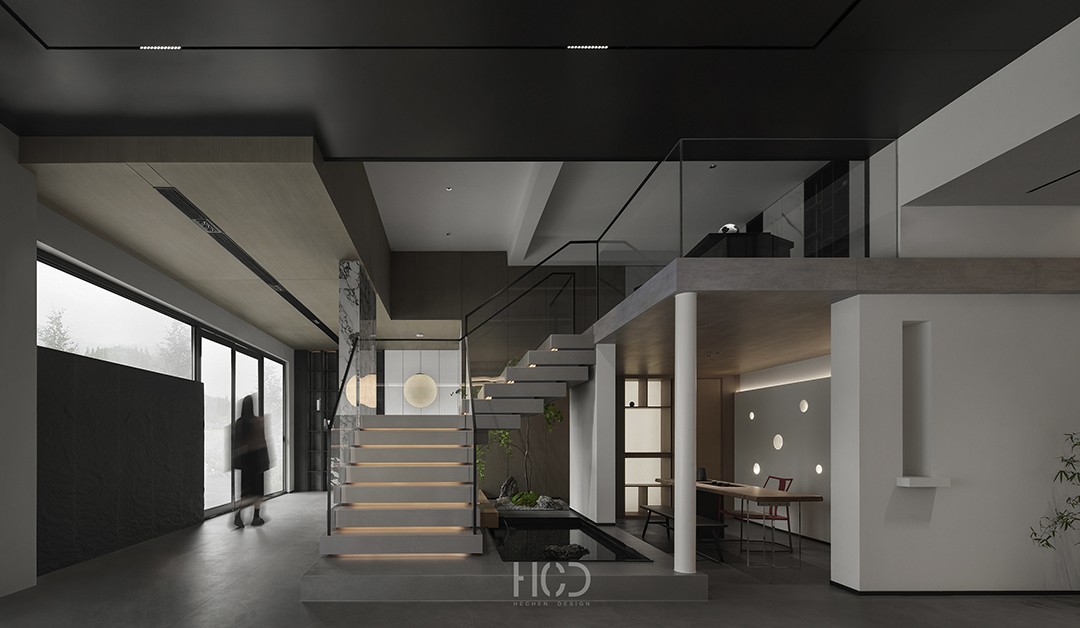
立足于展厅的商业逻辑,在空间展示的形态上,设计的落笔却极尽去展厅化。这一视觉体验,在展示立意的创新之上,更是综合考量的艺术,品牌的传达,产品要素的融入,动线的引导,人在其中作为主体与空间的互动关系,以及情感碰撞…… 灰空间,边界模糊等一系列概念的植入,是狭长空间的解决方案,也成全了整一性情绪体验,产品与品牌婉转融入,板材应用转译后的生活方式传达,都让归家的场域精神逐渐深化。 意境先行,空间有度,商业内化,人的行为与心理逻辑就在融合中被调动。 Based on the commercial logic of the exhibition hall, in terms of the form of spatial display, the design is extremely de showroom oriented. This visual experience, in addition to showcasing innovative ideas, is also a comprehensive consideration of art, brand communication, integration of product elements, guidance of movement, interaction between humans as subjects and space, and emotional collision The implantation of a series of concepts such as gray space and blurred boundaries is a solution to narrow and long spaces, and also achieves a holistic emotional experience. The smooth integration of products and brands, as well as the translation of lifestyle through board applications, gradually deepen the spirit of returning home. The artistic conception is first, the space is limited, and commercial internalization is achieved. Human behavior and psychological logic are mobilized through integration. 01 场域&识别 Field&Identification 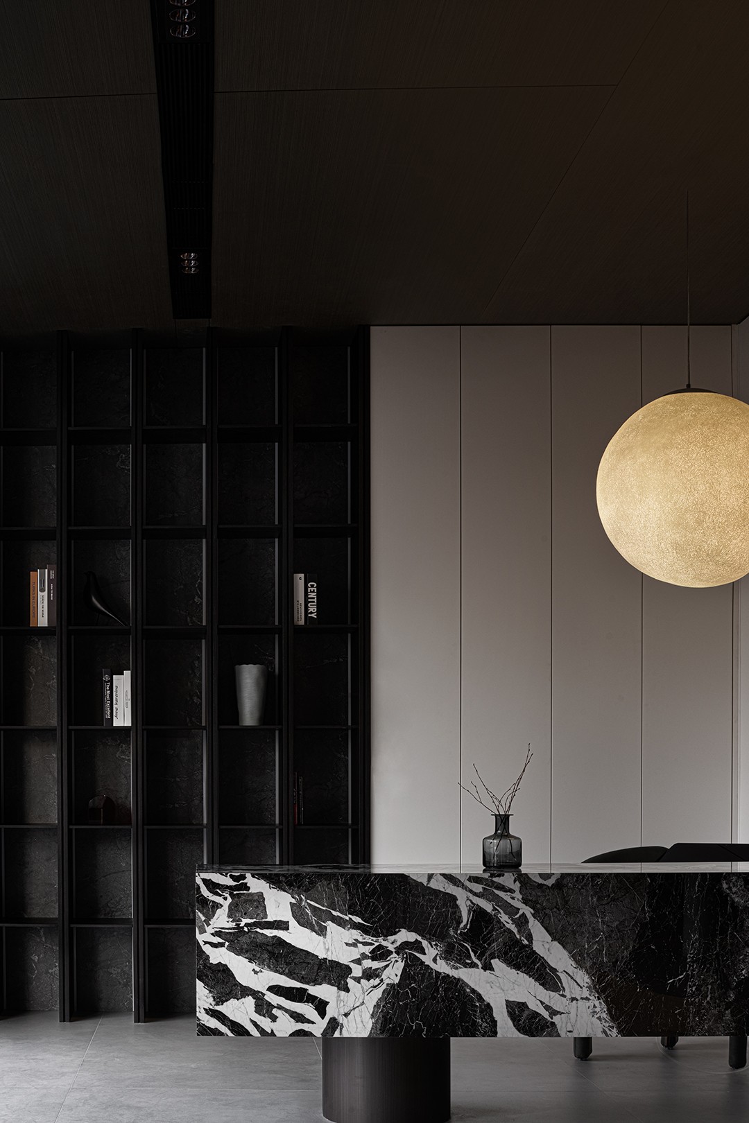
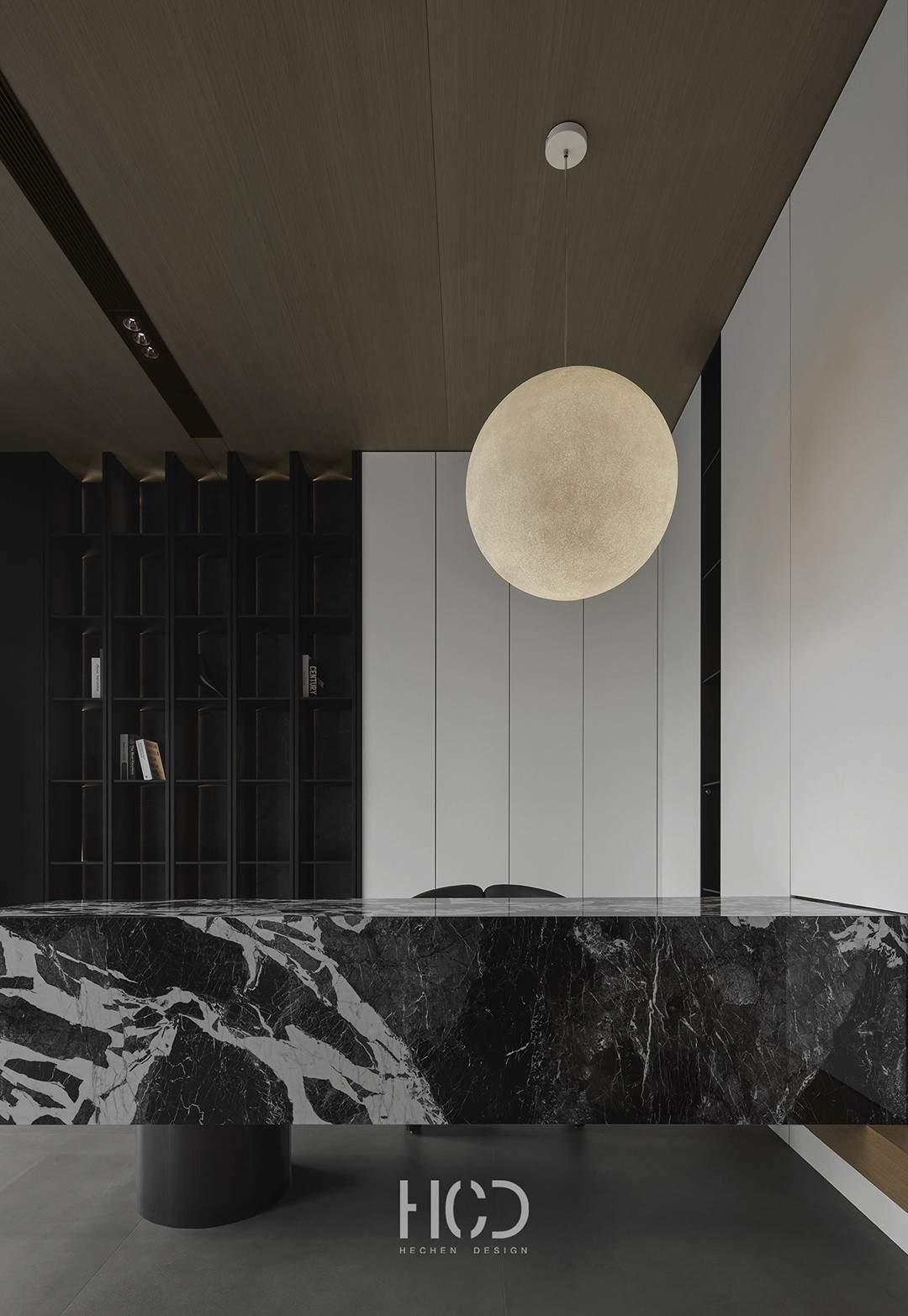
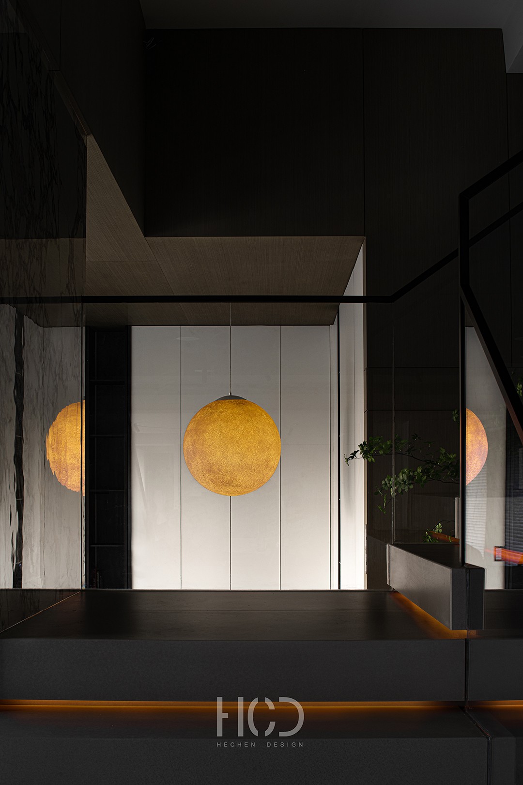
遥望画境,入境见幽,月球灯变幻的光影助兴,一键切换空间内外的两种心境。设计在人与空间的第一次过招中,便写定了品牌先入为主的高格初印象。不仅仅是品牌的形象展示,品牌的灵魂也在转瞬间立住。 Looking at the painting from afar, you can see the secluded scenery upon entering the country. The ever-changing light and shadow of the lunar lights add to your enjoyment, and you can switch between two different moods in and out of the space with just one click. In the first competition between people and space, design established the brand's preconceived high profile initial impression. Not only does it showcase the brand's image, but the soul of the brand also stands in an instant. 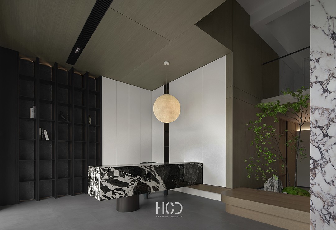
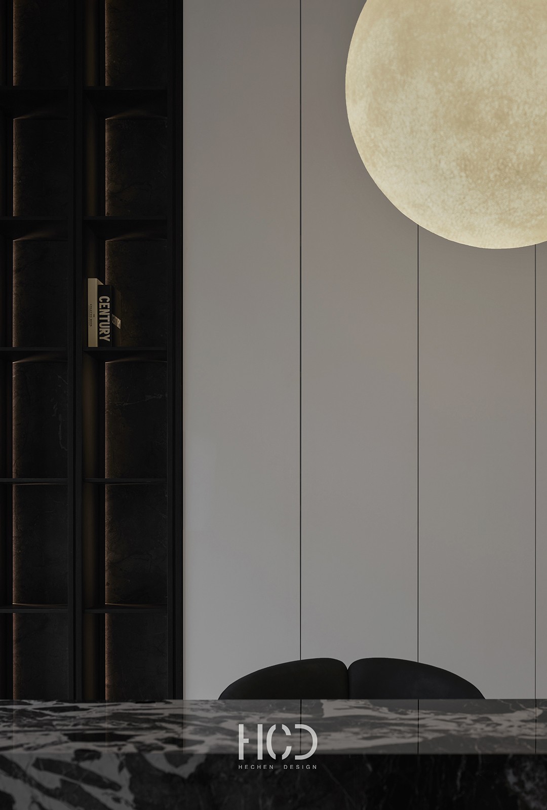
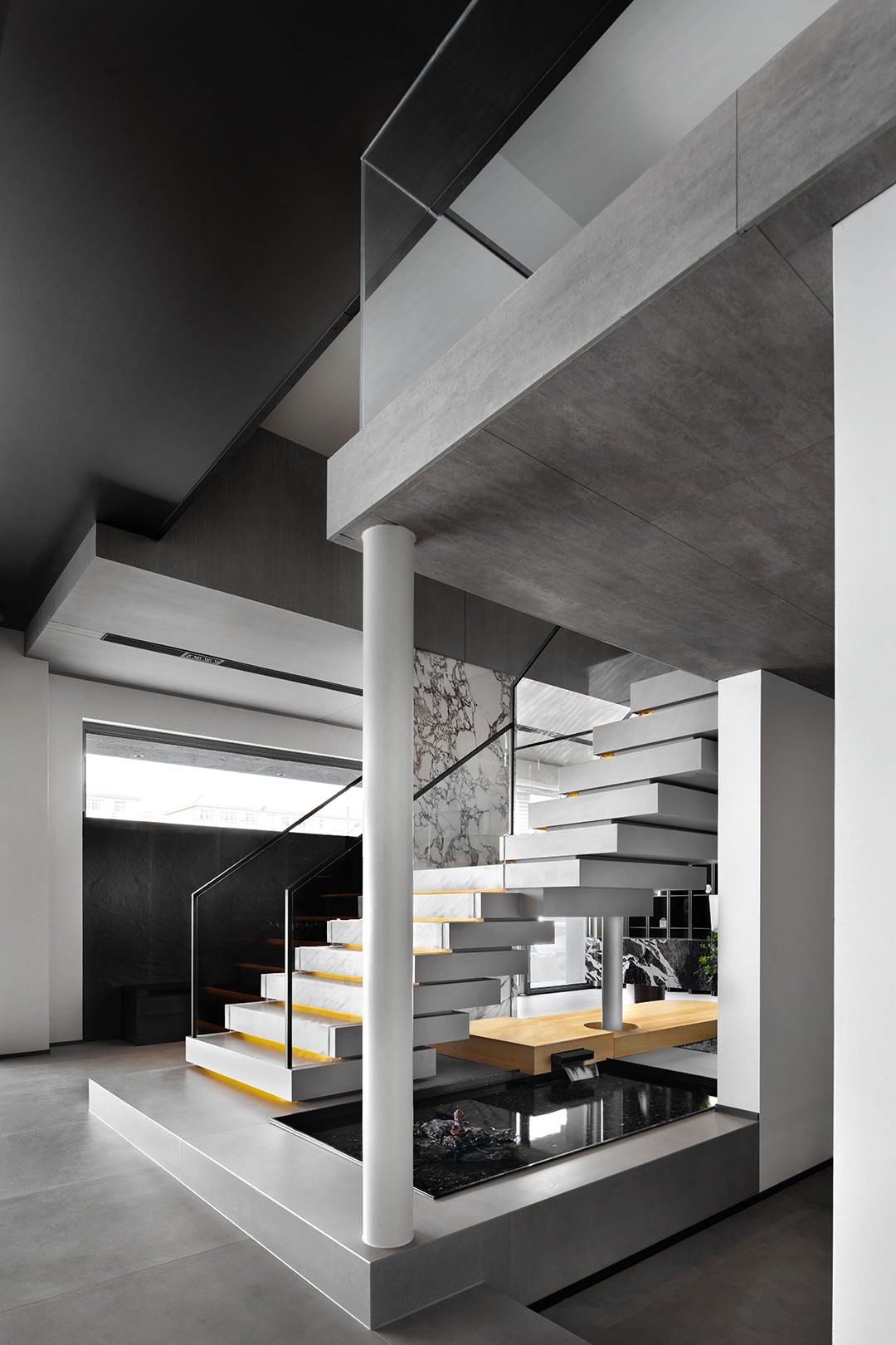
消解了常规商业空间的装置主义浓烈和奢华,视觉的冲击力反其道而行,以意境至上的静谧场域,入眼更入心,这一场人与空间故事的发生起笔便是不凡。现代的肌理是美学的视觉表象,光风霁月的韵脚,将空间的调性引向内敛的高级雅意。前台在意境化的加持下,早已超越了接待的固有功能,走向空间自发声的与人对话。 The strong and luxurious installation of conventional commercial spaces has been dispelled, and the visual impact is reversed. The tranquil field with artistic conception as the top priority is more eye-catching, and the occurrence of this story of people and space is extraordinary. The modern texture is the visual representation of aesthetics, with the melodies of light, wind, and moon, leading the tonality of space to an introverted and refined atmosphere. With the help of artistic conception, the front desk has already surpassed the inherent function of reception and moved towards a self speaking dialogue with people in the space. 引景入室,是意境美的核心来源。月境疏影,山水流光,梯台有序,共同完成了写意的张力,大有庭院深深深几许的幽情。生活质感的另一面,是对更高精神体验的追求,设计句句不提品牌的理念,却处处点题品牌对于生活塑造的主张和态度。 Introducing scenery into the room is the core source of artistic beauty. The sparse shadows of the moon, the flowing light of the mountains and rivers, and the orderly terraces all together create a tension of freehand brushwork, creating a deep and deep feeling in the courtyard. On the other hand, the quality of life is the pursuit of higher spiritual experiences. The design does not mention the brand's concept in every sentence, but everywhere it discusses the brand's advocacy and attitude towards shaping life. 最简洁的梯块交叠功法,如琴键的起伏,蕴生出几何艺术之美。木作面板,微部工艺,不管整体还是细节处的雕琢,都在昭示着产品的识别。设计对每一个场域的建构,都不止于一种目标的诉求,场景美学,产品工艺,空间呼应,都伏笔其中,演示着由零到整的生活方式如何练成。 The simplest ladder block overlapping technique, such as the undulation of piano keys, embodies the beauty of geometric art. Wooden panels, micro craftsmanship, and the overall and detailed carving all indicate the identification of the product. The construction of each field in design is not limited to a pursuit of a single goal. Scene aesthetics, product craftsmanship, and spatial resonance are all embedded in it, demonstrating how a zero to whole lifestyle can be practiced. 意式格调的简约生活,从不止一面现代风情。雅的精神层面,通达古今,贯穿中西。一方茶室隐于曲径通幽后,木作简素,与月同辉,更适配于东方语境下的都市隐逸浪漫,如隐秘的世外桃源,品牌专属的意式温润在慢煮清欢里徐徐展开。 The minimalist lifestyle of Italian style has more than just a modern charm. The spiritual aspect of elegance is accessible from ancient to modern times, running through both China and the West. A tea room is hidden behind winding paths, with simple wood that shines with the moon, making it more suitable for the urban seclusion and romance in the Eastern context, such as a secluded paradise. The brand's exclusive Italian warmth slowly unfolds in slow cooking and clear enjoyment. 02 切割&链接 Cut&Link 原生空间七个独立的狭长单元,如何达成功能与美学上的共识?“切而不分”的刚刚好拿捏,成全了最佳的解决方案。空间展示的逻辑,在切割与链接两方力量下推拉,人在其中的体验,既是统领全篇的,站位于某一个功能区域,又可领会到各自为章的当下独立焦点。 How can the seven independent narrow units of the native space achieve a consensus on functionality and aesthetics? The concept of 'cutting without dividing' is just easy to handle, achieving the best solution. The logic of spatial display is pushed and pulled by the forces of cutting and linking, and the experience of people in it is not only commanding the entire article, standing in a certain functional area, but also able to grasp the current independent focus of each chapter. 微模糊,强连接,以隐晦的语言诠释空间的新关系。为建立这种新的逻辑,承担建筑与外部环境过渡的灰空间概念,被引入室内的区块联系,边界弱化,却未完全消解。不同视角的两个空间皆能找到互语,穿插,狭长地带里的片段剪辑节奏自现。润物无声的指引下,人从一个空间区块进入另一个单元的行走自然发生。 Slightly vague, strongly connected, interpreting new relationships in space through obscure language. In order to establish this new logic, the concept of grey space that takes on the transition between the building and the external environment has been introduced into the indoor block connection, with weakened boundaries but not completely resolved. Two spaces from different perspectives can find mutual language, interspersed, and the rhythm of clip editing in narrow and elongated areas can emerge from each other. Under the silent guidance of moistening objects, people's walking from one spatial block to another naturally occurs. 黑白二元色以不同的立面和体块,变幻空间节奏,生出内在秩序,简约的极致品位看似毫不费力,全在比例的拿捏。雕琢,叠错,镂空,是同一平层,不同板块间呼应,沟通的方式。 通透开敞的全局下,细细品味便咂么出了边界的似有还无,与体块穿插的玄妙之美。 The black and white binary colors, with different facades and blocks, change the spatial rhythm and create internal order. The minimalist ultimate taste seems effortless, all in the control of proportion. Carving, stacking, and hollowing out are the ways of communication between different plates on the same level. Under the transparent and open overall situation, carefully savoring the seemingly non-existent and mysterious beauty interspersed with the body blocks, one can easily see the boundary. 03 间奏&意趣 Interlude&Interest 二层空间是设计有意为之的架构创造,展示的功能之上,更在于调和整个体验场馆先天狭长,以向上的力延展维度。复式结构的后天叠层处理,打破了狭长空间可能的单调与乏味,瞬间灵动了空间的节奏感,生出架构上的审美意趣。 The second floor space is an intentional architectural creation created by the design, showcasing functions that balance the inherent narrowness of the entire experience venue and extend dimensions with upward force. The postnatal layering of the duplex structure breaks the monotony and boredom that may exist in narrow spaces, instantly enlivens the rhythm of the space, and creates an aesthetic taste in the architecture. 站位于俯瞰的视角,整个观展路线生出意外之喜,如一处纵观全局的景观平台,让整个场域一览无余。玻璃材质的通透,成全开放式的视野,框景的每一个场域角度,皆是一幅写意画。品牌塑造的生活场域是主场,艺术腔调则是其中的主旋律。 Standing from a overlooking perspective, the entire exhibition route is filled with unexpected joy, like a landscape platform that provides a panoramic view of the entire venue. The transparent glass material creates an open view, and every angle of the frame scene is a freehand brushwork. The life field of brand shaping is the home field, and artistic tone is the main theme. 04 多维&归情 Multidimensional&Guiqing 归家的场域,是品牌综合能力的艺术,经设计解读后,终到达核心的浓墨重彩篇章。整体性家居生活场域塑造,是去展厅化的场景语言的主旨。重新组合排列,却丝毫未消解商业赋能。从微观的产品,到组块化的造境,品牌的点滴皆伏笔其中,看得见,摸得着,且材质应用一眼可知。动线游走,犹如归家,氛围之外,品牌自话。 The field of returning home is the art of the brand's comprehensive ability. After design and interpretation, it ultimately reaches the core of a rich and colorful chapter. The overall shaping of the home life field is the main theme of the de showroom scene language. Reorganize and rearrange, but do not eliminate commercial empowerment at all. From micro level products to modular manufacturing environments, every bit of the brand is embedded in it, visible and tangible, and the material application is evident at a glance. Moving around is like returning home, outside the atmosphere, the brand speaks to itself. 狭长的原生态之上,空间在设计的统筹下生长出多维度的立体坐标。每一面展示的触角,都舞动着现实生活发生的某个切面。叙述的主线从不是个体产品角色的独立跳出,串联后的整一生活意识形态,才是设计藉由场域,助力品牌迸发出的商业活力。 Above the narrow original ecology, space grows into multi-dimensional three-dimensional coordinates under the coordination of design. Each displayed antenna is dancing a certain aspect of real life. The main storyline of the narrative is not about the independent departure of individual product roles, but rather the integrated life ideology that is connected. It is the design that uses the field to help the brand unleash commercial vitality. 木作,墙板,柜体,家具,桌椅,灯光,微水泥,艺术漆……每一个独立板块,都由品牌的产品系统中提取元素,组合,集成为不同生活方式的侧面,去展开讲述居家生活的不同体验。餐厨的要素,烟火的形态,让家的引力,归家的强烈情愫浑然天成。 Woodwork, wall panels, cabinets, furniture, tables and chairs, lighting, micro cement, art paint... Each independent section is extracted from the brand's product system, combined, and integrated into different lifestyles, to unfold and tell the different experiences of home life. The elements of the kitchen and the form of fireworks make the attraction of home and the strong feeling of returning home natural. 场域塑造的目标,始终点题品牌属性。场域各异,却指向共同的型格,即现代极简质感的基因,和意式优雅的生活格调。卧室将优雅的态度极尽展示,不仅投射于品牌的某一产品要素,更与空间凝练成了生活的艺术。低调的精致时尚背后,隐喻的是品牌的一贯理念。 The goal of shaping the field is always to focus on brand attributes. The fields are diverse, but they point to a common style, which is the gene of modern minimalism and the elegant Italian style of life. The bedroom showcases an elegant attitude to the fullest, not only projecting onto a certain product element of the brand, but also condensed into the art of life with the space. Behind the understated and exquisite fashion, the metaphor is the brand's consistent philosophy. PLAN 项目名称丨HANSAND展厅 设计公司丨和尘设计 项目主创丨萧光青 项目配合丨席作超 王丽珊 项目地点丨德州 项目面积丨400㎡ 文案编辑丨清歌传媒 萧光青 HCD和尘设计创始人、设计总监 2017-2018中国室内设计行业年度创新设计机构奖 M+中国高端室内设计大赛2020年度影响力top20 2019金堂奖年度杰出别墅设计空间 40ANDER40中国(山东)设计杰出青年 关于我们 和尘设计 山东省济南市奥体西路 中国铁建国际中心 B座1507 |
精华推荐
换一换

 收藏
收藏  说两句
说两句 


发表评论0