|
▼该项目是位于上海古北的套房公寓,受屋主委托对其进行全面的翻新改造,高层建筑的结构限制了一部分改动空间,我们主要针对室内材质和家具布局来进行重新设计,让这间旧公寓焕发新的生机。 This project is located in Gubei apartment, Shanghai. It was entrusted by the owner to carry out a comprehensive renovation. The structure of high-rise buildings restricts a part of the transformation space. For this reason, we mainly redesigned the interior materials and furniture layout to breathe new life into this old apartment. ▼经过重新设计的空间整体以柔和的白色营造温暖的主基调,局部运用富有质感的天然材质形成对比度。 After redesigned, the main tone of the whole space is to create a warm atmosphere with soft white and natural materials with rich texture are used locally to form a contrast after redesigned. 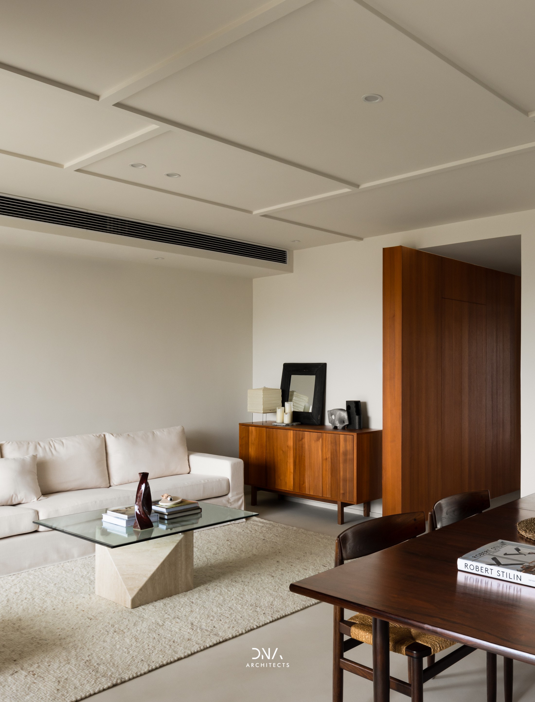
▼在大面积的留白空间中,运用简单的线条排序就能形成有趣的立体轮廓。 In a large area of blank space, an interesting three-dimensional outline can be formed by using simple line ordering. 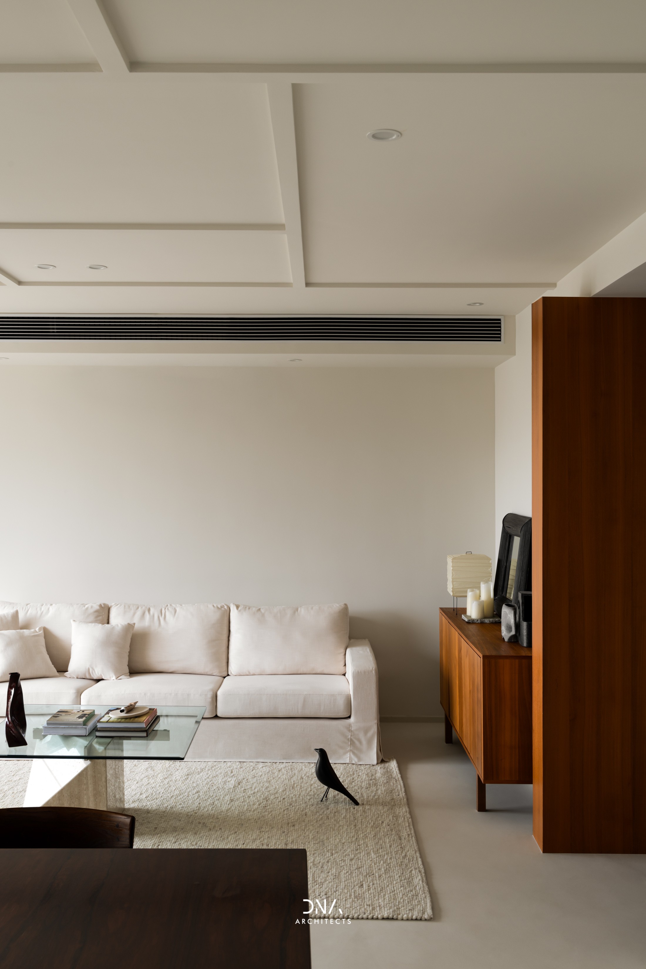
▼沙发一侧运用矮边柜来陈设一部分家居饰品,能够很好的营造出颇具美感的家居氛围。 Low side cabinet is used on the side of the sofa to display some home accessories, which can create a very aesthetic home atmosphere. 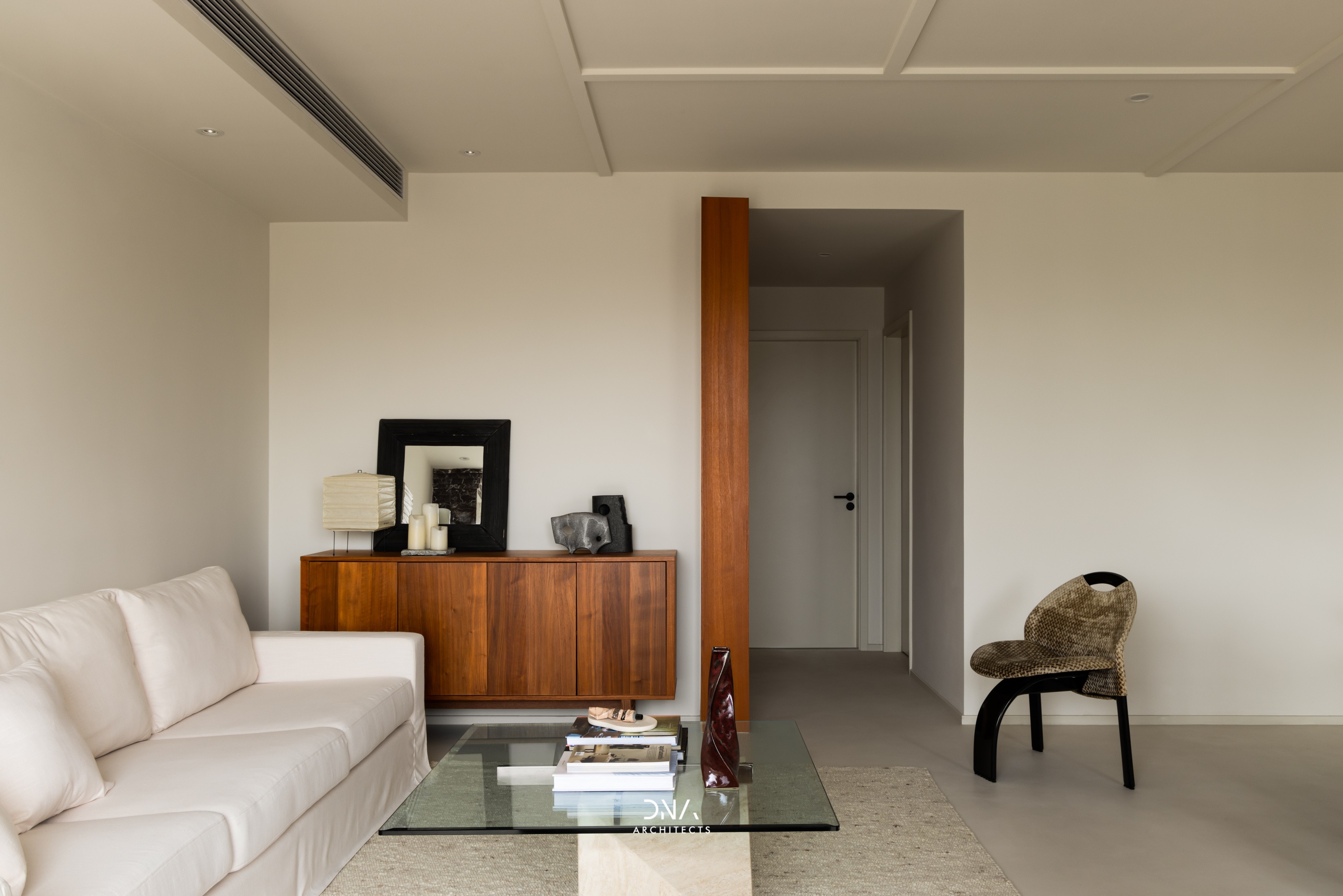
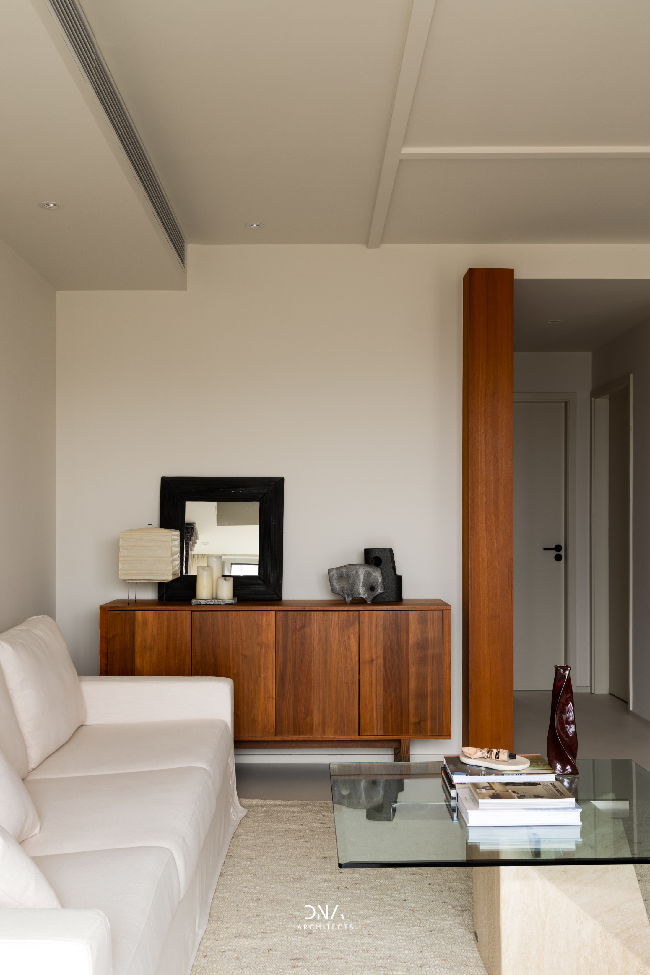
▼地面运用微水泥地坪漆来达到无缝覆盖的效果,使得空间更具纯净感,在这样的环境里能更好地突出家具本身的形体之美。 For the achieves the effect of seamless coverage, the ground uses microcement floor paint to make the space more pure and can better highlight the physical beauty of the furniture in this environment. ▼Sail Chairs by Giovanni Offredi 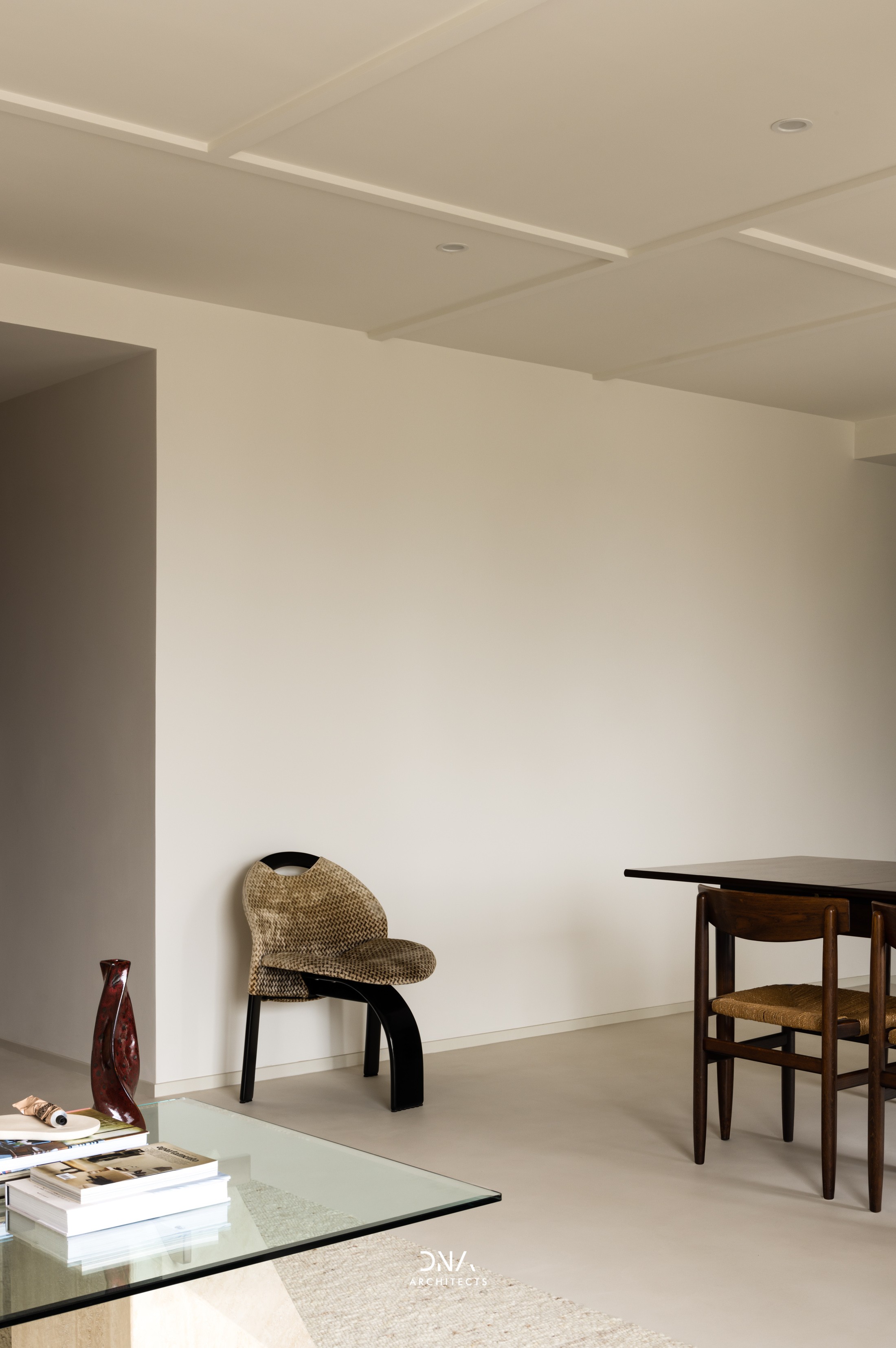
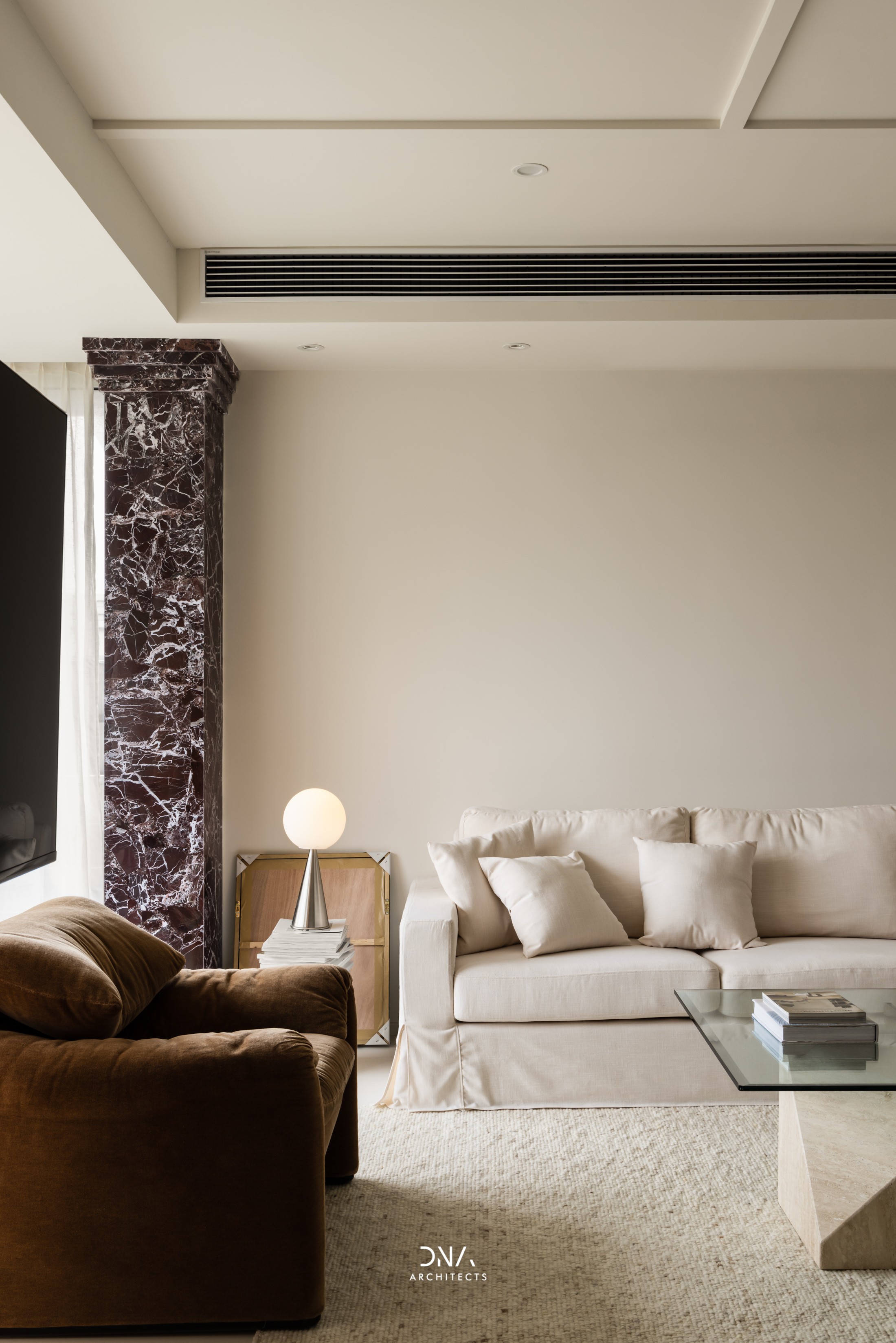
▼电视悬挂在侧面结构墙上,通过支架可以在客厅和餐厅之间任意变换方向,应对不同的生活情景。 The TV is hung on the side structural wall and the direction can be changed arbitrarily between the living room and the dining room through the bracket to cope with different living situations. ▼maralunga lounge chair by Vico Magistretti 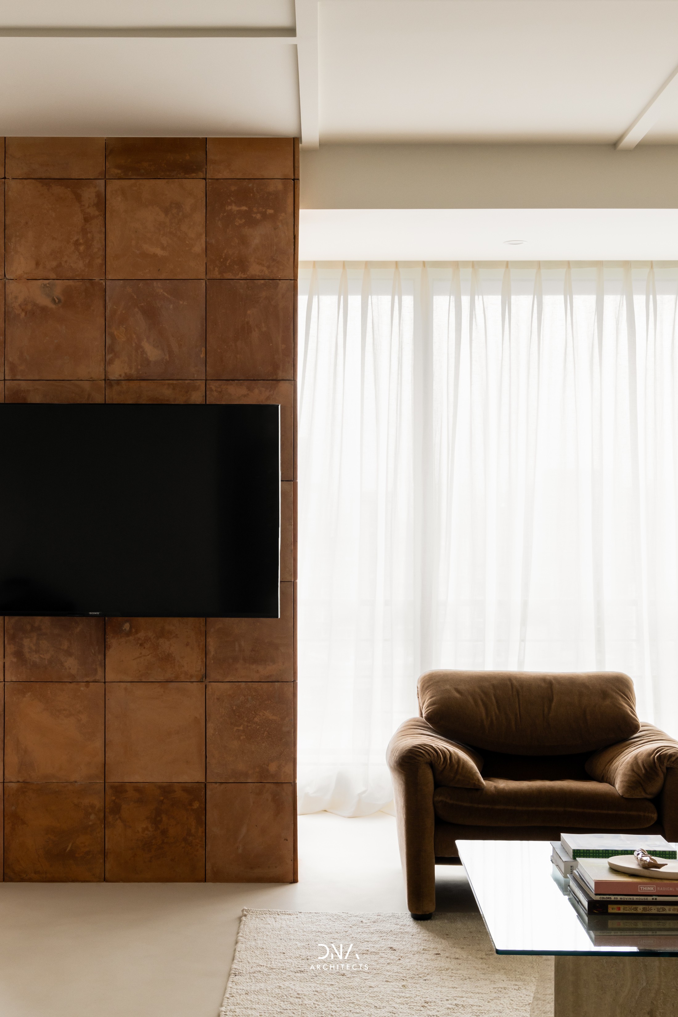
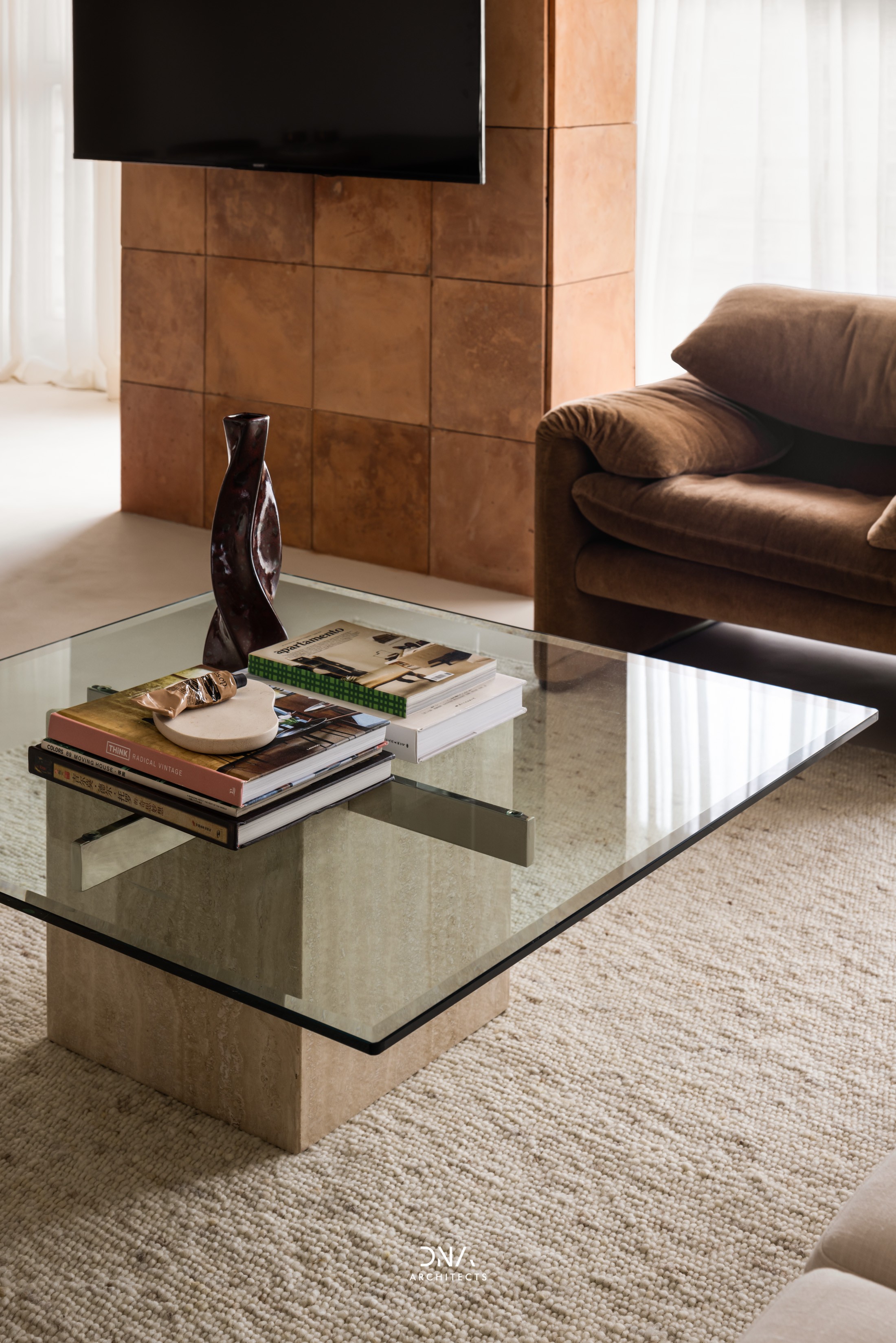
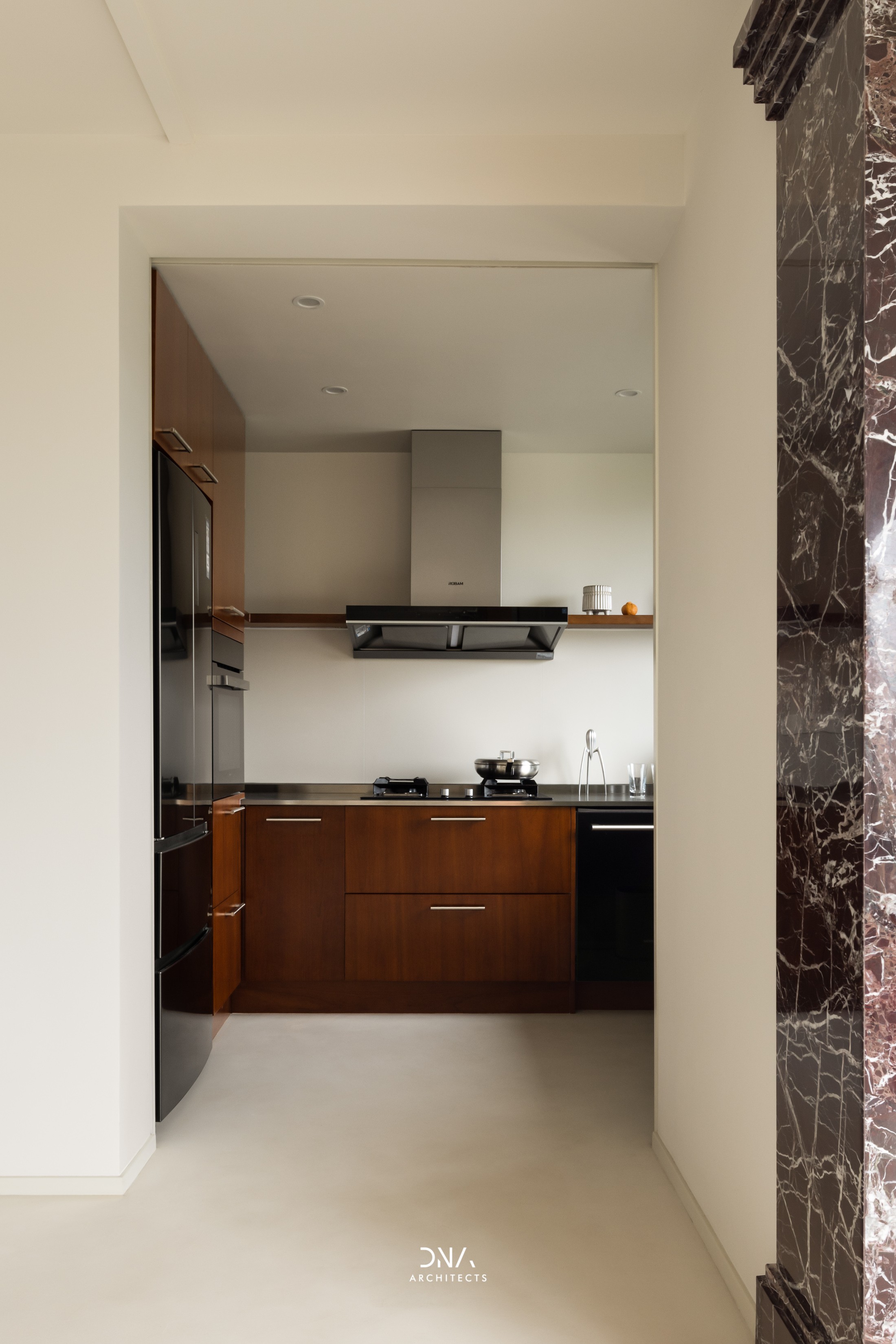
▼过道墙面的材质打破墙体边界,形成穿插的视觉效果,从而加强动线的引导作用。 The wall materials of the corridor breaks through the space boundary to form an interspersed visual effect, thus strengthening the guiding role of the moving line. ▼经过时间打磨的中古餐桌,黑黄檀木在光线下散发出玉润的质感。 The dinning table has been polished over time, and the rosewood is as delicate as jade in the light. ▼为延续简洁的设计语言,厨房设计采用白色岩板和隐蔽式移门。 In order to continue the minimalist design language, the kitchen is designed with white slate and concealed sliding doors. 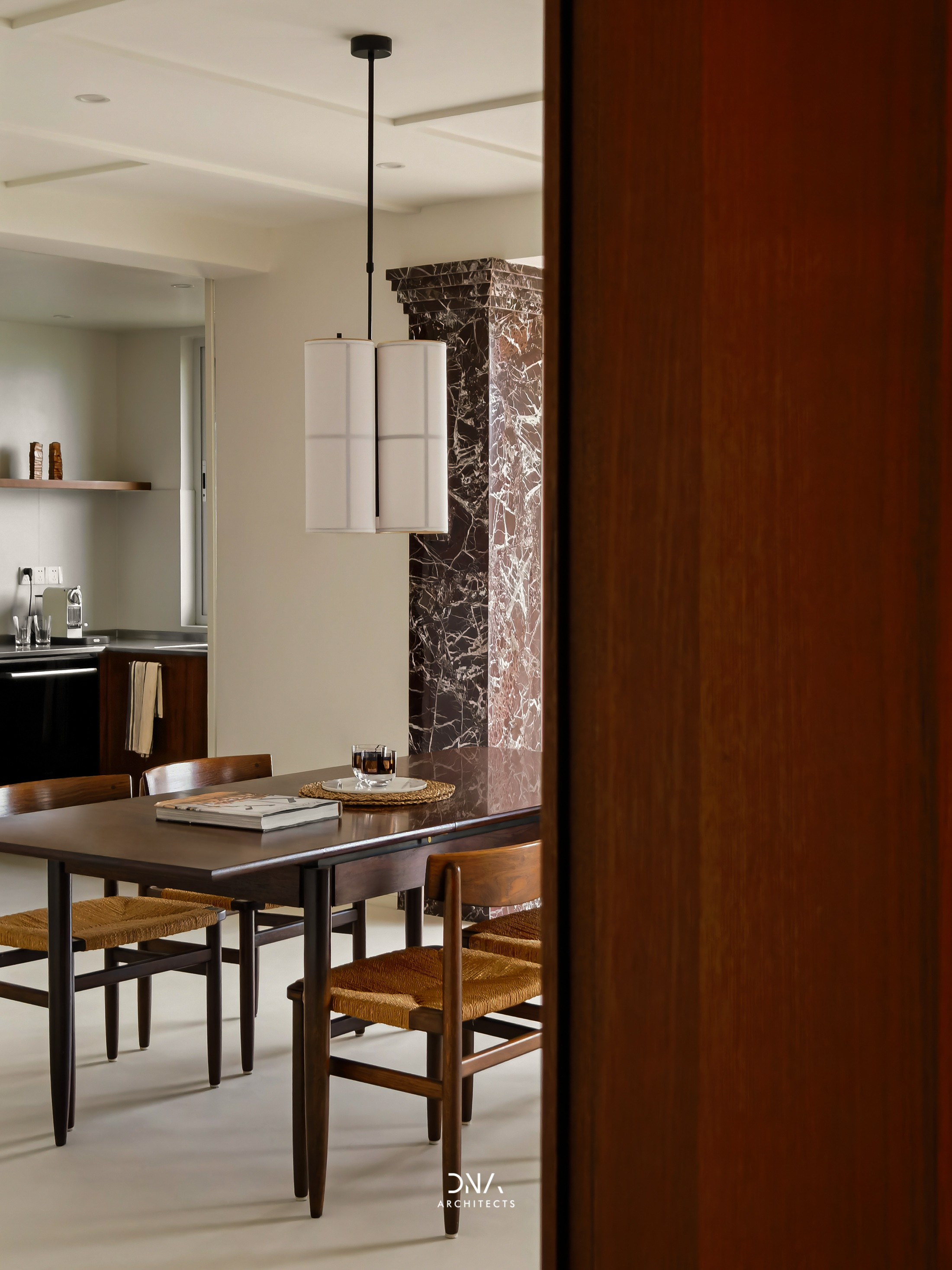
▼以错落的陈列架、梳妆桌、衣柜功能组合的衣帽间,成为主卧室的缓冲区域。 The cloakroom combines the functions of display shelves, dressing tables and wardrobes into a buffer area for the master bedroom. ▼地面微水泥材质延伸至衣帽间,并以主卧过道为分界线,来区分动静区的转换。 The microcement material extends to the cloakroom on the floor to divides the hallway of the master room to distinguish the transition from the active zone. ▼飘窗一侧的壁龛为原有的建筑结构,我们将其保留,做为阵列的陈设壁龛。 The side of the bay window niche is the original building structure, which is retained as the display niche of the array. ▼微水泥具备良好的防水能力,代替传统的材料,营造浑然一体的空间感。 Microcement has good waterproof ability to instead of traditional materials to create a seamless sense of space. ▼柚木的地板能更好地衔接立面材质和家具颜色,拼花的排列方式也更能在光影下呈现丰富的纹理变化。 The teak floor allows for a better connection between the facade material and the color of the furniture, and the parquet arrangement allows for a rich variety of textures in light and shadow. ▼平面图 | Plan 项目地点 | 中国上海 项目面积 | 120㎡ 设计时间 | 2020.10 设计团队 | 夏伟、杨晨愉、张李薇 摄影团队 | 川河映像 Project location | Shanghai, China Project area | 120㎡ Design period | 2020.10 Design team | Wei Xia、Chenyu Yang、Liwei Zhang Photographic team | River Studio |
精华推荐
换一换
 收藏
收藏  说两句
说两句 


很漂亮,客厅沙发旁石材包柱花色感觉不太搭,个人觉得哈