我希望建筑能够同时达成『简明』,也希望达到拥有『深度』。建筑应该是一个让人在精神上能够获得充实饱满力量的空间。 I hope to achieve simplicity, but I also hope to achieve depth … I believe it is important that architecture should be a space where you feel spiritually empowered. ——安藤忠雄 Tadao Ando 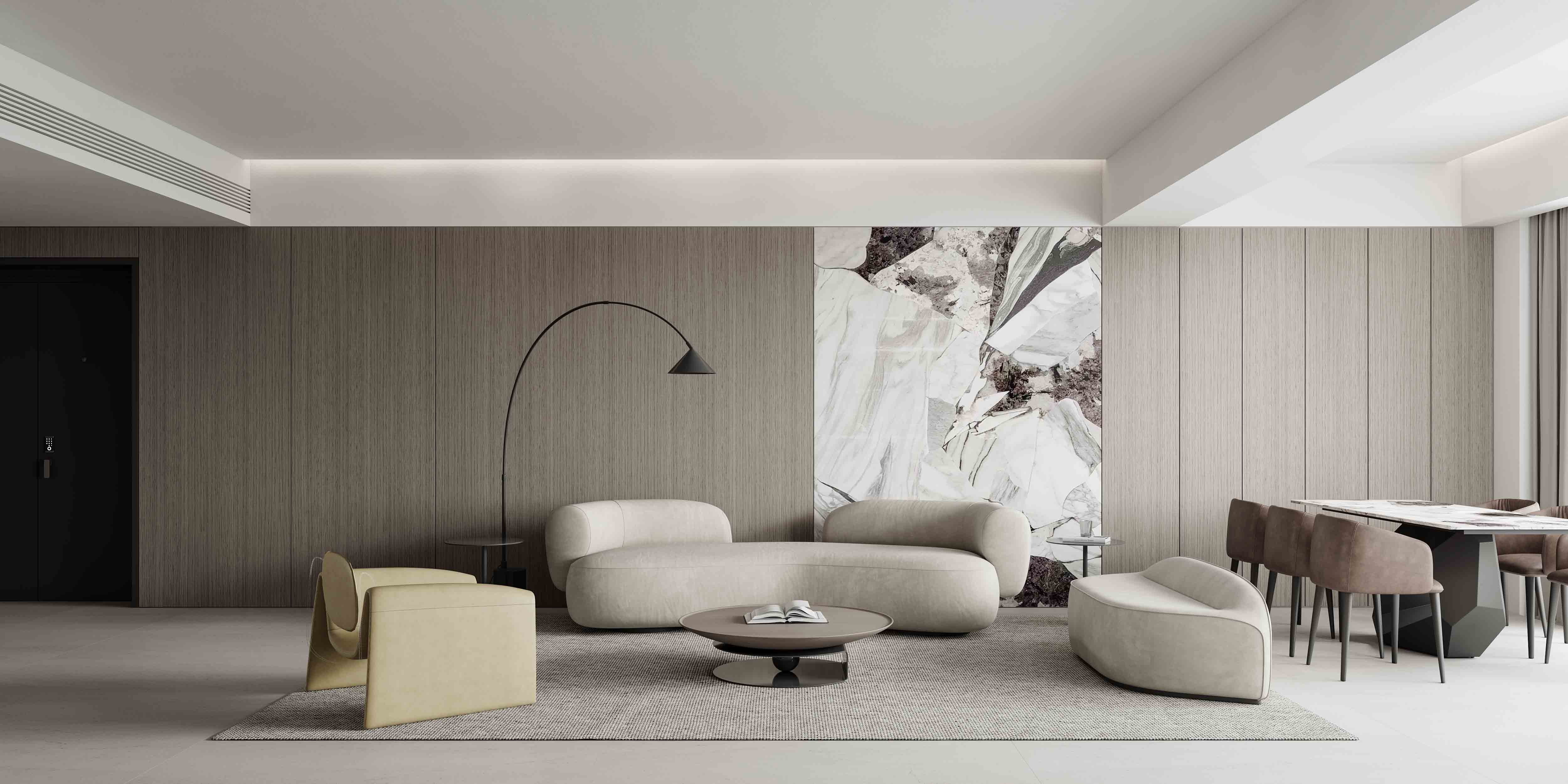
合群·天合名门 HE QUN·GLORY OF THE SEA 摒弃浮华,从生活的本质出发,携低饱和配色续写空间的静谧与优雅。用石材纹理间隔温润原木,赋予生活更多精神内涵,为人与场域勾勒更多不拘一格的想象。 Abandoning pomp and circumstance and starting from the essence of life, the space is renewed with low-saturated color scheme of tranquility and elegance. With stone texture interval warm logs, it gives more spiritual connotation to life and outlines more unconventional imagination for people and the field . 客厅 | Living Room 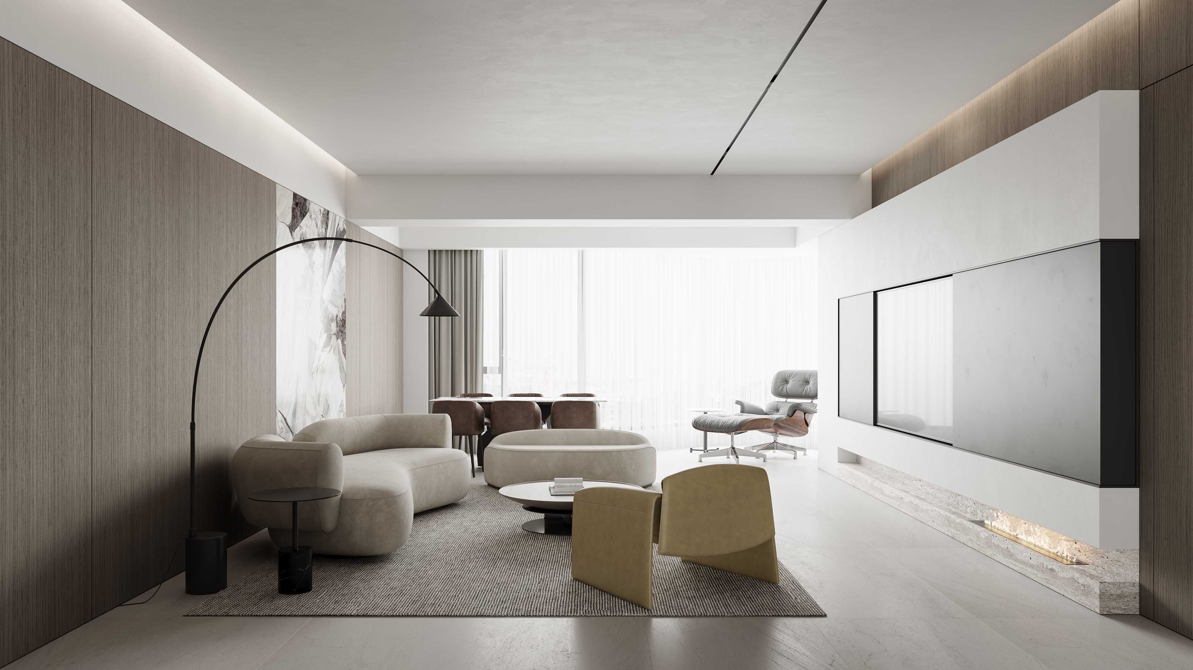
设计以无主灯开阔空间,自然光线通透室内,提亮功能区,为场域增添呼吸感。一面是经典黑白,一面是木质与石材,意式美学的表达,尽显屋主对生活品味与艺术追求的写意姿态。 The design of no main light opens up the space, natural light penetrates the interior, brightens the functional areas and adds a sense of breath to the field. The classic black and white on one side and the wood and stone on the other side are the expression of Italian aesthetics, showing the homeowner's taste for life and the pursuit of art. 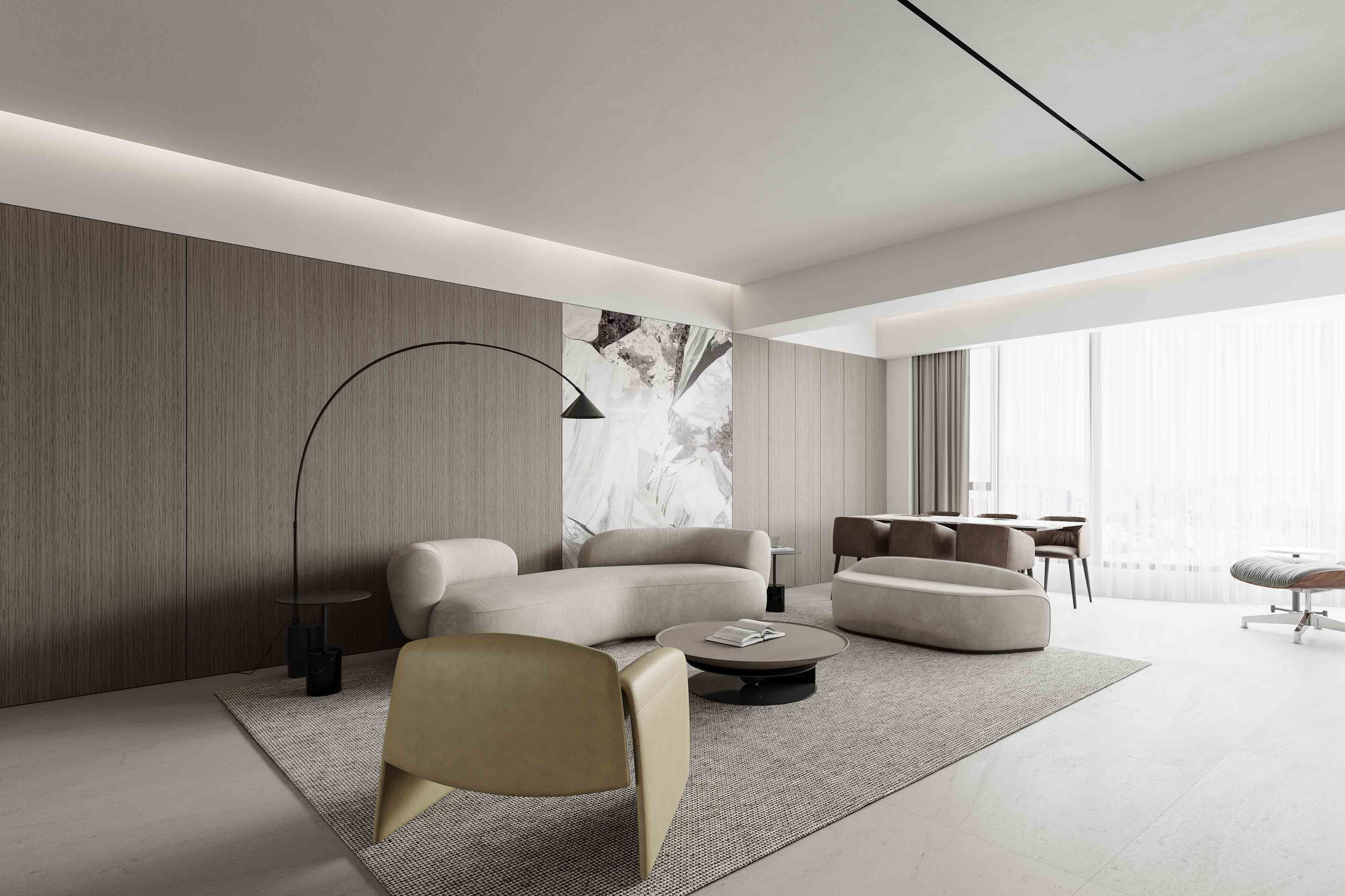
岩板不规则石纹隔断木质背景墙,软装弧度弱化块面棱角的尖锐,修饰圆润柔和的空间轮廓,把控张弛有度的视觉观感。 Rock plate irregular stone pattern partition wooden back wall, soft curvature weakens the sharpness of the block angles, modifies the rounded and soft space contour, and controls the visual perception of space tension and relaxation. 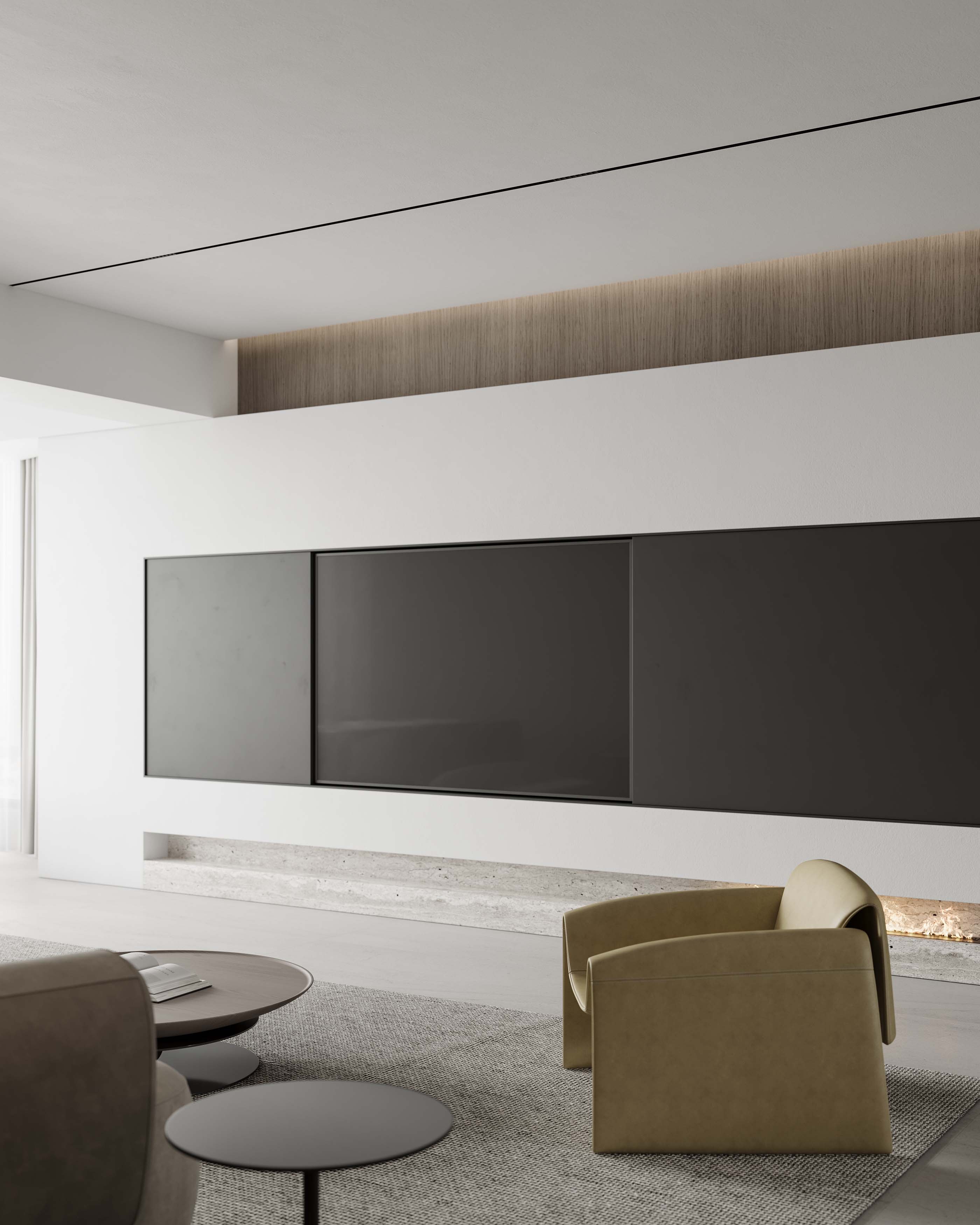
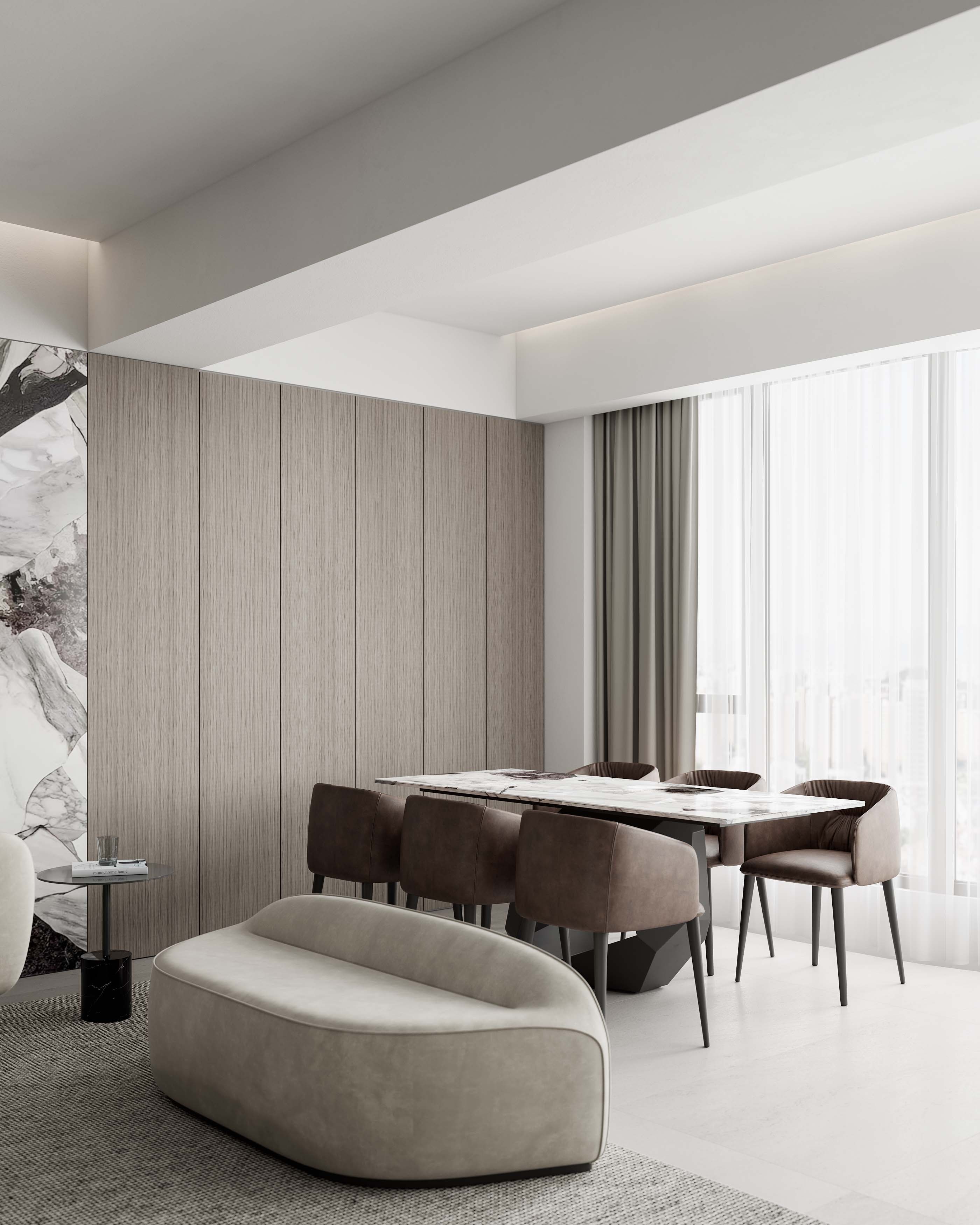
素白电视背景折射光影,释放自然气韵,使身心“聚焦”有多点可寻:电视剧情忘却愁绪,舒适沙发卸下压力,质感座椅倾注情趣。 The plain white TV background reflects light and shadow, releasing the natural charm and making the body and mind "focus" more findable. The TV drama forgetting the sorrow, comfortable sofa unloading the pressure, texture seat pouring interest. 呼应客厅岩板,为客厅到餐厅的空间动线,赋予生活节奏的切换,让日常如石材纹理一般,随性而不呆板…… Echoing the living room rock slab, for the living room to the dining room space dynamic, give the rhythm of life switch, so that everyday as the stone texture, casual and not dull ...... 餐厅 | Dining Area 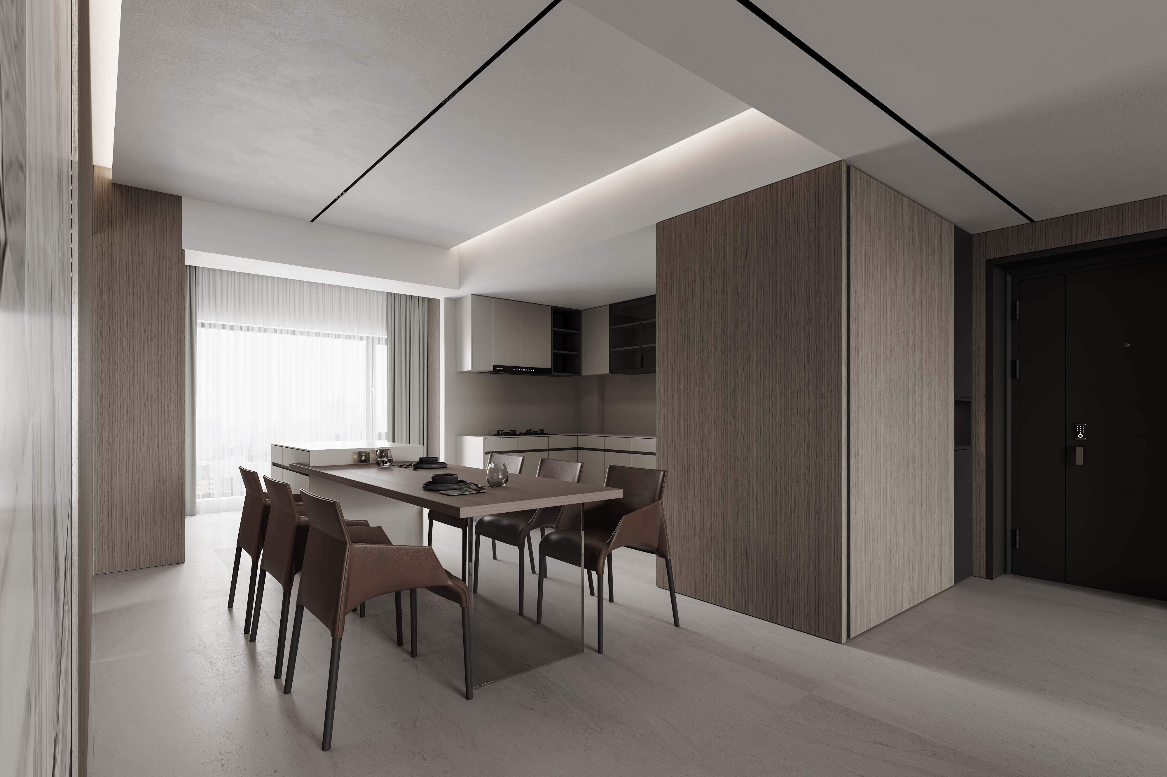
客厅与餐厅区域左右分明,玄关柜体延续至厨房,提升物品收纳功能,餐厅沿用客厅木饰面,强调整体布局的统一。 The living room and dining area are separated from each other. The entrance cabinet continues to the kitchen to enhance the storage function of items, and the dining room follows the wood veneer of the living room to emphasize the unity of the overall layout. 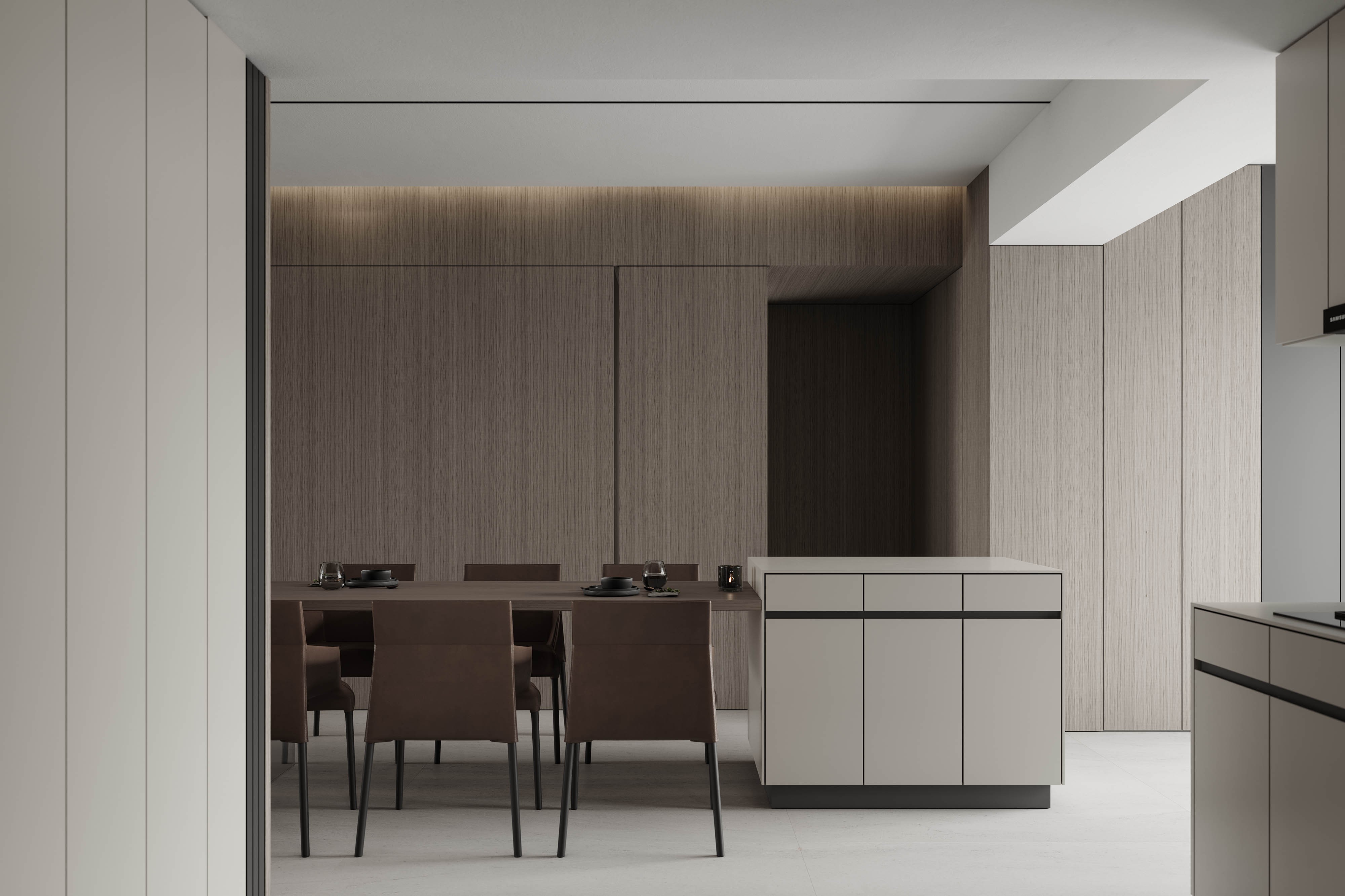
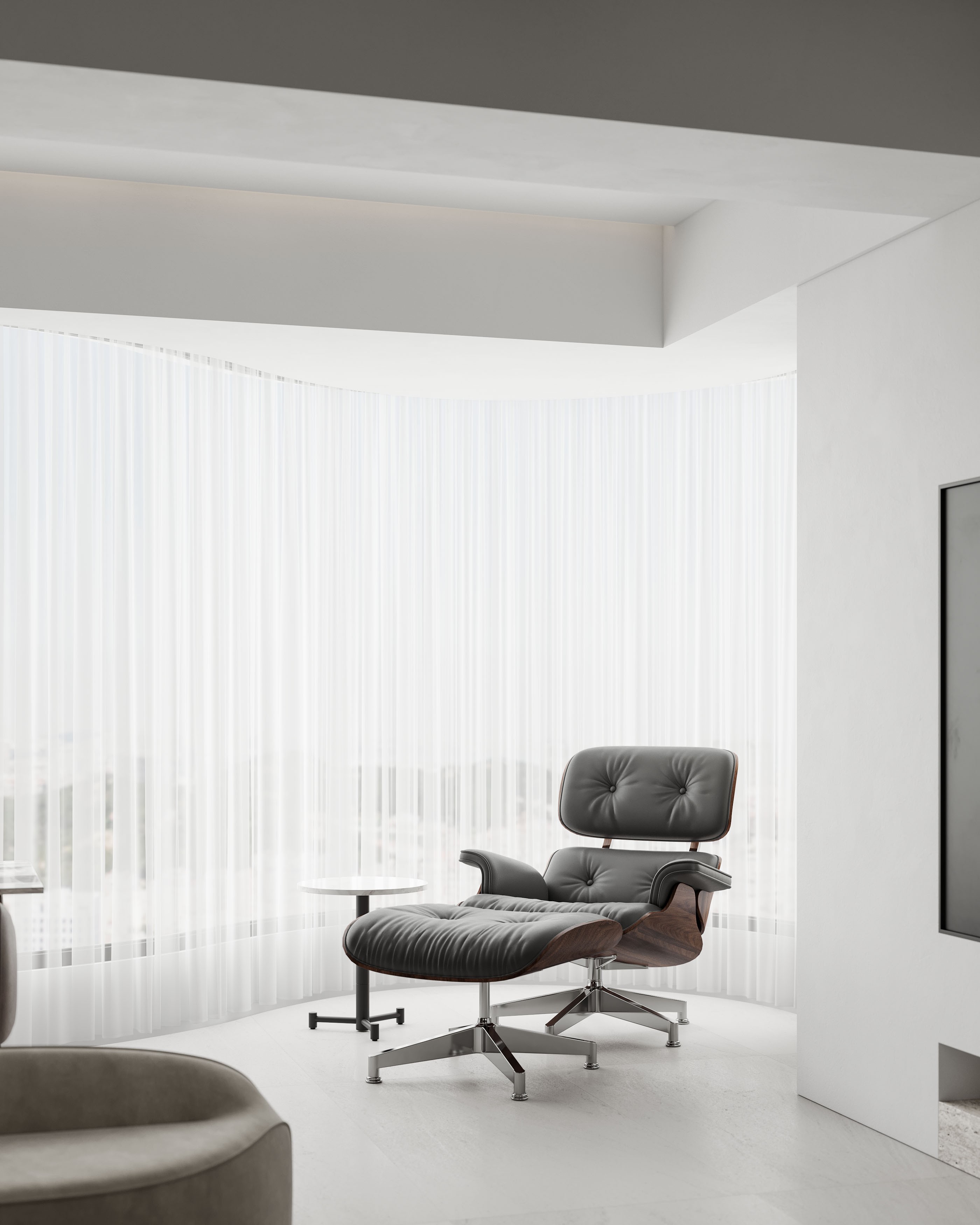
利落有序的柜体规划,为区域扫除凌乱,凝聚人与人之间的亲密情感…… The sharp and orderly cabinet planning, for the area to remove the clutter, cohesion between people and the intimate emotions ...... 岛台与厨房选用同款柔光面板,选配深棕餐椅搭配木质台面,功能与色系兼顾了实用与美学,为用餐时光记录更多互动的温馨与惬意。 The dining cabinet and kitchen use the same soft light panel, optional dark brown dining chairs with wooden countertops, function and color system to take into account the practical and aesthetic, for the dining time to record more interactive warm and cozy. 主卧 | Master Bedroom 主卧迎光而居,无主灯设计营造氛围,柔和的白色纱幔过滤强光,任其向内探索,为室内制造明朗气韵。 The master bedroom is designed to welcome light, with no main lights to create an atmosphere, and soft light curtains to filter the strong light and create a bright atmosphere in the room. 主卧迎光而居,无主灯设计营造氛围,柔和的白色纱幔过滤强光,任其向内探索,为室内制造明朗气韵。 The master bedroom is designed to welcome light, with no main lights to create an atmosphere, and soft light curtains to filter the strong light and create a bright atmosphere in the room. 隔离喧嚣的都市生活,极简贵妃椅为卧室创造一隅自由舒展的休闲区,携居家生活谱写诗意…… Isolated from the hustle and bustle of urban life, minimalist chaise lounge chair for the bedroom to create a corner of freedom to stretch the leisure area for home life poetic ...... 应屋主需求,卧室走道规划一处独立思考区。远程办公的今日,激发灵感的场地将被自由定义。 In response to the homeowner's request, a separate reflection area is planned for the bedroom walkway. In today's world of telecommuting, the space for inspiration will be freely defined. 主卫 | Master Bath “三式干湿分离”的主卫,将洗手台-浴室-如厕三者功能单独设置,彼此互不干扰,令日常起居有序进行。 The "three-style wet and dry" master bathroom has three separate functions: sink, bathroom and toilet, so that they do not interfere with each other and make daily life orderly. 区域功能的布局,为空间不重叠制造更多可能性…… ayout of regional functions to create more possibilities for non-overlapping spaces ...... 区域功能的布局,为空间不重叠制造更多可能性…… ayout of regional functions to create more possibilities for non-overlapping spaces ...... ▼平面图 | The Plan▼ 项目名称 | 合群·天合名门 Project name | HE QUN·GLORY OF THE SEA 设计机构 | 远校空间设计 Design Firm | YUANXIAO Space 主案设计 | 余远校 Interior Design | Yu YuanXiao 硬装设计 | 邵瑞环 余泽娇 余卓毅 Interior Design | Sao RuiHuan 项目地点 | 中国 汕头 Location | Shantou,China 设计面积 | 192㎡ Design Area | 192 sq.m. 设计时间 | 二零二三年六月 Design Time | Jun 2023 YUANXIAO SPACE DESIGN远校空间设计成立于2017年,我们一贯坚持“美学、专业、梦想”的理念。专注售楼中心、样板间、高端私宅、别墅 、办公室、酒店等领域,为客户提供全案设计及顶级定制服务。 汕头远校空间设计有限公司 YUANXIAO Space Design Co., Ltd 地址:汕头市澄海区登峰路 龙光阳光悦府4栋1梯2302号 Shantou Chenghai District Dengfeng Road No. 2302, Ladder 1, Building 4, Sunshine Yue Mansion, Longguang 电话 Tel : +131 1256 0037 邮箱 Email : 397174661@qq.com 微信 Wechat : 13112560037 微信公众号 : 远校设计 小红书 : 远校空间设计有限公司 【关注小红书】寻找你的心水案例 【微信咨询】为你提供满意的设计方案 |
精华推荐
换一换

 收藏
收藏  说两句
说两句 


发表评论0