|
本帖最后由 夏木岩 于 2023-8-16 16:17 编辑 前言 当一座展馆矗立于眼前,便不再只是展馆 而是无数个家的模样被予以呈现 When a pavilion stands in front of you it is no longer just a pavilion but the appearance of countless homes are presented 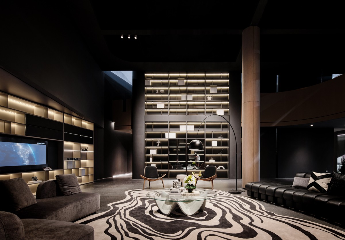
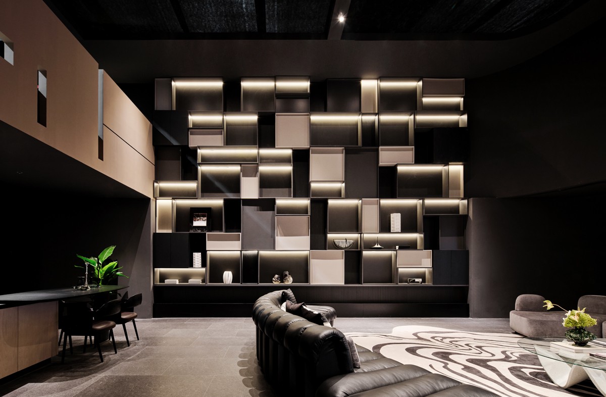
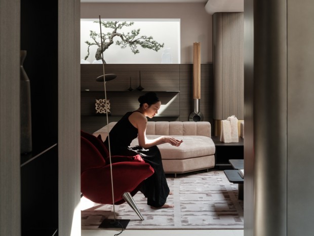
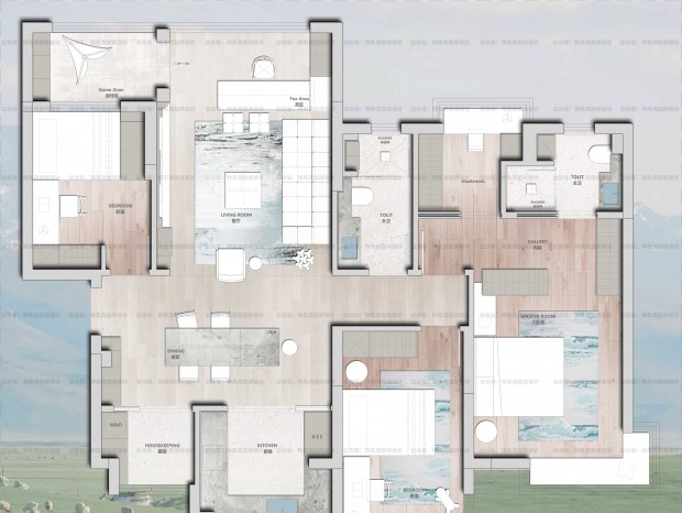
木门与墙板,作为家中不可或缺的产品,设计师以最自然的方式在展馆中立体呈现其观感及使用感。展馆以家为主题进行设计,由四个空间组构而成,以拥有最大人流量的客厅空间为主,延伸至厨房、卧室、衣橱间等家中基础场所。Wooden doors and wall panels, as indispensable products in the home, the designer in the most natural way in the pavilion three-dimensional presentation of their look and use. The pavilion is designed with the theme of home, and is composed of four Spaces, mainly in the living room with the largest flow of people, extending to the kitchen, bedroom, closet and other basic places in the home. 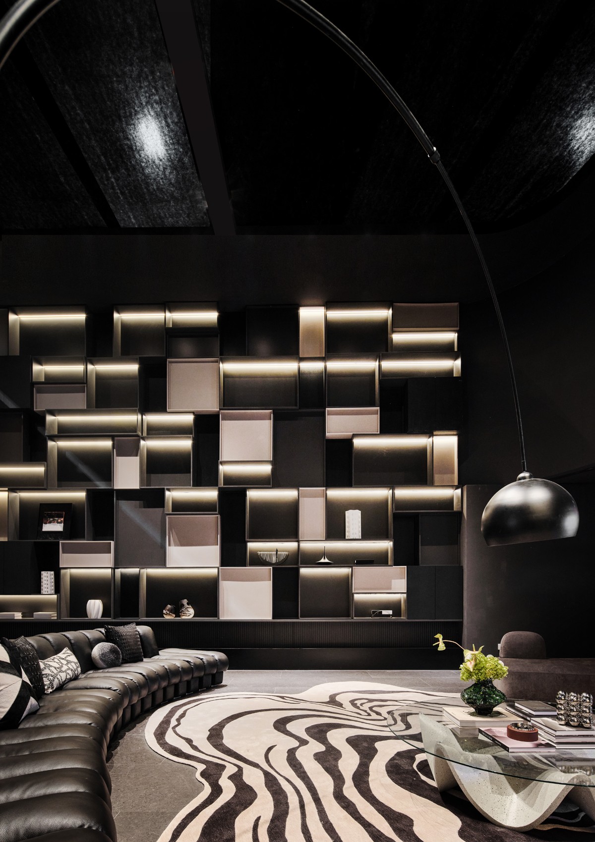
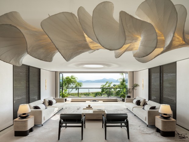
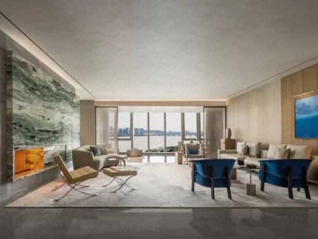
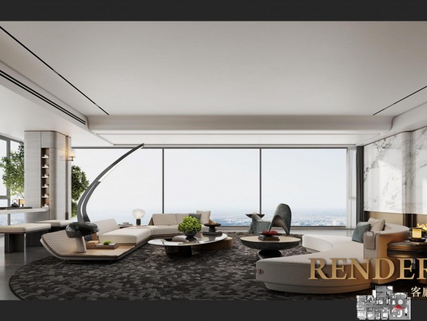
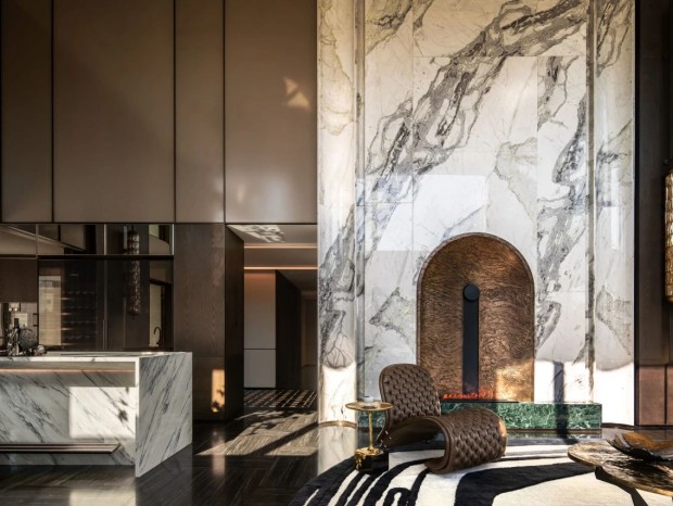
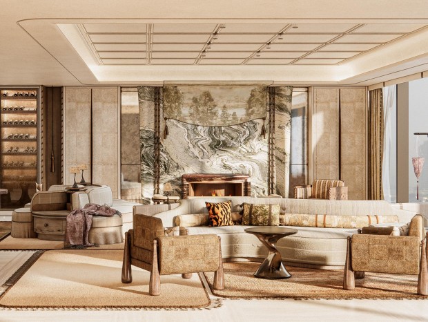
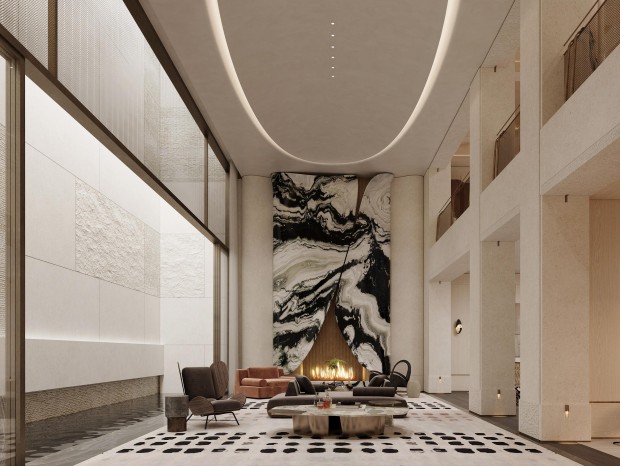
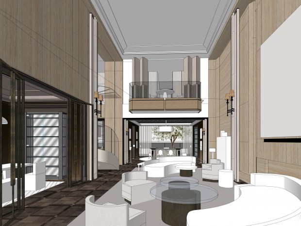
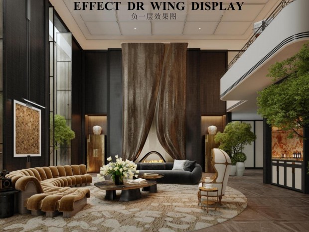
空间架构上,设计师多以整墙木柜代替隔断,多线条灯带点亮格与格之间的距离,层层分明。从狭窄通道过渡至宽阔客厅,规整满墙的木面柜橱与宽敞沙发座椅形成鲜明对比,视觉上极具冲击力。 In terms of space architecture, designers mostly replace partitions with wooden cabinets on the whole wall, and multi-line lights light up the distance between the grids, with distinct layers. Transitioning from the narrow passageway to the spacious living room, the well-structured wall-to-wall wood-faced cabinets contrast with the spacious sofa seats and are visually striking. 作为占地最多的主空间,客厅内部主结构依旧遵循外立面造型,以圆衬圆,以弧衬弧。 As the main space occupying the largest area, the main structure of the living room still follows the facade shape, with circles lining circles and arcs lining arcs.设计师以梦天木作产品精心打造家的模样,通过不同造型的曲面、平直面等将品牌产品的韧性与可塑性一望而知。 Designers with the dream wood products carefully create the appearance of home, through different shapes of the curved surface, flat face and other brand products toughness and plasticity. 品牌产品并无刻意做多余装饰,均以光滑平面呈现,干净利落的整体造型为空间打造更高端大气的场景体验。 Brand products do not deliberately do redundant decoration, are presented in a smooth plane, clean and crisp overall shape for the space to create a more high-end atmosphere scene experience. 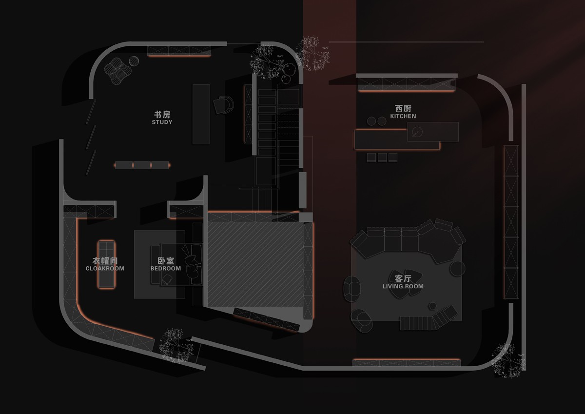
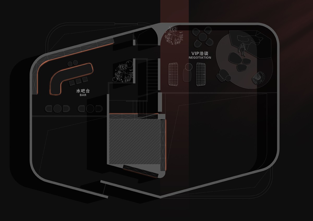
- 项目名称 | 梦天木作2023广州建博会展厅 设计公司 | BalanS / 沈健 蒋国成 项目面积 | 320㎡ 项目地点 | 中国 广州 主要材料 | 艺术涂料 实木 金属 皮革 摄影负责 | AK摄影 / 杨森 完成时间 | 2023.5 |
精华推荐
换一换

 收藏
收藏  说两句
说两句 





发表评论0