|
“空间的一半依赖于设计 另一半则源自于存在与精神” “Half of space depends on design the other half is derived from presence and spirit.” ——安藤忠雄(Tadao Ando) 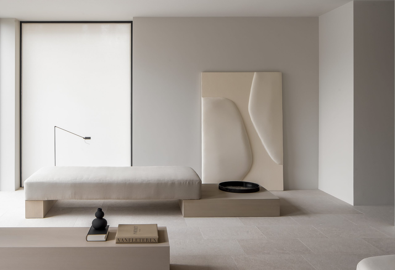

Residence Z是位于比利时安特卫普的简约住宅,由Jessy Van Gorp设计。建筑设计确保每个窗户都能看到周围的树叶或修剪整齐的草坪,促进与自然的无缝连接。 Residence Z is a minimalist residence located in Antwerp, Belgium, designed by Jessy Van Gorp. The architectural design ensures that every window can see the surrounding leaves or neatly trimmed lawn, promoting a seamless connection with nature. 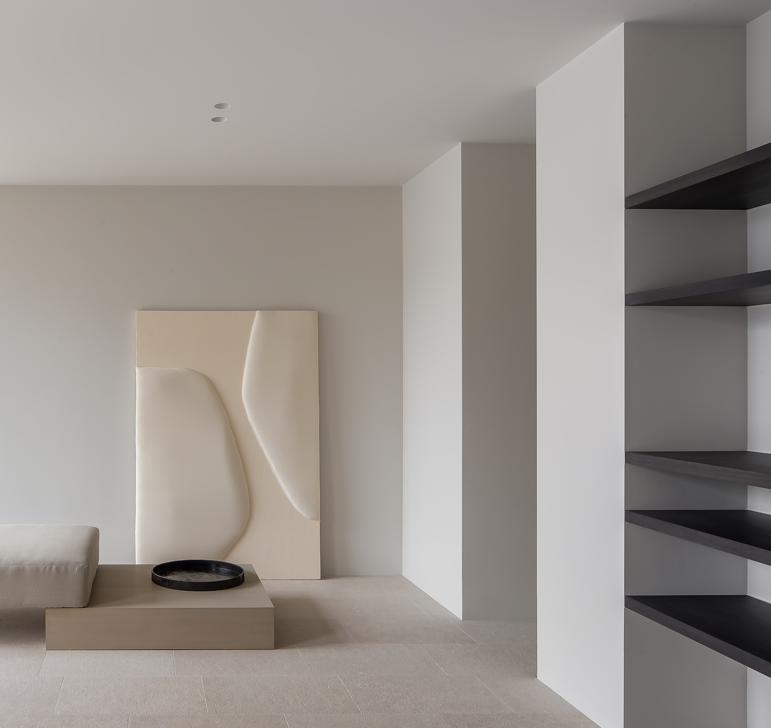
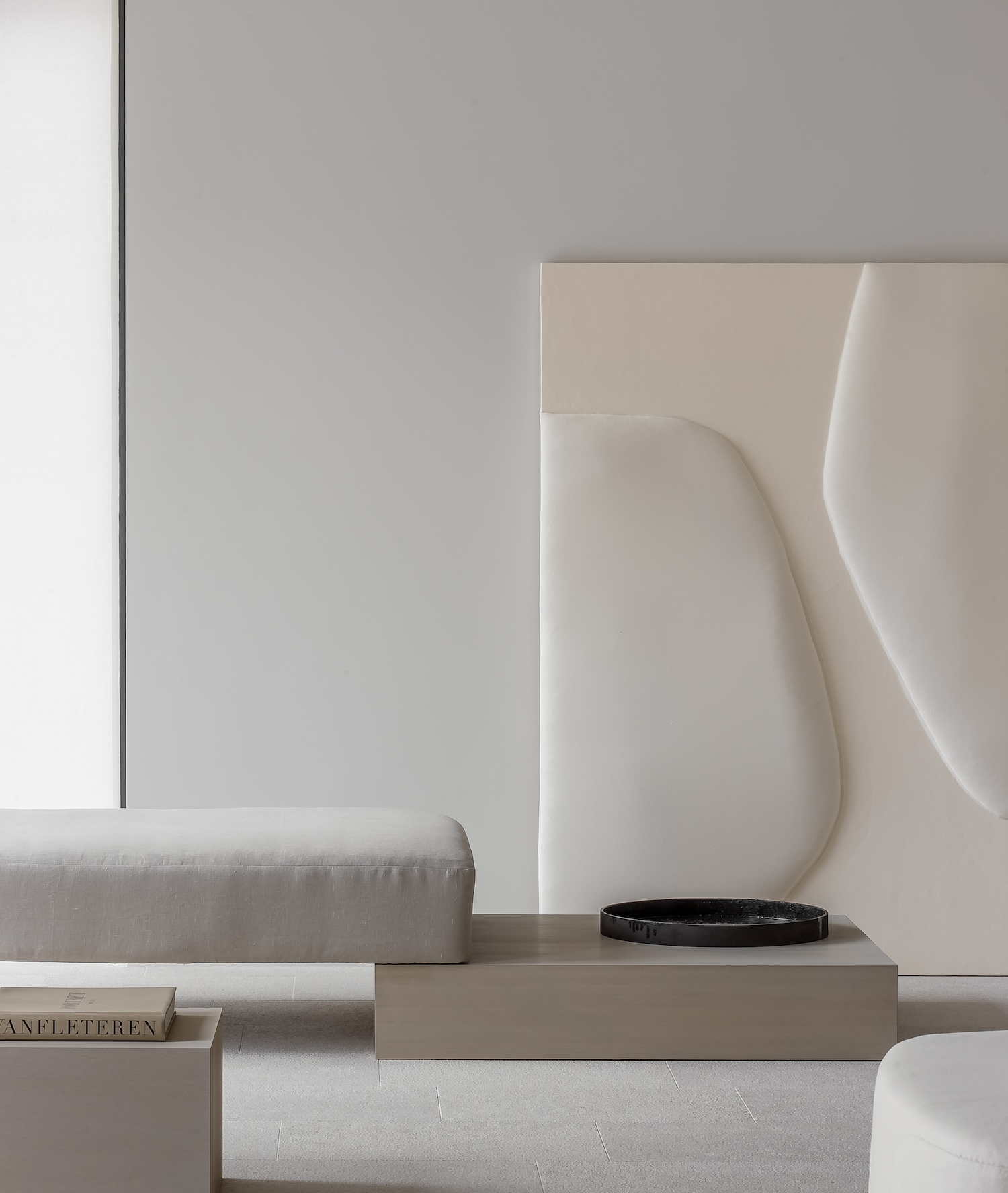
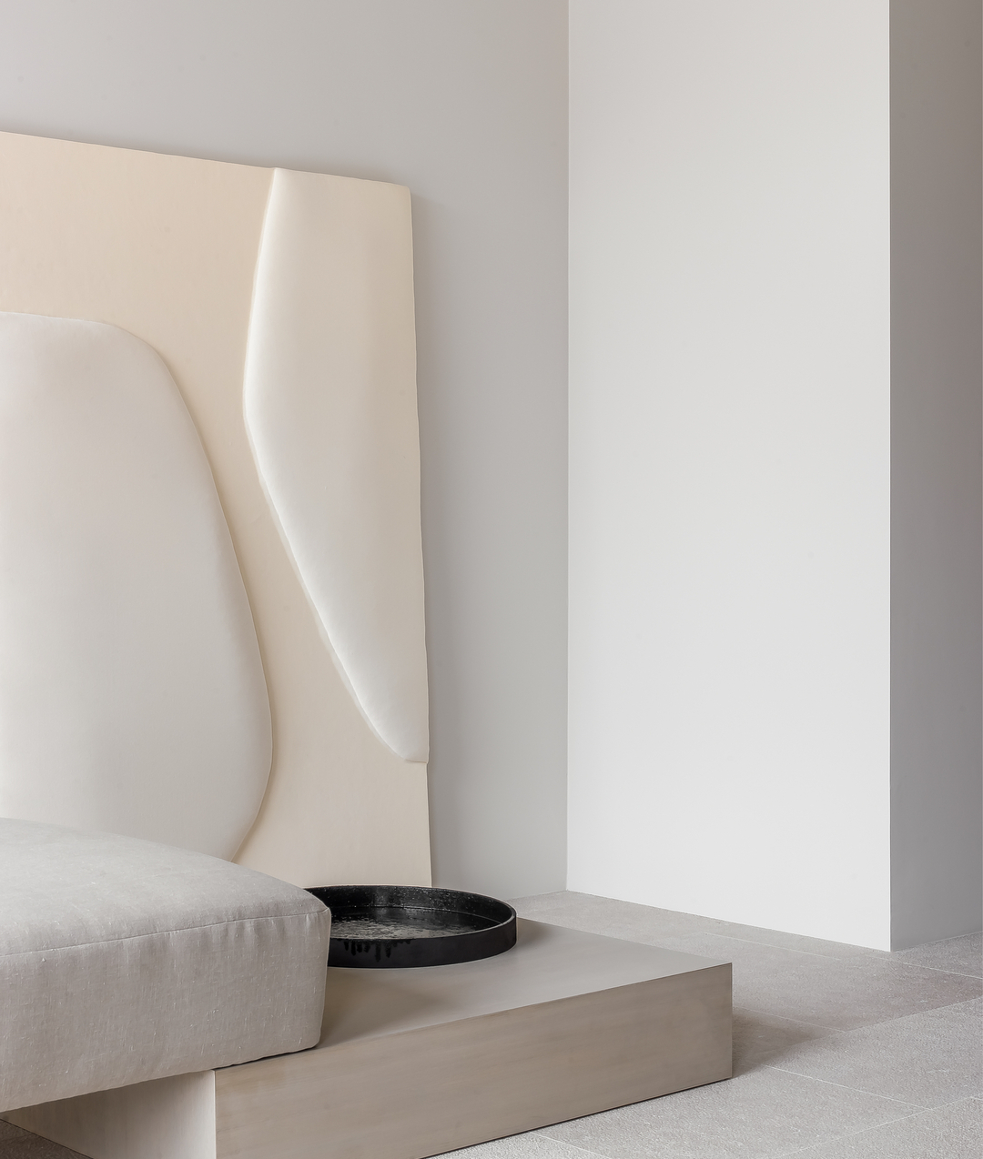
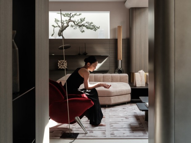
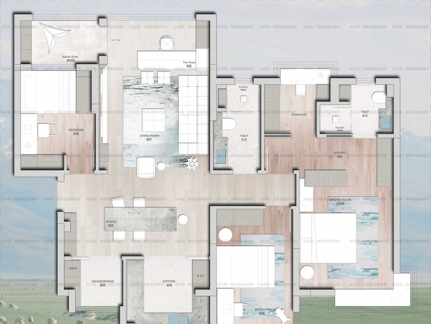
设计过程根据居住者的独特要求量身定制,将客户的愿望与空间潜力和自然光融为一体,打造一个有凝聚力和宁静的生活环境。 The design process is tailored to the unique requirements of residents, integrating their wishes with spatial potential and natural light to create a cohesive and peaceful living environment. 该项目的指导原则是创造明亮、通风、低调优雅的空间,强调宁静、温暖和宁静的氛围,有利于忙碌一天后放松身心。该住宅拥有一系列相互关联的空间,每个空间都有自己的特色,但设计统一。 The guiding principle of this project is to create a bright, ventilated, low-key and elegant space, emphasizing a peaceful, warm, and tranquil atmosphere, which is conducive to relaxing the body and mind after a busy day. This residence has a series of interconnected spaces, each with its own unique features, but with a unified design. 色调从厨房的灰白色调过渡到餐桌的微妙“粉红色赤土色”,再过渡到休息区的米色和黑/棕色色调,轻松打开舒适的电视角。这种布局不仅有利于整个家庭的流畅移动,而且还允许不同程度的隐私和居民之间的联系。 The color tone transitions from the gray and white tones in the kitchen to the subtle pink and earthy tones on the dining table, and then to the beige and black/brown tones in the rest area, effortlessly opening a comfortable TV corner. This layout not only facilitates the smooth movement of the entire family, but also allows for varying degrees of privacy and connections between residents. 自然光在住宅内部起着至关重要的作用,宽敞的玻璃部分迎接阳光,突出建筑轮廓并创造动态的视觉效果。 Natural light plays a crucial role inside residential buildings, with spacious glass sections welcoming sunlight, highlighting the building's contours and creating dynamic visual effects. 一个显着的特点是餐厅的大推拉门,它既可以保护家庭办公室的隐私,也可以展现郁郁葱葱的室外风景。主浴室配有桑拿浴室和按摩淋浴,精心布置的照明凸显了其时尚的设计。 notable feature is the large sliding door of the restaurant, which can protect the privacy of the home office and showcase the lush outdoor scenery. The master bathroom is equipped with a sauna and massage shower, and the carefully arranged lighting highlights its fashionable design. 致力于简约和使用天然材料是该住宅设计理念的标志。一楼展示了带有纹理的天然石材,而浴室则采用了带有大胆图案的大理石,所有这些都以有机的方式布置。 ]The commitment to simplicity and the use of natural materials is a hallmark of this residential design concept. The first floor displays natural stone with textures, while the bathroom features marble with bold patterns, all arranged in an organic way. 木材的选择从浅色到深色拉丝橡木不等,天然石灰灰泥和亚麻、羊毛和棉制成的纺织品等饰面强调了设计师对自然元素的偏爱。 The choice of wood ranges from light to dark brushed oak, with natural lime plaster and textiles made of linen, wool, and cotton accentuating the designer's preference for natural elements. 这种偏好反映在住宅的配色方案中,采用了一系列舒缓的白色、米色和深棕色,并点缀着引人注目的“粉红色赤土色”。 This preference is reflected in the color scheme of the residence, which adopts a series of soothing white, beige, and dark brown colors, and is embellished with a striking "pink terracotta color". |
精华推荐
换一换

 收藏
收藏  说两句
说两句 





我在拓者看世界